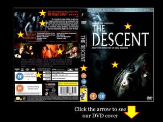
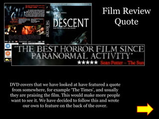
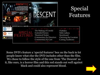
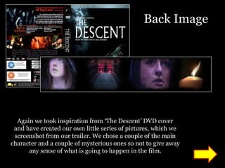
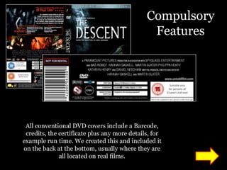
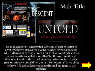
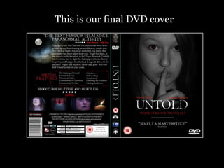
In what ways does your media
product use, develop or challenge
  forms and conventions of real
        media products?
On the next slide, there are two images
   – one of ‘The Descent’ DVD cover
   which we have used as inspiration
     when creating our DVD cover.
Clicking on the stars will navigate you
      to a different page giving an
explanation of the typical conventions
 we have used for that specific section
of the DVD cover. On each individual
  slide, click on the arrow to take you
 back to the slide with the DVD cover.
Click the arrow to see
    our DVD cover
Film Review
                                                  Quote


DVD covers that we have looked at have featured a quote
 from somewhere, for example ‘The Times’, and usually
they are praising the film. This would make more people
 want to see it. We have decided to follow this and wrote
       our own to feature on the back of the cover.
The Blurb


             2


  All DVD’s feature a blurb on the back, this is to inform
 people of the general story line. We have decided as well
to follow this common convention and write our own one
                which features on the back.
Special
                                                        Features


  Some DVD’s feature a ‘special features’ box on the back to let
  people know what else the DVD includes other than the film.
  We chose to follow the style of the one from ‘The Descent’ as
it, like ours, is a horror film and this red stands out well against
                black and could also represent blood.
Back Image


  Again we took inspiration from ‘The Descent’ DVD cover
 and have created our own little series of pictures, which we
 screenshot from our trailer. We chose a couple of the main
character and a couple of mysterious ones so not to give away
      any sense of what is going to happen in the film.
Compulsory
                                               Features


 All conventional DVD covers include a Barcode,
 credits, the certificate plus any more details, for
example run time. We created this and included it
on the back at the bottom, usually where they are
              all located on real films.
Main Title


  We used a different font to what everyone is used to seeing on
 DVD covers. We discovered a website called ‘www.dafont.com’
which allowed us to choose from a range of various fonts and we
  came across this one that was called ‘I still know’. We thought
 that as well as the title of the font being rather ironic, it looked
great on our cover. In addition, as in ‘The Descent’ title, we chose
   to have it in capital letters to make it stand out more to the
                               audience.
Certificate &
                                              Production


All DVD covers have the film certificate on
  the middle as well the films production
companies and financial partners, like ‘The
 Descent’ has ‘Pathe’ where we have used
   Paramount, Bad Robot and Spyglass.
Main Image


 We really liked the image used on the front cover of ‘The Descent’
 DVD. We liked how they incorporated a gray scale image with the
colour red and so we chose to edit the eyes of the main character and
 make them a dark red colour to convey a side of evil and to further
                    suggest the genre of horror.
This is our final DVD cover

Media dvd cover analysis

  • 1.
    In what waysdoes your media product use, develop or challenge forms and conventions of real media products?
  • 2.
    On the nextslide, there are two images – one of ‘The Descent’ DVD cover which we have used as inspiration when creating our DVD cover. Clicking on the stars will navigate you to a different page giving an explanation of the typical conventions we have used for that specific section of the DVD cover. On each individual slide, click on the arrow to take you back to the slide with the DVD cover.
  • 3.
    Click the arrowto see our DVD cover
  • 4.
    Film Review Quote DVD covers that we have looked at have featured a quote from somewhere, for example ‘The Times’, and usually they are praising the film. This would make more people want to see it. We have decided to follow this and wrote our own to feature on the back of the cover.
  • 5.
    The Blurb 2 All DVD’s feature a blurb on the back, this is to inform people of the general story line. We have decided as well to follow this common convention and write our own one which features on the back.
  • 6.
    Special Features Some DVD’s feature a ‘special features’ box on the back to let people know what else the DVD includes other than the film. We chose to follow the style of the one from ‘The Descent’ as it, like ours, is a horror film and this red stands out well against black and could also represent blood.
  • 7.
    Back Image Again we took inspiration from ‘The Descent’ DVD cover and have created our own little series of pictures, which we screenshot from our trailer. We chose a couple of the main character and a couple of mysterious ones so not to give away any sense of what is going to happen in the film.
  • 8.
    Compulsory Features All conventional DVD covers include a Barcode, credits, the certificate plus any more details, for example run time. We created this and included it on the back at the bottom, usually where they are all located on real films.
  • 9.
    Main Title We used a different font to what everyone is used to seeing on DVD covers. We discovered a website called ‘www.dafont.com’ which allowed us to choose from a range of various fonts and we came across this one that was called ‘I still know’. We thought that as well as the title of the font being rather ironic, it looked great on our cover. In addition, as in ‘The Descent’ title, we chose to have it in capital letters to make it stand out more to the audience.
  • 10.
    Certificate & Production All DVD covers have the film certificate on the middle as well the films production companies and financial partners, like ‘The Descent’ has ‘Pathe’ where we have used Paramount, Bad Robot and Spyglass.
  • 11.
    Main Image Wereally liked the image used on the front cover of ‘The Descent’ DVD. We liked how they incorporated a gray scale image with the colour red and so we chose to edit the eyes of the main character and make them a dark red colour to convey a side of evil and to further suggest the genre of horror.
  • 12.
    This is ourfinal DVD cover