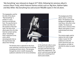
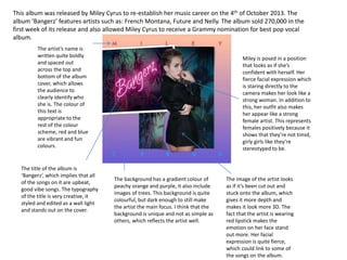
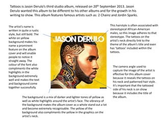
The typography used for
the title of the album
“My Everything” is
written in a very
feminine and delicate
font. The way the text is
written also links into
the emotion of the text
itself. The title of the
album gives fans the idea
that the content will be
about “everything”
that’s important to the
artist, which
stereotypically links to
the way females talk
about their feelings.
The female artist is captured on the front
cover wearing a minimal amount of clothing,
including very short shorts. The text goes
through the artist’s midriff, drawing the
audience’s attention to her torso and below.
‘My Everything’ was released on August 22nd 2014, following her previous album’s
success (Yours Truly), which features famous artists such as: Big Sean, Nathan Sykes
and Mac Miller. My Everything has sold around 700,000 copies in the US alone.
The background of this
album colour is almost
black. The darkness of the
background highlights the
main focus- the artist in the
middle. The black and
white colour scheme of this
album cover gives it a very
sophisticated and classy
look.
The camera angle used to
capture the main image
makes it easier for the
audience to view the
artist’s feminine pose. So
the audience are able to
identify this album as quite
girly.
In this particular album cover,
females are represented as
very girly and that they care
about their appearance. The
artist is pictured wearing high
heels and a matching set of
shorts and a bralet.
This album was released by Miley Cyrus to re-establish her music career on the 4th of October 2013. The
album ‘Bangerz’ features artists such as: French Montana, Future and Nelly. The album sold 270,000 in the
first week of its release and also allowed Miley Cyrus to receive a Grammy nomination for best pop vocal
album.
The artist’s name is
written quite boldly
and spaced out
across the top and
bottom of the album
cover, which allows
the audience to
clearly identify who
she is. The colour of
this text is
appropriate to the
rest of the colour
scheme, red and blue
are vibrant and fun
colours.
The title of the album is
‘Bangerz’, which implies that all
of the songs on it are upbeat,
good vibe songs. The typography
of the title is very creative, it
styled and edited as a wall light
and stands out on the cover.
The background has a gradient colour of
peachy orange and purple, it also include
images of trees. This background is quite
colourful, but dark enough to still make
the artist the main focus. I think that the
background is unique and not as simple as
others, which reflects the artist well.
The image of the artist looks
as if it’s been cut out and
stuck onto the album, which
gives it more depth and
makes it look more 3D. The
fact that the artist is wearing
red lipstick makes the
emotion on her face stand
out more. Her facial
expression is quite fierce,
which could link to some of
the songs on the album.
Miley is posed in a position
that looks as if she’s
confident with herself. Her
fierce facial expression which
is staring directly to the
camera makes her look like a
strong woman. In addition to
this, her outfit also makes
her appear like a strong
female artist. This represents
females positively because it
shows that they’re not timid,
girly girls like they’re
stereotyped to be.
Tattoos is Jason Derulo’s third studio album, released on 20th September 2013. Jason
Derulo wanted this album to be different to his other albums and for the growth in his
writing to show. This album features famous artists such as: 2 Chainz and Jordin Sparks.
The artist’s name is
written in quite a rustic
style, but still bold. The
white on yellow
background makes his
name a prominent
feature on the album
cover and will enable
people to notice it
straight away. The
colour of the font also
compliments the white
highlights in the
background extremely
well and makes the text
and background come
together successfully.
The background is a mix of darker and lighter tones of yellow as
well as white highlights around the artist’s face. The vibrancy of
the background makes the album cover as a whole stand out a lot
and become extremely recognisable. The yellow of the
background also compliments the yellow in the graphics on the
artist’s neck.
This hairstyle is often associated with
stereotypical African-American
males, so this image adheres to that
stereotype. The tattoos on the
artist’s neck directly link to the
theme of the album’s title and even
has ‘tattoos’ included within the
tattoos.
The camera angle used to
capture the image of the artist is
effective for this album cover
because it reveals the tattoos on
his neck and patterned hair style.
It’s important that the tattooed
side of his neck is on show
because it includes the title of
the album.
Artpop is the third studio album by Lady Gaga, released on November 6th 2013. Artpop
includes the famous single ‘Applause’ and features vocals from artists such as: R Kelly, T.I
and Twista.
The typography for the
title of the album and
the artist’s name is
extremely bold in
regards to the font itself
and the colour of the
font. The artist’s name
is bright pink, which is
very effective in regards
to standing out from
the background. The
colour of the title is
white, which looks bold
against the blue object
that it’s in front of.
Considering this is Lady Gaga’s third studio
album and the fact she’s frequently in the
media because of her unique style means that
most people know who she is. This means that
her name doesn’t need to look particularly
clear for the audience to know who’s album it
is if it’s accompanied by an image of her.
The background for this album
appears to be a collage of historical
images, broken up. There’s no clear
colour scheme for this album, but
this can be forgiven because the
title is ‘Artpop’ so it can be seen as
abstract and creative.
Lady Gaga is styled to look like
a statue, which links to the
historical background. Her
facial expression and body
language is very stiff and
emotion-less to capture this
role.

Album cover analysis

  • 1.
    The typography usedfor the title of the album “My Everything” is written in a very feminine and delicate font. The way the text is written also links into the emotion of the text itself. The title of the album gives fans the idea that the content will be about “everything” that’s important to the artist, which stereotypically links to the way females talk about their feelings. The female artist is captured on the front cover wearing a minimal amount of clothing, including very short shorts. The text goes through the artist’s midriff, drawing the audience’s attention to her torso and below. ‘My Everything’ was released on August 22nd 2014, following her previous album’s success (Yours Truly), which features famous artists such as: Big Sean, Nathan Sykes and Mac Miller. My Everything has sold around 700,000 copies in the US alone. The background of this album colour is almost black. The darkness of the background highlights the main focus- the artist in the middle. The black and white colour scheme of this album cover gives it a very sophisticated and classy look. The camera angle used to capture the main image makes it easier for the audience to view the artist’s feminine pose. So the audience are able to identify this album as quite girly. In this particular album cover, females are represented as very girly and that they care about their appearance. The artist is pictured wearing high heels and a matching set of shorts and a bralet.
  • 2.
    This album wasreleased by Miley Cyrus to re-establish her music career on the 4th of October 2013. The album ‘Bangerz’ features artists such as: French Montana, Future and Nelly. The album sold 270,000 in the first week of its release and also allowed Miley Cyrus to receive a Grammy nomination for best pop vocal album. The artist’s name is written quite boldly and spaced out across the top and bottom of the album cover, which allows the audience to clearly identify who she is. The colour of this text is appropriate to the rest of the colour scheme, red and blue are vibrant and fun colours. The title of the album is ‘Bangerz’, which implies that all of the songs on it are upbeat, good vibe songs. The typography of the title is very creative, it styled and edited as a wall light and stands out on the cover. The background has a gradient colour of peachy orange and purple, it also include images of trees. This background is quite colourful, but dark enough to still make the artist the main focus. I think that the background is unique and not as simple as others, which reflects the artist well. The image of the artist looks as if it’s been cut out and stuck onto the album, which gives it more depth and makes it look more 3D. The fact that the artist is wearing red lipstick makes the emotion on her face stand out more. Her facial expression is quite fierce, which could link to some of the songs on the album. Miley is posed in a position that looks as if she’s confident with herself. Her fierce facial expression which is staring directly to the camera makes her look like a strong woman. In addition to this, her outfit also makes her appear like a strong female artist. This represents females positively because it shows that they’re not timid, girly girls like they’re stereotyped to be.
  • 3.
    Tattoos is JasonDerulo’s third studio album, released on 20th September 2013. Jason Derulo wanted this album to be different to his other albums and for the growth in his writing to show. This album features famous artists such as: 2 Chainz and Jordin Sparks. The artist’s name is written in quite a rustic style, but still bold. The white on yellow background makes his name a prominent feature on the album cover and will enable people to notice it straight away. The colour of the font also compliments the white highlights in the background extremely well and makes the text and background come together successfully. The background is a mix of darker and lighter tones of yellow as well as white highlights around the artist’s face. The vibrancy of the background makes the album cover as a whole stand out a lot and become extremely recognisable. The yellow of the background also compliments the yellow in the graphics on the artist’s neck. This hairstyle is often associated with stereotypical African-American males, so this image adheres to that stereotype. The tattoos on the artist’s neck directly link to the theme of the album’s title and even has ‘tattoos’ included within the tattoos. The camera angle used to capture the image of the artist is effective for this album cover because it reveals the tattoos on his neck and patterned hair style. It’s important that the tattooed side of his neck is on show because it includes the title of the album.
  • 4.
    Artpop is thethird studio album by Lady Gaga, released on November 6th 2013. Artpop includes the famous single ‘Applause’ and features vocals from artists such as: R Kelly, T.I and Twista. The typography for the title of the album and the artist’s name is extremely bold in regards to the font itself and the colour of the font. The artist’s name is bright pink, which is very effective in regards to standing out from the background. The colour of the title is white, which looks bold against the blue object that it’s in front of. Considering this is Lady Gaga’s third studio album and the fact she’s frequently in the media because of her unique style means that most people know who she is. This means that her name doesn’t need to look particularly clear for the audience to know who’s album it is if it’s accompanied by an image of her. The background for this album appears to be a collage of historical images, broken up. There’s no clear colour scheme for this album, but this can be forgiven because the title is ‘Artpop’ so it can be seen as abstract and creative. Lady Gaga is styled to look like a statue, which links to the historical background. Her facial expression and body language is very stiff and emotion-less to capture this role.