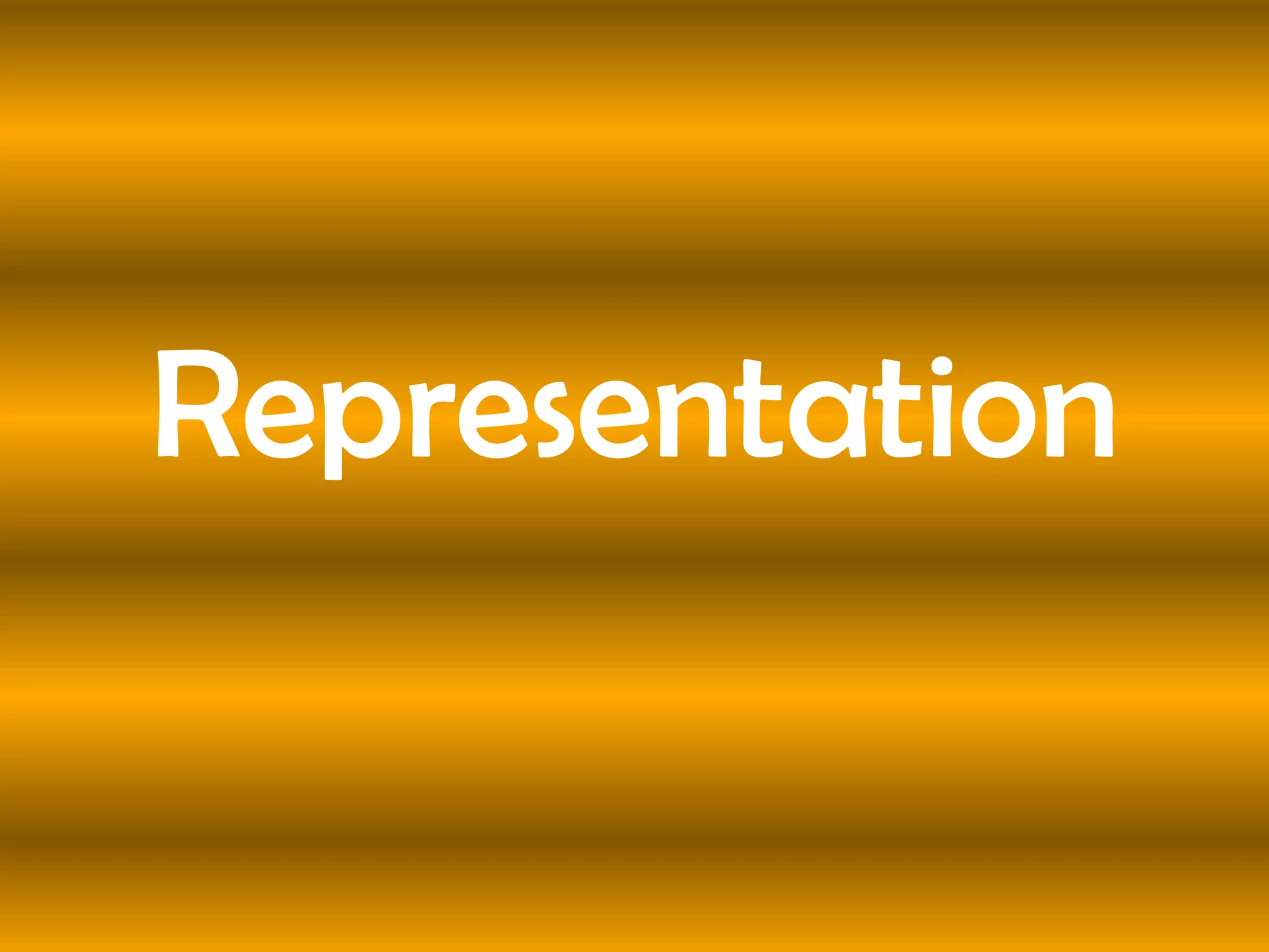
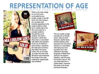
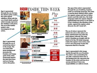
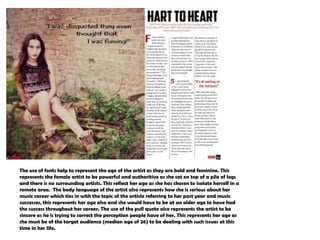
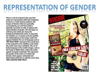
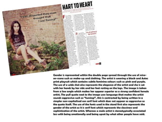
Representation
There is one main image
on my front cover
surrounded by two
smaller images in the left
third. The main image is
of a younger artist
instantly appealing to the
target audience which
has a median age of 26.
She is promoted as a
younger audience
through the use of
clothing. The artist is
dressed in a dark blue
dress, blue is a associated
with depth and expertise.
As the use of clothing is
quite trendy is represents
the indie genre and how
they follow the season
trends. The use of make
up makes the artist look
attractive and emphasises
the image of the artist
making her appeal bold
and confident.

The two smaller images
are both also of female
artists. They are both
dressed in darker Aztec
printed clothing which
represents the rock genre
and how it is associated
with being loud and
powerful, this is also
reflected in the body
language of Abbie Hart
and how she appears
rebellious with throwing
her hands in the air. The
use of the bold font in
capital letters, represent
the artists to be strong
and loud characters.
Age is represented
through the use of props,
the electric guitar makes
the artist appeal
rebellious along with the
use of dark black eyeliner
which strongly represents
the rebellious rock genre.
The use of the leather
jacket is also
stereotypical of rock
artists.

Age is represented
through the use of
contrasting colours
in the image. The
use of the bold
green background
promotes the
freedom and happy
spirit of the artist.
Contrasted against
the dark blue dress
and use of props
such as the guitar.

The age of the artist is represented
through the use of clothing, location,
make up and body language. The artist
is wearing dark clothing which makes
her appear unique and seen to follow
trends much like indie fans. Her body
language makes her appear elegant,
sophisticated and serious as she looks as
if she is looking in the direction of the
reader, against the caption which
discusses she will „reveal all‟.
The use of colours represent the
artist to be wise as the colours are
fairly sophisticated and make the
artist appear cultured. The male
artist is standing up straight with his
hand on his hip. His body language
makes him appear more serious and
as he is not using props it gives the
impression that he is focused.

Age is represented in this image
mostly through the use of location.
The artist is seen overlooking the
sea with a expensive boat near in
the background, this represents the
freedom of the artist and how he is
young and doesn‟t have any
responsibilities so is able to travel.
The use of fonts help to represent the age of the artist as they are bold and feminine. This
represents the female artist to be powerful and authoritive as she sat on top of a pile of logs
and there is no surrounding artists. This reflect her age as she has chosen to isolate herself in a
remote area. The body language of the artist also represents how she is serious about her
music career which ties in with the topic of the article referring to her past year and music
successes, this represents her age also and she would have to be at an older age to have had
the success throughout her career. The use of the pull quote also represents the artist to be
sincere as he is trying to correct the perception people have of her. This represents her age as
she must be of the target audience (median age of 26) to be dealing with such issues at this
time in her life.
There is a lot of contrast in the way that
artists are represented within the magazine.
As there is a male leaning audience, the
images of female artists are generally
surrounded by san serif font which is
typically masculine in order to balance the
representation of gender. The shot type is a
mid-long shot which also shows the
background behind the artist. It represents
her freedom as a musician and also signifies
her independency as the image makes her
appear isolated. The use of language such as
“MY WILD YEAR” represents the overall tone
of the magazine to be rebellious and makes
the artists seem more confident. The use of
body language in the smaller images, such as
the image of Abbie Hart, makes the artists
appear energetic and lively. This represents
the gender of the artist as it makes the
female artists appear motivated and
determined which ties in with the cover story
“MIA LUDLOW GOES SOLO”.
The main image on the contents page represents the gender
by its use of colour effects. The use of a subtle sepia effect
makes the artist appear elegant and feminine. This is
contrasted with the use body language which makes the
artist look confident and intimidating as if she is glaring at
the audience.
The image with the number 14 below it represents the
gender of the artist through the use of makeup, clothing
and props. The dark black eye liner, leather of rock artists.
It represents the artist as authoritive as the image is a midshot taken from a low angle. The second image along the
left hand column is represented as being peaceful and indie
leaning with the contrast of the block capital font which is
associated with being masculine. Serif font is used as the
pull quotes for majority of the images as this represents
femininity and breaks up the use of dark colour within the
contents page.
The third image down in the left hand column is plain and
only uses a colour effect but no use of representative props.
It has a greater focus on the success of the artist and
therefore a mid shot is used to show the emotion of the
artist and represent the male as a dedicated, hard working
musician. The final image in the column is taken in a exotic
location which emphasises the diversity of the magazine. It
enables the audience to see the culture behind the music
industry and represents the artists to be well travelled along
with representing the magazine to be informative. A
column of text is used to break up the content into sections
of interest to the audience and a plus section is also used as
a brief description of where each topic can be found. This
represents the magazine to be informative and well laid
out.
Gender is represented within the double page spread through the use of miseen-scene such as make-up and clothing. The artist is wearing a black and Aztec
print playsuit which contains subtle feminine colours such as pink and purple.
The use of a wide shot also represents the elegance of the artist and she is sat
with her hands by her side and her feet resting on the logs. The image is taken
from a low angle which makes her appear superior as a strong confident female
artist. The pull quote next to the image uses language that makes the artist
sounds aggressive such as “fuming!”, this is contrasted by being written in a
simpler non-capitalised san serif font which does not appear as aggressive as
the quote itself. The use of the fonts used in the stand first also represents the
gender of the artist as it is serif font which represents the classiness and
sophistication of the artist. Whereas a male artist is stereotypically associated
less with being emotionally and being upset by what other people have said.

Powerpoint

  • 1.
  • 2.
    There is onemain image on my front cover surrounded by two smaller images in the left third. The main image is of a younger artist instantly appealing to the target audience which has a median age of 26. She is promoted as a younger audience through the use of clothing. The artist is dressed in a dark blue dress, blue is a associated with depth and expertise. As the use of clothing is quite trendy is represents the indie genre and how they follow the season trends. The use of make up makes the artist look attractive and emphasises the image of the artist making her appeal bold and confident. The two smaller images are both also of female artists. They are both dressed in darker Aztec printed clothing which represents the rock genre and how it is associated with being loud and powerful, this is also reflected in the body language of Abbie Hart and how she appears rebellious with throwing her hands in the air. The use of the bold font in capital letters, represent the artists to be strong and loud characters.
  • 3.
    Age is represented throughthe use of props, the electric guitar makes the artist appeal rebellious along with the use of dark black eyeliner which strongly represents the rebellious rock genre. The use of the leather jacket is also stereotypical of rock artists. Age is represented through the use of contrasting colours in the image. The use of the bold green background promotes the freedom and happy spirit of the artist. Contrasted against the dark blue dress and use of props such as the guitar. The age of the artist is represented through the use of clothing, location, make up and body language. The artist is wearing dark clothing which makes her appear unique and seen to follow trends much like indie fans. Her body language makes her appear elegant, sophisticated and serious as she looks as if she is looking in the direction of the reader, against the caption which discusses she will „reveal all‟. The use of colours represent the artist to be wise as the colours are fairly sophisticated and make the artist appear cultured. The male artist is standing up straight with his hand on his hip. His body language makes him appear more serious and as he is not using props it gives the impression that he is focused. Age is represented in this image mostly through the use of location. The artist is seen overlooking the sea with a expensive boat near in the background, this represents the freedom of the artist and how he is young and doesn‟t have any responsibilities so is able to travel.
  • 4.
    The use offonts help to represent the age of the artist as they are bold and feminine. This represents the female artist to be powerful and authoritive as she sat on top of a pile of logs and there is no surrounding artists. This reflect her age as she has chosen to isolate herself in a remote area. The body language of the artist also represents how she is serious about her music career which ties in with the topic of the article referring to her past year and music successes, this represents her age also and she would have to be at an older age to have had the success throughout her career. The use of the pull quote also represents the artist to be sincere as he is trying to correct the perception people have of her. This represents her age as she must be of the target audience (median age of 26) to be dealing with such issues at this time in her life.
  • 5.
    There is alot of contrast in the way that artists are represented within the magazine. As there is a male leaning audience, the images of female artists are generally surrounded by san serif font which is typically masculine in order to balance the representation of gender. The shot type is a mid-long shot which also shows the background behind the artist. It represents her freedom as a musician and also signifies her independency as the image makes her appear isolated. The use of language such as “MY WILD YEAR” represents the overall tone of the magazine to be rebellious and makes the artists seem more confident. The use of body language in the smaller images, such as the image of Abbie Hart, makes the artists appear energetic and lively. This represents the gender of the artist as it makes the female artists appear motivated and determined which ties in with the cover story “MIA LUDLOW GOES SOLO”.
  • 6.
    The main imageon the contents page represents the gender by its use of colour effects. The use of a subtle sepia effect makes the artist appear elegant and feminine. This is contrasted with the use body language which makes the artist look confident and intimidating as if she is glaring at the audience. The image with the number 14 below it represents the gender of the artist through the use of makeup, clothing and props. The dark black eye liner, leather of rock artists. It represents the artist as authoritive as the image is a midshot taken from a low angle. The second image along the left hand column is represented as being peaceful and indie leaning with the contrast of the block capital font which is associated with being masculine. Serif font is used as the pull quotes for majority of the images as this represents femininity and breaks up the use of dark colour within the contents page. The third image down in the left hand column is plain and only uses a colour effect but no use of representative props. It has a greater focus on the success of the artist and therefore a mid shot is used to show the emotion of the artist and represent the male as a dedicated, hard working musician. The final image in the column is taken in a exotic location which emphasises the diversity of the magazine. It enables the audience to see the culture behind the music industry and represents the artists to be well travelled along with representing the magazine to be informative. A column of text is used to break up the content into sections of interest to the audience and a plus section is also used as a brief description of where each topic can be found. This represents the magazine to be informative and well laid out.
  • 7.
    Gender is representedwithin the double page spread through the use of miseen-scene such as make-up and clothing. The artist is wearing a black and Aztec print playsuit which contains subtle feminine colours such as pink and purple. The use of a wide shot also represents the elegance of the artist and she is sat with her hands by her side and her feet resting on the logs. The image is taken from a low angle which makes her appear superior as a strong confident female artist. The pull quote next to the image uses language that makes the artist sounds aggressive such as “fuming!”, this is contrasted by being written in a simpler non-capitalised san serif font which does not appear as aggressive as the quote itself. The use of the fonts used in the stand first also represents the gender of the artist as it is serif font which represents the classiness and sophistication of the artist. Whereas a male artist is stereotypically associated less with being emotionally and being upset by what other people have said.