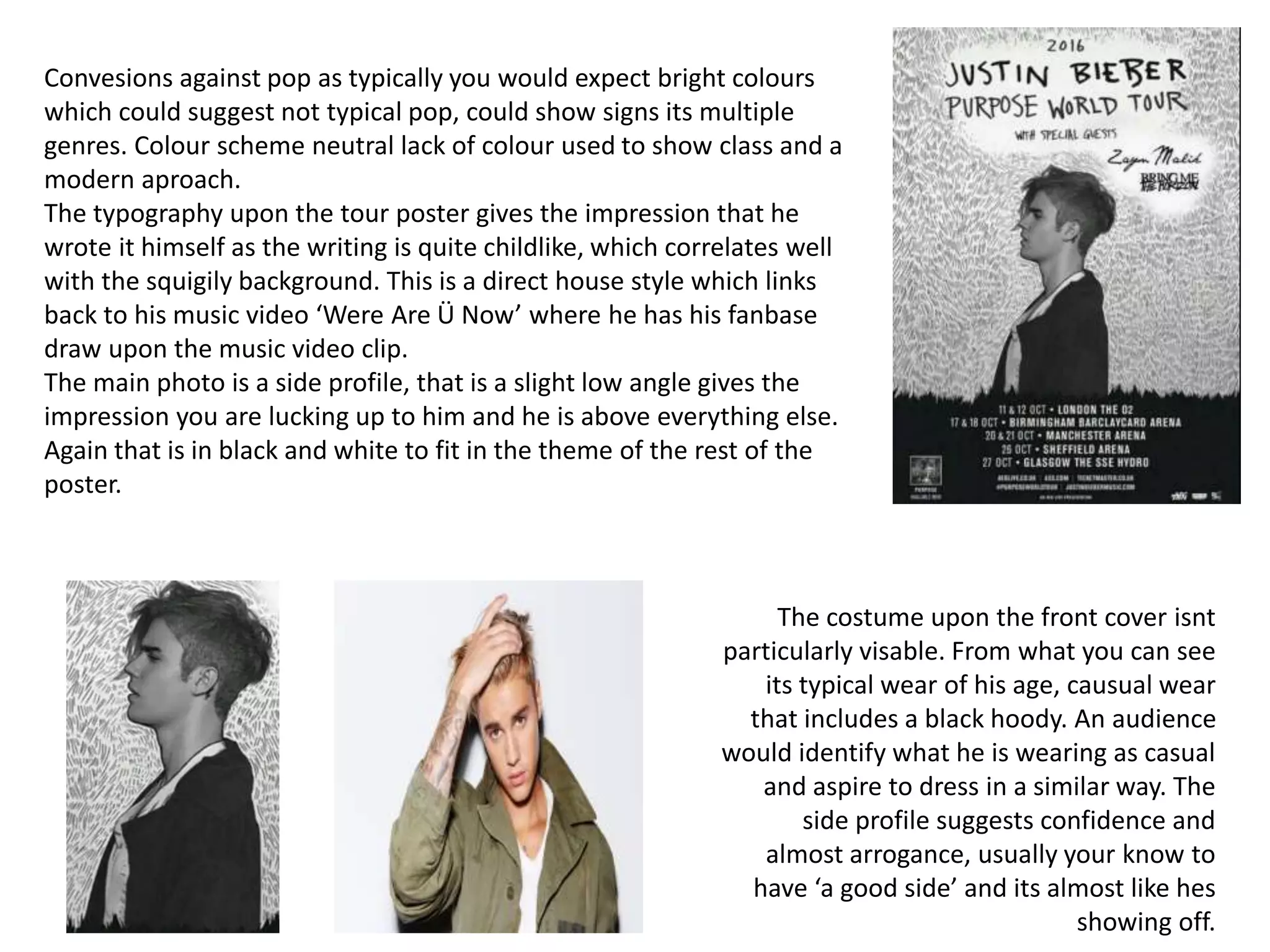
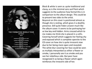
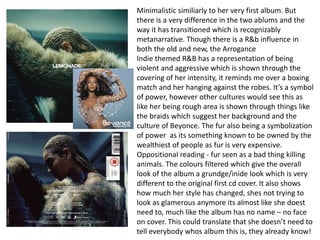
Convesions against pop as typically you would expect bright colours
which could suggest not typical pop, could show signs its multiple
genres. Colour scheme neutral lack of colour used to show class and a
modern aproach.
The typography upon the tour poster gives the impression that he
wrote it himself as the writing is quite childlike, which correlates well
with the squigily background. This is a direct house style which links
back to his music video ‘Were Are Ü Now’ where he has his fanbase
draw upon the music video clip.
The main photo is a side profile, that is a slight low angle gives the
impression you are lucking up to him and he is above everything else.
Again that is in black and white to fit in the theme of the rest of the
poster.
The costume upon the front cover isnt
particularly visable. From what you can see
its typical wear of his age, causual wear
that includes a black hoody. An audience
would identify what he is wearing as casual
and aspire to dress in a similar way. The
side profile suggests confidence and
almost arrogance, usually your know to
have ‘a good side’ and its almost like hes
showing off.
Black and white colour scheme is continued again from the poster to
the album which is a house style of his album Purpose. The hand
written font also continued from the album cover which is again house
style. I feel like these are both continued as the the overall theme is
almost portraying a destroyed and graffiti theme. On the tour poster
the whole poster is covered in scribbles and hand written font and
much like this one.
Confirmative religious imagery, gives a positive vibe as religion is seen
as a positive thing in society. With the use of crosses and religious
symbols to an audience shows him believing in god, and portrays him
as a religious person. It also could be a way of him portraying himself
praying for help?
Oppositional reading against religion as the praying with tattoos kind of
of gives of rebellious vibe, and almost gives a bad impression on
religion as you wouldn't’t expect somebody like him to be in to religion.
You notice him praying which is good but then you notice the tattoos
which leaves the viewer questioning weather he is praying for the right
reasons or just for the photo.
Abandoned plane again suggest to an audience that wrecked and
messy feel. The graffiti writing on the front, the tattoos and the praying
on the front cover links to him walking along plane on the back cover as
it all suggests to him being a thug. The idea of him being a thug is also
identifiable with him choice of clothing being a hoodie, which is typical
thug wear.
From the front and the back you get the impression that the album is
quite a grown up and for an older audience. This is partially due to the
lack of colour presented on the front cover. Location would suggest
pathetic fallacy as the weather sets negative mood The negative vibe,
also suggests that the music within the album wouldn't’t be typically
pop which is his usual style of music.
Black & white is seen as quite traditional and
classy, as is the minimal sans serif font which
suggests to the audience how formal this is in
comparison to the album design. This could be
to present two sides to the artist.
Beyoncé on this cover is positioned almost as
though she is resting, which gives it a deathly
presence. Still quite hiden unseen much like
the album cover. It seems to be portraying her
as low key and hidden. Arms crossed which to
me makes me think she is placed in a cofin.
Covering herself which suggests her feeling shy
and exposed which is complete opersite to the
CD cover on how she is quite innocent now
due to her being more open and revealed.
The white blur covering her face could be seen
as multiply interpreted as either a flower or
smoke, I personally see it as smoke and you
see her rebellious side. But peer have
recognized it as being a flower which again
reinforces the innocent side of her.
Minimalistic similiarly to her very first album. But
there is a very difference in the two ablums and the
way it has transitioned which is recognizably
metanarrative. Though there is a R&b influence in
both the old and new, the Arrogance
Indie themed R&B has a representation of being
violent and aggressive which is shown through the
covering of her intensity, it reminds me over a boxing
match and her hanging against the robes. It’s a symbol
of power, however other cultures would see this as
like her being rough area is shown through things like
the braids which suggest her background and the
culture of Beyonce. The fur also being a symbolization
of power as its something known to be owned by the
wealthiest of people as fur is very expensive.
Oppositional reading - fur seen as a bad thing killing
animals. The colours filtered which give the overall
look of the album a grundge/inide look which is very
different to the original first cd cover. It also shows
how much her style has changed, shes not trying to
look as glamerous anymore its almost like she doest
need to, much like the album has no name – no face
on cover. This could translate that she doesn’t need to
tell everybody whos album this is, they already know!

Justin Bieber

  • 1.
    Convesions against popas typically you would expect bright colours which could suggest not typical pop, could show signs its multiple genres. Colour scheme neutral lack of colour used to show class and a modern aproach. The typography upon the tour poster gives the impression that he wrote it himself as the writing is quite childlike, which correlates well with the squigily background. This is a direct house style which links back to his music video ‘Were Are Ü Now’ where he has his fanbase draw upon the music video clip. The main photo is a side profile, that is a slight low angle gives the impression you are lucking up to him and he is above everything else. Again that is in black and white to fit in the theme of the rest of the poster. The costume upon the front cover isnt particularly visable. From what you can see its typical wear of his age, causual wear that includes a black hoody. An audience would identify what he is wearing as casual and aspire to dress in a similar way. The side profile suggests confidence and almost arrogance, usually your know to have ‘a good side’ and its almost like hes showing off.
  • 2.
    Black and whitecolour scheme is continued again from the poster to the album which is a house style of his album Purpose. The hand written font also continued from the album cover which is again house style. I feel like these are both continued as the the overall theme is almost portraying a destroyed and graffiti theme. On the tour poster the whole poster is covered in scribbles and hand written font and much like this one. Confirmative religious imagery, gives a positive vibe as religion is seen as a positive thing in society. With the use of crosses and religious symbols to an audience shows him believing in god, and portrays him as a religious person. It also could be a way of him portraying himself praying for help? Oppositional reading against religion as the praying with tattoos kind of of gives of rebellious vibe, and almost gives a bad impression on religion as you wouldn't’t expect somebody like him to be in to religion. You notice him praying which is good but then you notice the tattoos which leaves the viewer questioning weather he is praying for the right reasons or just for the photo. Abandoned plane again suggest to an audience that wrecked and messy feel. The graffiti writing on the front, the tattoos and the praying on the front cover links to him walking along plane on the back cover as it all suggests to him being a thug. The idea of him being a thug is also identifiable with him choice of clothing being a hoodie, which is typical thug wear. From the front and the back you get the impression that the album is quite a grown up and for an older audience. This is partially due to the lack of colour presented on the front cover. Location would suggest pathetic fallacy as the weather sets negative mood The negative vibe, also suggests that the music within the album wouldn't’t be typically pop which is his usual style of music.
  • 3.
    Black & whiteis seen as quite traditional and classy, as is the minimal sans serif font which suggests to the audience how formal this is in comparison to the album design. This could be to present two sides to the artist. Beyoncé on this cover is positioned almost as though she is resting, which gives it a deathly presence. Still quite hiden unseen much like the album cover. It seems to be portraying her as low key and hidden. Arms crossed which to me makes me think she is placed in a cofin. Covering herself which suggests her feeling shy and exposed which is complete opersite to the CD cover on how she is quite innocent now due to her being more open and revealed. The white blur covering her face could be seen as multiply interpreted as either a flower or smoke, I personally see it as smoke and you see her rebellious side. But peer have recognized it as being a flower which again reinforces the innocent side of her.
  • 4.
    Minimalistic similiarly toher very first album. But there is a very difference in the two ablums and the way it has transitioned which is recognizably metanarrative. Though there is a R&b influence in both the old and new, the Arrogance Indie themed R&B has a representation of being violent and aggressive which is shown through the covering of her intensity, it reminds me over a boxing match and her hanging against the robes. It’s a symbol of power, however other cultures would see this as like her being rough area is shown through things like the braids which suggest her background and the culture of Beyonce. The fur also being a symbolization of power as its something known to be owned by the wealthiest of people as fur is very expensive. Oppositional reading - fur seen as a bad thing killing animals. The colours filtered which give the overall look of the album a grundge/inide look which is very different to the original first cd cover. It also shows how much her style has changed, shes not trying to look as glamerous anymore its almost like she doest need to, much like the album has no name – no face on cover. This could translate that she doesn’t need to tell everybody whos album this is, they already know!

Editor's Notes