FRONT COVER PROGRESS:
1) The beginningof the frontcoverprogressconsistedof the mainimage beingstretchedatthe
top (behindthe mastehead),inorderforthe image tofitthe requiredsize onPhotoshop.
The main image hadalsobeenrescaled,thisrequiredme touse a Photoshoptechnique such
as holdingshiftwhenrescalingasthispreventsthe image frombecomingblurredwhenthe
imagessize changes.Inaddition,Ienhancedthe leavesinthe backgroundbyusinga
Photoshoptechniquesuchashue and saturation.IusedthisPhotoshoptool toenhance the
coloursinthe image.The mastehead is‘Blippolight’andthe size of the textis70, I used a
Photoshopeffectsuchas otterglow and dropshadow to make the mastheadappearbold
and dominant.IalsotriedothertypographystylesthatIhad chosenduringmyresearchand
positionedthemdifferentlyonthe image,howevertheydidnotcomplementthe main
image (shownbelow).
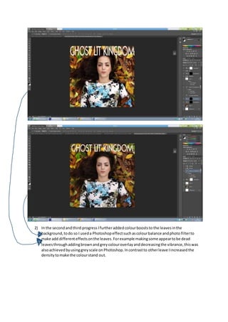
2) In the secondandthird progress Ifurtheraddedcolourbooststo the leavesinthe
background,todo so I useda Photoshopeffectsuchascolourbalance andphoto filterto
make add differenteffectsonthe leaves.Forexample makingsome appeartobe dead
leavesthroughaddingbrownandgreycolouroverlayanddecreasingthe vibrance,thiswas
alsoachievedbyusinggreyscale onPhotoshop.Incontrastto otherleave Iincreasedthe
densitytomake the colourstand out.
3) In the fourthpart of the frontcoverprogressthe typographysize changeditisnow 51 the
reasonfor changingthe size isbecause the previoussizewasonthe edge of the image this
wouldcause the textto bleedandasa resultwouldnotbe a realisticnorappropriate size to
use.AlsoIaddedon a sectionof the leavesfromthe topof thisimage bycroppingit from
anotherimage,inorderforthis sectiontolookapart of the image Iuseda Photoshop tool
such as blurand smudge forthe individualleavestoconnectwiththe otherhalf.Thisis
betterthanhow itpreviouslywasasitdoesnotlookoverstretchedbehindthe typography
and itallowsforthe image to lookrealistic.
4) The fifthprogresshaschangedthe typographystyle of the masthead,thistypographyis
similartothe typographyinthe magazine matehead,there isalsoaphotofilterthataddsa
hintof exposure andcolourtothe whole mainimage,thismakesthe artistskincolour
appearmore enhanced ratherthan pale.
5) In the sixthprogressthe masteheadwaschangedbackto‘blippolight’because itsstylesuch
as beingboldandshorterthan the othertypographyfitsbetter alsoadditionalhue and
saturationwasadded as well as dodgingandblurringaddedtothe artist face to emphasise
herbestfeaturesanddisguise others,alsothiswasusedforsome of the leaves.
Final-
6) The seventhprogresswe addedawhite border,the bordercomplementsthe miseenscene
such as clothingthe artistiswearing,aswell asthe boardermaintainsconsistencywiththe
magazine posterasit alsoused borderlines atthe topand bottomof the poster.

Front cover progress

  • 1.
    FRONT COVER PROGRESS: 1)The beginningof the frontcoverprogressconsistedof the mainimage beingstretchedatthe top (behindthe mastehead),inorderforthe image tofitthe requiredsize onPhotoshop. The main image hadalsobeenrescaled,thisrequiredme touse a Photoshoptechnique such as holdingshiftwhenrescalingasthispreventsthe image frombecomingblurredwhenthe imagessize changes.Inaddition,Ienhancedthe leavesinthe backgroundbyusinga Photoshoptechniquesuchashue and saturation.IusedthisPhotoshoptool toenhance the coloursinthe image.The mastehead is‘Blippolight’andthe size of the textis70, I used a Photoshopeffectsuchas otterglow and dropshadow to make the mastheadappearbold and dominant.IalsotriedothertypographystylesthatIhad chosenduringmyresearchand positionedthemdifferentlyonthe image,howevertheydidnotcomplementthe main image (shownbelow).
  • 2.
    2) In thesecondandthird progress Ifurtheraddedcolourbooststo the leavesinthe background,todo so I useda Photoshopeffectsuchascolourbalance andphoto filterto make add differenteffectsonthe leaves.Forexample makingsome appeartobe dead leavesthroughaddingbrownandgreycolouroverlayanddecreasingthe vibrance,thiswas alsoachievedbyusinggreyscale onPhotoshop.Incontrastto otherleave Iincreasedthe densitytomake the colourstand out.
  • 3.
    3) In thefourthpart of the frontcoverprogressthe typographysize changeditisnow 51 the reasonfor changingthe size isbecause the previoussizewasonthe edge of the image this wouldcause the textto bleedandasa resultwouldnotbe a realisticnorappropriate size to use.AlsoIaddedon a sectionof the leavesfromthe topof thisimage bycroppingit from anotherimage,inorderforthis sectiontolookapart of the image Iuseda Photoshop tool such as blurand smudge forthe individualleavestoconnectwiththe otherhalf.Thisis betterthanhow itpreviouslywasasitdoesnotlookoverstretchedbehindthe typography and itallowsforthe image to lookrealistic.
  • 4.
    4) The fifthprogresshaschangedthetypographystyle of the masthead,thistypographyis similartothe typographyinthe magazine matehead,there isalsoaphotofilterthataddsa hintof exposure andcolourtothe whole mainimage,thismakesthe artistskincolour appearmore enhanced ratherthan pale. 5) In the sixthprogressthe masteheadwaschangedbackto‘blippolight’because itsstylesuch as beingboldandshorterthan the othertypographyfitsbetter alsoadditionalhue and saturationwasadded as well as dodgingandblurringaddedtothe artist face to emphasise herbestfeaturesanddisguise others,alsothiswasusedforsome of the leaves.
  • 5.
    Final- 6) The seventhprogressweaddedawhite border,the bordercomplementsthe miseenscene such as clothingthe artistiswearing,aswell asthe boardermaintainsconsistencywiththe magazine posterasit alsoused borderlines atthe topand bottomof the poster.