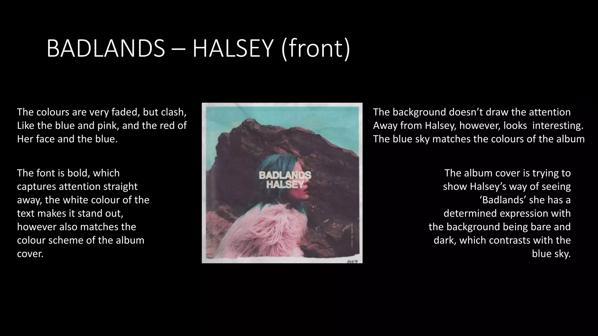
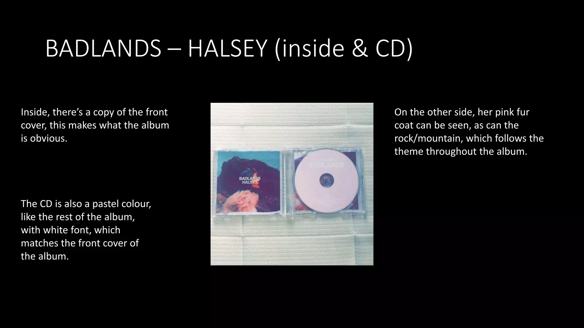
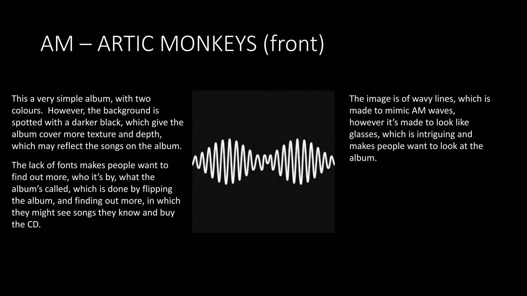
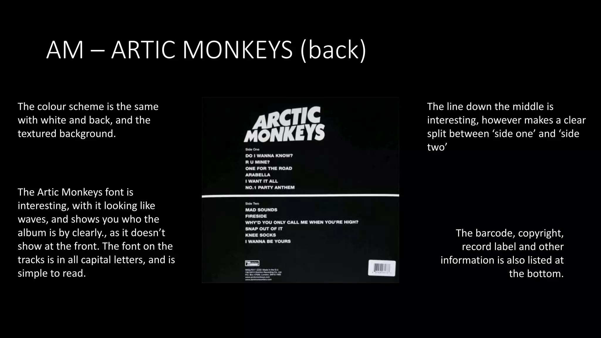
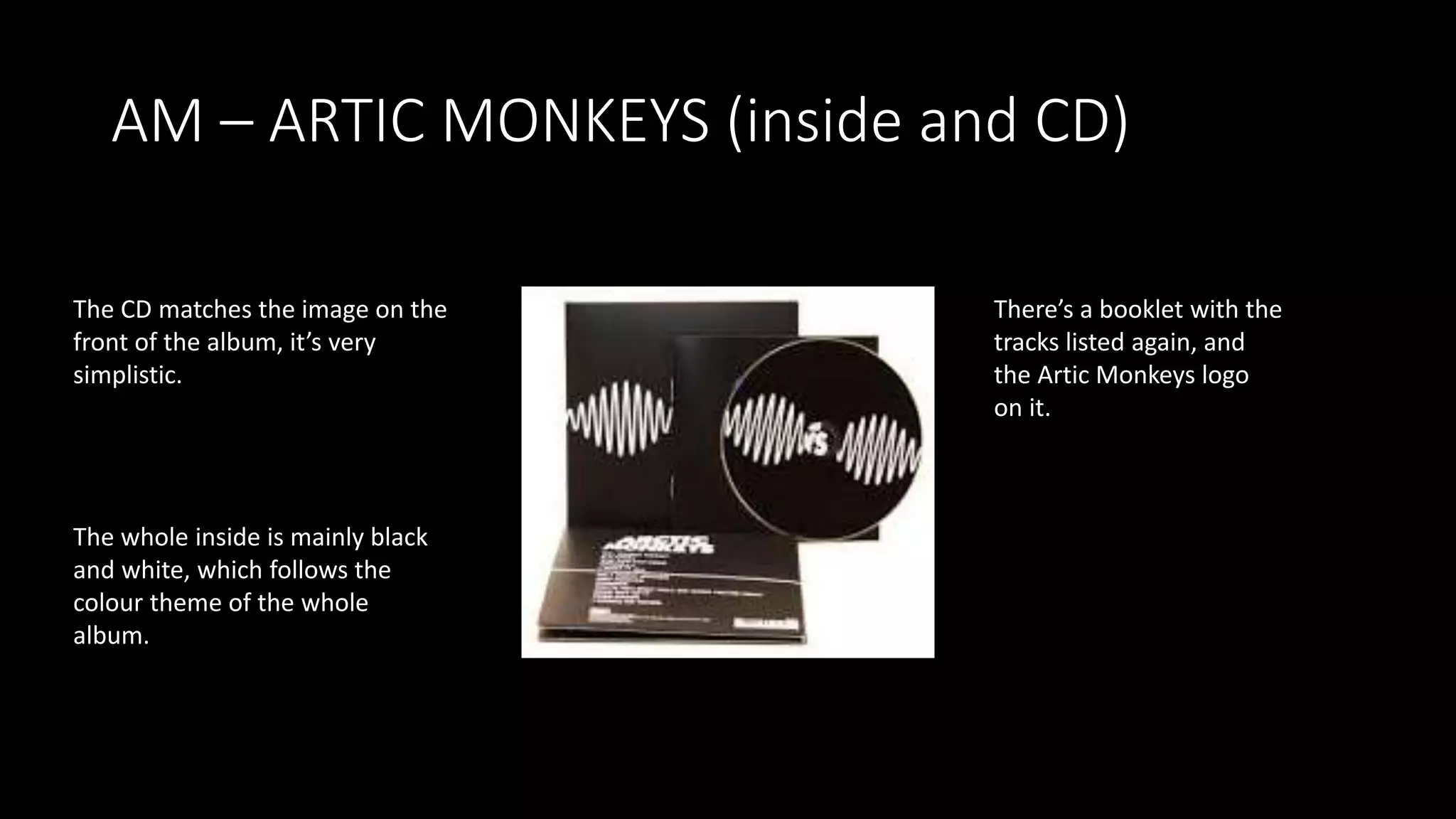
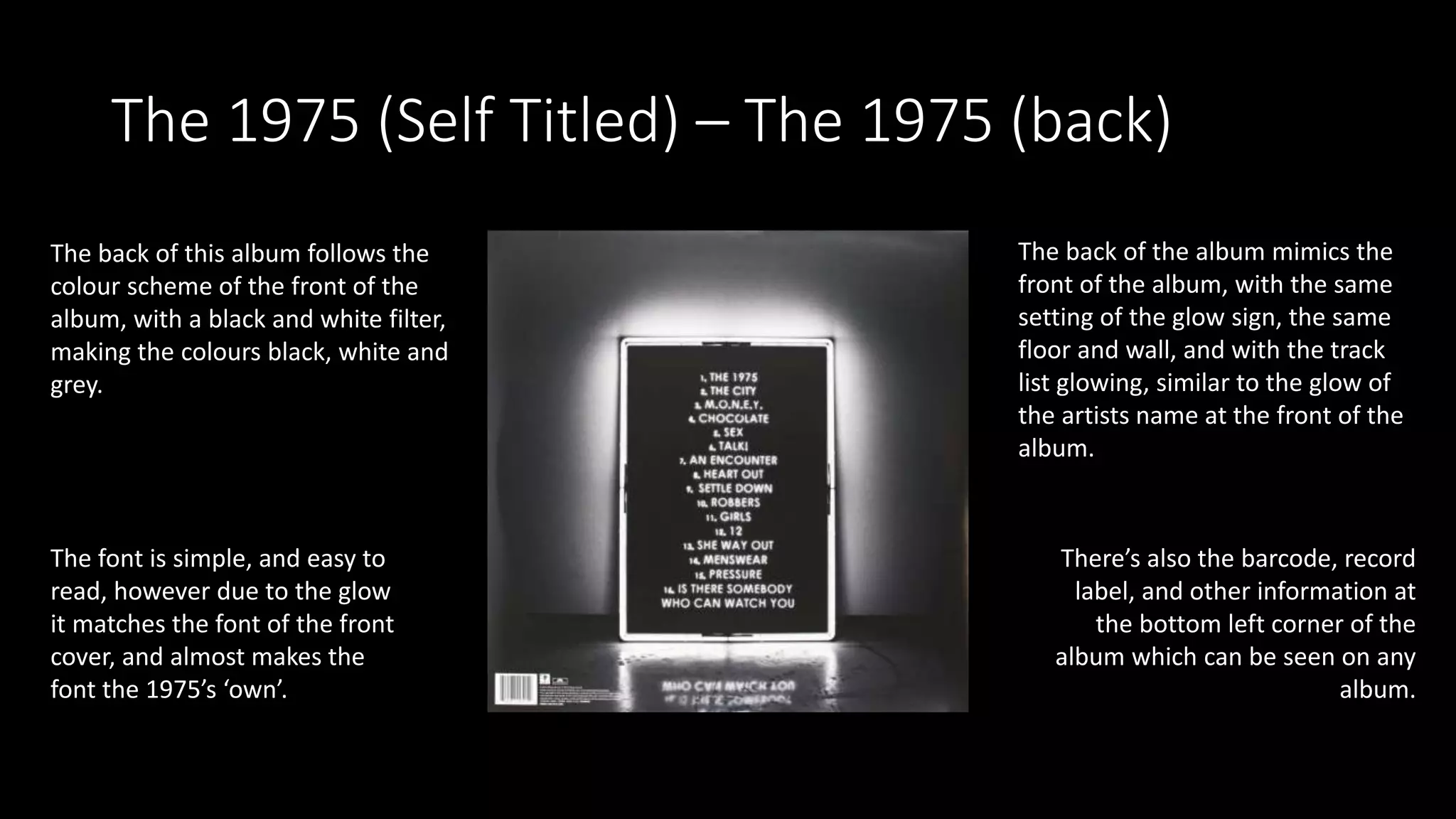
This document analyzes and describes the album covers of "Badlands" by Halsey, "AM" by Arctic Monkeys, and the self-titled album by The 1975. For each album, the color schemes, images, fonts, and consistency across the front, back, inside, and CD are described in detail. Common elements like the track listing, barcode, and label information are also noted. Overall, the document examines how the design elements of the album covers relate to the music styles and help identify the artists.
In depth CD cover analysis of the albums Only by the Night (Kings of Leon), Stadium Arcadium (Red Hot Chilli Peppers) and Brand New Eyes (Paramore- not quite finished!)
digipak analysis lorde, lana del rey, charli xcx, team music covers i am only doing this for the dicoverability score. this is getting super annoying man, public team speaking do this at the same time, pull the exmas now this is not working god i will break. my laptop is AMAZING. ahh the struggle
2137ad - Characters that live in Merindol and are at the center of main storiesluforfor
Kurgan is a russian expatriate that is secretly in love with Sonia Contado. Henry is a british soldier that took refuge in Merindol Colony in 2137ad. He is the lover of Sonia Contado.
2137ad Merindol Colony Interiors where refugee try to build a seemengly norm...luforfor
This are the interiors of the Merindol Colony in 2137ad after the Climate Change Collapse and the Apocalipse Wars. Merindol is a small Colony in the Italian Alps where there are around 4000 humans. The Colony values mainly around meritocracy and selection by effort.
The perfect Sundabet Slot mudah menang Promo new member Animated PDF for your conversation. Discover and Share the best GIFs on Tenor
Admin Ramah Cantik Aktif 24 Jam Nonstop siap melayani pemain member Sundabet login via apk sundabet rtp daftar slot gacor daftar
thGAP - BAbyss in Moderno!! Transgenic Human Germline Alternatives ProjectMarc Dusseiller Dusjagr
thGAP - Transgenic Human Germline Alternatives Project, presents an evening of input lectures, discussions and a performative workshop on artistic interventions for future scenarios of human genetic and inheritable modifications.
To begin our lecturers, Marc Dusseiller aka "dusjagr" and Rodrigo Martin Iglesias, will give an overview of their transdisciplinary practices, including the history of hackteria, a global network for sharing knowledge to involve artists in hands-on and Do-It-With-Others (DIWO) working with the lifesciences, and reflections on future scenarios from the 8-bit computer games of the 80ies to current real-world endeavous of genetically modifiying the human species.
We will then follow up with discussions and hands-on experiments on working with embryos, ovums, gametes, genetic materials from code to slime, in a creative and playful workshop setup, where all paticipant can collaborate on artistic interventions into the germline of a post-human future.
The Legacy of Breton In A New Age by Master Terrance LindallBBaez1
Brave Destiny 2003 for the Future for Technocratic Surrealmageddon Destiny for Andre Breton Legacy in Agenda 21 Technocratic Great Reset for Prison Planet Earth Galactica! The Prophecy of the Surreal Blasphemous Desires from the Paradise Lost Governments!
Explore the multifaceted world of Muntadher Saleh, an Iraqi polymath renowned for his expertise in visual art, writing, design, and pharmacy. This SlideShare delves into his innovative contributions across various disciplines, showcasing his unique ability to blend traditional themes with modern aesthetics. Learn about his impactful artworks, thought-provoking literary pieces, and his vision as a Neo-Pop artist dedicated to raising awareness about Iraq's cultural heritage. Discover why Muntadher Saleh is celebrated as "The Last Polymath" and how his multidisciplinary talents continue to inspire and influence.
2. BADLANDS – HALSEY (front)
The colours are very faded, but clash,
Like the blue and pink, and the red of
Her face and the blue.
The background doesn’t draw the attention
Away from Halsey, however, looks interesting.
The blue sky matches the colours of the album
The font is bold, which
captures attention straight
away, the white colour of the
text makes it stand out,
however also matches the
colour scheme of the album
cover.
The album cover is trying to
show Halsey’s way of seeing
‘Badlands’ she has a
determined expression with
the background being bare and
dark, which contrasts with the
blue sky.
3. BADLANDS – HALSEY (back)
The colours match the front cover,
with the white dominating the front
cover, which matches because of
the white border around the front
cover.
The glimpse of picture at the top looks
Like a cut up picture, which matches the
Indie genre, and it also is another
Picture of the rock (Badlands) on the
Front cover of the album.
The font is simple, and is all
in capital letters, like the
front cover, however a
different font, but it’s easy
to read.
There’s small writing at the bottom
which says about the album
producers, and essential information,
as well as a barcode and the record
label. This is common in all album
backs.
4. BADLANDS – HALSEY (inside & CD)
Inside, there’s a copy of the front
cover, this makes what the album
is obvious.
On the other side, her pink fur
coat can be seen, as can the
rock/mountain, which follows the
theme throughout the album.
The CD is also a pastel colour,
like the rest of the album,
with white font, which
matches the front cover of
the album.
5. AM – ARTIC MONKEYS (front)
This a very simple album, with two
colours. However, the background is
spotted with a darker black, which give the
album cover more texture and depth,
which may reflect the songs on the album.
The image is of wavy lines, which is
made to mimic AM waves,
however it’s made to look like
glasses, which is intriguing and
makes people want to look at the
album.
The lack of fonts makes people want to
find out more, who it’s by, what the
album’s called, which is done by flipping
the album, and finding out more, in which
they might see songs they know and buy
the CD.
6. AM – ARTIC MONKEYS (back)
The colour scheme is the same
with white and back, and the
textured background.
The line down the middle is
interesting, however makes a clear
split between ‘side one’ and ‘side
two’
The Artic Monkeys font is
interesting, with it looking like
waves, and shows you who the
album is by clearly., as it doesn’t
show at the front. The font on the
tracks is in all capital letters, and is
simple to read.
The barcode, copyright,
record label and other
information is also listed at
the bottom.
7. AM – ARTIC MONKEYS (inside and CD)
The CD matches the image on the
front of the album, it’s very
simplistic.
There’s a booklet with the
tracks listed again, and
the Artic Monkeys logo
on it.
The whole inside is mainly black
and white, which follows the
colour theme of the whole
album.
8. The 1975 (Self Titled) – The 1975 (Front)
This album has a black and white filter
over it, giving the album very limited
colours, similar to the Artic Monkey’s
album. However, this album has grey on
it, and it’s obvious there’s a glow.
The image is of a sign which is glowing,
this is common in the indie genre, fans
of the genre tend to have an aesthetic
to glowing, and this album cover
pleases that, and makes it obvious to
the target audience that it’s the genre
they want.
The only text is of the album’s
artist, which makes it obvious to
whoever’s looking at it who it’s by
and what the album is called.
The album actually mimics the way
the band has the background of
their concerts, which would be
appealing to fans.
9. The 1975 (Self Titled) – The 1975 (back)
The back of this album follows the
colour scheme of the front of the
album, with a black and white filter,
making the colours black, white and
grey.
The back of the album mimics the
front of the album, with the same
setting of the glow sign, the same
floor and wall, and with the track
list glowing, similar to the glow of
the artists name at the front of the
album.
The font is simple, and easy to
read, however due to the glow
it matches the font of the front
cover, and almost makes the
font the 1975’s ‘own’.
There’s also the barcode, record
label, and other information at
the bottom left corner of the
album which can be seen on any
album.
10. The 1975 (Self Titled) – The 1975 (inside &
CD)
The text of the inside matches
the back and front of the
cover. It shows information of
the creators of the album, as
well as the copyright and
record label information.
The colour scheme is exactly the
same as the rest of the album, with
black and white, however no grey
to make it easy to read.
The CD’s font has the
same font as the artist
name on the front of
the album.
The colours are the exact
same, with grey, black and
white.