Impact Of Educational Resources on Students' Academic Performance in Economic...
Research album typography
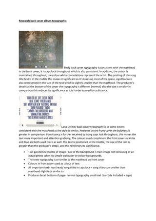
1. Research back cover album typography:
Birdy back cover typography is consistent with the masthead
in the front cover, it is caps lock throughout which is also consistent. In addition, the colour is
maintained throughout, the colour white connotations represent the artist. The positing of the song
title text is in the middle this makes it significant as it’s takes up most of the space, significance is
also represented in the size of the text which is slightly smaller than the masthead. The producer’s
details at the bottom of the cover the typography is different (normal) also the size is smaller in
comparison this reduces its significance as it is harder to read for a distance.
Lana Del Rey back cover typography is to some extent
consistent with the masthead as the style is similar, however on the front cover the boldness is
greater in comparison. Consistency is further retained by using caps lock throughout, this makes the
text more important and attention grabbing. The colours used compliment the front cover as white
and blue are both used there as well. The text is positioned in the middle, the size of the text is
greater than the producer’s detail, and this reinforces its significance.
Text positioned middle of image- due to the background / main image not consisting of an
actual photo taken its simple wallpaper or colour backgrounds.
The texts typography is or similar to the masthead on front cover
Colours in front cover used as colour of text
All important text- masthead/ song titles in caps lock – song titles size smaller than
masthead slightly or similar to.
Producer detail bottom of page- normal typography small text (barcode included + logo)
2. Front cover masthead typography research:
The masthead typography is maintained with the song title at the bottom or
the image, the size and colour is different but it compliment the front cover as they are both colours
included elsewhere. The masthead is the biggest text in the cover, this is effective as the audience
can identify the artist, album and its genre / style. The masthead in positioned at the top of the
image, the typography is bold, in caps lock this represents her to be strong and determined, and the
image being bellow further reinforces these ideas.
Birdy masthead typography is consistent with the typography in the back
cover, the typography size is not big, and therefore this represents it to be less significant. However
being the only text in the image and being in caps lock as well as being in white, which contrast
against the green undertone in the background makes it stand out more and enhances its
significance. In order to stand out for the audience to notice it. The masthead is positioned in the
corner top and is small font as it represents it to be simple, this is reinforced by the image which is
also simple, and here consistency is retained.
- Main image needs to have similar effect as masthead typography style.
- Masthead positioned top of the image
- Minimal text in front cover
- Colour of typography needs to have connotations with artist and compliment the images
used.
Magazine cover typography research:
The masthead typography is consistent with the front cover- the size, style and
positioning is maintained. Although the colour is different, the colour used in all mastheads
compliments a colour used in the image (the location/ clothing/ hair colour/ mood). The typography
for the album details is different, however its importance is reflected through the different use of
colour to stand certain points out and the text is all in caps lock. The main selling points such as ‘out
3. now’ emphasis is represented with the bold, underlined and caps lock. On the magazine cover all
information needed to find out more in the album or artist and purchase points are shown, this is
significant as the audience can interact and end up purchasing the product.
Ed Sheeran masthead typography is maintained in all the texts. However the
masthead significance is represented through the use of colour (white contrasting against the
orange background) and being a slightly greater in size, also significant points such as ‘+out now’ size
and colour is what grabs the audience attention. The text is positioned at the side of the album, this
compliments the main image positioning. In addition, purchase details are shown this is important
for the audience to enhance their interest from the advert into purchasing the album.
- Engaging, strong, bold words attracts audience
- Use images to show where can purchase product (music stores / websites)
- Artist name in the magazine cover- audience can identify ( needed if new)
- Main image similar to album cover front image- consistency maintained.