Album Covers Analysis
What is the purpose of an album
cover?
• An album cover is the front a packaging of a commercially-released audio recording
album. Can be refer to either the printed cardboard covers typically used to package
sets of 10" and 12" 78 rpm records.
• During the mid 1990's, CDs has become the most common form of physically
distributed music products. Packaging formats vary, including the very common plastic
jewel case, and the popular cardboard & plastic combination commonly known as a
Digipak.
• Album covers has become an important part of the culture of music. In which it is a
strong marketing tool and an expression of artistic intent and has gatefold covers, and
inserts, often with lyric sheets, this has made the album cover a desirable product in its
self.
• But because of the nature of downloading in recent years album covers has becoming
more significant in selling CDs but has become less significant in selling the artist and
therefore the state and importance of album covers in the future is uncertain.
• Information from Wikipedia
Benga -Diary of an Afro Warrior
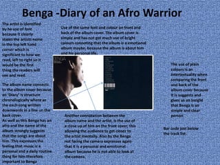
The artist is identified
by he use of font
because it clearly
states the artists name
in the top left hand
corner which is
significant to how we
read, left to right so it
would be the first
thing the readers will
see and read.
Use of the same font and colour on front and
back of the album cover. The album cover is
simple and has not got much use of bright
colours connoting that the album is a emotional
album maybe, because the album is about him
and his personal life.
The use of plain
colours is an
intertextuality when
comparing the front
and back of the
album cover because
it is suggests and
gives us an insight
that Benga is an
simple and clear
person
The album name connects
to the album cover because
an ‘Diary’ is structure
chronologically where as
the each song written
downwards in a line on the
back cover.
As well as this Benga has an
afro and the name of the
album strongly suggests
that the songs are about
him. This expresses the
feeling that music is a
personal and a daily routine
thing for him therefore
important to Benga
Another connotation between the
album name and the artist, is the use of
a close up of him on the front cover, this
allowing the audience to get closer to
the artist mentally. Also by the Benga
not facing the camera expresses again
that it is a personal and emotional
album because he is not able to look at
the camera.
Bar code just below
the track list.
The Prodigy- Invaders Must Die
The use of a lava and red colour
strongly links to the album
because red connotes blood and
death. Also the people on the
single cover links to the
‘invaders’ part of the CD song
name. Also the sharp cuts in the
letters connotations to the
album name.
Use of black and white
mise- en scene is
significant because
thorough- out the
song ‘invaders must
die’ it is set in black
and white too,
portraying the strong
connection between
pack- shot and the
music video
The mise- en scene
meets of their
target audience
because of the use
of colours also
because it is drum
and bass music
which is strongly
linked to Dubstep
genre
‘Prodigy’ is printed in the top
centre of the pack- shot in bold
portraying the importance of
the audience having to know
the bands name first.
Pendulum- Immersion
The use of the so real mis- en scene portrays uniqueness from the
artist group because the artists are not on album cover. Also the
mis- en scene does not particularly relate to the genre which allows
them to stand out other rock/drum and bass artist. This pack-shot
is heavy related though to their website where this so realness is
used often.
The artist name and album name is written
the bottom centre of the album cover with
colours blending in with the mis-en scene
this having an significance because that
gives an insight to the artist image.
The albums name has an strong
connection with the pack-shot
because ‘immersion means virtual
reality, this being shown by the mis-en
scene and the lighting on the two
people.
This album cover compare to the others seemed to have a
higher budget spent on it maybe because they are more
mainstream in contrast to the others , so that being the reason
why also that the artist do not need to be shown on the album
cover because they are already well known , by their group
name. Therefore suggesting because they are well known , they
are being promoted and sold to differentiate them themselves
from other artist in their genre. The use of the so realness
expresses this.
Skream
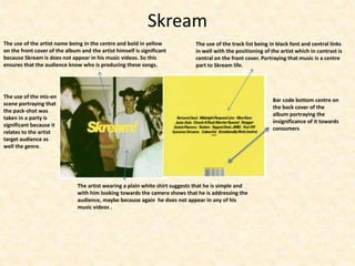
The use of the track list being in black font and central links
in well with the positioning of the artist which in contrast is
central on the front cover. Portraying that music is a centre
part to Skream life.
The use of the artist name being in the centre and bold in yellow
on the front cover of the album and the artist himself is significant
because Skream is does not appear in his music videos. So this
ensures that the audience know who is producing these songs.
The artist wearing a plain white shirt suggests that he is simple and
with him looking towards the camera shows that he is addressing the
audience, maybe because again he does not appear in any of his
music videos .
The use of the mis-en
scene portraying that
the pack-shot was
taken in a party is
significant because it
relates to the artist
target audience as
well the genre.
Bar code bottom centre on
the back cover of the
album portraying the
insignificance of it towards
consumers
Chase and Status- More than Alot
The importance of music to the artist is shown
with them immerging in the pack-shot. The album
cover is relatively clear and simple.
The album name is in a pink graffiti way which could be
said to be done to reach out to their target audience
because the use of a bright colours ensures that it stands
out and the typography also does this. Album cover stands
out because of the use of pink but the artist are men, this
may of been done to relate more at the female audience.
‘new edition’ relates to
the use an bright colour
and the way it is
immerged into the
letters. This portraying
the new image that the
group have.
Summary
• Most common techniques which occurred
• Clear and simple
• Connection between album name and pack-shot
• Artist/ group name on front cover
• Not many colours used
• Artist/group relate to the pack-shot

Album covers Analysis

  • 1.
  • 2.
    What is thepurpose of an album cover? • An album cover is the front a packaging of a commercially-released audio recording album. Can be refer to either the printed cardboard covers typically used to package sets of 10" and 12" 78 rpm records. • During the mid 1990's, CDs has become the most common form of physically distributed music products. Packaging formats vary, including the very common plastic jewel case, and the popular cardboard & plastic combination commonly known as a Digipak. • Album covers has become an important part of the culture of music. In which it is a strong marketing tool and an expression of artistic intent and has gatefold covers, and inserts, often with lyric sheets, this has made the album cover a desirable product in its self. • But because of the nature of downloading in recent years album covers has becoming more significant in selling CDs but has become less significant in selling the artist and therefore the state and importance of album covers in the future is uncertain. • Information from Wikipedia
  • 3.
    Benga -Diary ofan Afro Warrior The artist is identified by he use of font because it clearly states the artists name in the top left hand corner which is significant to how we read, left to right so it would be the first thing the readers will see and read. Use of the same font and colour on front and back of the album cover. The album cover is simple and has not got much use of bright colours connoting that the album is a emotional album maybe, because the album is about him and his personal life. The use of plain colours is an intertextuality when comparing the front and back of the album cover because it is suggests and gives us an insight that Benga is an simple and clear person The album name connects to the album cover because an ‘Diary’ is structure chronologically where as the each song written downwards in a line on the back cover. As well as this Benga has an afro and the name of the album strongly suggests that the songs are about him. This expresses the feeling that music is a personal and a daily routine thing for him therefore important to Benga Another connotation between the album name and the artist, is the use of a close up of him on the front cover, this allowing the audience to get closer to the artist mentally. Also by the Benga not facing the camera expresses again that it is a personal and emotional album because he is not able to look at the camera. Bar code just below the track list.
  • 4.
    The Prodigy- InvadersMust Die The use of a lava and red colour strongly links to the album because red connotes blood and death. Also the people on the single cover links to the ‘invaders’ part of the CD song name. Also the sharp cuts in the letters connotations to the album name. Use of black and white mise- en scene is significant because thorough- out the song ‘invaders must die’ it is set in black and white too, portraying the strong connection between pack- shot and the music video The mise- en scene meets of their target audience because of the use of colours also because it is drum and bass music which is strongly linked to Dubstep genre ‘Prodigy’ is printed in the top centre of the pack- shot in bold portraying the importance of the audience having to know the bands name first.
  • 5.
    Pendulum- Immersion The useof the so real mis- en scene portrays uniqueness from the artist group because the artists are not on album cover. Also the mis- en scene does not particularly relate to the genre which allows them to stand out other rock/drum and bass artist. This pack-shot is heavy related though to their website where this so realness is used often. The artist name and album name is written the bottom centre of the album cover with colours blending in with the mis-en scene this having an significance because that gives an insight to the artist image. The albums name has an strong connection with the pack-shot because ‘immersion means virtual reality, this being shown by the mis-en scene and the lighting on the two people. This album cover compare to the others seemed to have a higher budget spent on it maybe because they are more mainstream in contrast to the others , so that being the reason why also that the artist do not need to be shown on the album cover because they are already well known , by their group name. Therefore suggesting because they are well known , they are being promoted and sold to differentiate them themselves from other artist in their genre. The use of the so realness expresses this.
  • 6.
    Skream The use ofthe track list being in black font and central links in well with the positioning of the artist which in contrast is central on the front cover. Portraying that music is a centre part to Skream life. The use of the artist name being in the centre and bold in yellow on the front cover of the album and the artist himself is significant because Skream is does not appear in his music videos. So this ensures that the audience know who is producing these songs. The artist wearing a plain white shirt suggests that he is simple and with him looking towards the camera shows that he is addressing the audience, maybe because again he does not appear in any of his music videos . The use of the mis-en scene portraying that the pack-shot was taken in a party is significant because it relates to the artist target audience as well the genre. Bar code bottom centre on the back cover of the album portraying the insignificance of it towards consumers
  • 7.
    Chase and Status-More than Alot The importance of music to the artist is shown with them immerging in the pack-shot. The album cover is relatively clear and simple. The album name is in a pink graffiti way which could be said to be done to reach out to their target audience because the use of a bright colours ensures that it stands out and the typography also does this. Album cover stands out because of the use of pink but the artist are men, this may of been done to relate more at the female audience. ‘new edition’ relates to the use an bright colour and the way it is immerged into the letters. This portraying the new image that the group have.
  • 8.
    Summary • Most commontechniques which occurred • Clear and simple • Connection between album name and pack-shot • Artist/ group name on front cover • Not many colours used • Artist/group relate to the pack-shot