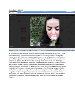
1) The back cover summary consisted of inserting the main image of the artist off-center to the left to allow more space for text on the right. Production information and song titles were added using different fonts and styles. Editing techniques like color exposure and burning were used to enhance features of the image.
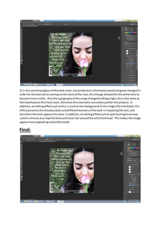
2) In the second progress, the positioning of production information was changed to avoid overlapping text. The font of song titles was changed for consistency. Blurring was used on the background to prevent textures from impacting the text. Imperfections on the artist's image were removed.
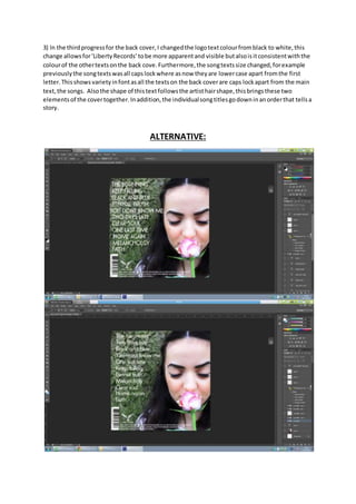
3) In the final progress, the logo text color was changed to white for visibility. Song titles were changed to