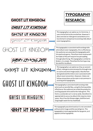
This document evaluates different typography options for an indie music album cover. It analyzes whether each font choice is consistent with conventions of the indie genre and typography used by similar artists. Some fonts are rejected for being too feminine, informal, or associated with other genres like rap. Other fonts are considered good options because they are simple like designs used by indie artists Birdy and Lana Del Rey or have an antique style fitting for the genre.


![Comparing conventions [autosaved]](https://cdn.slidesharecdn.com/ss_thumbnails/comparingconventionsautosaved-160425183744-thumbnail.jpg?width=640&height=640&fit=bounds)


