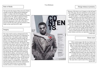
Challengers I Told Ya ShirtChallengers I Told Ya Shirt
ย
Vibe contents
1. Yves Robinson
Vibes contents pages, like this one, feature one
large main image which is the stronger focus on the
page, the same bold sans serif header used in this
layout, usually black depending on the choice of
background colour, and small faint text on the
opposite side of the main image. There is a lot of
negative space used in each of the vibe contents
page designs and the model in the main image used
is usually the focus of that magazine issue, for
instance Kanye West who features on this page
will be the most significant article in the magazine
and will have a double page spread feature or more.
The same font is used in each of the contents page
layouts also.
Imagery
The image itself is used as a background for the
entire page which in itself shows an importance to
the artist chosen. The negative space around the
artist drives the attention toward the model and
makes it clear of that issues main focus. Because of
the lack of strong colours in the design and the
recurring use of black and grey, the negative space
around the artist doesnโt seem too out of place and
gives a nice clean and well put together look. The
only colour that I can see on the page is the small
splash of red in the centre of the page, in the form of
the artists heart. This makes a contrast to the all
grey design and the artists dull facial expression
and eerie direct address, and almost gives off the
message that although he doesnโt show it he still is
a human being. A womanโs arm is draped over his
shoulder and clasping at his heart, the fact that the
women isnโt visible in the image and her arm is
also grey makes it as though she is insignificant,
and her desperate clutch around the representation
of his heart could be seen as a sexist remark
towards women as it almost objectifies them.
Because of the heavy use of imagery on the left hand
side of the page, they have balanced it out by placing
the header on the other side, diagonal to the image.
The tonally darker โVโ behind the image ties the two
together, the head of the artist and the bottom of the
header align in the centre of the page to create
balance. For the header they have used a strong black
which stands out from the rest of the page, and a large
bold sans serif font which makes it easy to read and
doesnโt give sole attention to the main image. Most of
the text is aligned on the right, filling the negative
space between the main image and the header yet is
still very small and faint. Both the header and the text
seem to mould around the main image which again
creates balance and shows an importance of the artist
to that issue.
Rule of thirds
The layout for the imagery follows the rule of thirds
strongly as both the model and the background
image (โvโ) align on the left of the page. This
creates a more interesting and aesthetically pleasing
composition for the reader as apposed to being
central on the page. The fact that the image is
placed on the left and not the right again indicates
the artists importance to the issue, as the left is
proven to be the first side to gain the attention of the
reader as they read from left to right .
House style
Design balance/symmetry