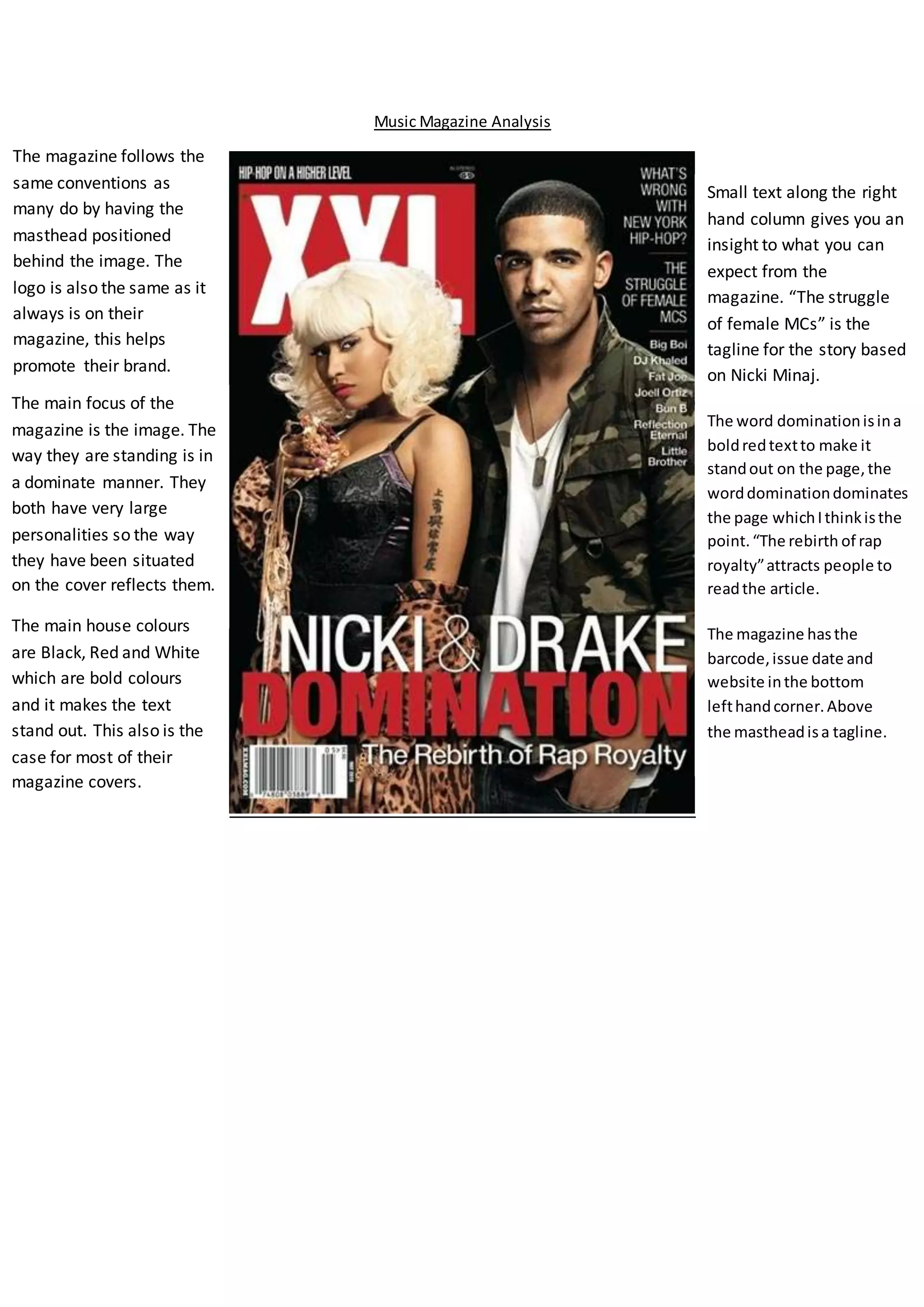
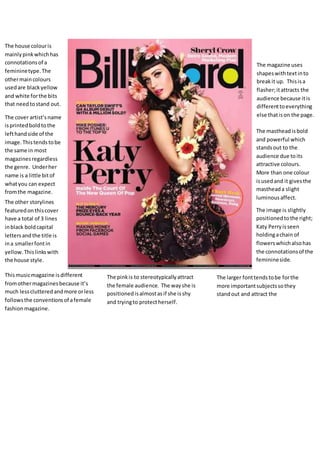
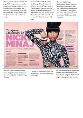
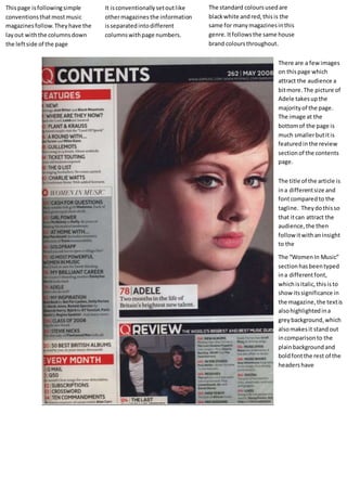
This document provides a detailed analysis of the layout, design elements, and conventions used across multiple pages of a music magazine. Key points include:
- The magazine follows typical conventions like positioning the masthead behind cover images and using consistent branding.
- Color schemes, fonts, image placement, and section headings are deliberately designed to attract readers and guide them to specific articles or content.
- Different techniques are used on the cover, contents page, interviews, and articles to entice readers and represent the stylistic approach of the magazine.
- Conventions like columns, categories, and standard colors provide consistency while unique design elements help each piece stand out.