Billboard magazine has been published since 1894 and covers various music genres but focuses on charts tracking popular songs and albums. It is considered one of the most influential music media brands globally. The magazine is published in both the US and UK and had a circulation of over 18,000 in 2008. Billboard magazine uses consistent design elements throughout issues, including colors from the cover being carried into interior pages and a simple yet recognizable masthead featuring white text.
The document analyzes the contents page of the music magazine Vibe. It summarizes that the layout uses simple colors like black, grey, and white to create a sophisticated look representing the magazine's music genre. Key elements like the masthead and cover lines stand out in white against the dark background to easily guide readers to content. Images of a scantily-clad model portray stereotypical attitudes appealing to both women and men in the target demographic.
The document summarizes the layout and design elements of a magazine article about the artist Lady Gaga. It analyzes where images and text are placed based on optical areas, use of symmetry and balance in design, and adherence to rules of thirds for the main image. Key points analyzed include bold masthead design fitting Gaga's unusual personality, black and white color scheme making the magazine look professional, and large centered image drawing reader attention.
Analysing contents pages prep for blog pptPotterM2
The document provides an analysis of the layout and design features of two magazine contents pages:
1) NME magazine from September 2009. Key features analyzed include the masthead, main image relating to the cover story, band listings in red with page numbers in black, and sections for previous/future editions and subscriptions.
2) Billboard magazine. Key features analyzed include the masthead, listings of album and song charts, a large main image of a female artist resembling the target audience, and subheadings in capitals separating content sections.
Overall, the analyses examine how visual and structural elements are used consistently across pages to clearly convey information to readers and promote reader engagement.
my textual alaysis of contents page's and double page spreadszire1
The two-page contents spread features images and text that are consistent with the magazine's genre of rock and punk music. A large black-and-white image of a band performing on stage grabs the reader's attention. Section headers and smaller supporting images guide readers to specific articles. Contrasting text colors against backgrounds make all content clear and easy to read.
This magazine cover uses bright colours like pink and yellow along with child-friendly themes and designs to appeal to its target audience of young females aged 10+. The large masthead and attention-grabbing headlines help draw the reader's eyes to the main stories. The magazine's layout is cluttered but helps show there is a lot of content for readers.
The document provides an evaluation of a music magazine product. Key details include:
- The magazine uses a bold masthead and prominent images of popular artists to draw attention.
- Interviews and articles about trending artists are included to attract readers interested in learning about new music.
- Consistent colors, fonts, and layouts are used throughout the magazine to provide continuity and familiarity for readers.
- Popular music genres and artists are featured to appeal to the target audience of teenagers and young adults. Consistent branding aims to clearly represent this social group.
The magazine cover uses a simple yet professional design that appeals to its target audience of young adults. High key lighting is used on the main image to make the artist easily recognizable. The bold masthead stretches across the top to clearly display the magazine name. Cover lines down the left side briefly summarize additional articles to entice readers. The overall house style with plain colors and formal typefaces creates a serious yet appealing tone.
This magazine cover uses bold typography, bright colors, and images of popular bands to attract fans of rock and punk music. The masthead prominently displays the magazine's name in a modern sans-serif font against a light blue background. Additional cover lines below promote featured articles on specific bands and albums. A large central image of multiple band members from various punk groups aims to appeal to fans of those artists. Smaller sub-images provide a preview of posters included in the issue. Together, these visual elements are designed to catch the eye of the magazine's target audience.
The document analyzes the design elements of Kerrang magazine to appeal to its target rock music audience. It discusses the magazine's use of a dark color scheme in black, red, and white to signify rock music. Photos on the cover and inside pages feature unposed shots from live performances or the studio to make bands seem relatable. The writing style throughout is brief and aggressive to not target young children but an older teenage and adult readership interested in rock music. Overall the magazine's coordinated design with these elements creates a style that is easily recognized by its target audience.
The document describes the layout and design of a magazine contents page. It uses three columns, with a large main image taking up half the page. The main image features a famous salsa singer to attract young readers and relate their story. Text is placed in columns below the image with short descriptions of the magazine's stories. The layout aims to highlight the main content while providing enough context to intrigue readers without overwhelming them with text.
This document summarizes key details about two rock music magazines: Rock Sound and Kerrang!.
For both magazines, it provides information on the type of music they focus on, their target audiences, publishing companies, editors, dates of first publication, prices, and distribution.
It then analyzes aspects of their designs that make them effective, such as large mastheads, skylines, coverlines, fonts, images, colors, layouts, and how information is organized on the cover and contents pages.
Kristie O'Brien evaluates her media product, a music magazine, and how it compares to real music magazines. She discusses the conventions her magazine uses or challenges, such as incentives, mastheads, images, and pull quotes. She represents teenagers and young adults interested in rock and indie music. Her target audience is 16-21 year old UK males and females. She would likely be distributed by IPC Media, like NME magazine. She attracts her audience with incentives and an appealing design while addressing their interests in new music and artists. Through this process, she has learned about technologies like Photoshop and improved her design and layout skills.
The Q magazine contents page uses color, images, and layout to highlight key sections. Red page numbers stand out against black text. A large band photo promotes the main feature. Reviews are separately blocked. Like NME, Q links the contents to the cover through a repeated masthead logo and dates to help readers find past or future issues.
The document provides an analysis of the front cover, contents page, and a double page spread from an issue of Q magazine.
The front cover features the band Muse smashing the masthead to entice readers and show what the main article is about. Cover lines promote different music genres. The contents page condenses information onto one page using images and page numbers.
The double page spread focuses on an interview with the lead singer of Muse, using quotes and photos of the band at different stages. It suggests readers value music and learning about their favorite artists.
The document analyzes various aspects of NME magazine, including its cover featuring Dizzee Rascal, contents page, and a double page article spread. Key points include:
1) The cover uses design elements like typography, imagery and color scheme to portray Dizzee Rascal as an urban artist and promote a sense of new music.
2) The contents page lists articles in a clear layout and uses red and black colors consistently with the magazine's style.
3) The double page spread continues using a photo of Dizzee Rascal and design principles like column layout and captions to tell the story of the artist.
This magazine is published monthly and focuses exclusively on acoustic music. It targets both male and female readers who enjoy acoustic genres, particularly younger adults and teenagers. The magazine provides coverage of both well-known and up-and-coming acoustic artists through features, news, and reviews.
Analysing contents pages prep for blog pptasmediag12
The contents page of NME magazine in September 2009 uses consistent colors, fonts and layout to maintain the magazine's style. Key features include a gray banner displaying "NME CONTENTS" to identify the purpose of the page. Bands are listed in red with page numbers in black. The date reminds readers the content is current. Subheadings are blocked in subsections to look organized while emphasizing important sections. The page effectively directs readers through the magazine using visual cues in its design.
This magazine content page uses bold designs and images to attract rock music fans. A large picture of the band Bring Me the Horizon grabs attention at the top. Article titles like "News" and "Feedback" promise to keep readers informed and engaged with the rock community. While the page has a rugged style, the main image of guitarist Slash smiling conveys that rock musicians have tough exteriors but normal personalities underneath. The varied fonts, colors and article previews aim to clearly showcase content and entice readers to learn more each week.
This document analyzes the layout and design features of contents pages from three different magazines: NME, Vibe, and Billboard.
The analysis examines visual elements like mastheads, images, headings, fonts, and page sections. It notes how these elements are used to attract readers' attention, convey information efficiently, and relate to the magazines' purposes and target audiences. Key aspects like color schemes, placement of images and text, and level of detail vs simplicity are evaluated.
The document provides a close visual analysis of how contents pages from different magazines employ design to effectively summarize and entice readers about the issues' content.
The magazine cover uses various design techniques to draw attention to key information. The central image of Katy Perry dominates the cover. Her gaze directly addresses the audience. Additional techniques like bold fonts, different colors, and pull quotes are used to highlight the artist's name and other important details. The layout, colors, images, and text work together to effectively promote the stories and grab readers' interest.
The document discusses music magazines and their effectiveness at informing readers about artists and current music trends. It provides examples of some of the top music magazines, including Billboard, Electronic Musician, Entertainment Weekly, Guitar Player, and M. The summary analyzes how music magazines appeal to audiences through layout, images, colors and targeting a variety of music genres. It represents readers as people who enjoy learning about various musicians and genres. The analysis shows how magazines are effective at catching readers' attention and interest to persuade them to purchase the publication.
The magazine cover uses bold colors, fonts, and positioning of images and text to draw attention and convey key information. The central image of Katy Perry dominates the page. Her direct gaze at the viewer is intended to involve the audience. Use of buzzwords and differing fonts emphasize important stories and promotions. Proper placement of the masthead, issue date, and other elements follows industry conventions to clearly communicate the publication's identity and contents.
The document describes the common design elements of a music magazine focused on rock music. These include:
1) A masthead with a black, shattered font to imply rebelliousness associated with rock music.
2) Images and headlines that take up significant space on the front cover to draw attention to the main stories.
3) Use of bold fonts, inverting colors, and strategic placement of elements to make key information like headlines and captions easy to identify.
NME uses a newspaper-style layout with columns, few images, and boxes around headings and subheadings. The layout is organized and makes the information seem factual rather than opinionated. Color is used consistently throughout the magazine to connect different elements and highlight key parts of the page.
The double page spread features a medium close up image of artist Alexandra Burke. The background is plain to focus attention on the image and text. Pink text is used to highlight a quote drawing the reader in. Burke makes direct eye contact inviting the reader in. Her wind swept hair suggests freedom, relating to the quote about her journey from living with her mum to her current success. The layout neatly divides images and text in three columns, following the magazine's style of being mainly image-based.
This magazine cover uses bright colours like pink and yellow along with child-friendly themes and designs to appeal to its target audience of young females aged 10+. The large main story image and attention-grabbing masthead are used to draw readers in and promote the key articles. The consistent colour scheme, fonts, and layout create an aesthetically pleasing design that helps readers easily navigate to find content they want.
Your media product represents a particular social group in the following ways:
- Target demographic: Based on your market research, your target audience is 16-year-old girls who enjoy indie/alternative/rock music. This represents a specific youth demographic interested in this genre of music.
- Musical interests: The content and stories featured focus on indie/rock bands and artists that would appeal to this social group. Including a competition for a festival known for indie acts further signals the musical tastes represented.
- Visual style: The bright color scheme, use of a young female on the cover, and casual/individualistic dress and style depicted visually convey the fashion and aesthetic preferences of this social group.
- Topics covered:
This document summarizes key design elements of magazine covers and layouts. It discusses how covers use prominent images and colors to highlight featured artists. The inside pages are organized with article previews, section categories, and page numbers to help readers navigate. Feature stories employ large images and fonts to draw attention, while subtle design choices like tilted text and contrasting colors make pages more visually interesting. Overall the document examines visual strategies magazines use to attract audiences and guide them through content.
The document summarizes typical conventions used in music magazine layouts, including placing the main image prominently on the front cover, listing article titles and images on the contents page, and including identifying information and pull quotes within article spreads. Key elements are consistent color schemes, prominent placement of artists, and visual cues to guide readers through content.
The document summarizes the key design elements of several magazine content pages. It discusses layouts, color schemes, use of images, section headings, and other stylistic choices. The magazines profiled target audiences interested in rock/indie music, fashion, climate issues, and more. Date placement, mastheads, and section labels help readers navigate content in a clear and engaging format.
The document summarizes the key design elements of several magazine content pages. In 3 sentences:
The content pages showcase the main stories through large images and use consistent color schemes, typography, and layouts to clearly showcase sections like features and reviews. Logos and mastheads are prominently displayed in high contrast colors to brand each magazine. Additional elements like dates, page numbers, and quotes are strategically placed to guide readers through content and attract subscriptions.
The document summarizes the key design elements of content pages from different magazines. It discusses layouts, color schemes, use of images, section headings, and other stylistic choices that appeal to target audiences and convey the magazines' brands. Common techniques included prominent mastheads, dates, section labels in bold colors, and lead stories taking up significant space to draw readers in.
Kerrang magazine was originally focused on new wave of British heavy metal in the 1980s and 1990s but lost popularity by shifting to cover newer trends like grunge. It has been published weekly since 1981. NME also targets rock fans and has a similar audience to Kerrang. MOJO magazine was first published in 1993 to cater to the growing interest in classic rock. It covers both newer and older, less mainstream artists. All three magazines use color schemes and layouts to draw readers in and highlight key information like cover artists and included bonuses like CDs.
The document provides an analysis of the front cover of a music magazine. It analyzes various design elements including color, layout, images, and language. The main image is of a famous musician, Matthew Bellamy of Muse, which draws in readers through the male gaze theory. The cover uses contrasting colors and short, conversational text to attract and inform readers. Overall, the front cover is deemed an effective promotional tool for the magazine.
This magazine cover targets a young female audience aged 10-13 years old from a lower social class. This is evident through the use of bright pink and yellow colours, cartoon-like images of girls' clothes, and child-friendly themes. The magazine uses modern technology references like a heart to convey "love" to appeal to its target audience. The large bold fonts, bright colours, and overlapping images are used to grab attention and highlight the main story.
The contents page uses a simple layout and color scheme to easily guide readers. It includes three large images indicating main articles, issue number and date, page titles with brief summaries, and contact information. Recycling signs promote environmental friendliness. While the "table of contents" title is non-traditional, the gray banner clarifies it is the title, and pictures follow conventions to entice readers. Overall it provides essential details about the magazine's content in an accessible format.
The document discusses magazine design conventions that the author followed in creating a mock music magazine cover and contents page. Key points include:
- The cover features a central image of the artist to draw focus, with cover lines and graphics highlighting key information. Font sizes, masthead placement, and banners also follow conventions.
- The contents page similarly features the artist image and magazine logo. It divides articles into categories and includes an editorial, photo, and subscription offer - all common elements.
- A double page spread example divides text and a related image across the two pages, as is typical magazine layout convention.
The author aims to create a polished, professional look by carefully adhering to regular magazine design conventions across
The document analyzes a magazine cover and article. The magazine cover uses bright colors and images to attract attention and features a Paramore artist. The placement of cover lines and images ties to rock music stereotypes. The inside article uses diverse images of a band to showcase their new business venture in a contrasting formal style. Headings introduce the target audience to something new about the band.
The front cover of the magazine focuses on Drake as the main artist. His large central image draws attention and his clothing suggests he is unstoppable. The bold masthead and use of contrasting red, black, and white makes the magazine title, cover lines about Drake's status in hip hop, and other artist names visible and easy to read. Unconventional formatting and an ellipsis are used to intrigue readers and make them want to learn more by opening the magazine.
The document provides details about the cover of an NME magazine. It analyzes various design elements of the cover including the use of color, font, images and text placement. The red masthead is overlapped by the main image to portray the magazine's passion for music and place artists first. Black and red colors highlight the gothic genre targeted at rock fans. Multiple images and cover lines represent the variety of music and artists covered in the issue.
The document provides an analysis of how the author's music magazine project uses and develops conventions of real music magazines. It summarizes the key design elements and layout choices made for the magazine's front cover, contents page, and a double-page article spread. These include using a central cover image, running cover lines, banners, logos and taglines to establish cohesion across pages and follow industry standards. Fonts, images, columns and other graphical elements are implemented deliberately to guide the reader and highlight important information.
The document analyzes the design elements of a music magazine cover and contents pages. Some key points:
1) Bold fonts, headlines, and photos are used throughout to attract readers' attention and advertise the main stories.
2) Consistent use of colors like red, black, and white maintain the magazine's stylistic brand identity.
3) Photos provide insights into artists featured in articles to engage readers.
4) The contents pages use a clear layout and subheadings to make specific sections easy to find.
The documentary uses, develops, and challenges conventions of real media products in the following ways:
1) It adheres to typical documentary codes and conventions like a serious tone, inclusion of opinionated and condemnatory aspects, and factual information.
2) It replicates theories of documentary modes from scholars like Bill Nichols - particularly employing the expository mode with an authoritative voiceover.
3) Aspects of genres like public affairs, cinema verite, and actuality documentary styles are also employed to engage audiences and present the topic realistically.
4) While it incorporates techniques from several modes, the documentary challenges conventions by avoiding styles that did not suit its topic, like the poetic or participatory
The document discusses audience feedback received for a documentary on social networking. Some key learnings include:
- Questionnaires identified that the target audience wanted to be informed about how social networking is influencing media.
- Audience feedback influenced the direction of the documentary to provide a balanced argument on the issue.
- The documentary mostly followed conventions but some felt the sound levels needed improvement.
- The radio trailer was well-received but the magazine article was less engaging and did not grab much attention.
- Overall, valuable feedback was received that highlighted strengths and weaknesses to consider for future projects.
1) The document discusses audience feedback received for a documentary on social networking. Questionnaires were used to understand the target audience and their opinions on social networking.
2) The feedback showed that while most people were familiar with social networking, 33% did not know its impacts. Audiences wanted expert interviews, facts, and good music in the documentary.
3) Based on the feedback, the documentary mostly followed conventions but some felt the sound quality could be improved. The radio trailer was well-received but the magazine article was less engaging. Overall, the feedback provided valuable insights to better target the intended audience.
Before creating their documentary, radio trailer, and magazine article, the author conducted research including questionnaires to understand their target audience. They learned that while people were familiar with social networking, 33% did not know its impacts. The audience feedback influenced the direction of the projects.
After creating the products, the author evaluated them with their audience. The documentary followed conventions but its sound quality was sometimes poor. While the radio trailer was well-received, the magazine article was less engaging and did not motivate many to watch the documentary. Overall, the author learned effective audience research methods and gained feedback to improve their work.
Professional interviews and why we chose themasmediaf12
This document discusses three interviews conducted for a documentary about social networks and social media. Mike Hatton, a media teacher, was interviewed to provide information about social media from an educational perspective. Richard Jones, a media technician, was interviewed to discuss how social media is used in education and the college's view of social networking sites. Frances Jones, a sociology teacher, was interviewed to share her knowledge about how social media has impacted socializing and her opinions on the topic.
Professional interviews and why we chose themasmediaf12
The document discusses three interviews conducted for a documentary about social networks and social media. Mike Hatton, a media teacher, was interviewed to provide information about social media from an educational perspective. Richard Jones, a media technician, was interviewed to discuss his experience creating blogs and YouTube accounts for students and share the college's view of social networking sites. Frances Jones, a sociology teacher, was interviewed to offer insight into how socializing online has impacted people from a sociological perspective and give her opinions on the topic.
The document summarizes the results of a 10 question questionnaire. It found that 92% of respondents use social networking sites, most commonly Facebook and Twitter. The majority of respondents were between 16-21 years old and use social media to connect with friends and socialize. Respondents indicated that social media patterns have changed since younger ages, shifting from gaming to connecting. Around 75% correctly understood that 3 in 4 people worldwide use social media, and over half watched documentaries.
The document describes various emails sent to arrange interviews for a documentary project. An email was received from Hayley, a psychologist, confirming her availability for an interview. However, due to scheduling conflicts they were unable to interview her. Emails were also sent to Kamil, a business teacher, and Nicky, the head of management at a library, but they also could not be interviewed. An email exchange was had with Dave, the CEO of a sustainability company, to arrange an expert interview on the business aspects of social networking for the documentary.
Analysis of Double Page Spread-Radio Timesasmediaf12
The document summarizes a double page spread from the magazine Radio Times. It is split into four columns with the main focus on images, including a large central image of Eric and Ernie. The colors used are red, black, white, and grey to create a simple yet bold design. Text is kept concise to appeal to readers who prefer images over large blocks of text. Key elements like headings, bylines, and page numbers follow standard magazine conventions.
Our documentary focuses on how social networking sites affect students. It will examine how students are the biggest users of social media and how this extensive use can impact them. By targeting the student demographic, our documentary aims to educate them about the effects of social networking so they can help spread this message to others.
Catfish, Too Poor for Posh School and MBFRGWasmediaf12
The document analyzes three documentaries to find techniques that could be useful for its own documentary about social networks. It summarizes that Catfish uses a globe opening to symbolize social networking globally and extreme close-ups of screens to show its focus on technology. Too Poor for Posh School uses music to set the tone and clever shots to engage audiences. My Big Fat Royal Gypsy Wedding uses fast-paced edits in its opening to quickly introduce the topic and a title sequence to excite viewers.
How has our research helped us towards our documentaryasmediaf12
The researchers conducted primary and secondary research in multiple ways for their documentary. The primary research through surveys of their target audience was useful to get viewer opinions and create a credible documentary that meets their needs. The factual information from secondary research helped the researchers gain a better understanding of social networking to effectively convey this insight in their documentary.
Our documentary will examine the effects of social networking on students through a balanced, expository lens. We will interview students, teachers, and conduct a questionnaire to understand social media's impact from different perspectives. The documentary will have a formal voiceover and include stock footage of students using social media online and on their phones. We will conduct primary research through surveys and a focus group, and secondary research using recent statistics about social networking habits.
The document summarizes the results of a 10 question questionnaire about social networking usage. It found that 92% of respondents use social networking sites, most commonly Facebook and Twitter. The majority of respondents were between 16-21 years old. Most people use social networking to connect with friends and socialize rather than for business purposes. Attitudes towards social networking have changed since respondents were younger, shifting from gaming to connecting with others. The document also provides statistics on global social networking usage.
The first social networking site was email, which allowed people to exchange digital messages as early as 1971. Social networks later developed on the internet, allowing users to communicate and share information through profiles and posts. Today, over 1.7 billion people worldwide use social media, with Facebook alone having over 1.4 billion users. While social networks allow people to stay connected and share updates, they can also negatively impact privacy and lead to distractions or overuse.
The document discusses design choices for a magazine called "JHEEZ". It describes using red for the masthead to make it stand out, and enlarging the z in the name. It also mentions including a competition to attract readers and buy the magazine. An exclusive interview with Chris and Rihanna is highlighted on the cover to appeal to the target teenage audience. The price of £1.50 is kept low to encourage initial sales as it is a new magazine. The contents page uses varied images of artists to give a flavor of what is inside. Bold colors are used against a black background following the color scheme without being too bright. Competitions are highlighted to engage readers. An article uses questions and answers split between
The magazine uses a pink color scheme and images of boy bands to appeal to its young, female target audience. There is no single dominant image on the cover, focusing more on cover lines. Inside, article pages use pink banners and mastheads for branding and easy-to-read fonts with short sentences and many images. Advertisements blend in with the page layout and color scheme rather than standing out.
The document provides details on the layout and design choices for a magazine spread. Key elements include a masthead in green and red colors at the top, a date, price, and barcode in the top right corner. Cover lines are placed in a C-shape and the main image features an artist making eye contact. Promotional offers, a clothing voucher, and consistent color scheme are included. The double page spread uses a large image of the artist and keeps the same font and color scheme throughout the interview-style article.
The document discusses the equipment and software used to create a magazine. The author took photos with a digital camera and learned to import them into Adobe programs like Photoshop and InDesign. These Adobe programs allowed the author to effectively manipulate many aspects of the magazine, like images, fonts, colors and textures to construct the magazine pages.
This magazine product uses conventions of real magazines such as:
- A masthead at the top of the front cover and contents page
- Placement of the barcode, date, price and cover lines on the front cover
- Consistent color scheme and fonts throughout
- Inclusion of promotional offers, clothing vouchers, and album information
- Double page spreads with large images and article layouts using interviews
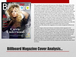
1. • The masthead is focused in the top row of the thirds. The house style of the
masthead is consistent throughout all issues of Billboard. Additionally, the
name of the magazine which is ‘billboard’ could connote importance of the
information included within the magazine being as billboards are usually
used to feed people with news and recent information. The house style used
for the masthead is rather bland and simple, however, it works because it
emphasises everything else on the cover as well as standing out and being
clear. Furthermore, the colour used is white which emphasises that it’s new
and fresh, although, it uses extra colours such as blue and green in the gaps
of the lowercase letters, which are quite refreshing colours so therefore will
reinforce the freshness and that it’s the newest music trends as well as
giving the masthead of the magazine it’s own personal uniqueness. Also this
allows the magazines masthead to be flexible from issue to issue.
Furthermore, this allows the magazine to be easily recognised without any
confusion.
• The main image is the most obvious convention which appeals to the
readers because it’s the largest element on the front cover. In the image the
artist ‘Carrie Underwood’ is using eye contact and looking directly towards
to readers which is inviting them in. The image sets the tone to be focused
on the serious side of music and it’s an extremely professional photo and
she seems to be wearing extremely fashionable black clothing which
emphasises that it’s modern and original as well as showing us her personal
grace and elegance. The background is a rather dim colour yet effective
being as it’s two-toned which will also emphasise and make the artist stand
out more.
Billboard Magazine Cover Analysis…
2. • The coverlines on a magazine cover are a key point because
it’s one of the few main elements in which attract the
consumer most. All the coverlines follow the colour scheme
apart from one visual rule break of the colour yellow which
seems to be added occasionally. The main coverline is
easily visible, ‘Carrie Underwood’ is in a different style font
yet in white which is the same as the masthead, this colour
is used as part of the colour scheme, although, it could be
used to tell us about her personality and it connotes the idea
of peace, calmness and possibly the recentness of her music.
In addition, the other main coverlines seem to be in the
colour red which is rather bright and appealing and
connotes the idea of lust, sexiness and passion. The main
coverlines are situated within the column of the left rule of
thirds and followed by the others on the cover which are
visible in a letter ‘C’ which makes it easier for the consumer
to read them.
Billboard Magazine Cover Analysis Continued…
3. Subsidiary Images.
• The layout of the contents page is typically using the rule of thirds
which makes it neat, a clear understanding and more professional
looking. The colour scheme matches the colours used within the
spaces of the lowercase letters in the masthead, furthermore, the
white has connotations of being new and fresh emphasising the
recentness of the music. The left rule of thirds column consists of the
latest music of the charts which reoccur in every issue of the magazine
which gives it the edge and special uniqueness to the magazine itself
compared to other music magazines. In addition, in this area of the
page the magazine logo is also placed on the page which gives the page
a personal effect. The three smaller sized images based in the top row
of the rule of thirds are subsidiary images which give the reader an
incite about what to expect in the issue. These images are
accompanied by pages number that are clear and stand out, in order
for the consumer to be informed on which page these particular artists
are situated on. The title of the contents page is used in order to tell
the reader what page they’re currently on as well as it making the page
look more organised and official. The main image usually compliments
the cover of the magazine, but remains quite a neutral tone and doesn’t
completely fill the page which will intrigue readers to continue
reading. Subheadings consist throughout the middle section of the
page emphasising it’s the centre piece and main focus, informing
Page number. readers what is featured in the magazine as well as having
Column of the latest summarised information to accompany the main image and headings
music in the charts. which are used to give the consumer more incite about the included
features.
Billboard Contents Page Analysis…
4. A key convention of this double page spread would be
the main image which the right page consists of. The
image is a medium close up shot which is
modern, fresh and fashionable emphasising the
recentness of the her music or maybe a new single. In
addition, the effect of Alexandre Burke’s hair looks
windswept which shows connotations of freedom, as
well as having direct eye contact with the reader so
inviting them in which could reinforce the idea of
female power and dominance which would appeal to
the readers being as they may look up to her as an
icon. The background of the image is white which
shows contrast between it and the foreground image
making it more effect and stand out more to the
consumer.
The left page of the spread consists of the text and a subsidiary image of the artist in which the article is
about. Furthermore, the layout of it is set out in the rule of thirds which shows us the professionalism used.
The text is well organised and placed into three columns which makes it easier for the reader to read the
information. There is a pull quote used on this page and it is used in the colour pink and the particular text
has been enlarged also to make it more noticeable, additionally, this could emphasise the importance of this
particular quote and set the tone for the entire article or the chosen artist.
Billboard Double Page Spread Analysis…
5. • Billboard magazine’s first issue was published in the year 1894 and it tends to
cover all genres of music, but mainly consists of artists and albums revolving
around the charts which track the most popular albums and songs on a weekly
basis. Although, it generally bases its genre on either hip hop or R&B. It is
known to be the worlds most influential music media brand which is owned by
the American entertainment publishing company ‘Prometheus Global Media’.
The current editorial director of this music magazine is Bill Werde who works
alongside the publisher Tommy Page. When Billboard was first published it was
sold in the US, however, it is now also sold in the UK. In the year 2008,
Billboard achieved a circulation of 18,385. In addition, Billboard magazine was
proudly awarded with the 2010 National Magazine Award For Digital Media,
due to the fact it has gained a tremendous digital growth year over year. An
incredible fact would be that it attracts more than 4 million readers each month
in more than a 100 countries.
Background & Research of Billboard magazine…
6. The housestyle used within Billboard varies each issue, but in
one particular issue it chooses to consist of the colours chosen
on the cover, throughout the rest of the issue. The masthead
throughout every issue which is published, continues to use the
set colours in the example to the left which increases the chance
of making Billboard magazine more popular, well known and
without difficulty recognisable. The colour white which is used
in the masthead consistently, as well as on other pages and other
text which connotes the freshness of the music which is included
in the magazine, as well as it being quite vibrant and eye
catching over other magazine competitors, to the consumer.
HOUSE STYLE…