Q magazine uses a large red pull quote in the form of the letter "L" to emphasize Lady Gaga's name across a double page spread. They utilize significant white space around the spread to make the black and grey photograph and text stand out. Drop capitals are also used to liven up the dense copy and keep readers engaged. The magazine targets young males through revealing photographs and avoids taboo language.
Unit 8 - Information and Communication Technology (Paper I).pdfThiyagu K
This slides describes the basic concepts of ICT, basics of Email, Emerging Technology and Digital Initiatives in Education. This presentations aligns with the UGC Paper I syllabus.
The Roman Empire A Historical Colossus.pdfkaushalkr1407
The Roman Empire, a vast and enduring power, stands as one of history's most remarkable civilizations, leaving an indelible imprint on the world. It emerged from the Roman Republic, transitioning into an imperial powerhouse under the leadership of Augustus Caesar in 27 BCE. This transformation marked the beginning of an era defined by unprecedented territorial expansion, architectural marvels, and profound cultural influence.
The empire's roots lie in the city of Rome, founded, according to legend, by Romulus in 753 BCE. Over centuries, Rome evolved from a small settlement to a formidable republic, characterized by a complex political system with elected officials and checks on power. However, internal strife, class conflicts, and military ambitions paved the way for the end of the Republic. Julius Caesar’s dictatorship and subsequent assassination in 44 BCE created a power vacuum, leading to a civil war. Octavian, later Augustus, emerged victorious, heralding the Roman Empire’s birth.
Under Augustus, the empire experienced the Pax Romana, a 200-year period of relative peace and stability. Augustus reformed the military, established efficient administrative systems, and initiated grand construction projects. The empire's borders expanded, encompassing territories from Britain to Egypt and from Spain to the Euphrates. Roman legions, renowned for their discipline and engineering prowess, secured and maintained these vast territories, building roads, fortifications, and cities that facilitated control and integration.
The Roman Empire’s society was hierarchical, with a rigid class system. At the top were the patricians, wealthy elites who held significant political power. Below them were the plebeians, free citizens with limited political influence, and the vast numbers of slaves who formed the backbone of the economy. The family unit was central, governed by the paterfamilias, the male head who held absolute authority.
Culturally, the Romans were eclectic, absorbing and adapting elements from the civilizations they encountered, particularly the Greeks. Roman art, literature, and philosophy reflected this synthesis, creating a rich cultural tapestry. Latin, the Roman language, became the lingua franca of the Western world, influencing numerous modern languages.
Roman architecture and engineering achievements were monumental. They perfected the arch, vault, and dome, constructing enduring structures like the Colosseum, Pantheon, and aqueducts. These engineering marvels not only showcased Roman ingenuity but also served practical purposes, from public entertainment to water supply.
The Art Pastor's Guide to Sabbath | Steve ThomasonSteve Thomason
What is the purpose of the Sabbath Law in the Torah. It is interesting to compare how the context of the law shifts from Exodus to Deuteronomy. Who gets to rest, and why?
Palestine last event orientationfvgnh .pptxRaedMohamed3
An EFL lesson about the current events in Palestine. It is intended to be for intermediate students who wish to increase their listening skills through a short lesson in power point.
Students, digital devices and success - Andreas Schleicher - 27 May 2024..pptxEduSkills OECD
Andreas Schleicher presents at the OECD webinar ‘Digital devices in schools: detrimental distraction or secret to success?’ on 27 May 2024. The presentation was based on findings from PISA 2022 results and the webinar helped launch the PISA in Focus ‘Managing screen time: How to protect and equip students against distraction’ https://www.oecd-ilibrary.org/education/managing-screen-time_7c225af4-en and the OECD Education Policy Perspective ‘Students, digital devices and success’ can be found here - https://oe.cd/il/5yV
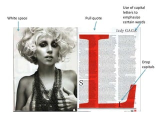
2. Q magazine have a double page spread on lady gaga. They have used a large and red
letter ‘L’, as that’s what her name begins with, right across the page, this is usually
known as a pull quote, by making it larger and a different colour from the rest of the
copy makes it stand out and draws your attention to it . They also have a lot of white
space surrounding the double page spread, which I think makes it look more
professional as they have the photograph of Lady Gaga in black and grey which stands
out more against the white space, but also making the text and ‘L’ stand out and works
well with the copy and letter ‘L’ to get peoples attention but to also anchor Q
magazines style.. The photograph used will draw the attention of the target audience
that Q magazine aim to please, as they are mostly young males and the photograph is
revealing which the male population will like more. The copy is quite dense which
shows that the people who read the magazine are actually interested in the gossip
about Lady Gaga. The use of the drop capitals used in the columns to liven up the
copy and make it look more interesting and keep the readers interested as there is a lot
of plain copy to read. They have put the header onto the left side of the page, Lady is
in a lower cape serif font, and Gaga, is a serif font as well however in capitals, I think
they have done this as the word ‘gaga’ normally means quite mad, so by empathizing
the word ‘gaga’ could show they are saying that Lady gaga has a reputation of being a
bit crazy. The magazine has used three large columns which is the same amount of
space as the picture takes up. Unlike most magazines, as this magazine is aimed mainly
young males around the ages of 20, they tend not to star any taboo language as you
can see from just glancing at the article.
4. Vibe magazine have done a double page spread on Solange Knowles, as
many people may not know who she is, because I do not think she is that
famous, they have used a strapline where they have made her name stand
out by changing the colour to a bright blue. They have used a cut out image
of the artist to place in the middle of the pages so when people glance at the
page it makes you aware of who it is about, they have also used several
different images, all black and white at the top of the page gives a better
representation of the artists personality, but does not draw too much
attention away from the picture used in the middle. Underneath the black
and white images they have chosen to add black lines going across the page
which separates the pictures from the copy, they have also thought is would
be the right place to add a white box to stand out from the lines which
includes details about her latest single. Unlike most magazine articles, vibe
has chosen not to use a drop letter but to use a bold sentence, which is short
and draws the reader in by saying she is an ‘easy target’ because many
people will read on to find why she is, by having the first sentence bold
makes the whole article look more intriguing. On the right side of the
double page spread they have used a pull quote from the article, this is used
to drawn the reader more into reading the full article, by using a good and
interesting quote it will entice the readers as they may feel the whole article
is going to be as interesting as the pull quote.