The document provides details on the layout, design and visual elements of various magazine covers and contents pages. Key points discussed include:
- The use of images, fonts, and color schemes to represent the genres of music featured and appeal to target audiences.
- Placement of mastheads, headlines, and other text elements to guide the reader and draw attention.
- Separating content into clear sections and including page numbers to aid navigation.
- Inclusion of multiple images on spreads to preview articles and engage readers.
Software Delivery At the Speed of AI: Inflectra Invests In AI-Powered QualityInflectra
In this insightful webinar, Inflectra explores how artificial intelligence (AI) is transforming software development and testing. Discover how AI-powered tools are revolutionizing every stage of the software development lifecycle (SDLC), from design and prototyping to testing, deployment, and monitoring.
Learn about:
• The Future of Testing: How AI is shifting testing towards verification, analysis, and higher-level skills, while reducing repetitive tasks.
• Test Automation: How AI-powered test case generation, optimization, and self-healing tests are making testing more efficient and effective.
• Visual Testing: Explore the emerging capabilities of AI in visual testing and how it's set to revolutionize UI verification.
• Inflectra's AI Solutions: See demonstrations of Inflectra's cutting-edge AI tools like the ChatGPT plugin and Azure Open AI platform, designed to streamline your testing process.
Whether you're a developer, tester, or QA professional, this webinar will give you valuable insights into how AI is shaping the future of software delivery.
State of ICS and IoT Cyber Threat Landscape Report 2024 previewPrayukth K V
The IoT and OT threat landscape report has been prepared by the Threat Research Team at Sectrio using data from Sectrio, cyber threat intelligence farming facilities spread across over 85 cities around the world. In addition, Sectrio also runs AI-based advanced threat and payload engagement facilities that serve as sinks to attract and engage sophisticated threat actors, and newer malware including new variants and latent threats that are at an earlier stage of development.
The latest edition of the OT/ICS and IoT security Threat Landscape Report 2024 also covers:
State of global ICS asset and network exposure
Sectoral targets and attacks as well as the cost of ransom
Global APT activity, AI usage, actor and tactic profiles, and implications
Rise in volumes of AI-powered cyberattacks
Major cyber events in 2024
Malware and malicious payload trends
Cyberattack types and targets
Vulnerability exploit attempts on CVEs
Attacks on counties – USA
Expansion of bot farms – how, where, and why
In-depth analysis of the cyber threat landscape across North America, South America, Europe, APAC, and the Middle East
Why are attacks on smart factories rising?
Cyber risk predictions
Axis of attacks – Europe
Systemic attacks in the Middle East
Download the full report from here:
https://sectrio.com/resources/ot-threat-landscape-reports/sectrio-releases-ot-ics-and-iot-security-threat-landscape-report-2024/
Neuro-symbolic is not enough, we need neuro-*semantic*Frank van Harmelen
Neuro-symbolic (NeSy) AI is on the rise. However, simply machine learning on just any symbolic structure is not sufficient to really harvest the gains of NeSy. These will only be gained when the symbolic structures have an actual semantics. I give an operational definition of semantics as “predictable inference”.
All of this illustrated with link prediction over knowledge graphs, but the argument is general.
UiPath Test Automation using UiPath Test Suite series, part 4DianaGray10
Welcome to UiPath Test Automation using UiPath Test Suite series part 4. In this session, we will cover Test Manager overview along with SAP heatmap.
The UiPath Test Manager overview with SAP heatmap webinar offers a concise yet comprehensive exploration of the role of a Test Manager within SAP environments, coupled with the utilization of heatmaps for effective testing strategies.
Participants will gain insights into the responsibilities, challenges, and best practices associated with test management in SAP projects. Additionally, the webinar delves into the significance of heatmaps as a visual aid for identifying testing priorities, areas of risk, and resource allocation within SAP landscapes. Through this session, attendees can expect to enhance their understanding of test management principles while learning practical approaches to optimize testing processes in SAP environments using heatmap visualization techniques
What will you get from this session?
1. Insights into SAP testing best practices
2. Heatmap utilization for testing
3. Optimization of testing processes
4. Demo
Topics covered:
Execution from the test manager
Orchestrator execution result
Defect reporting
SAP heatmap example with demo
Speaker:
Deepak Rai, Automation Practice Lead, Boundaryless Group and UiPath MVP
Let's dive deeper into the world of ODC! Ricardo Alves (OutSystems) will join us to tell all about the new Data Fabric. After that, Sezen de Bruijn (OutSystems) will get into the details on how to best design a sturdy architecture within ODC.
Essentials of Automations: Optimizing FME Workflows with ParametersSafe Software
Are you looking to streamline your workflows and boost your projects’ efficiency? Do you find yourself searching for ways to add flexibility and control over your FME workflows? If so, you’re in the right place.
Join us for an insightful dive into the world of FME parameters, a critical element in optimizing workflow efficiency. This webinar marks the beginning of our three-part “Essentials of Automation” series. This first webinar is designed to equip you with the knowledge and skills to utilize parameters effectively: enhancing the flexibility, maintainability, and user control of your FME projects.
Here’s what you’ll gain:
- Essentials of FME Parameters: Understand the pivotal role of parameters, including Reader/Writer, Transformer, User, and FME Flow categories. Discover how they are the key to unlocking automation and optimization within your workflows.
- Practical Applications in FME Form: Delve into key user parameter types including choice, connections, and file URLs. Allow users to control how a workflow runs, making your workflows more reusable. Learn to import values and deliver the best user experience for your workflows while enhancing accuracy.
- Optimization Strategies in FME Flow: Explore the creation and strategic deployment of parameters in FME Flow, including the use of deployment and geometry parameters, to maximize workflow efficiency.
- Pro Tips for Success: Gain insights on parameterizing connections and leveraging new features like Conditional Visibility for clarity and simplicity.
We’ll wrap up with a glimpse into future webinars, followed by a Q&A session to address your specific questions surrounding this topic.
Don’t miss this opportunity to elevate your FME expertise and drive your projects to new heights of efficiency.
Accelerate your Kubernetes clusters with Varnish CachingThijs Feryn
A presentation about the usage and availability of Varnish on Kubernetes. This talk explores the capabilities of Varnish caching and shows how to use the Varnish Helm chart to deploy it to Kubernetes.
This presentation was delivered at K8SUG Singapore. See https://feryn.eu/presentations/accelerate-your-kubernetes-clusters-with-varnish-caching-k8sug-singapore-28-2024 for more details.
Search and Society: Reimagining Information Access for Radical FuturesBhaskar Mitra
The field of Information retrieval (IR) is currently undergoing a transformative shift, at least partly due to the emerging applications of generative AI to information access. In this talk, we will deliberate on the sociotechnical implications of generative AI for information access. We will argue that there is both a critical necessity and an exciting opportunity for the IR community to re-center our research agendas on societal needs while dismantling the artificial separation between the work on fairness, accountability, transparency, and ethics in IR and the rest of IR research. Instead of adopting a reactionary strategy of trying to mitigate potential social harms from emerging technologies, the community should aim to proactively set the research agenda for the kinds of systems we should build inspired by diverse explicitly stated sociotechnical imaginaries. The sociotechnical imaginaries that underpin the design and development of information access technologies needs to be explicitly articulated, and we need to develop theories of change in context of these diverse perspectives. Our guiding future imaginaries must be informed by other academic fields, such as democratic theory and critical theory, and should be co-developed with social science scholars, legal scholars, civil rights and social justice activists, and artists, among others.
Builder.ai Founder Sachin Dev Duggal's Strategic Approach to Create an Innova...Ramesh Iyer
In today's fast-changing business world, Companies that adapt and embrace new ideas often need help to keep up with the competition. However, fostering a culture of innovation takes much work. It takes vision, leadership and willingness to take risks in the right proportion. Sachin Dev Duggal, co-founder of Builder.ai, has perfected the art of this balance, creating a company culture where creativity and growth are nurtured at each stage.
"Impact of front-end architecture on development cost", Viktor TurskyiFwdays
I have heard many times that architecture is not important for the front-end. Also, many times I have seen how developers implement features on the front-end just following the standard rules for a framework and think that this is enough to successfully launch the project, and then the project fails. How to prevent this and what approach to choose? I have launched dozens of complex projects and during the talk we will analyze which approaches have worked for me and which have not.
Kubernetes & AI - Beauty and the Beast !?! @KCD Istanbul 2024Tobias Schneck
As AI technology is pushing into IT I was wondering myself, as an “infrastructure container kubernetes guy”, how get this fancy AI technology get managed from an infrastructure operational view? Is it possible to apply our lovely cloud native principals as well? What benefit’s both technologies could bring to each other?
Let me take this questions and provide you a short journey through existing deployment models and use cases for AI software. On practical examples, we discuss what cloud/on-premise strategy we may need for applying it to our own infrastructure to get it to work from an enterprise perspective. I want to give an overview about infrastructure requirements and technologies, what could be beneficial or limiting your AI use cases in an enterprise environment. An interactive Demo will give you some insides, what approaches I got already working for real.
Dev Dives: Train smarter, not harder – active learning and UiPath LLMs for do...UiPathCommunity
💥 Speed, accuracy, and scaling – discover the superpowers of GenAI in action with UiPath Document Understanding and Communications Mining™:
See how to accelerate model training and optimize model performance with active learning
Learn about the latest enhancements to out-of-the-box document processing – with little to no training required
Get an exclusive demo of the new family of UiPath LLMs – GenAI models specialized for processing different types of documents and messages
This is a hands-on session specifically designed for automation developers and AI enthusiasts seeking to enhance their knowledge in leveraging the latest intelligent document processing capabilities offered by UiPath.
Speakers:
👨🏫 Andras Palfi, Senior Product Manager, UiPath
👩🏫 Lenka Dulovicova, Product Program Manager, UiPath
LF Energy Webinar: Electrical Grid Modelling and Simulation Through PowSyBl -...DanBrown980551
Do you want to learn how to model and simulate an electrical network from scratch in under an hour?
Then welcome to this PowSyBl workshop, hosted by Rte, the French Transmission System Operator (TSO)!
During the webinar, you will discover the PowSyBl ecosystem as well as handle and study an electrical network through an interactive Python notebook.
PowSyBl is an open source project hosted by LF Energy, which offers a comprehensive set of features for electrical grid modelling and simulation. Among other advanced features, PowSyBl provides:
- A fully editable and extendable library for grid component modelling;
- Visualization tools to display your network;
- Grid simulation tools, such as power flows, security analyses (with or without remedial actions) and sensitivity analyses;
The framework is mostly written in Java, with a Python binding so that Python developers can access PowSyBl functionalities as well.
What you will learn during the webinar:
- For beginners: discover PowSyBl's functionalities through a quick general presentation and the notebook, without needing any expert coding skills;
- For advanced developers: master the skills to efficiently apply PowSyBl functionalities to your real-world scenarios.
AI for Every Business: Unlocking Your Product's Universal Potential by VP of ...
Media coursework 9 analysis'
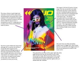
1. The image is mid shot of yasmin a young singer from the uk and she's not really that known the pose is quite seductive and she’s holding the glasses below her eyes this represents her revealing herself to the uk music scene instead of her covering her eyes. The Glasses correspond with the very bright and distinctive colour scheme they are also 3d glasses which are quite trendy these days so it represent popularity amongst the youth. The image appeals to the young boys because it makes look like she is looking straight at you trying to attract you. The colour scheme is quite bright and colourful it consists of the colours blue red yellow green and purple which makes it appeal to the young female teenagers. The colours represent the genre she does which is r&b this type of music is considered as more of a happy genre so it makes sense it being represented by loads of colours. The cover lines are white and yellow. Drakes name is a bigger font which shows that he is considered as the biggest artist in the list and represents his status in the music scene. The font is quite childish this shows that although she is a woman she still has a young side which appeals tot he audience because although people at that age are growing but they always have a childish side and no one can deny it but yasmin isn’t afraid to show it. This is also shown through the paint splats on the cover, most children are considered as messy and unruly. They placed the cover lines at the upper right side of the page because that was the only place to put it with obscuring the image. Which personally I think is quite unorthodox because they usually place it on the left hand side because people read from right to left so it catches their eye instantly.
2. Head and shoulders shot of “Kano” is quite dark because of the effects, this makes him seem more mysterious and dark which also corresponds with the genre that he’s promoting which is Grime, this type of music is more underground and not as big as this music we see on TV now days but the image shows a light shining down on him which represents the mainstream side of music which he also does and how he’s breaking down the barriers between grime and mainstream. Kano is also seen as one of the big shots of grime so he is one of the best people to represent it, everyone who listens to grime knows Kano so by him being on the front it makes it more genre specific. He is also wearing shades which is quite ironic considering the background is dark, but this is to show that he maintains his superstar image even whilst doing grime (underground genre). Link for competition to win free tickets to the biggest grime event this appeals to the audience because as grime fans they would want to attend this event to see their favourite artists live it’s placed in a bubble so it stands out more in order to stop the reader from just over looking it. The colour scheme is a simple black grey and white which symbolises darkness which is to do with the genre grime which is a darker type of music compared to the pop music we hear. The font looks unique futuristic and it stands out . This is to represent the artist on the front being Kano he’s seen as futuristic and unique one of the reasons why he is where he is in the music scene.
3. The headline is the next biggest font on the front cover after the masthead. It has a bright colour and it’s centred in the middle of the front cover to catch the readers eye and draw them into reading the magazine. Since Beyonce is on the front cover you'd expect her to have the most important article in the magazine that's why she's involved in the headline. Also the magazine is aimed at particularly young people so in order to keep them interested you wouldn’t use small and dull fonts . A big bright circle is used in order to highlight one of the magazines main events which is “5 years at the top” it is useful because it is a contrasting colour to the text and background which therefore makes it stand out even more. Mid shot of Beyonce is blown up and made the centre of attention of the front page, so much that she is even over the magazines masthead. This is used particularly to attract the young boys as she is seen as attractive by males world wide. If a boy does see a beautiful woman on the front page they’ll be more interested in the magazine. The image of Beyonce is quite seductive almost as if the picture is luring the audience in. But it’s not just appealing for males because Beyonce is seen as an iconic figure for what she has done and her success in the industry, a lot of young female singers want to be like her. Informal language in the strap line implies that the magazine is for young people and they use the language to appeal to them and make it seem like they are actually speaking out to that intended audience. The layout and design is slightly contradictive as the background is blue which is usually considered as a boys colour but the image is a mid shot of Beyonce which I personally think means that they are attracting boys with the colour and Beyonce, so these two contrasting factors go together to appeal to their intended audience (young people) and the colour orange is very vibrant and could represent youth as it is a fresh bright colour. Also a simple colour scheme of blue white orange is used, not too many colours show that it is for young people but not too young they still want teenagers to read as having too many colours is quite immature and usually used to entertain small children and that will slightly patronize the readers which the magazine has cleverly avoided.
4. The lay out here is quite interesting and not used a lot by other magazines. They have laid out 4 pictures next to each other with a small separation in order to distinguish to the readers that they are 4 separate images. I like the layout because they have put the images there for reader to acknowledge what is to come later on in the magazine which is a quite interesting technique. The contents of the magazine is separated into two parts called “Regulars” and features so this makes it easier for the reader to differentiate the two from each other instead of having them all squashed together so if they are looking for the particular artist feature they can find it at the bottom which is very effective by saving the readers time. The page numbers are bold which makes it stand out from the rest of the text, also its also quite important on the page because without it there's no point in having the page itself because you wont find the page One thing I don't find effective is the way the contents is laid out. They’ve made it so it looks like a paragraph which makes it harder for the reader to read it because its all packed together.
5. The contents page has a simple basic layout which makes it easy to read. Theyve seperated it into four different parts of the magazine being “regulars, Fetures, Style guide and Unwind”. This works well as it makes it easier for the reader to find what particular type of article they are looking for instead of having all the different types of articles in one big block. Each block has an image which corresponds with one of the storys in each one for example in the 2 nd block to the right thereis an image of 3 female singers which links with the article “who runs the world girls”. This gives the reader an idea of what to expect in that particular column. The image is a Mid shot of 3 ladies standing in front of a van which says caution men at work, this contrast the two things going on in the picture, whilst the men are at work the 3 ladies seem more carefree and fun which links to its article saying Who runs the world girls, the image implies that the girls run the world because they’re having fun and they dont need to work. The text is nothing special but they used it well, the headlines for each article is made bold in order to differentiate it from the explanation of the article which avoids reader confusion. A simple colour scheme is used and its almost more like a key where each type has its own colour i like this as once the reader becomes a regualar reader instead of reading “style guide” he could just see the colour and know what it is which saves the readers time especially in this case when RWD’s main audience are young people who are usually on the go and dont like to read too much.
6. The contents page of RWD magazine has many features where it is quite simple and straightforward. It is the main navigation tool of any magazine. Firstly what's unusual is there is no masthead to show that it is from the RWD magazine, hence it has been kept very minimal. To show that it is a contents page ‘contents’ has been printed in big black bold capitals with the date beside it. As the text is bold it increases the sharpness of the text and contrasts with the white background, making it easy for the viewer to read. Also the bold subheadings on the contents page help to guide the reader through the magazine. the use of black line stands and differentiates the content in the magazine. Underneath these subheadings the page numbers are in a black bold font so that the reader knows. Then we can see beside the page number is some textual content about what artist the page is going to be about. Since there is not much text it has been kept very simple, allowing the reader to navigate to a specific page easily. On the top of the page we can see four images to show other additional information inside the magazine through the use of a medium camera shot. The four images look effective as it adds colour to the contents page, rather than it being completely black and white. This then attracts and draws the reader’s attention into the contents page, rather than the reader getting bored looking at just text. On the bottom of the page we can see the magazine website so that the reader exactly knows what magazine they are reading as this contents page contains no mention of rwd magazine except for the website link.
7. The colour scheme is simple and classy it consists of three colours being burgundy white and black these are quite calm colours which links with the headline being “unwind with Griminal”. The word Griminal in the title is black and bigger which makes it stand out from the rest and makes it seem more important especially considering the fact that the article is about “Griminal” himself. There are two images on the article one being an over the shoulder shot the other being a close up. The over the shoulder shot shows Griminal having an interview and he's smiling which shows the artists personality, that he can have fun in business situations. In the other image you see the more focused side of him he’s looking up at something which could be his future as he is a young promising rapper with his whole life ahead of him. In the image he is sporting a burgundy cap and back pack which is worn in order to correspond with the themes colour and it makes the article look more organised and attractive instead of him wearing a multi coloured shirt. Each question is highlited with a burgundy colour which shows the reader which ones the question without the reader having to try and pick it out
8. The colour code corresponds with the colours on the contents page marking it out to making it easier for the reader to distinguish the features in this double page spread. There are a various amount of fonts used here the most funky ones are featured down the right column which makes it stand out and it appeals to the young audience that read it instead of having boring fonts. There are a series of images on the spread one for each story to be exact which tells the reader what the article is about before reading it. The image of Ed Sheeran is followed by orange text which goes with his hair thus linking with theme to make it more appealing to read and it looks more colourful. Also Ed Sheeran is well known in the music scene so by making him the main image of the article it makes the reader want to read it and see how its linked to him, as young people are usually interested celebrity gossip so it links with the magazines intended audience.
9. A simple colour scheme of white yellow and black is used, there are not many colours which avoid bombarding the reader with too many colours and make it a colourful patronising magazine. There are a series of images on this double page spread to show what went on in the day the images show the transition as they went on, with the times in the corner of each image it shows the biggest image is the B-boy in the middle of dancing which relates to the story of spending the day with a Dancer. The quotes are in italic which makes it stand out from the rest of the text and shows that it is crucial and its an important thing that the dancer said. The text is a black font with a black background that makes it stand out and makes it easier to read. The image shows the dancer dancing, he's looking directly at you which makes it seem like he is dancing for you to watch them which gets you more interested in reading what's to come.