Download as PDF, PPTX

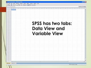

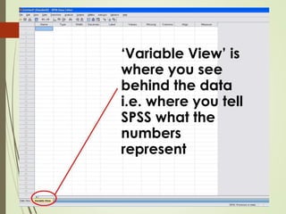

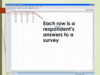
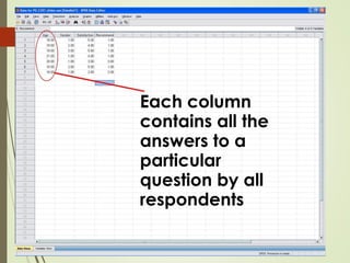
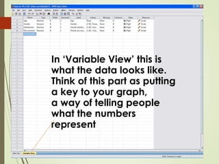
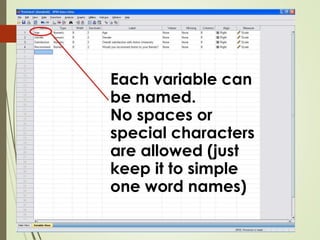
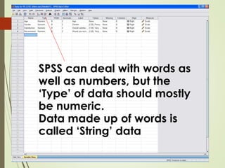

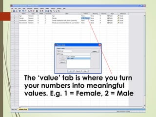


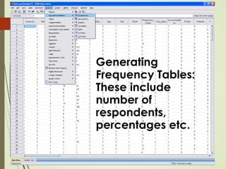
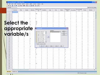


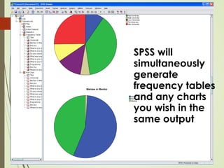
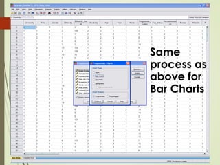


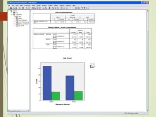
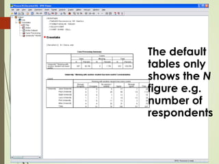


This document provides a basic overview of using SPSS software to analyze survey data. It explains that SPSS has two main views - the Data View, where raw survey responses are entered, and the Variable View, where users define what the data values represent. It then demonstrates how to generate frequency tables, charts, and cross-tabulations in SPSS to analyze and visualize the survey data in different ways. The goal is to efficiently extract meaningful insights from the raw data through descriptive statistics.