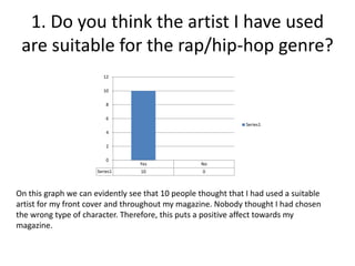
Based on feedback from 10 people on the audience survey:
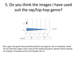
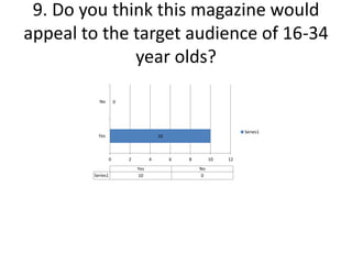
- All 10 people thought the artist and images used were suitable for the rap/hip-hop genre of the magazine.
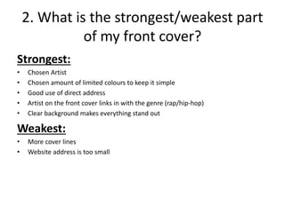
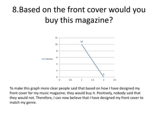
- The strongest parts of the front cover were the chosen artist, limited colors, direct address, and genre-linked artist. 8 people said they would buy the magazine based on the front cover.
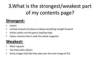
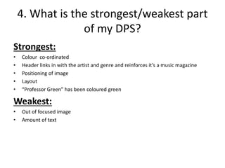
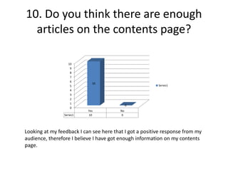
- The strongest parts of the contents page were the layout, limited colors, and genre-suited artist outfits.
- The strongest parts of the double-page spread were the color coordination, header linking to artist and genre, image positioning, and layout.
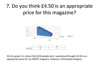
- 10 people thought £4.50 was an appropriate price for