The document summarizes feedback from a questionnaire given to 10 people about a magazine prototype for the indie rock genre. Key findings include:
- The artist's face on the front cover stood out the most and caught attention as intended.
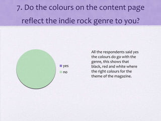
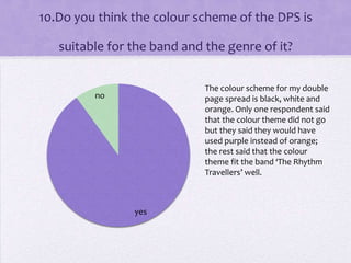
- Colors on the front cover and content page (red, black, white) were deemed suitable for indie rock.
- Cover lines like "indie-vidual" made the magazine enticing to pick up.
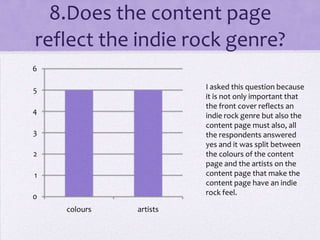
- Images throughout were considered professionally done and the content page/double-page spread fit the genre through colors and artists featured.
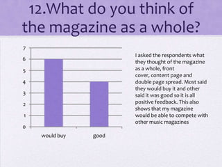
- Respondents said the magazine as a whole would be able to compete with other music magazines in the market.