The album has a gritty look, identifying that the genre is rock. The
main image of a sci-fi looking gun, made of solid steel is also
reflective of this as many famous rock bands have
unusual/conceptual imagery as the main theme of their covers.
The simplistic logo is a more modern trait put onto the cover,
normally used by indie bands the font used for the band’s name is
clean and mini minimalist. A gritty effect is added to the cover to
further the bands ties to rock.
The colours are very limited, A lot of grey , black and almost yellow.
Giving the album a very desaturated look. The boldness of the
imagery and this combined created the sense that the album is
more serious in tone.
The way that the title of the album is the same name as the band
also gives the album an air of confidence. As if the name is
recognizable enough.
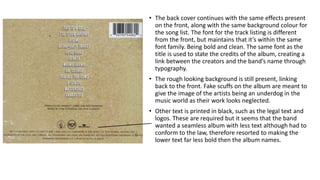
• The back cover continues with the same effects present
on the front, along with the same background colour for
the song list. The font for the track listing is different
from the front, but maintains that it’s within the same
font family. Being bold and clean. The same font as the
title is used to state the credits of the album, creating a
link between the creators and the band’s name through
typography.
• The rough looking background is still present, linking
back to the front. Fake scuffs on the album are meant to
give the image of the artists being an underdog in the
music world as their work looks neglected.
• Other text is printed in black, such as the legal text and
logos. These are required but it seems that the band
wanted a seamless album with less text although had to
conform to the law, therefore resorted to making the
lower text far less bold then the album names.
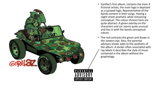
• Gorillaz’s first album, contains the main 4
fictional artists, the main logo is depicted
as a sprayed logo. Representative of the
bands content in their songs. Having a
slight street aesthetic while remaining
conceptual. The colour choices here are
quite abstract. A green overlay on the
characters and car seems quite unusual
and ties in with the bands conceptual
nature.
• The red contrasts the green and draws in
the viewers eye. Also, the parental
advisory sticker adds to the aesthetic of
the album. A sticker often associated with
rap labels it describes the style of music
contained in the album without the
graphology.
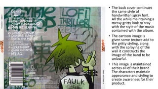
• The back cover continues
the same style of
handwritten spray font.
All the while maintaining a
messy gritty look to stay
with the style of the music
contained with the album.
• The cartoon image is
given some texture add to
the gritty styling, along
with the spraying of the
wall it constructs the
image of the band to be
unlawful.
• This image is maintained
across all of their brand.
The characters maintain
appearance and styling to
create awareness for their
product.

Ancillary Task Research

  • 1.
    The album hasa gritty look, identifying that the genre is rock. The main image of a sci-fi looking gun, made of solid steel is also reflective of this as many famous rock bands have unusual/conceptual imagery as the main theme of their covers. The simplistic logo is a more modern trait put onto the cover, normally used by indie bands the font used for the band’s name is clean and mini minimalist. A gritty effect is added to the cover to further the bands ties to rock. The colours are very limited, A lot of grey , black and almost yellow. Giving the album a very desaturated look. The boldness of the imagery and this combined created the sense that the album is more serious in tone. The way that the title of the album is the same name as the band also gives the album an air of confidence. As if the name is recognizable enough.
  • 2.
    • The backcover continues with the same effects present on the front, along with the same background colour for the song list. The font for the track listing is different from the front, but maintains that it’s within the same font family. Being bold and clean. The same font as the title is used to state the credits of the album, creating a link between the creators and the band’s name through typography. • The rough looking background is still present, linking back to the front. Fake scuffs on the album are meant to give the image of the artists being an underdog in the music world as their work looks neglected. • Other text is printed in black, such as the legal text and logos. These are required but it seems that the band wanted a seamless album with less text although had to conform to the law, therefore resorted to making the lower text far less bold then the album names.
  • 3.
    • Gorillaz’s firstalbum, contains the main 4 fictional artists, the main logo is depicted as a sprayed logo. Representative of the bands content in their songs. Having a slight street aesthetic while remaining conceptual. The colour choices here are quite abstract. A green overlay on the characters and car seems quite unusual and ties in with the bands conceptual nature. • The red contrasts the green and draws in the viewers eye. Also, the parental advisory sticker adds to the aesthetic of the album. A sticker often associated with rap labels it describes the style of music contained in the album without the graphology.
  • 4.
    • The backcover continues the same style of handwritten spray font. All the while maintaining a messy gritty look to stay with the style of the music contained with the album. • The cartoon image is given some texture add to the gritty styling, along with the spraying of the wall it constructs the image of the band to be unlawful. • This image is maintained across all of their brand. The characters maintain appearance and styling to create awareness for their product.