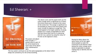
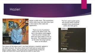
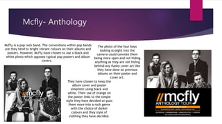
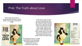
2. Ed Sheeran: +
The album cover and the poster both use the
colour orange which is significant as it shows
the artists brand and is related to the colour
of the artists hair. The orange is significant to
his branding as many of the artist posters and
music include his signature orange hair. This
would appeal to his target audience of young
people as it is easily recognisable for them
and also shows them how he is embracing
who he is as a person by using the colour of
his hair as the signature colour.
Having his debut album the
same colour as his hair again
allows people to make the
connection to Ed Sheeran when
seeing the colour orange and it
easily recognisable to people
making easy to identify who the
artist is.The tour poster continues to use the same typography as the album which
keeps the consistency for the artists branding.
The poster and album
both include a ’+’
symbol which is part of
the artist brand as he
name each of his album
after mathematical
signs.
3. Hozier:
Hozier is indie music. The conventions
within indie music are they often have
a retro look to their style and
appearance.
The colours of the album aren’t very bold and give a simplistic appeal to
the album artwork. His colour choice aren't bold and are quite plain
they're classic colours. This can be seen as conventional as they are
bright and bold which would typically be used for pop music.
The font used is quite quirky
and unusual which could be
consider to be conventional
within the indie genre.
There is a lot of symbolism
used on the album cover, the
tear is the sleeve could suggest
that the artist is broken and
there are many layers to him to
the artist. This could give a hint
as the what the song could be
about on the album.
4. Mcfly- Anthology
McFly is a pop rock band. The conventions within pop bands
are they tend to bright vibrant colours on their albums and
posters. However, McFly have chosen to use a black and
white photo which opposes typical pop posters and album
covers.
They have chosen to keep the
album cover and poster
simplistic using black and
white. Their use of orange on
the poster links to the simple
style they have decided on puts
them more into a rock genre
with the choice of darker
colours and they style of
clothing they have decided.
The photo of the four boys
looking straight into the
camera could connote them
being more open and not hiding
anything as they are not hiding
behind any flashy cover art like
they have done on previous
albums on their poster and
cover art.
5. P!nk: The Truth about Love
P!nk is pop/rock artists so
conventions you'd expect to see if
bright colours with a vivid stylish
image.
The background colour is bright
and colourful- pink and green.
This brings attention to the
album and it is also a
convention of pop music.
P!nk's style is seen as quite
eccentric especially her hair.
Her tattoos are also always on
show which could be consider
quite unconventional for pop
artist as they tend to have
'clean' image. Whereas this
shows P!nk is different from
other female artist in the same
genre as her. Because of her
unconventional style as she
doesn't follow the latest trend.