The document discusses the marketing campaigns for several music albums and tours:
- Ed Sheeran's album used orange and white tones on the album cover and posters to reference his ginger hair color as part of branding him as an artist.
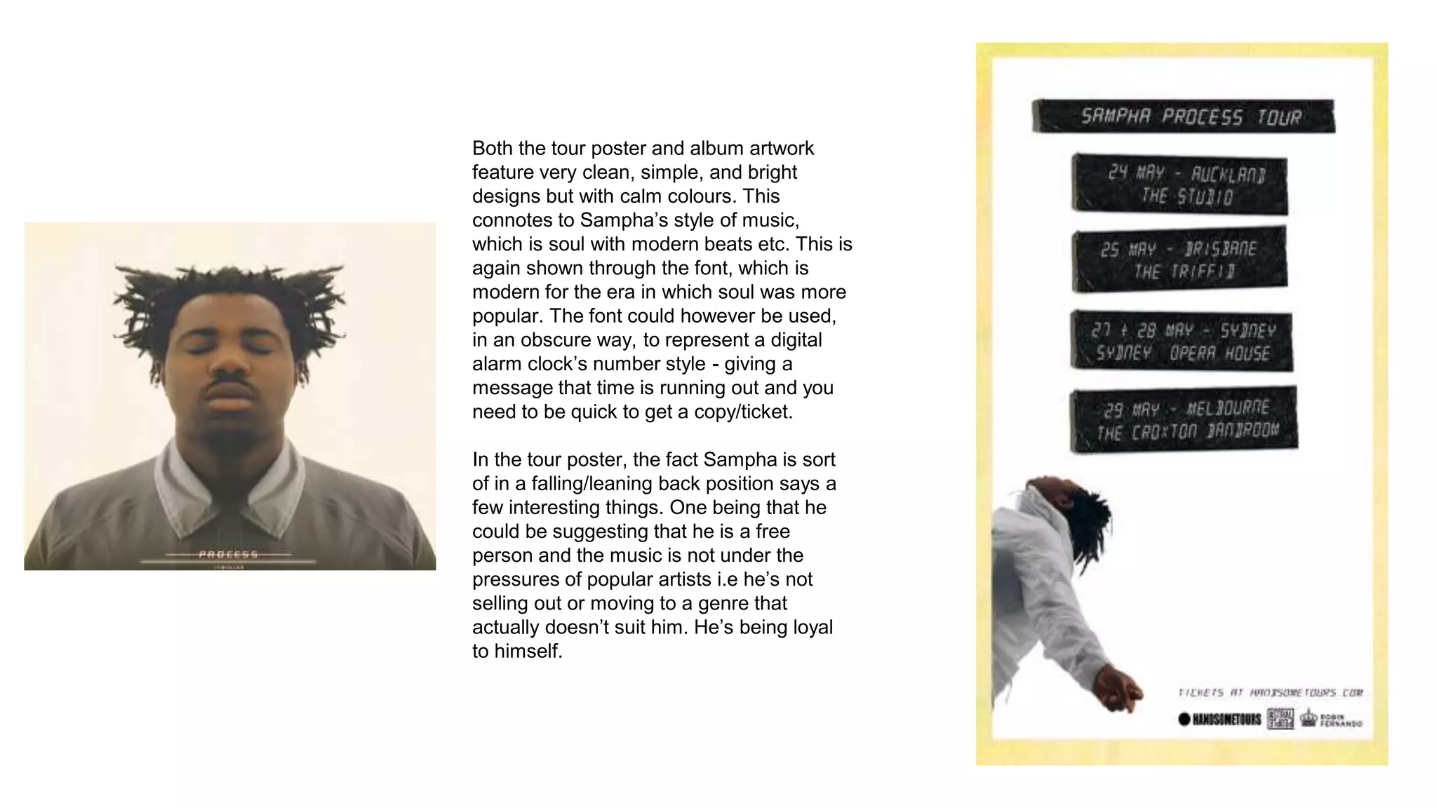
- Sampha's album artwork and tour poster featured simple but bright designs with calm colors to represent his soulful music style.
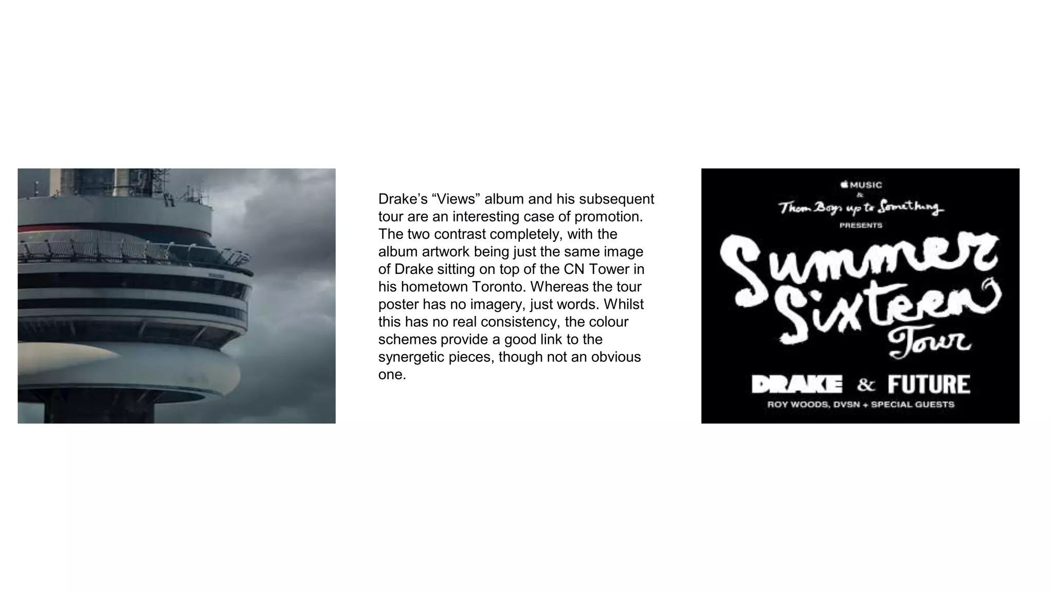
- Drake's "Views" album cover showed him sitting on the CN Tower but the tour poster had no imagery, though both used consistent color schemes.
- Dave's black album cover and tour poster featured the same font and black/yellow color scheme to represent the serious nature of his songs and make text stand out.