This document analyzes several factors related to CD covers, including:
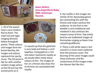
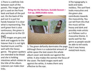
1) The relationship between the cover and other panels in terms of linking colors, images and themes to create a consistent brand identity.
2) How the choice of images, fonts, colors and layout/design are used to make the cover eye-catching and convey meaning about the genre and artist.
3) Where industry information like the artist, album, label and copyright details are typically displayed.
The document provides questions to consider when analyzing design elements and how they relate to marketing the artist and suggesting the music genre.
2. Questions I will answer during this
task.
• 1. Is there a relationship between the cover and the other panels in the
digipack (CD case)? How do they link together (colour, images, theme etc)?
Does the band have a ‘house style’ by creating a brand identity?
2. Analyse the choice of image, font and colour and explore their
effects/connotations.
3. Comment on layout and page design (white space/visual clutter). What is
the effect of these?
Remember this is a commercial object. How has the designer tried to make
it desirable or eye catching?
4. Does the design suggest the genre of the band? Look at design,
typography (serif/sans serif)
5. Does it use any iconography of the genre?
6. Does it develop the band or artist’s star image through motif’s/the key
image is the artist/a logo?
7. What industry information is included and where is it seen? (name of
album, artist, record label logo, release date, producer, information on
associated social networking sites, copyright logo? etc.
3. 1. There are clear 5.I would ay that the
house colours on iconography is not typical of
this digpack and the indie genre as there
white flower would usually be an image
against black are of the artist. Also the orchid
very dominant. symbolises love/luxury
These colours and which again is quite
the image of the feminime and not typical of
flower continue on the genre, flowers would
all of the panels normally be related to more
and CD. classical genres. The pull out
Kings of Leon, Aha Shake contains images of the band
HeartBreak ,2004, but they are not obviously
HandMeDown Records 3. There is a lot of white
on the main panels.
2. I believe the flower is space on the front of this
representing a very feminine album cover. The flower 4. The designer clearly thought
image of the band however the is the cntre image and about making this album eye
black dominates which is bold stands out effectively catching and has done so by
and masculine. Sans Serif font is agaisnt the black. It syas using white on black on the
used on the front panel again very little about the band front and vice versa on the
suggesting a feminine audience but may suggest due to back. It is very bold and the
although there the title of the the choice of image and flower stands out from a
songs is in a serif font white space that they distance. This album cover is
suggesting a mixed sex could be modern and eye catching and intriguing
audience. possibly indie. even without a band image.
4. Kings of Leon, Aha Shake HeartBreak ,2004,
HandMeDown Records (continued)
6.The black and white house 7. Industry information
colours could help create a can be seen on the back
star image motif for the panel of this cover. The
band as it could easily be record labels logo’s are
transferred on to other in the bottom right hand
pieces of media and future corner. The producers
album covers. and mixers names and
The orchid is the main year it was produced is
image in this album cover also on the back at the
and again could be seen as a bottom. The record
motif for the band. company logos can also
be found on the CD
itself and pull out.
5. Gwen Stefani,
Love,Angel,Music,Baby,
2004, Interscope 4. Her outfits in the images are
Records. similar of her dance/pop genre
but contrasting this with the
throne and crown confuse the
audience. As the font in the
1. All of the panels
booklet is very traditional and
have a very random
medieval it also confuses the
feel to them. The
viewers sense of time. Pop artists
royal red and regal
tend to use traditional images of
imaging (throne)
themselves singing so Gwen tries
follow throughall
something different.
panels. These colours
2.I would say that the gold font 3. There is still white space s but
and images form her
is very bold and follows a serif overall it is much more cluttered
brand identity, the
typeface. Using gold on a rich than the previous cover. The
images and colours
red colour represents royalty as blurring of the cover images could
represent her quirky
we would often relate these show confusion and the
music. The CD panel Is
colours to this. The images of randomness of the images make
like fur with another
her on a throne also show this the listener feel like this.
random image where
as thrones are associated with
as the CD just has the
royalty.
animal print on it.
6. Gwen Stefani, Love,Angel,Music,Baby, 2004,
Interscope Records.( Continued)
5. The iconography used in 7.Similarly to the previous
this album cover isn't album cover the industry
common for the genre as information can be found
pop Is usually less on the back cover at the
outgoing and the album bottom of the page. In
covers are usually played very small print it can be
safe with artists in direct seen on the CD itself and
address or performing all of the track information
where as Gwen is posing is on the back page of the
seductively in direct pull out.
address in a very out there
set up.
6. It definitely helps to create her star image
motif through randomness and royalty. She
has this image of a ‘Rich Girl’ which is also a
song name of hers and people will recognise
her through this. Her erotic images and big
blonde hair and revealing clothes also help to
create a star image motif as she will be widely
recognised.
7. 1.There is a definite link 4.The typography is
between each of the bold and looks
panels. The image of the reckless. The serif font
girl is used on the front Bring me the Horizon, Suicide Season – looks masculine and
back and back of the pull Cut up, 2009,Visible noise. the green also
out. On the back of the contributes towards
pull out it is just her the masculinity. You
hands however it is clear can tell from this that
what is representing. The the music will be
serif green font is also heavy and dark and
continuous, the green is possibly male artists
also carried on to the CD as it follows such a
itself. masculine theme. It
2.The images are gory and
works well for the
dark and suggests to the
genre as people would
listener that it is not light
be able to tell easily
hearted music and fits 3. The green defiantly dominates the page. that it was heavy
well with the heavy Although there is a substantial amount of metal/rock music.
genre. The green spatters white space the text covers the whole
are intended to be blood album cover and stands out against the
and she is holding white. It also makes the woman the focus of
intestines which relates to the cover. The bold images work well
the title of the album. against the white, it makes them very
Listeners can make clear effective to the eye.
links.
8. Bring me the Horizon, Suicide Season
– Cut up, 2009,Visible noise.
7. The industry information is
6. The concept of the green in the green textbook at the
blood and body parts could top of the back cover. The
become their star image label also print their logo on
motif as it fits the genre and both of the CD’s and their
5. The iconography is very dark would be well recognised. sponsors can be seen on the
and gruesome which relates to Also using a lot of white front page of the pull out
the album name and genre of spaces throughout the booklet.
the artist. You can clearly tell it album could also become
would not be a pop artist due one of their concepts as the
to the nature of the images. serif font would be well
Even though the main image is recognised on the white.
of a woman the font and
colours and concept of the
images you can tell that the
artists are males.