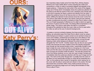
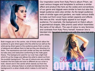
Our inspiration ideas mostly came from Katy Perry, Britney Spears,
Rihanna and Taylor Swifts album covers including the codes and
conventions in order to make a successful digipak that appeals to the
target audience. It features the main artist in the centre of the digipak ,
using rule of thirds which immediately draws the audiences attention to
the artist as she fills the centre of the cover, therefore rule of thirds with
a mid shot to express her figure, posture and identity from her style. It
makes the audience focus on her face as she is in the centre of rule of
thirds, fulfilling the element of star persona since the cover is all of her.
The colours used within the album are vibrant, bold and eye catching
but also complements the artist in similarity to Katy Perry’s album cover.
The us of bright typography if effective as it is able to stand out against
the choice of colours and the artist. The fading effect emphasises on the
whole image. The colours used within the album is consistent
throughout the website but also the music video as font is used within
the video as well as the use of colourful backgrounds.
It creates a common similarity between the three products. When
editing, we subverted away from Katy Perry’s album cover by using a
white background instead o a green screen as we wanted to keep out
cover more realistic, professional yet simple due to the effects on the
actual image and font styles with also the light trails running through.
Keeping a plain white background allowed the artist to stand out
alongside the ‘OUT ALIVE’. Another reason why we did not use a green
screen was because we were unable to have this specific equipment
even though we had several location shots, I personally thought it was
best to keep the cover simple as there is a lot going on in the music
video and the title colour and style will clearly inform the audience what
type of songs are included inside the album. This will also prevent the
cover from being clustered, as our main aim was to keep it simple and
immediately draw the audiences attention with the use if image and font
style. The name of the artist ‘Rouge Noir’ is smaller than the name of
the album as we intentionally thought our artist will be presented as a
‘Star’ so the audience feel a sense of recognition when seeing her on
the cover with the album name bold and vibrant in the centre. We had
discovered this convention within many media products during our
research and planning stage such as it being demonstrated on Katy
Perry’s album Prism.
Our inspiration came from Katy Perry’s album Prism, we
used various images and templates to achieve a similar
effect and product like hers as the codes and conventions
of our genre and digipak were similar to hers but also the
target audience were also similar. As the target audience
were of similar ages and genders, we made various drafts
to make out front cover have certain aspects and effects
like hers as this would highly appeal to our target
audience. For example, the background on Katy’s album
is geometrical shapes, little prisms used which resembles
the name of her album. The use of colour is very feminine
and contrasts from Katy Perry herself, however she is
blended into the prism background with the navy hair and
pink dress.
Both images are in the centre, rule of thirds which allow the
audience to give direct gaze onto the artist but as well as the
artist giving direct gaze to the audience gives them a sense
of pleasure and allows them to feel as they are directing it to
them. The expressions are both similar as they are dramatic
but also sexy and seductive conforming to the male gaze
theory. The background used for our over has a light trail
which lit up the image and allows the artist to stand out from
the purplish background. The use of colours are very similar,
however the font style and size is different as our cover is
bold, vibrant and in the centre which stands out from the
whole cover, whereas Katy’s is small and blended into the
background in a silver shade which makes it a bit hard to
see.
Our digipak’s inside cover uses a similar convention to Rihanna’s Album Loud as the image is stretched
throughout the digipak with a simple CD cover. By using long medium close up shot, it frames hr perfectly in the
centre of one of the double inside covers, drawing the audience into the artists beauty and voyeuristic feature,
creating a visual characteristic of the artist for the audience to indulge. This is a common feature of Pop genre to
allow the record labels to create a representation of the artist for the audience. A feature that works well artistically
and for the artist to connote a realism. This shot allows the audience to see the facial expression and features of
the artist. The colours used here are white and pink with the name ‘Rouge Noir’ in the same style and font used for
the front cover. The album name is not included on the CD, therefore the audience may not be aware of the album
name which could be an issue we might have to change. It has a baby pink rim around the circle which includes
the same colour throughout the digipak. Overall the CD has a simplistic mature yet bright style.

Question 1

  • 2.
    Our inspiration ideasmostly came from Katy Perry, Britney Spears, Rihanna and Taylor Swifts album covers including the codes and conventions in order to make a successful digipak that appeals to the target audience. It features the main artist in the centre of the digipak , using rule of thirds which immediately draws the audiences attention to the artist as she fills the centre of the cover, therefore rule of thirds with a mid shot to express her figure, posture and identity from her style. It makes the audience focus on her face as she is in the centre of rule of thirds, fulfilling the element of star persona since the cover is all of her. The colours used within the album are vibrant, bold and eye catching but also complements the artist in similarity to Katy Perry’s album cover. The us of bright typography if effective as it is able to stand out against the choice of colours and the artist. The fading effect emphasises on the whole image. The colours used within the album is consistent throughout the website but also the music video as font is used within the video as well as the use of colourful backgrounds. It creates a common similarity between the three products. When editing, we subverted away from Katy Perry’s album cover by using a white background instead o a green screen as we wanted to keep out cover more realistic, professional yet simple due to the effects on the actual image and font styles with also the light trails running through. Keeping a plain white background allowed the artist to stand out alongside the ‘OUT ALIVE’. Another reason why we did not use a green screen was because we were unable to have this specific equipment even though we had several location shots, I personally thought it was best to keep the cover simple as there is a lot going on in the music video and the title colour and style will clearly inform the audience what type of songs are included inside the album. This will also prevent the cover from being clustered, as our main aim was to keep it simple and immediately draw the audiences attention with the use if image and font style. The name of the artist ‘Rouge Noir’ is smaller than the name of the album as we intentionally thought our artist will be presented as a ‘Star’ so the audience feel a sense of recognition when seeing her on the cover with the album name bold and vibrant in the centre. We had discovered this convention within many media products during our research and planning stage such as it being demonstrated on Katy Perry’s album Prism.
  • 3.
    Our inspiration camefrom Katy Perry’s album Prism, we used various images and templates to achieve a similar effect and product like hers as the codes and conventions of our genre and digipak were similar to hers but also the target audience were also similar. As the target audience were of similar ages and genders, we made various drafts to make out front cover have certain aspects and effects like hers as this would highly appeal to our target audience. For example, the background on Katy’s album is geometrical shapes, little prisms used which resembles the name of her album. The use of colour is very feminine and contrasts from Katy Perry herself, however she is blended into the prism background with the navy hair and pink dress. Both images are in the centre, rule of thirds which allow the audience to give direct gaze onto the artist but as well as the artist giving direct gaze to the audience gives them a sense of pleasure and allows them to feel as they are directing it to them. The expressions are both similar as they are dramatic but also sexy and seductive conforming to the male gaze theory. The background used for our over has a light trail which lit up the image and allows the artist to stand out from the purplish background. The use of colours are very similar, however the font style and size is different as our cover is bold, vibrant and in the centre which stands out from the whole cover, whereas Katy’s is small and blended into the background in a silver shade which makes it a bit hard to see.
  • 4.
    Our digipak’s insidecover uses a similar convention to Rihanna’s Album Loud as the image is stretched throughout the digipak with a simple CD cover. By using long medium close up shot, it frames hr perfectly in the centre of one of the double inside covers, drawing the audience into the artists beauty and voyeuristic feature, creating a visual characteristic of the artist for the audience to indulge. This is a common feature of Pop genre to allow the record labels to create a representation of the artist for the audience. A feature that works well artistically and for the artist to connote a realism. This shot allows the audience to see the facial expression and features of the artist. The colours used here are white and pink with the name ‘Rouge Noir’ in the same style and font used for the front cover. The album name is not included on the CD, therefore the audience may not be aware of the album name which could be an issue we might have to change. It has a baby pink rim around the circle which includes the same colour throughout the digipak. Overall the CD has a simplistic mature yet bright style.