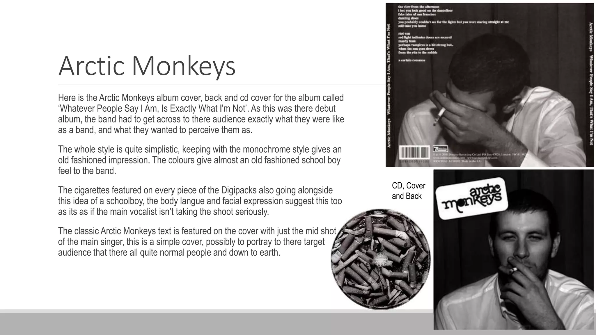
Analysis Of Digipacks
I HAVE ANALYSED DIFFERENT ARTISTS DIGIPACKS.
THE DIGIPACKS THAT I HAVE CHOSEN TO ANALYSE ARE MY INTENDED
STYLE THAT I PERSONALLY LIKE AND WOULD LIKE TO TAKE INSPIRATION
FROM WHEN CREATING MY OWN. THEY ARE QUITE SIMPLISTIC WITH
MONOCHROME COLOURS.
Arctic Monkeys
Here is the Arctic Monkeys album cover, back and cd cover for the album called
‘Whatever People Say I Am, Is Exactly What I'm Not’. As this was there debut
album, the band had to get across to there audience exactly what they were like
as a band, and what they wanted to perceive them as.
The whole style is quite simplistic, keeping with the monochrome style gives an
old fashioned impression. The colours give almost an old fashioned school boy
feel to the band.
The cigarettes featured on every piece of the Digipacks also going alongside
this idea of a schoolboy, the body langue and facial expression suggest this too
as its as if the main vocalist isn’t taking the shoot seriously.
The classic Arctic Monkeys text is featured on the cover with just the mid shot
of the main singer, this is a simple cover, possibly to portray to there target
audience that there all quite normal people and down to earth.
CD, Cover
and Back
The Weeknd
Here is the album artwork for The Weeknd with his album ‘Trilogy’. The front and back covers
of the album are all blacked out and very simplistic portraying quite a relaxed but yet
professional look for the album. The whole blacked out idea really revolves around the type of
music this musician produces which is about being zoned out, and being in almost a drug
influenced mood. The bold white colour of the font also reflects how this artist likes to be bold
within himself and also the lyrics within his music.
As you can see on the back of the album cover you can see a time span being displayed, by
putting the time span in which he wrote and produced this music gives that extra little bit of
information out there which will bring his fans closer.
The whole of the Digipacks revolves around the same
black and white theme, n my opinion I think that this looks
extremely profession and is a personal favourite of mine
to use minimalistic colours and type of style.
This particular album cover has inspired me to my own
taste, I know already that I like this type of colouring and
style but it has showed me how to present it and lay it out
too really look professional.
The Kooks
Here is the album artwork for The Kooks with Shine On. As this is now the third Digipacks that I
have analysed you can start to see the type of style that I like and enjoy. Similar to the other
this one is also monochrome, and also very minimalistic. They have a house font and colour
throughout the pack, black and white with quite a chunky bold font for the main headings and a
smaller, much neater font for all of the relevant information.
The main focus artwork on the cover of this album is very interesting, there's a main image that
has been split up inter squares, this then fades out toward the edges, there are also different
photographs within the image, I feel as if this is a very good way of making a simplistic album
cover that bit more exciting, I would like to design something like this for mine, simplistic with
the monochrome however have a more stylish complicated element.
The back is the same, even more simplistic with the whole of it being black, apart from the top
left had corner which displays all of the relevant information.

Analysis of digipack

  • 1.
    Analysis Of Digipacks IHAVE ANALYSED DIFFERENT ARTISTS DIGIPACKS.
  • 2.
    THE DIGIPACKS THATI HAVE CHOSEN TO ANALYSE ARE MY INTENDED STYLE THAT I PERSONALLY LIKE AND WOULD LIKE TO TAKE INSPIRATION FROM WHEN CREATING MY OWN. THEY ARE QUITE SIMPLISTIC WITH MONOCHROME COLOURS.
  • 3.
    Arctic Monkeys Here isthe Arctic Monkeys album cover, back and cd cover for the album called ‘Whatever People Say I Am, Is Exactly What I'm Not’. As this was there debut album, the band had to get across to there audience exactly what they were like as a band, and what they wanted to perceive them as. The whole style is quite simplistic, keeping with the monochrome style gives an old fashioned impression. The colours give almost an old fashioned school boy feel to the band. The cigarettes featured on every piece of the Digipacks also going alongside this idea of a schoolboy, the body langue and facial expression suggest this too as its as if the main vocalist isn’t taking the shoot seriously. The classic Arctic Monkeys text is featured on the cover with just the mid shot of the main singer, this is a simple cover, possibly to portray to there target audience that there all quite normal people and down to earth. CD, Cover and Back
  • 4.
    The Weeknd Here isthe album artwork for The Weeknd with his album ‘Trilogy’. The front and back covers of the album are all blacked out and very simplistic portraying quite a relaxed but yet professional look for the album. The whole blacked out idea really revolves around the type of music this musician produces which is about being zoned out, and being in almost a drug influenced mood. The bold white colour of the font also reflects how this artist likes to be bold within himself and also the lyrics within his music. As you can see on the back of the album cover you can see a time span being displayed, by putting the time span in which he wrote and produced this music gives that extra little bit of information out there which will bring his fans closer. The whole of the Digipacks revolves around the same black and white theme, n my opinion I think that this looks extremely profession and is a personal favourite of mine to use minimalistic colours and type of style. This particular album cover has inspired me to my own taste, I know already that I like this type of colouring and style but it has showed me how to present it and lay it out too really look professional.
  • 5.
    The Kooks Here isthe album artwork for The Kooks with Shine On. As this is now the third Digipacks that I have analysed you can start to see the type of style that I like and enjoy. Similar to the other this one is also monochrome, and also very minimalistic. They have a house font and colour throughout the pack, black and white with quite a chunky bold font for the main headings and a smaller, much neater font for all of the relevant information. The main focus artwork on the cover of this album is very interesting, there's a main image that has been split up inter squares, this then fades out toward the edges, there are also different photographs within the image, I feel as if this is a very good way of making a simplistic album cover that bit more exciting, I would like to design something like this for mine, simplistic with the monochrome however have a more stylish complicated element. The back is the same, even more simplistic with the whole of it being black, apart from the top left had corner which displays all of the relevant information.