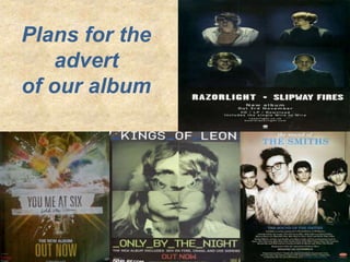
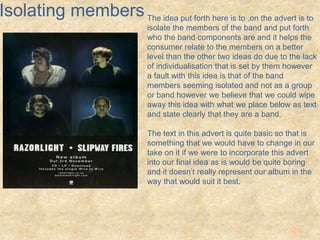
Plans for the 
advert 
of our album
Colourful and 
attractive 
One of the initial ideas it to not feature the band on 
the advert and instead try and make it as visually 
striking to the audience using colour and images 
such as the example to the left which is for ‘You Me 
At Six’ which features many bright and luminous 
colours and will stand out from other adverts that 
they would compete with in stores and on the Bright 
colours however may represent quite positive and 
bright emotions which are not really present in the 
song that is used for our project so we have to be 
careful when considering what colours and how we 
are mixing them to create our advert. 
We also have to make sure that the font 
differentiates from the colours used in the 
background as can be seen in this advert where 
there is a white background then hollows text to bring 
forth the background as the actual font however it 
can clearly be read and we could incorporate this 
idea in our advert.
Mixing images 
creates main 
cover 
Another idea is to possibly take images of things 
relating to the band not necessarily the band 
members themselves and creating an image 
that is interesting and that would stick in the 
minds of people who see, for example the 
image to the left that has the four members of 
Kings Of Leon and mixes them to create an 
eagle and this shall possibly stick in the mind of 
many of the people who see this. 
However we would have to make sure that the 
image created would appeal to our target 
audience with the song we are using, for 
example it would be useless binding several 
images to create say a unicorn or Tinkerbelle as 
it would just not appeal to the audience and 
would be worthless if not a hindrance to 
showing and representing our song. 
Also with this idea it would possibly be a good 
idea like seen on the example to keep all of the 
text the same colour except the main text that 
we need the audience to take in such as the 
album being ‘out now’.
Isolating members The idea put forth here is to ,on the advert is to 
isolate the members of the band and put forth 
who the band components are and it helps the 
consumer relate to the members on a better 
level than the other two ideas do due to the lack 
of individualisation that is set by them however 
a fault with this idea is that of the band 
members seeming isolated and not as a group 
or band however we believe that we could wipe 
away this idea with what we place below as text 
and state clearly that they are a band. 
The text in this advert is quite basic so that is 
something that we would have to change in our 
take on it if we were to incorporate this advert 
into our final idea as is would be quite boring 
and it doesn’t really represent our album in the 
way that would suit it best.
As a 
group 
This idea puts the band members all together as the 
main focus of the advert showing who the band is and 
that they are all part of what creates the music they 
produce however there are signs of a hierarchy in this 
band due to the main singer shown at the front and 
more into the camera that the person on his left 
shoulder who is at the back and can be seen to be 
somewhat less important due to his positioning. 
The colourless cover also gives a certain feel to the 
advert that makes it feel modern and artistic and adds 
a certain professional tone to the cover. The lead 
singer being placed in front of the rest of the band 
could help us apply Andrew Goodwin’s theory of star 
image and help our band put forth a person that the 
audience could relate to the band. 
We could change certain things within the advert to 
add specific changes to the expected look of our 
advert when representing our genre this would help 
apply David Buckingham’s theory of genre constantly 
changing however we wouldn’t want to change it 
enough as to change the look drastically or to possible 
look like we are trying to apply our product to another
All Ideas 
All ideas put forth ideas that could work 
when we create our Advert for our music 
video and I believe the one that my group 
and I find the most visually attractive and 
fitting for our band would be the first initial 
idea of a artwork for the advert and not 
featuring the band on the advert as to show 
it is about the music and not the band and 
artists who make it.

Advert Ideas

  • 1.
    Plans for the advert of our album
  • 2.
    Colourful and attractive One of the initial ideas it to not feature the band on the advert and instead try and make it as visually striking to the audience using colour and images such as the example to the left which is for ‘You Me At Six’ which features many bright and luminous colours and will stand out from other adverts that they would compete with in stores and on the Bright colours however may represent quite positive and bright emotions which are not really present in the song that is used for our project so we have to be careful when considering what colours and how we are mixing them to create our advert. We also have to make sure that the font differentiates from the colours used in the background as can be seen in this advert where there is a white background then hollows text to bring forth the background as the actual font however it can clearly be read and we could incorporate this idea in our advert.
  • 3.
    Mixing images createsmain cover Another idea is to possibly take images of things relating to the band not necessarily the band members themselves and creating an image that is interesting and that would stick in the minds of people who see, for example the image to the left that has the four members of Kings Of Leon and mixes them to create an eagle and this shall possibly stick in the mind of many of the people who see this. However we would have to make sure that the image created would appeal to our target audience with the song we are using, for example it would be useless binding several images to create say a unicorn or Tinkerbelle as it would just not appeal to the audience and would be worthless if not a hindrance to showing and representing our song. Also with this idea it would possibly be a good idea like seen on the example to keep all of the text the same colour except the main text that we need the audience to take in such as the album being ‘out now’.
  • 4.
    Isolating members Theidea put forth here is to ,on the advert is to isolate the members of the band and put forth who the band components are and it helps the consumer relate to the members on a better level than the other two ideas do due to the lack of individualisation that is set by them however a fault with this idea is that of the band members seeming isolated and not as a group or band however we believe that we could wipe away this idea with what we place below as text and state clearly that they are a band. The text in this advert is quite basic so that is something that we would have to change in our take on it if we were to incorporate this advert into our final idea as is would be quite boring and it doesn’t really represent our album in the way that would suit it best.
  • 5.
    As a group This idea puts the band members all together as the main focus of the advert showing who the band is and that they are all part of what creates the music they produce however there are signs of a hierarchy in this band due to the main singer shown at the front and more into the camera that the person on his left shoulder who is at the back and can be seen to be somewhat less important due to his positioning. The colourless cover also gives a certain feel to the advert that makes it feel modern and artistic and adds a certain professional tone to the cover. The lead singer being placed in front of the rest of the band could help us apply Andrew Goodwin’s theory of star image and help our band put forth a person that the audience could relate to the band. We could change certain things within the advert to add specific changes to the expected look of our advert when representing our genre this would help apply David Buckingham’s theory of genre constantly changing however we wouldn’t want to change it enough as to change the look drastically or to possible look like we are trying to apply our product to another
  • 6.
    All Ideas Allideas put forth ideas that could work when we create our Advert for our music video and I believe the one that my group and I find the most visually attractive and fitting for our band would be the first initial idea of a artwork for the advert and not featuring the band on the advert as to show it is about the music and not the band and artists who make it.