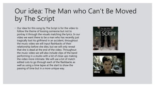
The document proposes ideas for a music video, album, and digipak for a fictional band.
For the music video, it suggests following a man who has recently lost his girlfriend in an accident, showing flashbacks of their relationship through the song.
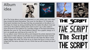
For the album, it recommends taking artistic elements from The Script's album covers but making the band name larger.
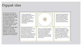
For the digipak, it outlines using images of the band on the front and back with information about the songs, band members, and background on the inside panels.


![Magazine research really official [recovered]](https://cdn.slidesharecdn.com/ss_thumbnails/magazine-research-really-official-recovered-160211094822-thumbnail.jpg?width=640&height=640&fit=bounds)


