Evaluation

Q#2. HOW EFFECTIVE IS THE COMBINATION OF YOUR MEDIA PRODUCT AND
ANCILLARY TASK?
For this media project, I produced three products: promo music video, the dvd
cover (i.e. supposed to be a part of the digipak) and the magazine advert. The two
ancillary tasks were produced for the promotion of the main media product, which
is the music video. These three, needed to be designed in such an integrated way,
that their outlook would convey the feel of a “house style image”. This is the most
essential step of the process of marketing (to attract a major group of people,
especially the target audience)!

In order to do that, one needs to focus on the elements of each product with a
great level of alertness. As I wanted, to develop that specific required image and
wanted to convey that idea that the products from “Z.B Production House” follow a
specific theme and promote a particular genre, I tried to form a link between my
three products, which not only was a representation of the pop genre, but was also
beneficial for the advertising purpose. My research work on the codes and
conventions of pop genre, from different cultures proved to be extremely helpful.
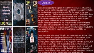
Digipak
This is the digipak for the promotion of my music video. I have tried
my level best to make it a proper representation of pop genre, that is
the most praised genre among people. As, the video of my song
covers a love story (falls under the romance genre), I’ve tried to show
it through the digipak as well. You can notice, that on the front cover
of the digipak I’ve put the pictures of the actors in heart shaped
designs, which conveys the main theme of the music
album, however, I did not use red colour, besides the fact that the
release date which I chose for my music album was 14th February
(Valentine’s day) and red colour is usually linked with this day, but the
only reason behind this was that, I thought that would be too
stereotypical.
Then, one more interesting thing is the colour contrast. Purple, blue
and pink shades are highlighted in my products and this was done
purposely; in order to create a link between my products. For
example, the background colour of my magazine advert is purple, but
the actress is wearing a pink dress in that picture, therefore, the
inside covers, in fact the whole digipak has some shades of pink and
purple, even the text written on the digipack has that pink purple
element there. Maybe those shades are not that prominent, but they
help in creating an effect, which is forming a link with the
“ Find My Way”
Love is destined to
people…
main product, as the actress of my music video is wearing
a purple dress in the main scenes of the video, then in
some other scenes as well, she’s wearing different shades
of purple, this is a kind of link which the females will find
really interesting, and because of the increasing
popularity of these colours among males and most
significantly, because the effect which this combination
created, people will be able to relate all three products
with each other.
Then, through the pictures of musical instruments, such
as the guitar (on the back cover of the digipak) and
through romantic quotes (which are on the inside
cover), through the establishing line “Love is destined to
people..”, people will be able to identify its
genre, because songs falling under the metal or punk
category mostly do not have a romantic narrative and
other features relating to it. Then, most of the pictures
which I’ve given in the digipak are taken from that original
music video; then, the main picture of the magazine
advert is also an iconic scene of my music video. I did
this, so the audience will be able to notice a specific
link, and therefore, these ancillary products will work as a
reminder to the audience, of the music video
My research work which I conducted on different
magazine covers, adverts and digipaks from the
pop genre was really beneficial, I learnt different
techniques, such as how to use some iconic
scenes from the video in your other ancillary
tasks to form a relation, Ketty Perry’s “Part of
Me” front cover, Justin Bieber’s “Believe
Acoustic” front cover and Celine Dion’s advert of
the song “My Heart Will Go On” are good
examples, which I’ve mentioned in my research
work as well. I was inspired by the video song
“Beintaha” from the movie “Race 2”, therefore, I
applied that concept to my products as well;
where the singer is singing a romantic song and
the actors are conveying the story, the idea which
is obvious from my digipak as well. For the
pictures, which are inside the digipak, that
picture (taken from the music video), which I
have used in my magazine advertisement for the
promotion purpose and those picture that are on
Magazine
Advert
the cover of the digipak are a good combination of long
shots, close ups and mid-close ups, however, on the
front cover I’ve mainly put two close up pictures of the
actors and one highlighted mid close up of the singer, as
this technique is mostly followed.
In order to produce a good link between the products, I
have not only focused on major things, such as the main
cover photos, but I’ve also taken into consideration all
those small things, which are individually, might not that
prominent, but help in creating an obvious and visible
effect. For example, the picture of my actors in the
magazine advert is in a heart shaped design, and in my
music video there is a close up scene of a heart shaped
decoration piece which is swaying in the air. Then, there
is a picture of music notes on my magazine advert and
on my dvd front cover as well, then the Valentine’s date
14th Feb and romantic quotes are helping in the
promotion of the main product, which is a romantic
music video. Moreover, the logo “Z.B Productions”
contributes to this link formation thing a lot. Then, the
font used in my magazine advert and
the font used in my music video for the credits is the
same “Calibri”.
I have used several marketing elements to generate
interest among the audience. The magazine advert and
the digipak of the music album successfully convince the
audience that a love story in the form of a romantic pop
music video is coming and contain the standard
elements that are used to sell the idea of a film to the
target audience. Then, the main images (especially the
one used in the magazine advert) echo some significant
scenes, which are present in the video. Moreover, the
pictures of the actors (as they are teenagers) are a good
attraction. Most importantly, the release date 14th
February (Valentine’s Day) works as a unique selling
point, while forming a link to the main product.
Therefore, I think that I nicely and elegantly managed to
produce an effective combination between my media
product and the ancillary tasks.
Thanks

Evaluation (Question#2)

  • 1.
    Evaluation Q#2. HOW EFFECTIVEIS THE COMBINATION OF YOUR MEDIA PRODUCT AND ANCILLARY TASK?
  • 2.
    For this mediaproject, I produced three products: promo music video, the dvd cover (i.e. supposed to be a part of the digipak) and the magazine advert. The two ancillary tasks were produced for the promotion of the main media product, which is the music video. These three, needed to be designed in such an integrated way, that their outlook would convey the feel of a “house style image”. This is the most essential step of the process of marketing (to attract a major group of people, especially the target audience)! In order to do that, one needs to focus on the elements of each product with a great level of alertness. As I wanted, to develop that specific required image and wanted to convey that idea that the products from “Z.B Production House” follow a specific theme and promote a particular genre, I tried to form a link between my three products, which not only was a representation of the pop genre, but was also beneficial for the advertising purpose. My research work on the codes and conventions of pop genre, from different cultures proved to be extremely helpful.
  • 3.
    Digipak This is thedigipak for the promotion of my music video. I have tried my level best to make it a proper representation of pop genre, that is the most praised genre among people. As, the video of my song covers a love story (falls under the romance genre), I’ve tried to show it through the digipak as well. You can notice, that on the front cover of the digipak I’ve put the pictures of the actors in heart shaped designs, which conveys the main theme of the music album, however, I did not use red colour, besides the fact that the release date which I chose for my music album was 14th February (Valentine’s day) and red colour is usually linked with this day, but the only reason behind this was that, I thought that would be too stereotypical. Then, one more interesting thing is the colour contrast. Purple, blue and pink shades are highlighted in my products and this was done purposely; in order to create a link between my products. For example, the background colour of my magazine advert is purple, but the actress is wearing a pink dress in that picture, therefore, the inside covers, in fact the whole digipak has some shades of pink and purple, even the text written on the digipack has that pink purple element there. Maybe those shades are not that prominent, but they help in creating an effect, which is forming a link with the
  • 4.
    “ Find MyWay” Love is destined to people…
  • 5.
    main product, asthe actress of my music video is wearing a purple dress in the main scenes of the video, then in some other scenes as well, she’s wearing different shades of purple, this is a kind of link which the females will find really interesting, and because of the increasing popularity of these colours among males and most significantly, because the effect which this combination created, people will be able to relate all three products with each other. Then, through the pictures of musical instruments, such as the guitar (on the back cover of the digipak) and through romantic quotes (which are on the inside cover), through the establishing line “Love is destined to people..”, people will be able to identify its genre, because songs falling under the metal or punk category mostly do not have a romantic narrative and other features relating to it. Then, most of the pictures which I’ve given in the digipak are taken from that original music video; then, the main picture of the magazine advert is also an iconic scene of my music video. I did this, so the audience will be able to notice a specific link, and therefore, these ancillary products will work as a reminder to the audience, of the music video
  • 6.
    My research workwhich I conducted on different magazine covers, adverts and digipaks from the pop genre was really beneficial, I learnt different techniques, such as how to use some iconic scenes from the video in your other ancillary tasks to form a relation, Ketty Perry’s “Part of Me” front cover, Justin Bieber’s “Believe Acoustic” front cover and Celine Dion’s advert of the song “My Heart Will Go On” are good examples, which I’ve mentioned in my research work as well. I was inspired by the video song “Beintaha” from the movie “Race 2”, therefore, I applied that concept to my products as well; where the singer is singing a romantic song and the actors are conveying the story, the idea which is obvious from my digipak as well. For the pictures, which are inside the digipak, that picture (taken from the music video), which I have used in my magazine advertisement for the promotion purpose and those picture that are on
  • 8.
    Magazine Advert the cover ofthe digipak are a good combination of long shots, close ups and mid-close ups, however, on the front cover I’ve mainly put two close up pictures of the actors and one highlighted mid close up of the singer, as this technique is mostly followed. In order to produce a good link between the products, I have not only focused on major things, such as the main cover photos, but I’ve also taken into consideration all those small things, which are individually, might not that prominent, but help in creating an obvious and visible effect. For example, the picture of my actors in the magazine advert is in a heart shaped design, and in my music video there is a close up scene of a heart shaped decoration piece which is swaying in the air. Then, there is a picture of music notes on my magazine advert and on my dvd front cover as well, then the Valentine’s date 14th Feb and romantic quotes are helping in the promotion of the main product, which is a romantic music video. Moreover, the logo “Z.B Productions” contributes to this link formation thing a lot. Then, the font used in my magazine advert and
  • 9.
    the font usedin my music video for the credits is the same “Calibri”. I have used several marketing elements to generate interest among the audience. The magazine advert and the digipak of the music album successfully convince the audience that a love story in the form of a romantic pop music video is coming and contain the standard elements that are used to sell the idea of a film to the target audience. Then, the main images (especially the one used in the magazine advert) echo some significant scenes, which are present in the video. Moreover, the pictures of the actors (as they are teenagers) are a good attraction. Most importantly, the release date 14th February (Valentine’s Day) works as a unique selling point, while forming a link to the main product. Therefore, I think that I nicely and elegantly managed to produce an effective combination between my media product and the ancillary tasks.
  • 10.