Downloaded 177 times


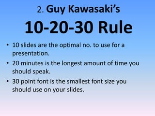


This document outlines 8 elements of a good presentation: 1) Stick to 3-4 main points and elaborate on them to avoid too much information. 2) Follow Guy Kawasaki's "10-20-30 rule" of 10 slides, 20 minutes speaking, and 30 point font minimum. 3) Choose a design template that is appropriate for your topic and audience. 4) Use good color contrast and keep text dark on a light background. 5) Use readable fonts in an appropriate size. 6) Include photos, charts and diagrams to emphasize key points. 7) Use consistent animations to avoid confusion. 8) Present slides in a logical order that flows well.


