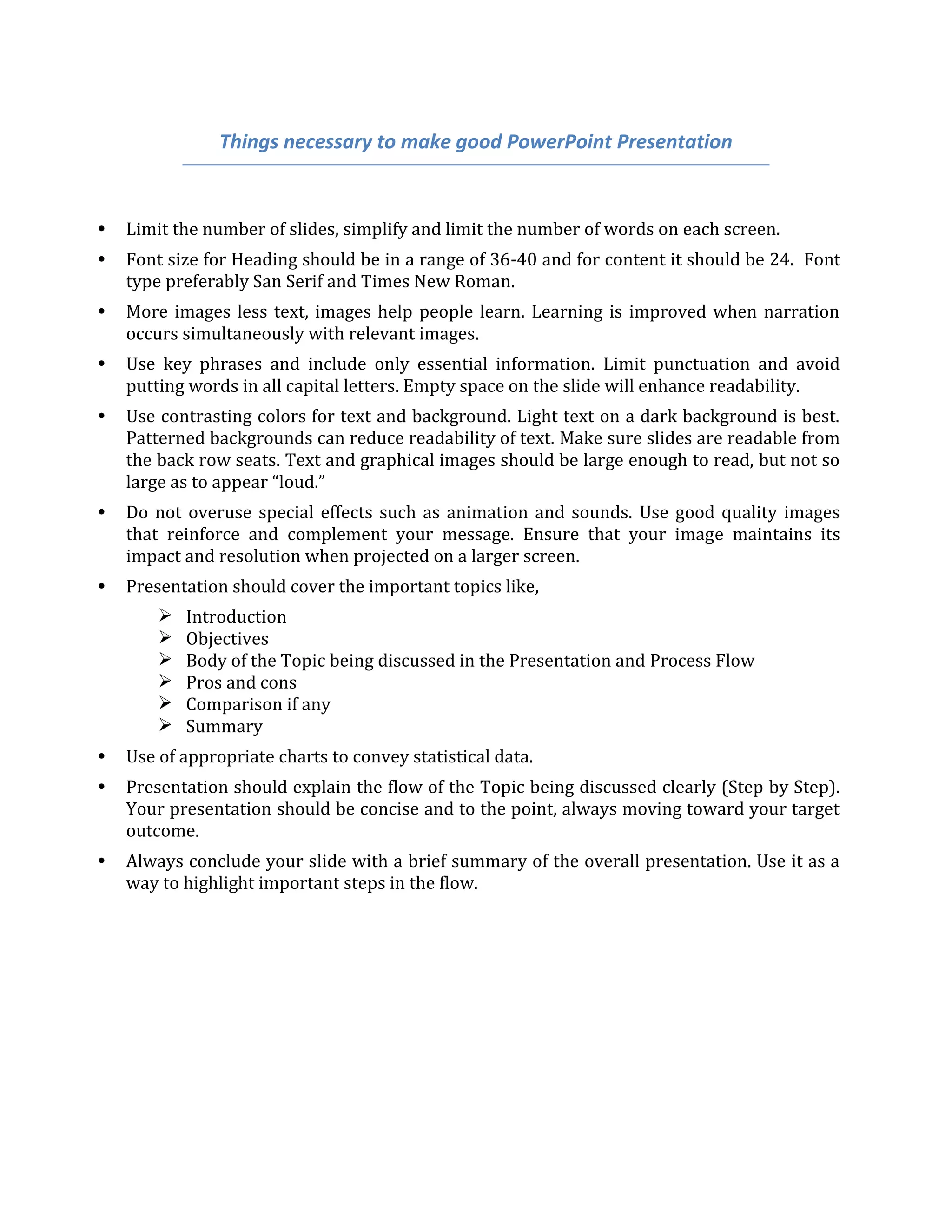
Things necessary to make good PowerPoint Presentation
 Limit the number of slides, simplify and limit the number of words on each screen.
 Font size for Heading should be in a range of 36-40 and for content it should be 24. Font
type preferably San Serif and Times New Roman.
 More images less text, images help people learn. Learning is improved when narration
occurs simultaneously with relevant images.
 Use key phrases and include only essential information. Limit punctuation and avoid
putting words in all capital letters. Empty space on the slide will enhance readability.
 Use contrasting colors for text and background. Light text on a dark background is best.
Patterned backgrounds can reduce readability of text. Make sure slides are readable from
the back row seats. Text and graphical images should be large enough to read, but not so
large as to appear “loud.”
 Do not overuse special effects such as animation and sounds. Use good quality images
that reinforce and complement your message. Ensure that your image maintains its
impact and resolution when projected on a larger screen.
 Presentation should cover the important topics like,
 Introduction
 Objectives
 Body of the Topic being discussed in the Presentation and Process Flow
 Pros and cons
 Comparison if any
 Summary
 Use of appropriate charts to convey statistical data.
 Presentation should explain the flow of the Topic being discussed clearly (Step by Step).
Your presentation should be concise and to the point, always moving toward your target
outcome.
 Always conclude your slide with a brief summary of the overall presentation. Use it as a
way to highlight important steps in the flow.
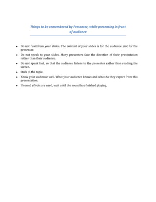
Things to be remembered by Presenter, while presenting in front
of audience
 Do not read from your slides. The content of your slides is for the audience, not for the
presenter.
 Do not speak to your slides. Many presenters face the direction of their presentation
rather than their audience.
 Do not speak fast, so that the audience listens to the presenter rather than reading the
screen.
 Stick to the topic.
 Know your audience well. What your audience knows and what do they expect from this
presentation.
 If sound effects are used, wait until the sound has finished playing.

Things necessary to make a good power point presentation

  • 1.
    Things necessary tomake good PowerPoint Presentation  Limit the number of slides, simplify and limit the number of words on each screen.  Font size for Heading should be in a range of 36-40 and for content it should be 24. Font type preferably San Serif and Times New Roman.  More images less text, images help people learn. Learning is improved when narration occurs simultaneously with relevant images.  Use key phrases and include only essential information. Limit punctuation and avoid putting words in all capital letters. Empty space on the slide will enhance readability.  Use contrasting colors for text and background. Light text on a dark background is best. Patterned backgrounds can reduce readability of text. Make sure slides are readable from the back row seats. Text and graphical images should be large enough to read, but not so large as to appear “loud.”  Do not overuse special effects such as animation and sounds. Use good quality images that reinforce and complement your message. Ensure that your image maintains its impact and resolution when projected on a larger screen.  Presentation should cover the important topics like,  Introduction  Objectives  Body of the Topic being discussed in the Presentation and Process Flow  Pros and cons  Comparison if any  Summary  Use of appropriate charts to convey statistical data.  Presentation should explain the flow of the Topic being discussed clearly (Step by Step). Your presentation should be concise and to the point, always moving toward your target outcome.  Always conclude your slide with a brief summary of the overall presentation. Use it as a way to highlight important steps in the flow.
  • 2.
    Things to beremembered by Presenter, while presenting in front of audience  Do not read from your slides. The content of your slides is for the audience, not for the presenter.  Do not speak to your slides. Many presenters face the direction of their presentation rather than their audience.  Do not speak fast, so that the audience listens to the presenter rather than reading the screen.  Stick to the topic.  Know your audience well. What your audience knows and what do they expect from this presentation.  If sound effects are used, wait until the sound has finished playing.