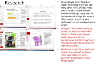
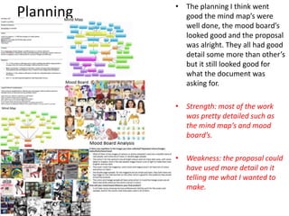
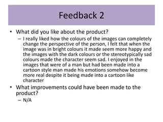
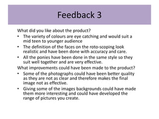
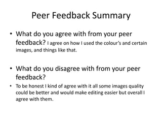
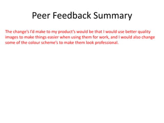
The document provides an evaluation of a production process. It discusses the student's research, planning, time management, technical and aesthetic qualities of their work, audience appeal, and peer feedback. For research, the student notes it was difficult due to lack of similar works but they obtained useful information from questionnaires and interviews. Planning included detailed mind maps and mood boards but the proposal could have been more detailed. Time management was good at first but the student fell behind towards the end. The technical and aesthetic qualities of the works were analyzed, and the student aimed to appeal to target audiences identified through research. Peer feedback was positive about colors and accuracy but suggested improvements like lighter skin tones and backgrounds. The student agreed with most feedback and would use higher
This is the evaluation for unit 3. The evaluation talks about the final steps which would be reviewing the product. The review for the product includes peer feedback, comparing existing products with my own and talking about how I could include some of the improvements for it.
Uma breve introdução sobre DevOps e algumas técnicas e ferramentas para ajudar a praticar DevOps em seu projeto e acelerar a sua entrega de software já! Nessa palestra serão abordadas algumas dicas sobre como captar oportunidades para praticar devOps em seu projeto bem como uma análise de caso de uso para ferramentas de automação de infra.
TDC 2016 - Garantindo a qualidade da sua infraestruturaFernanda Martins
Teste unitário não é só para software. É e deve ser utilizada para infraestrutura também. Nessa palestra aprenda como aplicar alguns dos conceitos da pirâmide de testes dentro da sua infraestrutura. Vamos mostrar como aplicar tecnologias para criar testes unitários e funcionais para chef.
How to Make a Field invisible in Odoo 17Celine George
It is possible to hide or invisible some fields in odoo. Commonly using “invisible” attribute in the field definition to invisible the fields. This slide will show how to make a field invisible in odoo 17.
How to Split Bills in the Odoo 17 POS ModuleCeline George
Bills have a main role in point of sale procedure. It will help to track sales, handling payments and giving receipts to customers. Bill splitting also has an important role in POS. For example, If some friends come together for dinner and if they want to divide the bill then it is possible by POS bill splitting. This slide will show how to split bills in odoo 17 POS.
The French Revolution, which began in 1789, was a period of radical social and political upheaval in France. It marked the decline of absolute monarchies, the rise of secular and democratic republics, and the eventual rise of Napoleon Bonaparte. This revolutionary period is crucial in understanding the transition from feudalism to modernity in Europe.
For more information, visit-www.vavaclasses.com
We all have good and bad thoughts from time to time and situation to situation. We are bombarded daily with spiraling thoughts(both negative and positive) creating all-consuming feel , making us difficult to manage with associated suffering. Good thoughts are like our Mob Signal (Positive thought) amidst noise(negative thought) in the atmosphere. Negative thoughts like noise outweigh positive thoughts. These thoughts often create unwanted confusion, trouble, stress and frustration in our mind as well as chaos in our physical world. Negative thoughts are also known as “distorted thinking”.
Instructions for Submissions thorugh G- Classroom.pptxJheel Barad
This presentation provides a briefing on how to upload submissions and documents in Google Classroom. It was prepared as part of an orientation for new Sainik School in-service teacher trainees. As a training officer, my goal is to ensure that you are comfortable and proficient with this essential tool for managing assignments and fostering student engagement.
3. Research • Research was pretty hard due
mostly to the fact there was not
many other works already made
similar to what I want to make
which made things really hard for
me to research things. But when I
did get what I wanted it went
pretty well not the best but it went
alright.
• Strength: i had a wide variety of
product’s I looked at and talked
about so I had a good Idea on
what I wanted to do, the
questionnaire and interview’s gave
me good answer’s to also help me
with the research.
• Weakness: I could have used more
product’s to research and some
more information on some
question’s I had asked to make
thing’s easier.
4. Planning • The planning I think went
good the mind map’s were
well done, the mood board’s
looked good and the proposal
was alright. They all had good
detail some more than other’s
but it still looked good for
what the document was
asking for.
• Strength: most of the work
was pretty detailed such as
the mind map’s and mood
board’s.
• Weakness: the proposal could
have used more detail on it
telling me what I wanted to
make.
5. Time Management
• I started off quiet well with time management I was one time I did everything I
need to but as it got closer to the end of the project I started to fall behind.
• With more time I would be able to get my work in on time instead of falling behind
like I have done and maybe if I did have spare time I could make something else to
go with what I already made.
• What product have you made that would have improved with more time? What
would you have done to improve it? With extra time I would have improved on the
colourisation image’s making them neater and more eye catching than rushed and
child like.
6. Technical Qualities
Both works look a lot alike the real
thing which isn’t easy to pull off.
Mine doesn’t use any fading like the
other work does.
Similarities: thy are both roto-scope’s
of real live people and are well
known, they both use real colour’s
like for the skin tone and the clothes.
Differences: one difference is that the
doctor one has some smooth edge’s
on it making it look blurred and out
of focus where as mine does not have
those smooth edge’s.
Which is better and why: I think mine
is better because of the sharp edge’s
and the detail make it look more
professional.
7. Aesthetic Qualities
I think my work look’s great it was creative, its what I wanted to make and it all turned out
good I don’t think I could improve anything on any of them I really do like how they all
turned out. Strengths: this image look’s
professional like with all the
detail that is in it with the
wrinkles and highlight’s and
outlines and the colour’s
look natural and real
instead of random colour’s
being thrown on it.
Weaknesses: I believe I
could have put a tiny bit of
more detail into it in things
like that hair skin and
shirt’s.
What you would do
differently/improve: again I
would add more detail into
it making it look real
8. Aesthetic Qualities Strengths: I like the colour’s
they stick to a theme that
was set along with the
effect’s and size’s of
image’s.
Weaknesses: I like hoe it
look’s but I think the images
could use some work
maybe with size or use
other images instead.
What you would do
differently/improve: I would
think more about the
image’s I’d use and see if I
could find any other’s that
could suit the theme.
9. Audience Appeal
This cover would appeal
to female’s and fan’s of
the games and company,
it has a lot of pink on it
showing its meant to be
aimed at females, and
for the fan’s it has many
of the character’s they
will know and love.
This image will appeal to
any fan’s of the king of
YouTube pewdepie or the
man himself.
This would appeal to the person in the
image, any kind of artist that deal with
this kind of art.
10. Audience Appeal
Go through questionnaire results and give examples about how you have done
what the audience wanted
For the colourisation I have appealed to the masses by
colour changing real people and the smaller audience with
non-real people and I have done the same thing with the
rotoscope but for both I have done more real people than
non-real.
12. Feedback 1
• What did you like about the product?
– What I like about this product is the colours that you have chosen through
each individual one and they all go perfectly together. I like the way you
have got the same theme going through the images that you have
changed. With the magazine you have set out all the images out well to be
spread out across the page and great text choices for this type of
magazine. I love all the my little ponies design's of how you have outlined
them.
• What improvements could have been made to
the product?
• What I think you should improve on is with the skin colour on the peoples face
I think they should be a lighter colour so then it wouldn't make the colours
seem more focused on the parts of the face.
13. Feedback 2
• What did you like about the product?
– I really liked how the colours of the images can completely
change the perspective of the person, I felt that when the
image was in bright colours it made seem more happy and
the images with the dark colours or the stereotypically sad
colours made the character seem sad. I enjoyed in the
images that were of a man but had been made into a
cartoon style man made his emotions somehow become
more real despite it being made into a cartoon like
character
• What improvements could have been made to the
product?
– N/A
14. Feedback 3
What did you like about the product?
• The variety of colours are eye catching and would suit a
mid teen to younger audience
• The definition of the faces on the roto-scoping look
realistic and have been done with accuracy and care.
• All the ponies have been done in the same style so they
suit well together and are very effective.
What improvements could have been made to the product?
• Some of the photographs could have been better quality
as they are not as clear and therefore makes the final
image not as effective.
• Giving some of the images backgrounds could have made
them more interesting and could have developed the
range of pictures you create.
15. Peer Feedback Summary
• What do you agree with from your peer
feedback? I agree on how I used the colour’s and certain
images, and things like that.
• What do you disagree with from your peer
feedback?
• To be honest I kind of agree with it all some images quality
could be better and would make editing easier but overall I
agree with them.
16. Peer Feedback Summary
The change’s I’d make to my product’s would be that I would use better quality
images to make things easier when using them for work, and I would also change
some of the colour scheme’s to make them look professional.
Editor's Notes
What were the strengths of your research? How did your research help your product?
What were the weaknesses of your research? What could you have done better/improve? What effect would this have had on your product?
What were the strengths of your planning? How did your planning help your product?
What were the weaknesses of your planning? What could you have done better/improve? What effect would this have had on your product?
Did you manage your time well? Did you complete your project on time or would your products have improved with additional time?
What would you have done if you had more time to produce your work?
Compare your work to similar existing products and discuss the similarities and differences
Put your final piece(s) in the centre of a page alongside an existing product
Use text boxes and arrows
Does your work look good? Was it creative? What aspects of your visuals do you like? What would you improve? How would you improve it?
Discuss the strengths and weaknesses
Put your final piece(s) in the centre of a page and analyse them
Use text boxes and arrows
Does your work look good? Was it creative? What aspects of your visuals do you like? What would you improve? How would you improve it?
Discuss the strengths and weaknesses
Put your final piece(s) in the centre of a page and analyse them
Use text boxes and arrows
How have you appealed to your target audience? What specific bits of content would appeal to your target audience.
Refer to your findings from your questionnaire.
Put your final piece(s) in the centre of a page and analyse them
Use text boxes and arrows
How have you appealed to your target audience? What specific bits of content would appeal to your target audience.
Refer to your findings from your questionnaire.
Put your final piece(s) in the centre of a page and analyse them
Use text boxes and arrows
What changes would you make to your product based upon your peer feedback and why?