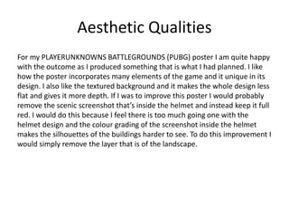
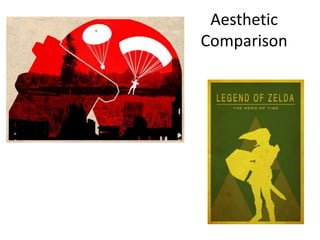
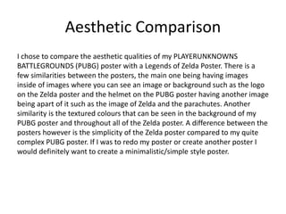
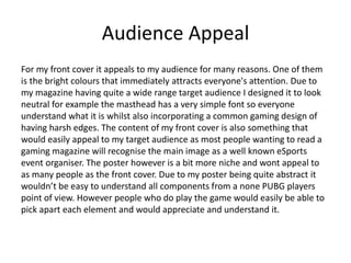
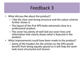
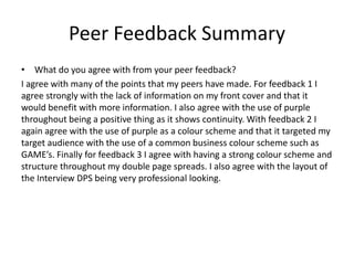
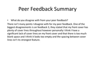
Evaluation
Your name
Production Process Evaluation
Research
• Strengths –
One of the strengths of my research was investigating existing products. By
looking at past products that were already successful I could take inspiration
as well as change the product so it suited my content and needs. For example
looking at the poster design I really liked the colour scheme and the low
opacity overlays so I used them in my poster however I changed the idea
enough to create an original idea. Another strength of my research was my
survey which I conducted amongst the class. By creating a survey and
recording all the information I could easily see what people would want to
see in my magazine and how they would like this information shown. One of
the most helpful things I asked on my survey was the cost people would pay
for a magazine as well as what sections people would like to read.
Research
• Weaknesses –
One of the weaknesses of my research was the techniques research I did. This
was mainly because I focused on very broad techniques as well as techniques
I didn’t even use. For example with research techniques on the interview I
didn’t really focus on anything specific I just research how to do an interview
however this covers a lot of aspects without focusing on anything I might use
myself. Due to my technique using any general interview it doesn’t really
relate to gaming and therefor it wasn’t as helpful as it could have been. What
I should have researched was more the type of questions and how to ask
them to get the most out of the interview. By doing this it would have most
likely lead to a higher quality interview. As for researching techniques I did
not use, this related to the logo. By not actually creating a logo in my
production this feels like a bit of a wasted technique research however it did
benefit me in aspects such as looking at colour schemes and other areas of
design
Planning
• Strengths –
One of the strengths of my planning was creating a detailed schedule. By
creating this schedule it allowed me to have a goal each week and broke up
this project very nicely. Due to splitting this project into specific areas such as
giving a set week to producing my front cover it meant I had a main focus for
that week and allowed a better quality product as I don’t have to split my
time between several projects. Another strength of my planning was the style
sheet I created in order to get an idea of colours to use in my product. By
creating this style sheet it meant when it came to actually creating my
products I already had an idea of the colours I wanted to use and which
colours worked best together. This helped a lot when it came to picking
images for my products as I knew what colours they would either have to
match with or contrast against.
Planning
• Weaknesses –
One of the weaknesses of my planning was my flat plans for both the front
page and the double page spread. I created 2 flat plans for my front cover and
1 for my double page spread and I didn’t use any of them to help with the
actual creation of my products. If I was to use my flat plans I could have
possibly produced a better look front cover and DPS however there is no way
of knowing that for sure. Another weakness of my planning was the lack
detail with the front cover font. I just made a selection of fonts and didn’t
explore how the colours would look with the font or which colours looked
best. If I did this it would have saved time on my production.
Time Management
Personally I think I could have managed my time a lot better during this
project. I found that due to underestimating how long my production would
take I have left little time to do any improvements. To prevent this from
happening in any further projects I will make a full hour by hour Gannt chart
and be more realistic with how long each task would take and be more strict
with sticking to the schedule. If I had more time for my production I would
have most likely created a logo for my magazine company in Adobe Illustrator.
By doing this I would have been able to add it into my already produced work
to be treated as a watermark. Also with more time I would have most likely
improved my front cover by adding more detail to it and making it less
simplified.
Technical Qualities
Technical Qualities
I chose to compare my magazine front cover with one from one of the largest
magazine companies, PC Gamer. One of the similarities of the front covers is
the layout. Both front covers follow the very widely used, masthead at the top
with the main image in the centre. To further the similarities of the layout
both magazines have a cover line above the masthead as well as a news puff
in the corner relating to something else included in the magazine. The
continuation of colour scheme throughout the front cover is also something
both have in common. The differences of both front covers however is that
lack of side stories on my front cover, it has a lot of blank space whereas the
PC Gamer front cover is covered with at least 5 side stories 2 puffs.
Technical Qualities
Technical Qualities
I chose to compare my double page spreads with a gaming double page
spread as well as a lifestyle interview double page spread. There a quite a few
similarities between all the double page spreads. One of the main similarities
is the continuation of a colour scheme throughout the DPS. For example on
the Dolly Parton interview all of the accents and highlights are in red which is
the same with my DPS in which all of the accents are purple. This is good as
everything flows and brings everything together. Another similarity is the
layout of my Major DPS and the Dolly Parton DPS where there is a page
dedicated to the text and the other is for an image. This is common with
double page spreads as it gives each page a separate focus however both
have a link. The differences of the double page spreads is the amount of
splash quotes and side mentions that are on the gaming DPS and the Dolly
Parton DPS. Another difference is the infographic that is on my CS:GO DPS.
This is something that isn’t extremely common on double page spreads.
Technical Qualities
Technical Qualities
I chose to compare my PLAYERUNKNOWNS BATTLEGROUNDS (PUBG) with a
Bioshock poster. There is a lot of similarities between these posters as this
was some of the inspiration for my own poster. The most noticeable similarity
is the layering of each part of the image how there is images inside of images.
The use of a skyline is also something that is very similar between both
posters. The differences of each poster however is that the Bioshock is a lot
simpler than my poster. This is because in the Bioshock they use only
silhouettes with block colours whereas my poster has a background that is a
screenshot straight out of the game with the colours drowned out.
Aesthetic
Qualities
Aesthetic Qualities
I am quite happy with the outcome of my front cover, I think all the colours
work well together and nothing is out of place. I also like the bottom headline
how it curves around which is quite unique in a front cover where it is
normally straight lines and blocks. If I was to improve my work I would
definitely add more to it such as more headlines and story lines that could go
along the side of the front cover. This is because right now it feels very simple
and there isn’t enough going on. This isn’t good as people buying the
magazine will want to know why its worth buying and if there isn’t a lot of
stories they may not buy it. To make this improvement I would simply fill the
blank space with either puffs containing information about a specific page or
just text going along the side of the front cover.
Aesthetic
Comparison
Aesthetic Comparison
I chose to compare the aesthetic qualities of my piece with a front cover from
the magazine company GamesTM. As shown by the side by side comparison
of the front covers they both have notable similarities. One of the main
similarities is the masthead that is at the top of the front cover. This is a
common thing to see on magazines and is somewhat expected. Another
similarity is the main centre piece image. For mine it is the FaceIt logo
whereas on GamesTM it is a Destiny image with the main focus being on the
title of the game. The differences however of the 2 front covers is the way of
showing other headlines and cover stories. On my front cover I do it through
headers and footers as well as puffs on the side of the page whereas
GamesTM goes for very passive side stories by just having some text coming
off the main image.
Aesthetic Qualities
Aesthetic Qualities
For my CS:GO Major double page spread I am again quite happy with the
outcome of the overall piece. It follows quite a common layout with a page
dedicated to images and a page dedicated to text. One of the things I like
most about this DPS is the infographic that is something quite unique in
magazines, along with the infographic I like that the colour used for the
background is the same as one of the prominent colours in the image. If I was
to make any improvements to this DPS I would want to add more images to
the left side as it doesn’t show that much about the article. To do this I would
fade the bottom of the left page where there is quite a bit of dead space and
add 2 more images relating to the article.
Aesthetic
Comparison
Aesthetic Comparison
I chose to compare the aesthetic qualities of my double page spread with a
double page spread from the magazine company Game UK. There isn’t many
similarities between the 2 double page spreads. This is because my design is
not the most common design in that double page spreads more than likely
have more than 1 image. With that said both double page spreads each have
a section that is related to the main article however is separated in some way.
In both of the double page spreads this is by having the background box a
different colour to the background of the rest of the article. Another
difference with the 2 double page spreads is the use of text wrapping images
which can be seen in the Game UK double page spread.
Aesthetic Qualities
Aesthetic Qualities
For my Interview double page spread I am very happy with the finished
product. Out of all the pieces I did for my FMP this is the one I am most proud
of. The reason for this is everything is my own work and has a full interview
that I conducted in it. All of the pictures are my own and the interview
questions were written by me and also conducted by me. The main thing I like
about this product is the unique layout as well as the continuing colour
scheme that runs throughout the DPS. If I was to improve anything for this
double page spread it would be to try add more images. To do this whilst also
keeping the same amount of text I would have to reduce the text size. I want
to keep the same amount of text as this was what I designed my whole piece
around. Due to the person I interviewed being so enthusiastic and had a lot of
knowledge on the topic which is why I want to keep all the text. I would also
add the images in the middle of the text using the text wrap tool that is in
InDesign.
Aesthetic
Comparison
Aesthetic Comparison
I chose to compare the aesthetic qualities of my double page spread with a
double page spread from the magazine company PC Gamer. There is quite a
few similarities with these 2 double page spreads, one of them is coloured
background on specific areas of the text, showing the continuity of a colour
scheme throughout the pages. Another similarity is the use of lots of images
and having a main image plus multiple supporting images. One of the
differences between the 2 double page spreads however, is at the bottom of
PC Gamers double page spread there is an extra section relating to the main
article however it is less informative than the other sections. I like this style of
giving information where you have the main article and then extra bits of
information off to the side or bottom.
Aesthetic Qualities
Aesthetic Qualities
For my PLAYERUNKNOWNS BATTLEGROUNDS (PUBG) poster I am quite happy
with the outcome as I produced something that is what I had planned. I like
how the poster incorporates many elements of the game and it unique in its
design. I also like the textured background and it makes the whole design less
flat and gives it more depth. If I was to improve this poster I would probably
remove the scenic screenshot that’s inside the helmet and instead keep it full
red. I would do this because I feel there is too much going one with the
helmet design and the colour grading of the screenshot inside the helmet
makes the silhouettes of the buildings harder to see. To do this improvement I
would simply remove the layer that is of the landscape.
Aesthetic
Comparison
Aesthetic Comparison
I chose to compare the aesthetic qualities of my PLAYERUNKNOWNS
BATTLEGROUNDS (PUBG) poster with a Legends of Zelda Poster. There is a
few similarities between the posters, the main one being having images
inside of images where you can see an image or background such as the logo
on the Zelda poster and the helmet on the PUBG poster having another image
being apart of it such as the image of Zelda and the parachutes. Another
similarity is the textured colours that can be seen in the background of my
PUBG poster and throughout all of the Zelda poster. A difference between the
posters however is the simplicity of the Zelda poster compared to my quite
complex PUBG poster. If I was to redo my poster or create another poster I
would definitely want to create a minimalistic/simple style poster.
Audience Appeal
For my front cover it appeals to my audience for many reasons. One of them
is the bright colours that immediately attracts everyone's attention. Due to
my magazine having quite a wide range target audience I designed it to look
neutral for example the masthead has a very simple font so everyone
understand what it is whilst also incorporating a common gaming design of
having harsh edges. The content of my front cover is also something that
would easily appeal to my target audience as most people wanting to read a
gaming magazine will recognise the main image as a well known eSports
event organiser. The poster however is a bit more niche and wont appeal to
as many people as the front cover. Due to my poster being quite abstract it
wouldn’t be easy to understand all components from a none PUBG players
point of view. However people who do play the game would easily be able to
pick apart each element and would appreciate and understand it.
Audience Appeal
Both of my double page spreads follow a similar style in that the text size and
layout is the same for both. Both of them would appeal due to the headline of
each DPS. To support the headlines each DPS has at least one large image
that relates to the headline and will further appeal to people who play or are
interested in gaming, which is my target audience. The amount of text on
both double page spreads appeals to a more older audience as there is quite
a lot of reading that younger people might not want to read. However to
further my target audience on my CS:GO Major DPS I included an infographic
that appeals to more of a younger audience as it is short facts supported by
images. On my Interview DPS I included more images that will again appeal to
a younger audience that would rather look at images than read large amounts
of text.
Peer
Feedback
Feedback 1
• What did you like about the product?
– I really like the fact you have used the purple from the
pictures to the text and backgrounds of the double page
spreads I also love the designs of the logos and the poster I
can see you have gone into a lot of effort Into designing it.
• What improvements could have been made to the product?
– Maybe add a bit more to the front page other than that it
is really good piece of work.
Feedback 2
• What did you like about the product?
– The style of the magazine feels really authentic and gives a
very professional feel. I like the way you have really
targeted the content of the magazine towards your target
audience by using familiar colour schemes such as GAME.
• What improvements could have been made to the product?
– No improvements to the things you have done but to
further the project maybe create a website
Feedback 3
• What did you like about the product?
– I like the clear and strong structure and the colour scheme
further shows it.
– The layout of the first DPS looks extremely close to a
professional product.
– The cover has plenty of well laid out cover lines and
information that clearly shows what is featured in the
product.
• What improvements could have been made to the product?
– Some of the headers for the articles on the DPS would
benefit from being equally spaced as it will help the work
look more structured and cleaner.
Peer Feedback Summary
• What do you agree with from your peer feedback?
I agree with many of the points that my peers have made. For feedback 1 I
agree strongly with the lack of information on my front cover and that it
would benefit with more information. I also agree with the use of purple
throughout being a positive thing as it shows continuity. With feedback 2 I
again agree with the use of purple as a colour scheme and that it targeted my
target audience with the use of a common business colour scheme such as
GAME’s. Finally for feedback 3 I agree with having a strong colour scheme and
structure throughout my double page spreads. I also agree with the layout of
the Interview DPS being very professional looking.
Peer Feedback Summary
• What do you disagree with from your peer feedback?
There isn’t many points I disagree with for my peer feedback. One of the
biggest disagreements is on feedback 3, they stated that my front cover has
plenty of cover lines throughout however personally I think I have a
significant lack of cover lines on my front cover and that there is too much
blank space and I think it looks too empty and the spacing between cover
lines isn’t its strongest feature.

7. evaluation

  • 1.
  • 2.
  • 3.
    Research • Strengths – Oneof the strengths of my research was investigating existing products. By looking at past products that were already successful I could take inspiration as well as change the product so it suited my content and needs. For example looking at the poster design I really liked the colour scheme and the low opacity overlays so I used them in my poster however I changed the idea enough to create an original idea. Another strength of my research was my survey which I conducted amongst the class. By creating a survey and recording all the information I could easily see what people would want to see in my magazine and how they would like this information shown. One of the most helpful things I asked on my survey was the cost people would pay for a magazine as well as what sections people would like to read.
  • 4.
    Research • Weaknesses – Oneof the weaknesses of my research was the techniques research I did. This was mainly because I focused on very broad techniques as well as techniques I didn’t even use. For example with research techniques on the interview I didn’t really focus on anything specific I just research how to do an interview however this covers a lot of aspects without focusing on anything I might use myself. Due to my technique using any general interview it doesn’t really relate to gaming and therefor it wasn’t as helpful as it could have been. What I should have researched was more the type of questions and how to ask them to get the most out of the interview. By doing this it would have most likely lead to a higher quality interview. As for researching techniques I did not use, this related to the logo. By not actually creating a logo in my production this feels like a bit of a wasted technique research however it did benefit me in aspects such as looking at colour schemes and other areas of design
  • 5.
    Planning • Strengths – Oneof the strengths of my planning was creating a detailed schedule. By creating this schedule it allowed me to have a goal each week and broke up this project very nicely. Due to splitting this project into specific areas such as giving a set week to producing my front cover it meant I had a main focus for that week and allowed a better quality product as I don’t have to split my time between several projects. Another strength of my planning was the style sheet I created in order to get an idea of colours to use in my product. By creating this style sheet it meant when it came to actually creating my products I already had an idea of the colours I wanted to use and which colours worked best together. This helped a lot when it came to picking images for my products as I knew what colours they would either have to match with or contrast against.
  • 6.
    Planning • Weaknesses – Oneof the weaknesses of my planning was my flat plans for both the front page and the double page spread. I created 2 flat plans for my front cover and 1 for my double page spread and I didn’t use any of them to help with the actual creation of my products. If I was to use my flat plans I could have possibly produced a better look front cover and DPS however there is no way of knowing that for sure. Another weakness of my planning was the lack detail with the front cover font. I just made a selection of fonts and didn’t explore how the colours would look with the font or which colours looked best. If I did this it would have saved time on my production.
  • 7.
    Time Management Personally Ithink I could have managed my time a lot better during this project. I found that due to underestimating how long my production would take I have left little time to do any improvements. To prevent this from happening in any further projects I will make a full hour by hour Gannt chart and be more realistic with how long each task would take and be more strict with sticking to the schedule. If I had more time for my production I would have most likely created a logo for my magazine company in Adobe Illustrator. By doing this I would have been able to add it into my already produced work to be treated as a watermark. Also with more time I would have most likely improved my front cover by adding more detail to it and making it less simplified.
  • 8.
  • 9.
    Technical Qualities I choseto compare my magazine front cover with one from one of the largest magazine companies, PC Gamer. One of the similarities of the front covers is the layout. Both front covers follow the very widely used, masthead at the top with the main image in the centre. To further the similarities of the layout both magazines have a cover line above the masthead as well as a news puff in the corner relating to something else included in the magazine. The continuation of colour scheme throughout the front cover is also something both have in common. The differences of both front covers however is that lack of side stories on my front cover, it has a lot of blank space whereas the PC Gamer front cover is covered with at least 5 side stories 2 puffs.
  • 10.
  • 11.
    Technical Qualities I choseto compare my double page spreads with a gaming double page spread as well as a lifestyle interview double page spread. There a quite a few similarities between all the double page spreads. One of the main similarities is the continuation of a colour scheme throughout the DPS. For example on the Dolly Parton interview all of the accents and highlights are in red which is the same with my DPS in which all of the accents are purple. This is good as everything flows and brings everything together. Another similarity is the layout of my Major DPS and the Dolly Parton DPS where there is a page dedicated to the text and the other is for an image. This is common with double page spreads as it gives each page a separate focus however both have a link. The differences of the double page spreads is the amount of splash quotes and side mentions that are on the gaming DPS and the Dolly Parton DPS. Another difference is the infographic that is on my CS:GO DPS. This is something that isn’t extremely common on double page spreads.
  • 12.
  • 13.
    Technical Qualities I choseto compare my PLAYERUNKNOWNS BATTLEGROUNDS (PUBG) with a Bioshock poster. There is a lot of similarities between these posters as this was some of the inspiration for my own poster. The most noticeable similarity is the layering of each part of the image how there is images inside of images. The use of a skyline is also something that is very similar between both posters. The differences of each poster however is that the Bioshock is a lot simpler than my poster. This is because in the Bioshock they use only silhouettes with block colours whereas my poster has a background that is a screenshot straight out of the game with the colours drowned out.
  • 14.
  • 15.
    Aesthetic Qualities I amquite happy with the outcome of my front cover, I think all the colours work well together and nothing is out of place. I also like the bottom headline how it curves around which is quite unique in a front cover where it is normally straight lines and blocks. If I was to improve my work I would definitely add more to it such as more headlines and story lines that could go along the side of the front cover. This is because right now it feels very simple and there isn’t enough going on. This isn’t good as people buying the magazine will want to know why its worth buying and if there isn’t a lot of stories they may not buy it. To make this improvement I would simply fill the blank space with either puffs containing information about a specific page or just text going along the side of the front cover.
  • 16.
  • 17.
    Aesthetic Comparison I choseto compare the aesthetic qualities of my piece with a front cover from the magazine company GamesTM. As shown by the side by side comparison of the front covers they both have notable similarities. One of the main similarities is the masthead that is at the top of the front cover. This is a common thing to see on magazines and is somewhat expected. Another similarity is the main centre piece image. For mine it is the FaceIt logo whereas on GamesTM it is a Destiny image with the main focus being on the title of the game. The differences however of the 2 front covers is the way of showing other headlines and cover stories. On my front cover I do it through headers and footers as well as puffs on the side of the page whereas GamesTM goes for very passive side stories by just having some text coming off the main image.
  • 18.
  • 19.
    Aesthetic Qualities For myCS:GO Major double page spread I am again quite happy with the outcome of the overall piece. It follows quite a common layout with a page dedicated to images and a page dedicated to text. One of the things I like most about this DPS is the infographic that is something quite unique in magazines, along with the infographic I like that the colour used for the background is the same as one of the prominent colours in the image. If I was to make any improvements to this DPS I would want to add more images to the left side as it doesn’t show that much about the article. To do this I would fade the bottom of the left page where there is quite a bit of dead space and add 2 more images relating to the article.
  • 20.
  • 21.
    Aesthetic Comparison I choseto compare the aesthetic qualities of my double page spread with a double page spread from the magazine company Game UK. There isn’t many similarities between the 2 double page spreads. This is because my design is not the most common design in that double page spreads more than likely have more than 1 image. With that said both double page spreads each have a section that is related to the main article however is separated in some way. In both of the double page spreads this is by having the background box a different colour to the background of the rest of the article. Another difference with the 2 double page spreads is the use of text wrapping images which can be seen in the Game UK double page spread.
  • 22.
  • 23.
    Aesthetic Qualities For myInterview double page spread I am very happy with the finished product. Out of all the pieces I did for my FMP this is the one I am most proud of. The reason for this is everything is my own work and has a full interview that I conducted in it. All of the pictures are my own and the interview questions were written by me and also conducted by me. The main thing I like about this product is the unique layout as well as the continuing colour scheme that runs throughout the DPS. If I was to improve anything for this double page spread it would be to try add more images. To do this whilst also keeping the same amount of text I would have to reduce the text size. I want to keep the same amount of text as this was what I designed my whole piece around. Due to the person I interviewed being so enthusiastic and had a lot of knowledge on the topic which is why I want to keep all the text. I would also add the images in the middle of the text using the text wrap tool that is in InDesign.
  • 24.
  • 25.
    Aesthetic Comparison I choseto compare the aesthetic qualities of my double page spread with a double page spread from the magazine company PC Gamer. There is quite a few similarities with these 2 double page spreads, one of them is coloured background on specific areas of the text, showing the continuity of a colour scheme throughout the pages. Another similarity is the use of lots of images and having a main image plus multiple supporting images. One of the differences between the 2 double page spreads however, is at the bottom of PC Gamers double page spread there is an extra section relating to the main article however it is less informative than the other sections. I like this style of giving information where you have the main article and then extra bits of information off to the side or bottom.
  • 26.
  • 27.
    Aesthetic Qualities For myPLAYERUNKNOWNS BATTLEGROUNDS (PUBG) poster I am quite happy with the outcome as I produced something that is what I had planned. I like how the poster incorporates many elements of the game and it unique in its design. I also like the textured background and it makes the whole design less flat and gives it more depth. If I was to improve this poster I would probably remove the scenic screenshot that’s inside the helmet and instead keep it full red. I would do this because I feel there is too much going one with the helmet design and the colour grading of the screenshot inside the helmet makes the silhouettes of the buildings harder to see. To do this improvement I would simply remove the layer that is of the landscape.
  • 28.
  • 29.
    Aesthetic Comparison I choseto compare the aesthetic qualities of my PLAYERUNKNOWNS BATTLEGROUNDS (PUBG) poster with a Legends of Zelda Poster. There is a few similarities between the posters, the main one being having images inside of images where you can see an image or background such as the logo on the Zelda poster and the helmet on the PUBG poster having another image being apart of it such as the image of Zelda and the parachutes. Another similarity is the textured colours that can be seen in the background of my PUBG poster and throughout all of the Zelda poster. A difference between the posters however is the simplicity of the Zelda poster compared to my quite complex PUBG poster. If I was to redo my poster or create another poster I would definitely want to create a minimalistic/simple style poster.
  • 30.
    Audience Appeal For myfront cover it appeals to my audience for many reasons. One of them is the bright colours that immediately attracts everyone's attention. Due to my magazine having quite a wide range target audience I designed it to look neutral for example the masthead has a very simple font so everyone understand what it is whilst also incorporating a common gaming design of having harsh edges. The content of my front cover is also something that would easily appeal to my target audience as most people wanting to read a gaming magazine will recognise the main image as a well known eSports event organiser. The poster however is a bit more niche and wont appeal to as many people as the front cover. Due to my poster being quite abstract it wouldn’t be easy to understand all components from a none PUBG players point of view. However people who do play the game would easily be able to pick apart each element and would appreciate and understand it.
  • 31.
    Audience Appeal Both ofmy double page spreads follow a similar style in that the text size and layout is the same for both. Both of them would appeal due to the headline of each DPS. To support the headlines each DPS has at least one large image that relates to the headline and will further appeal to people who play or are interested in gaming, which is my target audience. The amount of text on both double page spreads appeals to a more older audience as there is quite a lot of reading that younger people might not want to read. However to further my target audience on my CS:GO Major DPS I included an infographic that appeals to more of a younger audience as it is short facts supported by images. On my Interview DPS I included more images that will again appeal to a younger audience that would rather look at images than read large amounts of text.
  • 32.
  • 33.
    Feedback 1 • Whatdid you like about the product? – I really like the fact you have used the purple from the pictures to the text and backgrounds of the double page spreads I also love the designs of the logos and the poster I can see you have gone into a lot of effort Into designing it. • What improvements could have been made to the product? – Maybe add a bit more to the front page other than that it is really good piece of work.
  • 34.
    Feedback 2 • Whatdid you like about the product? – The style of the magazine feels really authentic and gives a very professional feel. I like the way you have really targeted the content of the magazine towards your target audience by using familiar colour schemes such as GAME. • What improvements could have been made to the product? – No improvements to the things you have done but to further the project maybe create a website
  • 35.
    Feedback 3 • Whatdid you like about the product? – I like the clear and strong structure and the colour scheme further shows it. – The layout of the first DPS looks extremely close to a professional product. – The cover has plenty of well laid out cover lines and information that clearly shows what is featured in the product. • What improvements could have been made to the product? – Some of the headers for the articles on the DPS would benefit from being equally spaced as it will help the work look more structured and cleaner.
  • 36.
    Peer Feedback Summary •What do you agree with from your peer feedback? I agree with many of the points that my peers have made. For feedback 1 I agree strongly with the lack of information on my front cover and that it would benefit with more information. I also agree with the use of purple throughout being a positive thing as it shows continuity. With feedback 2 I again agree with the use of purple as a colour scheme and that it targeted my target audience with the use of a common business colour scheme such as GAME’s. Finally for feedback 3 I agree with having a strong colour scheme and structure throughout my double page spreads. I also agree with the layout of the Interview DPS being very professional looking.
  • 37.
    Peer Feedback Summary •What do you disagree with from your peer feedback? There isn’t many points I disagree with for my peer feedback. One of the biggest disagreements is on feedback 3, they stated that my front cover has plenty of cover lines throughout however personally I think I have a significant lack of cover lines on my front cover and that there is too much blank space and I think it looks too empty and the spacing between cover lines isn’t its strongest feature.

Editor's Notes

  • #4 What were the strengths of your research? How did your research help your product? What were the weaknesses of your research? What could you have done better/improve? What effect would this have had on your product?
  • #5 What were the strengths of your research? How did your research help your product? What were the weaknesses of your research? What could you have done better/improve? What effect would this have had on your product?
  • #6 What were the strengths of your planning? How did your planning help your product? What were the weaknesses of your planning? What could you have done better/improve? What effect would this have had on your product?
  • #7 What were the strengths of your planning? How did your planning help your product? What were the weaknesses of your planning? What could you have done better/improve? What effect would this have had on your product?
  • #8 Did you manage your time well? Did you complete your project on time or would your products have improved with additional time? What would you have done if you had more time to produce your work?
  • #9 Compare your work to similar existing products and discuss the similarities and differences Put your final piece(s) in the centre of a page alongside an existing product Use text boxes and arrows
  • #10 Compare your work to similar existing products and discuss the similarities and differences Put your final piece(s) in the centre of a page alongside an existing product Use text boxes and arrows
  • #11 Compare your work to similar existing products and discuss the similarities and differences Put your final piece(s) in the centre of a page alongside an existing product Use text boxes and arrows
  • #12 Compare your work to similar existing products and discuss the similarities and differences Put your final piece(s) in the centre of a page alongside an existing product Use text boxes and arrows
  • #13 Compare your work to similar existing products and discuss the similarities and differences Put your final piece(s) in the centre of a page alongside an existing product Use text boxes and arrows
  • #14 Compare your work to similar existing products and discuss the similarities and differences Put your final piece(s) in the centre of a page alongside an existing product Use text boxes and arrows
  • #15 Does your work look good? Was it creative? What aspects of your game’s visuals do you like? What would you improve? How would you improve it? Discuss the strengths and weaknesses Put your final piece(s) in the centre of a page and analyse them Use text boxes and arrows
  • #16 Does your work look good? Was it creative? What aspects of your game’s visuals do you like? What would you improve? How would you improve it? Discuss the strengths and weaknesses Put your final piece(s) in the centre of a page and analyse them Use text boxes and arrows
  • #17 Does your work look good? Was it creative? What aspects of your game’s visuals do you like? What would you improve? How would you improve it? Discuss the strengths and weaknesses Put your final piece(s) in the centre of a page and analyse them Use text boxes and arrows
  • #18 Does your work look good? Was it creative? What aspects of your game’s visuals do you like? What would you improve? How would you improve it? Discuss the strengths and weaknesses Put your final piece(s) in the centre of a page and analyse them Use text boxes and arrows
  • #19 Does your work look good? Was it creative? What aspects of your game’s visuals do you like? What would you improve? How would you improve it? Discuss the strengths and weaknesses Put your final piece(s) in the centre of a page and analyse them Use text boxes and arrows
  • #20 Does your work look good? Was it creative? What aspects of your game’s visuals do you like? What would you improve? How would you improve it? Discuss the strengths and weaknesses Put your final piece(s) in the centre of a page and analyse them Use text boxes and arrows
  • #21 Does your work look good? Was it creative? What aspects of your game’s visuals do you like? What would you improve? How would you improve it? Discuss the strengths and weaknesses Put your final piece(s) in the centre of a page and analyse them Use text boxes and arrows
  • #22 Does your work look good? Was it creative? What aspects of your game’s visuals do you like? What would you improve? How would you improve it? Discuss the strengths and weaknesses Put your final piece(s) in the centre of a page and analyse them Use text boxes and arrows
  • #23 Does your work look good? Was it creative? What aspects of your game’s visuals do you like? What would you improve? How would you improve it? Discuss the strengths and weaknesses Put your final piece(s) in the centre of a page and analyse them Use text boxes and arrows
  • #24 Does your work look good? Was it creative? What aspects of your game’s visuals do you like? What would you improve? How would you improve it? Discuss the strengths and weaknesses Put your final piece(s) in the centre of a page and analyse them Use text boxes and arrows
  • #25 Does your work look good? Was it creative? What aspects of your game’s visuals do you like? What would you improve? How would you improve it? Discuss the strengths and weaknesses Put your final piece(s) in the centre of a page and analyse them Use text boxes and arrows
  • #26 Does your work look good? Was it creative? What aspects of your game’s visuals do you like? What would you improve? How would you improve it? Discuss the strengths and weaknesses Put your final piece(s) in the centre of a page and analyse them Use text boxes and arrows
  • #27 Does your work look good? Was it creative? What aspects of your game’s visuals do you like? What would you improve? How would you improve it? Discuss the strengths and weaknesses Put your final piece(s) in the centre of a page and analyse them Use text boxes and arrows
  • #28 Does your work look good? Was it creative? What aspects of your game’s visuals do you like? What would you improve? How would you improve it? Discuss the strengths and weaknesses Put your final piece(s) in the centre of a page and analyse them Use text boxes and arrows
  • #29 Does your work look good? Was it creative? What aspects of your game’s visuals do you like? What would you improve? How would you improve it? Discuss the strengths and weaknesses Put your final piece(s) in the centre of a page and analyse them Use text boxes and arrows
  • #30 Does your work look good? Was it creative? What aspects of your game’s visuals do you like? What would you improve? How would you improve it? Discuss the strengths and weaknesses Put your final piece(s) in the centre of a page and analyse them Use text boxes and arrows
  • #31 How have you appealed to your target audience? What specific bits of content would appeal to your target audience. Refer to your findings from your questionnaire. Put your final piece(s) in the centre of a page and analyse them Use text boxes and arrows
  • #32 How have you appealed to your target audience? What specific bits of content would appeal to your target audience. Refer to your findings from your questionnaire. Put your final piece(s) in the centre of a page and analyse them Use text boxes and arrows
  • #38 What changes would you make to your product based upon your peer feedback and why?