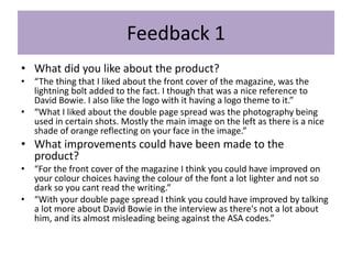
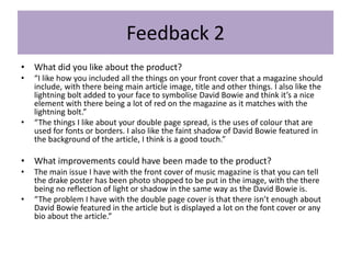
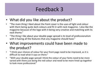
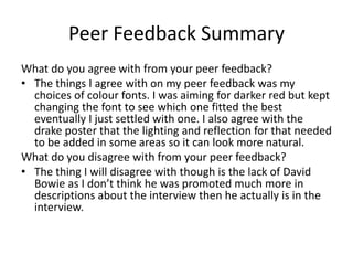
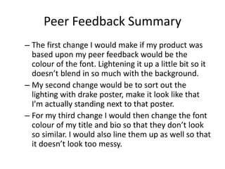
FMP Evaluation
George wetton
Production Process Evaluation
Research
Strengths
• The strengths of doing my research was when I researched into existing products observing,
all the magazine on the internet that would be similar to the idea that I had come up with so
far. Looking at the different colours and camera angles really helped me compare it with what
I was thinking and also added additional ideas to what I wanted my magazine to look like.
Looking at the layout of each existing category helped me dearly. Plus, near the end where I
had to gather up all the aspects that I liked and would include in my final design it helped me
think about it was I wanted. The audience profile also had helped me massively thinking
about the audience that I was actually aiming at. Looking at secondary research based stuff
online helped, gathering information that was already there and everything is useful.
Through looking at this type of stuff it helped me gather what my audience profile would be,
so it was really reliable information.
Weaknesses
• The weaknesses of doing my research was somethings that were missing that I could have
added if been given additional time, like getting a outside opinion as to what the audience
would like. As opposed to just what audience it might stereotypically aimed at. Any kind of
survey on survey monkey would have been really useful to gather just a second opinion and
would have been great to have just have any kind quantitative research. The problem was we
were only really focusing on qualitative research.
Planning
Strengths
• The strengths of doing my planning was gathering up the layout, seeing what I
was going to have on the main cover and where the logo would be put. Also
building up a schedule helped as it made me think more about how long thing
would be realistically be put together and what software's I would be using.
Also props and location helped me as it made me though t about the location
of the photography that I wanted to be shot in a dark lonely street, to make it
look quite professional. It also made me think about props more with the idea
of using a record as a props came from this bit of planning.
Weaknesses
• The weaknesses of doing my planning was when I did the style sheet because I
had already decided at that point what my main idea for my logo was going to
be. However it was nice to look at alternative ideas and comparing with the
logo that I was going to go for officially. Also despite it being sensible to be
cautious, I couldn’t think of many things to put on the health and safety, apart
from things that would happen when doing any project or working on any
computer.
Time Management
• I did manage my time well completing the project in time.
With additional time I would have made a few changes such
as making the headline and anchorage in a different font
making it more look like a lightning bolt with it being in line
with the lightning bolt on my face, the style would have
matched. Also I would have changed the colour of the font to
a less darker red, but it was difficult because that colour
would have been better if it was there, the problem was it
was too dark and blended in with the background. I also
would have edited the photos more to make them look more
professional.
Technical Qualities – front cover
flash
Border
banner
Used
different
color
overlay
Different
layout -
rotated
headlines
Barcode
and
magazine
details
plug
Technical Qualities – Double page spread
Big letter
to start
the
interview.More
images
More of a
lengthy
interview
First letter of
the interview
takes up the
entire page.border
Image
information
More
than one
big letter
to start a
sentence
Background
image Similar
layout
designs
Different
position:
body shot
(my
magazine)
and head
shot (Jay
Z).
Aesthetic Qualities – Front cover
Strength: Aiming at
more than one
generation of
audience.
Weakness: Font is
wrong and needs
to be changed to a
lighter colour so
that people can see
it.
Weakness: Missing
a menu strip.
Weakness:
Drake poster
needs to look
more natural,
with it needing
more light and
shadow
reflecting on it.
Strength: Plug
Strength: the
overlay colour
looks great.
Strength:
Photography
Strength: red
lightning bolt
Aesthetic Qualities - Double page spread
Weakness:
Lettering
needs to
be more in
line.
Strength: Fade
in with the
David Bowie.
Strength:
photography
Weakness:
Font
needs to
be
different
for the
headline
ands the
quote.
Strength: Photo
links with the
article.
Strength:
Fully
written
well
columned
interview.
Weakness:
Needs a
page
three.
Strength:
interview
easy to read
because the
questions are
in black and
the interview
is in red.
Weakness: It
doesn’t tell you
who the
interviewer is.
Audience Appeal – front cover
Old well known
musicians – jog
memories of old
people and names
some young people
would have heard
because they are so
iconic.
Introducing
old readers to
modern stars
through the
comparisons.
Rock aesthetic
Old fashioned
color style.
Happy that
someone
my age
listens to
that type of
music.
Callbacks to
David Bowie –
appreciated by
the older
audience.
Agreeable for the older
audience
Audience Appeal – Double page spread
Callback to David
Bowie –
appreciated by the
older audience.
Older people might not
know what spotify is
but to the ones that do,
is a good mix of the way
we even listen to music.
Easy to read
Reader can
relate to this
headline.
Black and
white
photography –
appealed by
modern and
old audience
Same style
of writing,
being easy
to follow.
Many different
Genres, large
Target audience.
The way the
bowie
poster is
faded in the
background.
Peer
Feedback
Feedback 1
• What did you like about the product?
• “The thing that I liked about the front cover of the magazine, was the
lightning bolt added to the fact. I though that was a nice reference to
David Bowie. I also like the logo with it having a logo theme to it.”
• “What I liked about the double page spread was the photography being
used in certain shots. Mostly the main image on the left as there is a nice
shade of orange reflecting on your face in the image.”
• What improvements could have been made to the
product?
• “For the front cover of the magazine I think you could have improved on
your colour choices having the colour of the font a lot lighter and not so
dark so you cant read the writing.”
• “With your double page spread I think you could have improved by talking
a lot more about David Bowie in the interview as there's not a lot about
him, and its almost misleading being against the ASA codes.”
Feedback 2
• What did you like about the product?
• “I like how you included all the things on your front cover that a magazine should
include, with there being main article image, title and other things. I also like the
lightning bolt added to your face to symbolise David Bowie and think it’s a nice
element with there being a lot of red on the magazine as it matches with the
lightning bolt.”
• “The things I like about your double page spread, is the uses of colour that are
used for fonts or borders. I also like the faint shadow of David Bowie featured in
the background of the article, I think is a good touch.”
• What improvements could have been made to the product?
• The main issue I have with the front cover of music magazine is that you can tell
the drake poster has been photo shopped to be put in the image, with the there
being no reflection of light or shadow in the same way as the David Bowie is.
• “The problem I have with the double page cover is that there isn’t enough about
David Bowie featured in the article but is displayed a lot on the font cover or any
bio about the article.”
Feedback 3
• What did you like about the product?
• “The main thing I liked about the front cover is the uses of light and colour
with them being quite dark colours and fit in with rock magazine. I also like the
magazine because of the logo with it being very creative and matching with its
rock theme.”
• “The thing I like about your double page spread is its level of professionalism
with it having all the features that any magazine should have.”
• What improvements could have been made to
the product?
• “I think your choices of colour for your front page need to be improved, as it is
difficult to read what it says on there.”
• “With your double page spread I think the colour of your fonts need to be more
varied with there just being the red colour and need to be more lined up together
to look more professional.”
Peer Feedback Summary
What do you agree with from your peer feedback?
• The things I agree with on my peer feedback was my
choices of colour fonts. I was aiming for darker red but kept
changing the font to see which one fitted the best
eventually I just settled with one. I also agree with the
drake poster that the lighting and reflection for that needed
to be added in some areas so it can look more natural.
What do you disagree with from your peer feedback?
• The thing I will disagree with though is the lack of David
Bowie as I don’t think he was promoted much more in
descriptions about the interview then he actually is in the
interview.
Peer Feedback Summary
– The first change I would make if my product was
based upon my peer feedback would be the
colour of the font. Lightening it up a little bit so it
doesn’t blend in so much with the background.
– My second change would be to sort out the
lighting with drake poster, make it look like that
I'm actually standing next to that poster.
– For my third change I would then change the font
colour of my title and bio so that they don’t look
so similar. I would also line them up as well so that
it doesn’t look too messy.

7. evaluation(3)

  • 1.
  • 2.
  • 3.
    Research Strengths • The strengthsof doing my research was when I researched into existing products observing, all the magazine on the internet that would be similar to the idea that I had come up with so far. Looking at the different colours and camera angles really helped me compare it with what I was thinking and also added additional ideas to what I wanted my magazine to look like. Looking at the layout of each existing category helped me dearly. Plus, near the end where I had to gather up all the aspects that I liked and would include in my final design it helped me think about it was I wanted. The audience profile also had helped me massively thinking about the audience that I was actually aiming at. Looking at secondary research based stuff online helped, gathering information that was already there and everything is useful. Through looking at this type of stuff it helped me gather what my audience profile would be, so it was really reliable information. Weaknesses • The weaknesses of doing my research was somethings that were missing that I could have added if been given additional time, like getting a outside opinion as to what the audience would like. As opposed to just what audience it might stereotypically aimed at. Any kind of survey on survey monkey would have been really useful to gather just a second opinion and would have been great to have just have any kind quantitative research. The problem was we were only really focusing on qualitative research.
  • 4.
    Planning Strengths • The strengthsof doing my planning was gathering up the layout, seeing what I was going to have on the main cover and where the logo would be put. Also building up a schedule helped as it made me think more about how long thing would be realistically be put together and what software's I would be using. Also props and location helped me as it made me though t about the location of the photography that I wanted to be shot in a dark lonely street, to make it look quite professional. It also made me think about props more with the idea of using a record as a props came from this bit of planning. Weaknesses • The weaknesses of doing my planning was when I did the style sheet because I had already decided at that point what my main idea for my logo was going to be. However it was nice to look at alternative ideas and comparing with the logo that I was going to go for officially. Also despite it being sensible to be cautious, I couldn’t think of many things to put on the health and safety, apart from things that would happen when doing any project or working on any computer.
  • 5.
    Time Management • Idid manage my time well completing the project in time. With additional time I would have made a few changes such as making the headline and anchorage in a different font making it more look like a lightning bolt with it being in line with the lightning bolt on my face, the style would have matched. Also I would have changed the colour of the font to a less darker red, but it was difficult because that colour would have been better if it was there, the problem was it was too dark and blended in with the background. I also would have edited the photos more to make them look more professional.
  • 6.
    Technical Qualities –front cover flash Border banner Used different color overlay Different layout - rotated headlines Barcode and magazine details plug
  • 7.
    Technical Qualities –Double page spread Big letter to start the interview.More images More of a lengthy interview First letter of the interview takes up the entire page.border Image information More than one big letter to start a sentence Background image Similar layout designs Different position: body shot (my magazine) and head shot (Jay Z).
  • 8.
    Aesthetic Qualities –Front cover Strength: Aiming at more than one generation of audience. Weakness: Font is wrong and needs to be changed to a lighter colour so that people can see it. Weakness: Missing a menu strip. Weakness: Drake poster needs to look more natural, with it needing more light and shadow reflecting on it. Strength: Plug Strength: the overlay colour looks great. Strength: Photography Strength: red lightning bolt
  • 9.
    Aesthetic Qualities -Double page spread Weakness: Lettering needs to be more in line. Strength: Fade in with the David Bowie. Strength: photography Weakness: Font needs to be different for the headline ands the quote. Strength: Photo links with the article. Strength: Fully written well columned interview. Weakness: Needs a page three. Strength: interview easy to read because the questions are in black and the interview is in red. Weakness: It doesn’t tell you who the interviewer is.
  • 10.
    Audience Appeal –front cover Old well known musicians – jog memories of old people and names some young people would have heard because they are so iconic. Introducing old readers to modern stars through the comparisons. Rock aesthetic Old fashioned color style. Happy that someone my age listens to that type of music. Callbacks to David Bowie – appreciated by the older audience. Agreeable for the older audience
  • 11.
    Audience Appeal –Double page spread Callback to David Bowie – appreciated by the older audience. Older people might not know what spotify is but to the ones that do, is a good mix of the way we even listen to music. Easy to read Reader can relate to this headline. Black and white photography – appealed by modern and old audience Same style of writing, being easy to follow. Many different Genres, large Target audience. The way the bowie poster is faded in the background.
  • 12.
  • 13.
    Feedback 1 • Whatdid you like about the product? • “The thing that I liked about the front cover of the magazine, was the lightning bolt added to the fact. I though that was a nice reference to David Bowie. I also like the logo with it having a logo theme to it.” • “What I liked about the double page spread was the photography being used in certain shots. Mostly the main image on the left as there is a nice shade of orange reflecting on your face in the image.” • What improvements could have been made to the product? • “For the front cover of the magazine I think you could have improved on your colour choices having the colour of the font a lot lighter and not so dark so you cant read the writing.” • “With your double page spread I think you could have improved by talking a lot more about David Bowie in the interview as there's not a lot about him, and its almost misleading being against the ASA codes.”
  • 14.
    Feedback 2 • Whatdid you like about the product? • “I like how you included all the things on your front cover that a magazine should include, with there being main article image, title and other things. I also like the lightning bolt added to your face to symbolise David Bowie and think it’s a nice element with there being a lot of red on the magazine as it matches with the lightning bolt.” • “The things I like about your double page spread, is the uses of colour that are used for fonts or borders. I also like the faint shadow of David Bowie featured in the background of the article, I think is a good touch.” • What improvements could have been made to the product? • The main issue I have with the front cover of music magazine is that you can tell the drake poster has been photo shopped to be put in the image, with the there being no reflection of light or shadow in the same way as the David Bowie is. • “The problem I have with the double page cover is that there isn’t enough about David Bowie featured in the article but is displayed a lot on the font cover or any bio about the article.”
  • 15.
    Feedback 3 • Whatdid you like about the product? • “The main thing I liked about the front cover is the uses of light and colour with them being quite dark colours and fit in with rock magazine. I also like the magazine because of the logo with it being very creative and matching with its rock theme.” • “The thing I like about your double page spread is its level of professionalism with it having all the features that any magazine should have.” • What improvements could have been made to the product? • “I think your choices of colour for your front page need to be improved, as it is difficult to read what it says on there.” • “With your double page spread I think the colour of your fonts need to be more varied with there just being the red colour and need to be more lined up together to look more professional.”
  • 16.
    Peer Feedback Summary Whatdo you agree with from your peer feedback? • The things I agree with on my peer feedback was my choices of colour fonts. I was aiming for darker red but kept changing the font to see which one fitted the best eventually I just settled with one. I also agree with the drake poster that the lighting and reflection for that needed to be added in some areas so it can look more natural. What do you disagree with from your peer feedback? • The thing I will disagree with though is the lack of David Bowie as I don’t think he was promoted much more in descriptions about the interview then he actually is in the interview.
  • 17.
    Peer Feedback Summary –The first change I would make if my product was based upon my peer feedback would be the colour of the font. Lightening it up a little bit so it doesn’t blend in so much with the background. – My second change would be to sort out the lighting with drake poster, make it look like that I'm actually standing next to that poster. – For my third change I would then change the font colour of my title and bio so that they don’t look so similar. I would also line them up as well so that it doesn’t look too messy.

Editor's Notes

  • #4 What were the strengths of your research? How did your research help your product? What were the weaknesses of your research? What could you have done better/improve? What effect would this have had on your product?
  • #5 What were the strengths of your planning? How did your planning help your product? What were the weaknesses of your planning? What could you have done better/improve? What effect would this have had on your product?
  • #6 Did you manage your time well? Did you complete your project on time or would your products have improved with additional time? What would you have done if you had more time to produce your work?
  • #7 Compare your work to similar existing products and discuss the similarities and differences Put your final piece(s) in the centre of a page alongside an existing product Use text boxes and arrows
  • #9 Does your work look good? Was it creative? What aspects of your game’s visuals do you like? What would you improve? How would you improve it? Discuss the strengths and weaknesses Put your final piece(s) in the centre of a page and analyse them Use text boxes and arrows
  • #11 How have you appealed to your target audience? What specific bits of content would appeal to your target audience. Refer to your findings from your questionnaire. Put your final piece(s) in the centre of a page and analyse them Use text boxes and arrows
  • #18 What changes would you make to your product based upon your peer feedback and why?