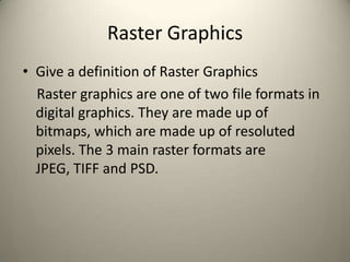
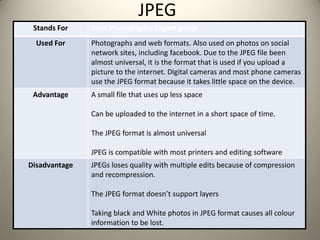
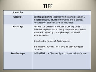
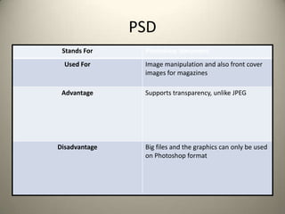
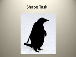
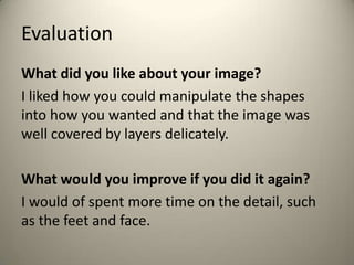
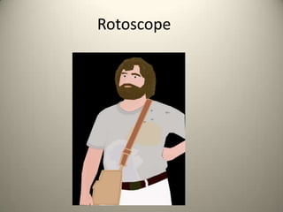
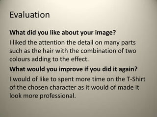
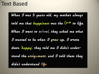
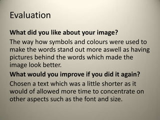
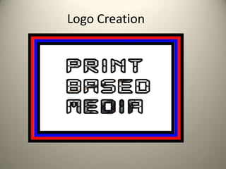
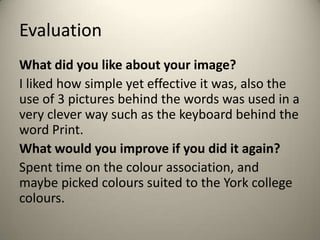
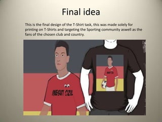
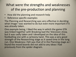
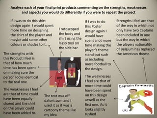
3. Raster Graphics
• Give a definition of Raster Graphics
Raster graphics are one of two file formats in
digital graphics. They are made up of
bitmaps, which are made up of resoluted
pixels. The 3 main raster formats are
JPEG, TIFF and PSD.
4. Vector Graphics
• Give a definition of Vector Graphics
Vector graphics is the second of the two file
formats in digital graphics. They are made up of
vectors/path. Unlike raster's, they are defined by
a start and end point, which include curves,
points and angles between them. In comparison
to Raster graphics, Vectors can be scaled big and
small and never lose any definition. The 2 types
of vector formats are AI and 3DS.
5. JPEG
Stands For Joint Photographic Expert group
Used For Photographs and web formats. Also used on photos on social
network sites, including facebook. Due to the JPEG file been
almost universal, it is the format that is used if you upload a
picture to the internet. Digital cameras and most phone cameras
use the JPEG format because it takes little space on the device.
Advantage A small file that uses up less space
Can be uploaded to the internet in a short space of time.
The JPEG format is almost universal
JPEG is compatible with most printers and editing software
Disadvantage JPEGs loses quality with multiple edits because of compression
and recompression.
The JPEG format doesn’t support layers
Taking black and White photos in JPEG format causes all colour
information to be lost.
6. TIFF
Stands For Tagged image File format
Used For Desktop publishing (popular with graphic designers),
magazine layout, advertisement due to it’s lossless
compression, scanners and fax machines
Advantage Lossless compression – It doesn’t lose any of it’s
definition by been edited many times like JPEG, this is
because it doesn’t go through compression and
recompression.
It is a flexible format of Raster graphic
It is a lossless format, this is why it’s used for digital
cameras
Disadvantage Unlike JPEG, the files are big and take up a lot of space.
7. PSD
Stands For Photoshop document
Used For Image manipulation and also front cover
images for magazines
Advantage Supports transparency, unlike JPEG
Disadvantage Big files and the graphics can only be used
on Photoshop format
8. AI
Stands For Adobe Illustrator
Used For Logos creation and can also be used for
graphics to represent a company
Advantage Can be scaled big or small because Vectors
have no loss in definition
Disadvantage Limited with software used, can only be
used on the Adobe Illustrator format
9. 3DS
Stands For 3D studio
Used For 3D modelling,animation and rendering. It
can also be used for creation of 3D
characters and environments.
Advantage More advanced and powerful
Disadvantage Hard to learn and big files
12. Evaluation
What did you like about your image?
I liked how you could manipulate the shapes
into how you wanted and that the image was
well covered by layers delicately.
What would you improve if you did it again?
I would of spent more time on the detail, such
as the feet and face.
14. Evaluation
What did you like about your image?
I liked the attention the detail on many parts
such as the hair with the combination of two
colours adding to the effect.
What would you improve if you did it again?
I would of like to spent more time on the T-Shirt
of the chosen character as it would of made it
look more professional.
16. Evaluation
What did you like about your image?
The way how symbols and colours were used to
make the words stand out more aswell as having
pictures behind the words which made the
image look better.
What would you improve if you did it again?
Chosen a text which was a little shorter as it
would of allowed more time to concentrate on
other aspects such as the font and size.
18. Evaluation
What did you like about your image?
I liked how simple yet effective it was, also the
use of 3 pictures behind the words was used in a
very clever way such as the keyboard behind the
word Print.
What would you improve if you did it again?
Spent time on the colour association, and
maybe picked colours suited to the York college
colours.
23. Proposal
Dimensions
2400 by 3200 pixels
Export Format
PNG
Advantages; Compatible with Red bubble, can save transparency and lowered opacity.
Disadvantages; Larger file size than similar formats such as JPEG
24. Content
I am going to make that of a sporting T-shirt. I am aiming to make a T-shirt
with Footballer Mesut Özil on, however using the Umlaut as two googly on
the players shirt. Having looked on Red Bubble for similar ideas I have not
found any looking like my idea. My idea consists of having the player stood
with the ball. And using the style of Rotoscoping to make the player look
more of a comic version, this will go with the comic font used for the name.
This printed on a white T-Shirt. Also I will have the German flag behind the
player as it is his nationality and goes with the picture very well.
My second idea is that of forming Thomas Vermaelen head ( The Arsenal
Captain)With Captain Americas body forming one person and calling him
captain fantastic, this will be ideally uploaded on Red bubble as a second
design and to be on posters and Birthday cards. This is to back up for the
ideas involving the First idea and expanding the theme.
25. Proposal
Deadline
Friday 4th October
Monday Wednesday Friday
Research Existing ideas
Create spider diagram
Proposal
Mood board
Digital Flat plan
Complete final design.
Complete Pro forma
Final design
Export as PNG file
Upload to Redbubble
Add tag on York college
PBM
Send all work to blog
Email Http address of blog
to Guy
Schedule
Audience
I want to target football fans, mainly the ones who support arsenal. People of all
ages and both genders. The second idea is targeting both cartoon fans as well as
arsenal fans targeting younger generation.
27. Font to be used for final design
The googly eyes representing the umlaut in the footballers name
as he is from Germany. This also adds to the ideas of being
cartoony and the German idea with the flag. The font is used in a
bold way so it grabs the attention and makes the eyes stand out
better. This will be on the T-shirt itself to replace the badge to
prevent copy write issues.
28. Idea 2.
• Arsenal captain Thomas Vermaelen on captain
Americas body. 2 captains formed in one. TO
make a poster
31. Second idea- Finished piece
This is a design that relates to the cartoon theme and
also sticking to the chosen football club one. This is
mainly designed as a poster to follow up on ideas
from the initial design. This can be used on Birthday
Cards aswell.
32. Final idea
This is the final design of the T-Shirt task, this was made solely for
printing on T-Shirts and targeting the Sporting community aswell as the
fans of the chosen club and country.
34. Does your final product reflect your
original intentions?
• Compare your planning/digital flat plans/
storyboards to your final product
In comparison the digital flat plan was almost
identical to the final piece. However the spider
diagram with the original ideas was not quite as
similar, as it was going more down the gaming
route. On the other hand the main idea of having
the certain player on the T-Shirt has stayed the
same only for the text and background to be
changed
35. Is your product suitable for your
audience?
• Reference your proposal
• Give an audience profile and describe suitability in
reference to content
• I do believe that this Design I have made will reach out
to the original target audience, that being of Sporting
fans of a younger generation which I was targeting in
my Proposal before making the designs. The audience
will be fans of Arsenal the football team or that from a
German background and the design itself will be very
suitable as it not over the top but very appropriate for
the buyer as it relates to their interests.
36. What do you like/dislike about the
techniques you have used?
• Reference specific tools you used with images
I have liked the way in which I used Rotoscoping
to make the player look more life like and
therefore make the T-Shirt look more
professional. However I disliked the way in
which I used the font and could of found a
better and clearer size.
37. What do you like/dislike about how
your final product looks?
• I liked how the background complements the
image and makes it stand out more. Also the
detail on some of the face I found very
precise. On the other hand the T-Shirt on the
player could have been dealt with better
should more time have been given, however I
am very happy with the overall product and
feel it could make a few sales on
Redbubble.com
38. Why did you include the content you
used?
• Images, fonts, effects, colours
The image was used as it was a very popular image with the
target audience I was aiming at, plus I found it was the
appropriate image size to fit the template given before hand.
The font I used was to try and come across as more of a
cartoony type T-Shirt to partner the Googly eye balls also next
to the text.
The colours I used were very effective in showing what the
final image was such as the German flag in the background as
well as the Arsenal Colours on the player that of red and
white.
39. What style have you employed in your
products?
• Discuss influences/ existing products
• What visual style does your work have and why
did you choose it?
The style my products have is that of a not over the
top method and using pictures rather than text to
explain what I want to get across. I chose this way
of using more picture than text as I feel it appeals
more to the audience I was aiming at and generally
T-Shirt buyers as they find it more interesting to
look at.
40. What were the strengths and weaknesses
of the pre-production and planning
• How did the planning and research help
• Reference specific examples
The Planning and Researching was very effective in deciding
what image I was wanted to do but even more important if it
was already taken.
One example being, I liked the way in which the game GTA
was linked together with Breaking bad the Television show,
but it was sadly taken and I developed on the idea of this
footballing one with a cartoony twist. This was a very good
strength of the Researching stage as it saved time in the long
run. One Weakness I felt was that of in the Planning stage as I
found the mood boards did not add to any ideas I had
previously from the spider diagram.
41. Analyse each of your final print products commenting on the strengths, weaknesses
and aspects you would do differently if you were to repeat the project
The strengths with
this Product I feel is
that of how much
time has been spent
on making sure the
person looks identical
to the real one.
The weaknesses I feel
are that of time could
have been equally
shared and the shirt
on the player could
have been added to.
If I was to do this shirt
design again I would spent
more time on designing
the shirt of the player and
maybe add some other
colours or shades to it.
Strengths I feel are that
of the way in which not
only have two Captains
been included in one
but the way in which
the players nationality
of Belgium has replaced
the American theme.
The weaknesses
I feel are that of
more time could
have been spent
on this design
aswell as the
first one. As it
looks slightly
rushed
If I was to do
this Poster
design again I
would have
spent a lot more
time making the
player’s theme
stand out such
as including
more football to
the design.
I rotoscoped
the body and
shirt using the
lasso tool on
the side bar
The text was off
dafont.com and I
used it as it was a
cartoony theme like
my idea
42. Peer Evaluation
What are the strengths of the final image?
I like the placement of the German flag behind the player. What is particularly
interesting is the fact the image is placed vertically opposed to horizontally, and as a
result of this, makes gives the player more height in the way their stood.
The colours that are used are bold, and when looking at specific details, and the arm
and neck pieces have a smaller stroke, which gives the clothing that the player is
wearing a much realistic look.
What could be developed if the image was repeated?
One thing I noticed was how the “Ozil” on the shirt is slightly faded on the left. This
was something in particular I noticed when you were working on the image. To
prevent this happening in future, I would recommend using a lasso tool to get better
selections. Otherwise, the image is strong, it has great detail and composition. Well
done!
43. Peer Feedback
Summarise peer feedback and discuss
– Responses you agree with: The responses I agree
with are that of the way in which the German flag
is presented as it was how I intended it. I also
agree with the criticism and will take them on
board in future.