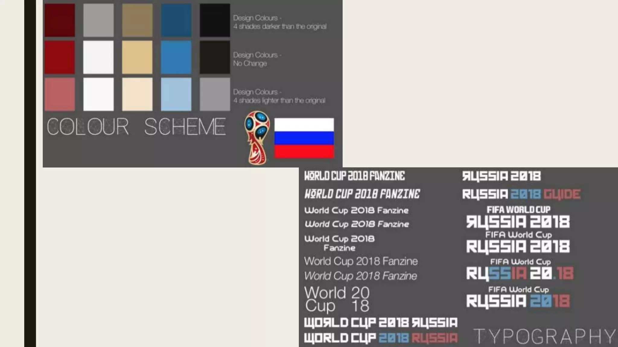
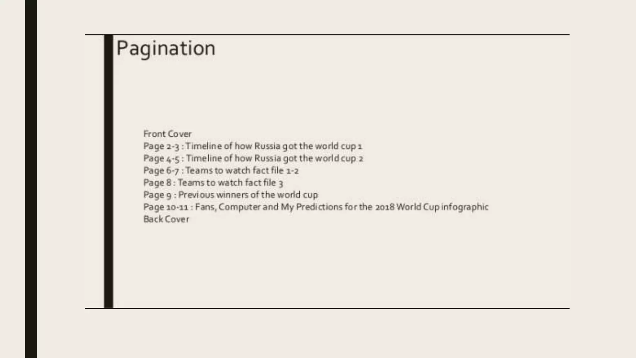
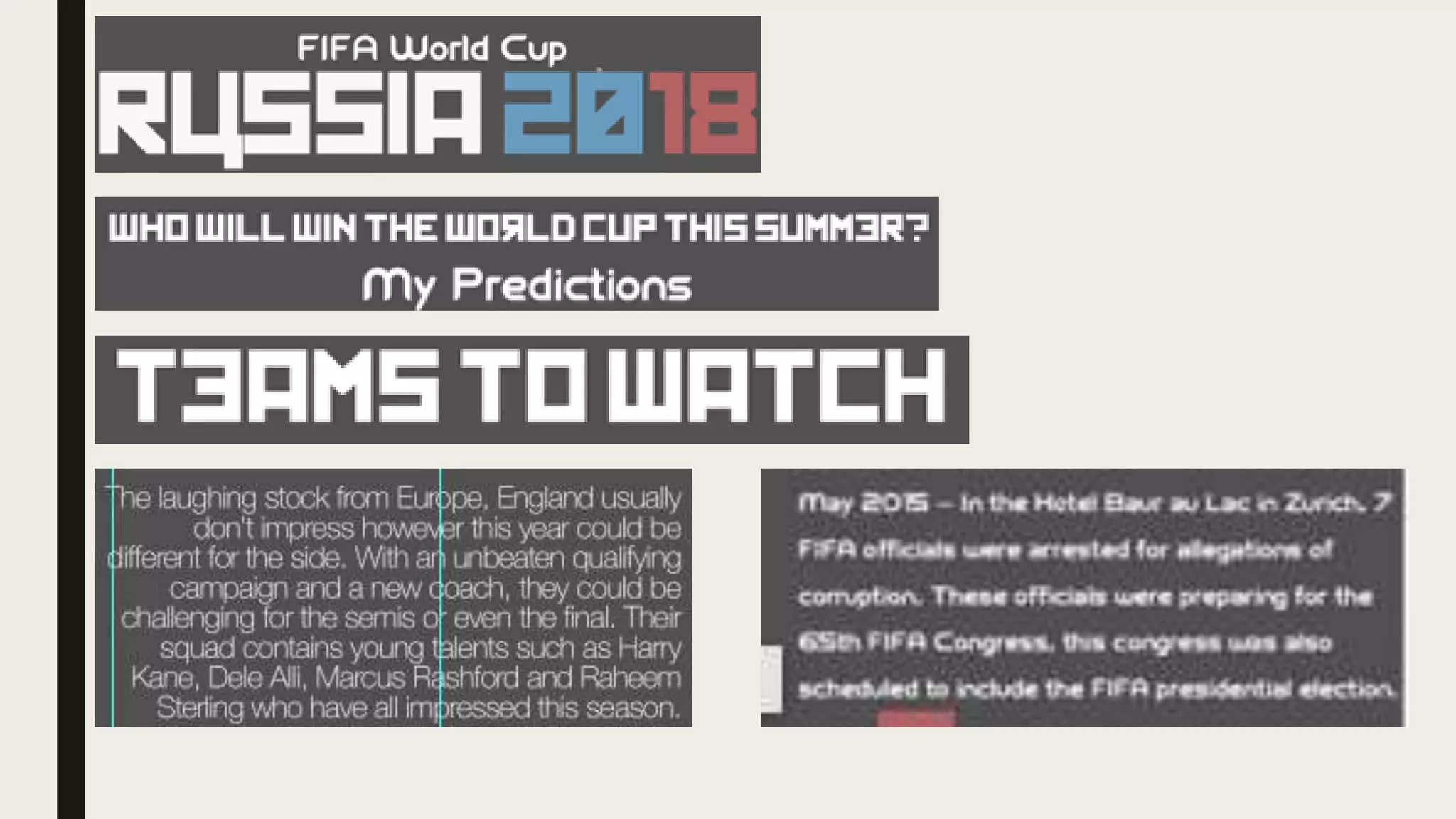
TASK 6 -
EVALUATION
Sjon Barnes
PRE PRODUCTION
Sjon Barnes
Planning and Pre Production
The planning and pre production for this project has been better than some other projects
I have done in the past, I have included typography, colours and past pictures to show that
I have planned out the key parts of the project. I also included a basic yet ok schedule for
the 3 weeks of work that has to happen, I also made a pagination that outlines what will be
on every page of the book this has been edited numerous times since I have made it. I also
made a factual copy of the fanzine, this is the fanzine but without graphics so it’s just a
word document.There has been numerous drafts of this document, to show how I have
streamlined the fanzine so the text can fit into the 12 pageA5 document.
Time Management
My time management for this project has been
difficult and problematic, in my planning stage I
had a good plan as to how I was to go about the 3
weeks between the 12th and the 30th March when
making my fanzine. However this plan didn't work
well as pre production took longer than I thought it
was going to take and I spent a long time debating
over what was going into each page which cost me
more time during the 3 weeks, it actually took me
3 and a half weeks to finish the production
completely. For the next project I’m really going to
make a more detailed plan to make sure I can stay
on time for this project and not let this mistake
happen again.
CreativeAspects -Typography
The most creative aspect of the fanzine is with the typography, the Russian font creates the
idea in the readers mind that it’s Russian.The whole fanzine is based around the RussianWorld
Cup and bringing in the use of the Russian alphabet which is largely different to ours, makes
the impression that it’s Russian. In the titles of every page only a few of the letters will be from
the Russian alphabet, the occasional different ’n’ or a backwards ‘e’ gives the impression that
it’s Russian.The other creative aspect used in the typography is the other font, this is known as
the FIFA font which was used for the 2006 World Cup in Germany.This font is iconic to most
football fans, so to the audience of this fanzine they will see that font and make the link
between the font and football just like they’d make the link between the Russian font and the
topic of Russia.The last font that was used in this project was called Helvetica Neue, this is a
font that I have used for the majority of my projects.This font featured in the teams to watch
section, this is because the section has a lot of bunched up text which doesn’t look nice with
the FIFA font so I chose this as it fits in and won’t take up much space.
CreativeAspects – Colour Schemes
Another aspect that I focussed on during this project was the colour scheme, during the
production stage I strictly focussed on sticking to the colour scheme I made during pre
production and I believe I stuck to that pretty well.The 3 main colours that are on the
colour scheme come from the Russian flag, I then made the colours 4 shades lighter which
has now lead to what I have made now.The other colours have come from colours of the
official logo of the world cup, and any colours that match up with those colours from the
website coolers.co.The colours have really gone well with the grey background as they
stick out, the colours have been an essential part of every page from the colours of the
font, to the rotoscopes on the double page spread.
TechnicalAspects - Designs
The majority of the rotoscope designs can be seen on the first two pages for the multi
page spread, these designs go alongside the text on the timeline.These designs are
simple and faceless, they only use basic colours that match up with the colour scheme I
chose for the fanzine.These simple designs fit nicely with the simple design aesthetic that
I used up to now so it really does just fit in with everything else in the fanzine and it
doesn’t stick out. It also fills in all of the negative space that was left on the timeline from
after I put the text in. Other designs that were included in the fanzine were the trophy’s
from the History page and from the front cover, the flags from the prediction pages that
follow a similar colour scheme to the rest of the fanzine, and finally the team crests from
the back page and from theTeamsToWatch pages which also fit the colour scheme from
the fanzine.
FINISHED PRODUCT
Sjon Barnes
Intentions
My original intentions was to have a detailed guide for the 2018 FIFAWorld Cup that
would include history timeline, predictions, a teams to watch guide and a stadium guide.
However these original intentions had to be scaled down to fit the timeframe and the size
of the guide itself, this resulted in what has been created which is a smaller version of
what I had imagined.One key feature I was going to have in the final version of the fanzine
was the stadium guide, this would give an overview to the all or some of the stadiums that
will be featured in the world cup.This part of the fanzine had to be cut because it took up
too much space in the 12 page fanzine, and I couldn’t find a way to cut it down efficiently
enough like the team guide where I could cut teams based on how good they are.
Is it appropriate for your audience?
The target audience for this fanzine is generally going to be men who enjoy football the
age range for this could be around 18-29, and I believe the product is appropriate for the
audience I have targeted.The target age means that they would be able to participate in
the online survey I had meaning, they would be able to see if their vote on who would win
the world cup contributed much to the fan prediction page on the fanzine.The fanzine
itself is all about the world cup, so stereotypically it’ll be aimed for men and it has
definitely achieved that as the fanzine is all about it. In conclusion, I think my fanzine is
appropriate for the general target audience.
The Content
There are 4 different topics that are included within my fanzine, the first topic is the
timeline at the start of my fanzine titled “How DidWe Get Here”.This is a timeline that
shows from 2009-2018 how Russia got the world cup and the controversies surrounding it
that lead to now, most of the text is then accompanied with a small graphic beside or
under the text to represent the text.The second topic in the fanzine is titled “TeamsTo
Watch”, this is a guide outlining in my opinion the 9 best teams to watch out for at the
world cup.The countries included were Egypt, Morocco, Spain, France, Iceland, Brazil,
Germany, England and Belgium.They was an overview saying how they got to the world
cup and who their key players are, this would then be accompanied with a graphic of the
team logo beside it.
The Content continued
The third topic that is included in the fanzine is the shortest of the four topics, this is a
graphic showing the previous winners of the world cup from 1930-2014.This graphic also
shows the rotoscoped world cup trophy and the now defunct Jules RimetTrophy, I have
also created small basic flags representing the nations that won the world cup.The last
topic I have done in the fanzine is the fan interaction part of the fanzine, this is the part
where I got information from the fans to see who will win the world cup I also recorded my
predictions and a prediction from a super computer. I made a prediction page because I
want my fanzine to have fan interaction, and so by adding in the prediction survey the
fans can feel like they contributed their opinion to the fanzine they are reading.The fans
can then compare their prediction to mine and the supercomputers prediction, which I
also what I have put in that section.
The Style
The style for the fanzine was chosen way before the content of the fanzine, and the idea
behind it was to have a simple design for the graphics that looked nice. For example the
crests on the back cover have no words, this takes away some of the complexities of the
design and instead replaces it with a more original design.The only ones that are
completely original are the Nigerian and Mexican crests, as they were too complicated so I
made simpler versions of the crests using shapes on Photoshop.Another big style choice
for the fanzine was the selection of colours, the same few colours are used throughout the
fanzine with only a few exceptions. I wanted the colours to stay the same throughout so it
keeps the same Russian type style I have portrayed it as on the front cover, these colours
can be seen in the planning slides and they are mostly based off the Russian flag.
How have your skills developed?
During my time with this project my skills with Photoshop have increased in my opinion, I
now stick to a theme rather than going off on a new style for every page. My use of fonts
are now down to the ones I have chosen during the planning phase, and my rotoscoping
skills have also increased. My skills with planning are the most notable change, this is
because I decided to make a more detailed plan that included typography, colours and
past images to further help my grade when it comes to planning as I lack on that part of a
project sometimes. In conclusion there has been some minor changes in my skills, but the
most change has come in pre production.
Improvements
If given more time to complete the work I would make multiple improvements, the main
one being including the stadium guide which I left out because of time and space on the
fanzine. If I had more time I would make improvements on the timeline, as I think more
events could have been included to even out the timeline even though I am quite pleased
with the current state of it. In conclusion there isn’t much I would change because I am
quite happy with what I currently have, however there is still some sections that I’m quite
unhappy with cutting out.

Evalution

  • 1.
  • 2.
  • 3.
    Planning and PreProduction The planning and pre production for this project has been better than some other projects I have done in the past, I have included typography, colours and past pictures to show that I have planned out the key parts of the project. I also included a basic yet ok schedule for the 3 weeks of work that has to happen, I also made a pagination that outlines what will be on every page of the book this has been edited numerous times since I have made it. I also made a factual copy of the fanzine, this is the fanzine but without graphics so it’s just a word document.There has been numerous drafts of this document, to show how I have streamlined the fanzine so the text can fit into the 12 pageA5 document.
  • 7.
    Time Management My timemanagement for this project has been difficult and problematic, in my planning stage I had a good plan as to how I was to go about the 3 weeks between the 12th and the 30th March when making my fanzine. However this plan didn't work well as pre production took longer than I thought it was going to take and I spent a long time debating over what was going into each page which cost me more time during the 3 weeks, it actually took me 3 and a half weeks to finish the production completely. For the next project I’m really going to make a more detailed plan to make sure I can stay on time for this project and not let this mistake happen again.
  • 8.
    CreativeAspects -Typography The mostcreative aspect of the fanzine is with the typography, the Russian font creates the idea in the readers mind that it’s Russian.The whole fanzine is based around the RussianWorld Cup and bringing in the use of the Russian alphabet which is largely different to ours, makes the impression that it’s Russian. In the titles of every page only a few of the letters will be from the Russian alphabet, the occasional different ’n’ or a backwards ‘e’ gives the impression that it’s Russian.The other creative aspect used in the typography is the other font, this is known as the FIFA font which was used for the 2006 World Cup in Germany.This font is iconic to most football fans, so to the audience of this fanzine they will see that font and make the link between the font and football just like they’d make the link between the Russian font and the topic of Russia.The last font that was used in this project was called Helvetica Neue, this is a font that I have used for the majority of my projects.This font featured in the teams to watch section, this is because the section has a lot of bunched up text which doesn’t look nice with the FIFA font so I chose this as it fits in and won’t take up much space.
  • 10.
    CreativeAspects – ColourSchemes Another aspect that I focussed on during this project was the colour scheme, during the production stage I strictly focussed on sticking to the colour scheme I made during pre production and I believe I stuck to that pretty well.The 3 main colours that are on the colour scheme come from the Russian flag, I then made the colours 4 shades lighter which has now lead to what I have made now.The other colours have come from colours of the official logo of the world cup, and any colours that match up with those colours from the website coolers.co.The colours have really gone well with the grey background as they stick out, the colours have been an essential part of every page from the colours of the font, to the rotoscopes on the double page spread.
  • 11.
    TechnicalAspects - Designs Themajority of the rotoscope designs can be seen on the first two pages for the multi page spread, these designs go alongside the text on the timeline.These designs are simple and faceless, they only use basic colours that match up with the colour scheme I chose for the fanzine.These simple designs fit nicely with the simple design aesthetic that I used up to now so it really does just fit in with everything else in the fanzine and it doesn’t stick out. It also fills in all of the negative space that was left on the timeline from after I put the text in. Other designs that were included in the fanzine were the trophy’s from the History page and from the front cover, the flags from the prediction pages that follow a similar colour scheme to the rest of the fanzine, and finally the team crests from the back page and from theTeamsToWatch pages which also fit the colour scheme from the fanzine.
  • 13.
  • 14.
    Intentions My original intentionswas to have a detailed guide for the 2018 FIFAWorld Cup that would include history timeline, predictions, a teams to watch guide and a stadium guide. However these original intentions had to be scaled down to fit the timeframe and the size of the guide itself, this resulted in what has been created which is a smaller version of what I had imagined.One key feature I was going to have in the final version of the fanzine was the stadium guide, this would give an overview to the all or some of the stadiums that will be featured in the world cup.This part of the fanzine had to be cut because it took up too much space in the 12 page fanzine, and I couldn’t find a way to cut it down efficiently enough like the team guide where I could cut teams based on how good they are.
  • 15.
    Is it appropriatefor your audience? The target audience for this fanzine is generally going to be men who enjoy football the age range for this could be around 18-29, and I believe the product is appropriate for the audience I have targeted.The target age means that they would be able to participate in the online survey I had meaning, they would be able to see if their vote on who would win the world cup contributed much to the fan prediction page on the fanzine.The fanzine itself is all about the world cup, so stereotypically it’ll be aimed for men and it has definitely achieved that as the fanzine is all about it. In conclusion, I think my fanzine is appropriate for the general target audience.
  • 16.
    The Content There are4 different topics that are included within my fanzine, the first topic is the timeline at the start of my fanzine titled “How DidWe Get Here”.This is a timeline that shows from 2009-2018 how Russia got the world cup and the controversies surrounding it that lead to now, most of the text is then accompanied with a small graphic beside or under the text to represent the text.The second topic in the fanzine is titled “TeamsTo Watch”, this is a guide outlining in my opinion the 9 best teams to watch out for at the world cup.The countries included were Egypt, Morocco, Spain, France, Iceland, Brazil, Germany, England and Belgium.They was an overview saying how they got to the world cup and who their key players are, this would then be accompanied with a graphic of the team logo beside it.
  • 17.
    The Content continued Thethird topic that is included in the fanzine is the shortest of the four topics, this is a graphic showing the previous winners of the world cup from 1930-2014.This graphic also shows the rotoscoped world cup trophy and the now defunct Jules RimetTrophy, I have also created small basic flags representing the nations that won the world cup.The last topic I have done in the fanzine is the fan interaction part of the fanzine, this is the part where I got information from the fans to see who will win the world cup I also recorded my predictions and a prediction from a super computer. I made a prediction page because I want my fanzine to have fan interaction, and so by adding in the prediction survey the fans can feel like they contributed their opinion to the fanzine they are reading.The fans can then compare their prediction to mine and the supercomputers prediction, which I also what I have put in that section.
  • 18.
    The Style The stylefor the fanzine was chosen way before the content of the fanzine, and the idea behind it was to have a simple design for the graphics that looked nice. For example the crests on the back cover have no words, this takes away some of the complexities of the design and instead replaces it with a more original design.The only ones that are completely original are the Nigerian and Mexican crests, as they were too complicated so I made simpler versions of the crests using shapes on Photoshop.Another big style choice for the fanzine was the selection of colours, the same few colours are used throughout the fanzine with only a few exceptions. I wanted the colours to stay the same throughout so it keeps the same Russian type style I have portrayed it as on the front cover, these colours can be seen in the planning slides and they are mostly based off the Russian flag.
  • 19.
    How have yourskills developed? During my time with this project my skills with Photoshop have increased in my opinion, I now stick to a theme rather than going off on a new style for every page. My use of fonts are now down to the ones I have chosen during the planning phase, and my rotoscoping skills have also increased. My skills with planning are the most notable change, this is because I decided to make a more detailed plan that included typography, colours and past images to further help my grade when it comes to planning as I lack on that part of a project sometimes. In conclusion there has been some minor changes in my skills, but the most change has come in pre production.
  • 20.
    Improvements If given moretime to complete the work I would make multiple improvements, the main one being including the stadium guide which I left out because of time and space on the fanzine. If I had more time I would make improvements on the timeline, as I think more events could have been included to even out the timeline even though I am quite pleased with the current state of it. In conclusion there isn’t much I would change because I am quite happy with what I currently have, however there is still some sections that I’m quite unhappy with cutting out.