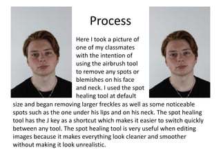
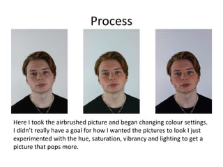
The document describes the process of creating a Star Wars movie poster. It involves:
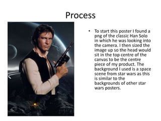
- Sizing up an image of Han Solo and placing it in the center of the canvas.
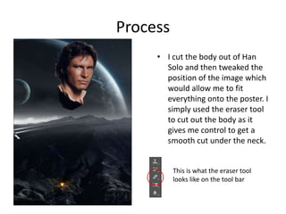
- Cutting out Han Solo's body and adjusting the position.
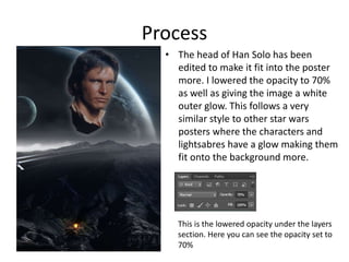
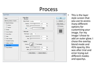
- Lowering the opacity and adding an outer glow to Han Solo's head to blend it into the background.
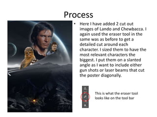
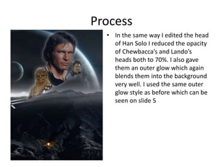
- Adding cutouts of Lando and Chewbacca and adjusting them similarly.
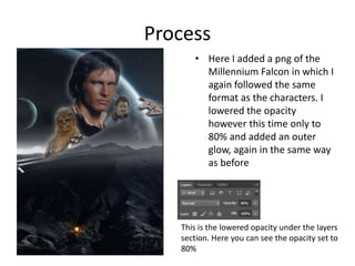
- Adding the Millennium Falcon ship and adjusting it.
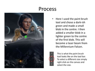
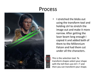
- Creating laser beams using brush strokes and transforming them.
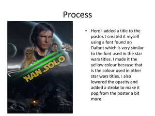
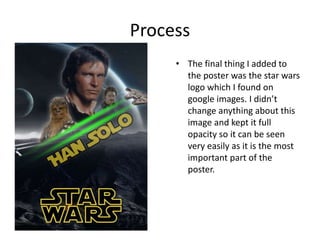
- Adding a title and the Star Wars logo.