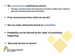
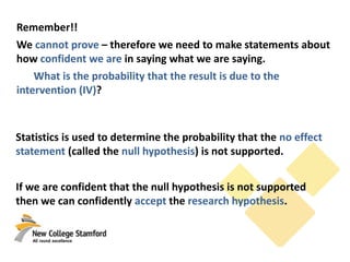
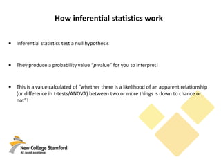
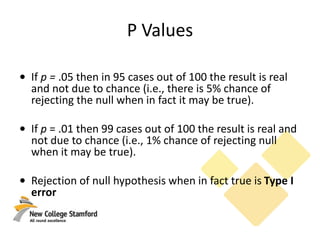
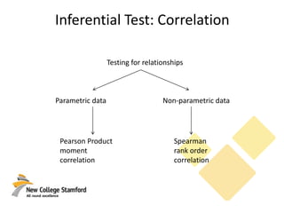
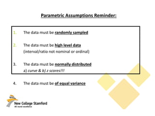
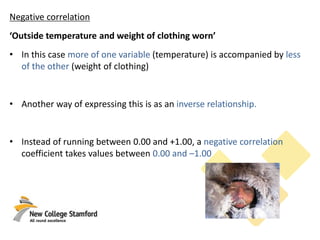
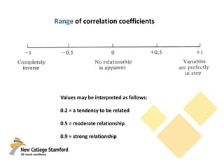
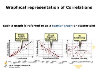
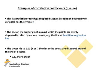
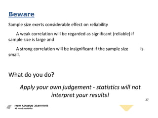
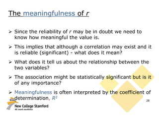
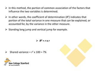
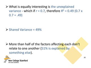
This document discusses correlations and inferential statistics. It explains that while science cannot prove relationships, statistics can determine the probability that two variables are related rather than due to chance. A correlation coefficient (r value) quantifies the strength of association between variables. Strong correlations near -1 or 1 indicate the variables are likely related, while values near 0 suggest no relationship. However, correlations do not prove causation - only experiments can do that. The document provides examples of interpreting correlation values and limitations like sample size effects on reliability.
Statistical inference: Statistical Power, ANOVA, and Post Hoc testsEugene Yan Ziyou
This deck was used in the IDA facilitation of the John Hopkins' Data Science Specialization course for Statistical Inference. It covers the topics in week 4 (statistical power, ANOVA, and post hoc tests).
The data and R script for the lab session can be found here: https://github.com/eugeneyan/Statistical-Inference
Measure of dispersion has two types Absolute measure and Graphical measure. There are other different types in there.
In this slide the discussed points are:
1. Dispersion & it's types
2. Definition
3. Use
4. Merits
5. Demerits
6. Formula & math
7. Graph and pictures
8. Real life application.
Basics of Hypothesis testing for PharmacyParag Shah
This presentation will clarify all basic concepts and terms of hypothesis testing. It will also help you to decide correct Parametric & Non-Parametric test for your data
Correlation & Regression Analysis using SPSSParag Shah
Concept of Correlation, Simple Linear Regression & Multiple Linear Regression and its analysis using SPSS. How it check the validity of assumptions in Regression
The ppt gives an idea about basic concept of Estimation. point and interval. Properties of good estimate is also covered. Confidence interval for single means, difference between two means, proportion and difference of two proportion for different sample sizes are included along with case studies.
SPSS does not have Z test for proportions, So, we use Chi-Square test for proportion tests. Test for single proportion and Test for proportions of two samples
Steps To Become a Social Leader:
A) Take part and take control.
B) Demonstrate your leadership.
C) Accelerate sales.
D) Gain distinctive industry insights.
- IBM Z13 - The new possible
- Cloud and Service Management on IBM Z System
- Big data and Analytics on IBM Z System
- Mobile Challenge with IBM Z System
- DevOps on IBM Z System
- Security on IBM Z System
Every one in the world wants to live in a compact environment. like in olden days the peoples they were used telephone, telegram, etc. for communication. but in the current scenario every one have smart phones for better communication. Because smartphones are compact and convenient to them.This presentation about Compact City planning and also it dealt how various compact cities in the developed and developing countries manage themselves. This presentation just gives an outline of the compact city planning.
8 Statistical SignificanceOK, measures of association are one .docxevonnehoggarth79783
8 Statistical Significance
OK, measures of association are one important thing to examine in data. There is another important thing to consider. If you find associations, are they a result of associations that exist in the population or are those associations simply a result of sampling error? Tests of statistical significance estimate the chances that your associations are a result of the population, and not simply sampling error.
Chi-Square Tests
Chi-Square tests are appropriate for nominal and ordinal variables. When you calculate Chi-Square, you determine the probability that your answer is a result of your sample and not the population. So, a probability of .05 (p = .05) means that the association that you found in your analysis would occur only 5 out of 100 times if there actually was no association in the population. If you had a p = .001, this means that out of 1,000 samples, you would find the association simply as a result of your sampling error 1 time. Convention suggests that probabilities of .05, 01, and .001 support a differing levels of statistical significance of your conclusions.
Let’s go back to our variables SEX and HAPPY. You actually do the same thing that you did when you calculated lambda, except you also check chi-square in the statistics box. Here are the exact steps:
· Analyze > Descriptive Statistics > Crosstabs
· Dependent variable as the Row variable (Mneumonic suggestion: remember DR, dependent belongs on the row)
· Independent variable as the column variable
· Statistics: Lambda or Gamma AND Chi-Square
· Continue > OK
Most of your output will look be the same as when we calculated lambda. There is one new box:
Look at the Asymp. Sig (2 sided). This means that out of 1,000 chances, 883 times you would get the lambda of 0 totally by accident of your sample! Is that statistically significant? Well, not for scientific research. People play the lottery with far worse odds than this, but remember, for a result to be statistically significant in social science research, the probability must be .05 or less.
Let’s think about our query about the relationship between gender and happiness. We have discovered that there is no association between the two and there is no statistical significance. What does that mean? Well, I guess that is a good thing for men and women. It is not a good finding however if you were expecting to find an association between the variables!
T Tests
T tests are used to determine statistical significance of scale (ratio/interval) variables. If you want to examine the associations of nominal/scale variables, you may be quickly overwhelmed with data. If you do discover that you would like to discover the statistical significance of scale variables, I would suggest that you use an Independent-sample t test. You can use your output for the Pearson’s r and it will tell you your level of significance.
Here is the output for our analysis of the association between AGE and SIBS:
SPSS has cal.
Fundamental of Statistics and Types of CorrelationsRajesh Verma
Fundamental of Statistics and Types of Correlations. Pearson r, Point Biserial, Phi Coefficient, Biserial, Tetrachoric, Spearman Rank Difference, Kendall's tau, Inferential Statistics, Descriptive Statistics
BUS 308 – Week 4 Lecture 2 Interpreting Relationships .docxcurwenmichaela
BUS 308 – Week 4 Lecture 2
Interpreting Relationships
Expected Outcomes
After reading this lecture, the student should be able to:
1. Interpret the strength of a correlation
2. Interpret a Correlation Table
3. Interpret a Linear Regression Equation
4. Interpret a Multiple Regression Equation
Overview
As in many detective stories, we will often find that when one thing changes, we see that
something else has changed as well. Moving to correlation and regression opens up new insights
into our data sets, but still lets us use what we have learned about Excel tools in setting up and
generating our results.
The correlation between events is mirrored in data analysis examinations with correlation
analysis. This week’s focus changes from detecting and evaluating differences to looking at
relationships. As students often comment, finding significant differences in gender-based
measures does not explain why these differences exist. Correlation, while not always explaining
why things happen gives data detectives great clues on what to examine more closely and helps
move us towards understanding why outcomes exist and what impacts them. If we see
correlations in the real world, we often will spend time examining what might underlie them;
finding out if they are spurious or causal.
Regression lets us use relationships between and among our variables to predict or
explain outcomes based upon inputs, factors we think might be related. In our quest to
understand what impacts the compa-ratio and salary outcomes we see, we have often been
frustrated due to being basically limited to examining only two variables at a time, when we felt
that we needed to include many other factors. Regression, particularly multiple regression, is the
tool that allows us to do this.
Linear Correlation
When two things seem to move in a somewhat predictable way, we say they are
correlated. This correlation could be direct or positive, both move in the same direction, or it
could be inverse or negative, where when one increases the other decreases. The Law of Supply
in economics is a common example of an inverse (or negative) correlation, where the more
supply we have of something, the less we typically can charge for it; the Law of Demand is an
example of a direct (or positive) correlation as the more demand exists for something, the more
we can charge for it. Height and weight in young children is another common example of a
direct correlation, as one increases so does the other measure.
Probably the most commonly used correlation is the Pearson Correlation Coefficient,
symbolized by r. It measures the strength of the association – the extent to which measures
change together – between interval or ratio level measures as well as the direction of the
relationship (inverse or direct). Several measures in our company data set could use the Pearson
Correlation to show relationships; salary and midpoint, salary and yea.
BUS 308 – Week 4 Lecture 2 Interpreting Relationships .docxjasoninnes20
BUS 308 – Week 4 Lecture 2
Interpreting Relationships
Expected Outcomes
After reading this lecture, the student should be able to:
1. Interpret the strength of a correlation
2. Interpret a Correlation Table
3. Interpret a Linear Regression Equation
4. Interpret a Multiple Regression Equation
Overview
As in many detective stories, we will often find that when one thing changes, we see that
something else has changed as well. Moving to correlation and regression opens up new insights
into our data sets, but still lets us use what we have learned about Excel tools in setting up and
generating our results.
The correlation between events is mirrored in data analysis examinations with correlation
analysis. This week’s focus changes from detecting and evaluating differences to looking at
relationships. As students often comment, finding significant differences in gender-based
measures does not explain why these differences exist. Correlation, while not always explaining
why things happen gives data detectives great clues on what to examine more closely and helps
move us towards understanding why outcomes exist and what impacts them. If we see
correlations in the real world, we often will spend time examining what might underlie them;
finding out if they are spurious or causal.
Regression lets us use relationships between and among our variables to predict or
explain outcomes based upon inputs, factors we think might be related. In our quest to
understand what impacts the compa-ratio and salary outcomes we see, we have often been
frustrated due to being basically limited to examining only two variables at a time, when we felt
that we needed to include many other factors. Regression, particularly multiple regression, is the
tool that allows us to do this.
Linear Correlation
When two things seem to move in a somewhat predictable way, we say they are
correlated. This correlation could be direct or positive, both move in the same direction, or it
could be inverse or negative, where when one increases the other decreases. The Law of Supply
in economics is a common example of an inverse (or negative) correlation, where the more
supply we have of something, the less we typically can charge for it; the Law of Demand is an
example of a direct (or positive) correlation as the more demand exists for something, the more
we can charge for it. Height and weight in young children is another common example of a
direct correlation, as one increases so does the other measure.
Probably the most commonly used correlation is the Pearson Correlation Coefficient,
symbolized by r. It measures the strength of the association – the extent to which measures
change together – between interval or ratio level measures as well as the direction of the
relationship (inverse or direct). Several measures in our company data set could use the Pearson
Correlation to show relationships; salary and midpoint, salary and yea ...
Assessment 2 ContextIn many data analyses, it is desirable.docxfestockton
Assessment 2 Context
In many data analyses, it is desirable to compute a coefficient of association. Coefficients of association are quantitative measures of the amount of relationship between two variables. Ultimately, most techniques can be reduced to a coefficient of association and expressed as the amount of relationship between the variables in the analysis. There are many types of coefficients of association. They express the mathematical association in different ways, usually based on assumptions about the data. The most common coefficient of association you will encounter is the Pearson product-moment correlation coefficient (symbolized as the italicized r), and it is the only coefficient of association that can safely be referred to as simply the "correlation coefficient". It is common enough so that if no other information is provided, it is reasonable to assume that is what is meant.
Correlation coefficients are numbers that give information about the strength of relationship between two variables, such as two different test scores from a sample of participants. The coefficient ranges from -1 through +1. Coefficients between 0 and +1 indicate a positive relationship between the two scores, such as high scores on one test tending to come from people with high scores on the second. The other possible relationship, which is every bit as useful, is a negative correlation between -1 and 0. A negative correlation possesses no less predictive power between the two scores. The difference is that high scores on one measure are associated with low scores on the other.
An example of the kinds of measures that might correlate negatively is absences and grades. People with higher absences will be expected to have lower grades. When a correlation is said to be significant, it can be shown that the correlation is significantly different form zero in the population. A correlation of zero means no relationship between variables. A correlation other than zero means the variables are related. As the coefficient gets further from zero (toward +1 or -1), the relationship becomes stronger.Interpreting Correlation: Magnitude and Sign
Interpreting a Pearson's correlation coefficient (rXY) requires an understanding of two concepts:
· Magnitude.
· Sign (+/-).
The magnitude refers to the strength of the linear relationship between Variable X and Variable
The rXY ranges in values from -1.00 to +1.00. To determine magnitude, ignore the sign of the correlation, and the absolute value of rXY indicates the extent to which Variable X and Variable Y are linearly related. For correlations close to 0, there is no linear relationship. As the correlation approaches either -1.00 or +1.00, the magnitude of the correlation increases. Therefore, for example, the magnitude of r = -.65 is greater than the magnitude of r = +.25 (|.65| > |.25|).
In contrast to magnitude, the sign of a non-zero correlation is either negative or positive.
These labels are not interpreted ...
Assessment 2 ContextIn many data analyses, it is desirable.docxgalerussel59292
Assessment 2 Context
In many data analyses, it is desirable to compute a coefficient of association. Coefficients of association are quantitative measures of the amount of relationship between two variables. Ultimately, most techniques can be reduced to a coefficient of association and expressed as the amount of relationship between the variables in the analysis. There are many types of coefficients of association. They express the mathematical association in different ways, usually based on assumptions about the data. The most common coefficient of association you will encounter is the Pearson product-moment correlation coefficient (symbolized as the italicized r), and it is the only coefficient of association that can safely be referred to as simply the "correlation coefficient". It is common enough so that if no other information is provided, it is reasonable to assume that is what is meant.
Correlation coefficients are numbers that give information about the strength of relationship between two variables, such as two different test scores from a sample of participants. The coefficient ranges from -1 through +1. Coefficients between 0 and +1 indicate a positive relationship between the two scores, such as high scores on one test tending to come from people with high scores on the second. The other possible relationship, which is every bit as useful, is a negative correlation between -1 and 0. A negative correlation possesses no less predictive power between the two scores. The difference is that high scores on one measure are associated with low scores on the other.
An example of the kinds of measures that might correlate negatively is absences and grades. People with higher absences will be expected to have lower grades. When a correlation is said to be significant, it can be shown that the correlation is significantly different form zero in the population. A correlation of zero means no relationship between variables. A correlation other than zero means the variables are related. As the coefficient gets further from zero (toward +1 or -1), the relationship becomes stronger.Interpreting Correlation: Magnitude and Sign
Interpreting a Pearson's correlation coefficient (rXY) requires an understanding of two concepts:
· Magnitude.
· Sign (+/-).
The magnitude refers to the strength of the linear relationship between Variable X and Variable
The rXY ranges in values from -1.00 to +1.00. To determine magnitude, ignore the sign of the correlation, and the absolute value of rXY indicates the extent to which Variable X and Variable Y are linearly related. For correlations close to 0, there is no linear relationship. As the correlation approaches either -1.00 or +1.00, the magnitude of the correlation increases. Therefore, for example, the magnitude of r = -.65 is greater than the magnitude of r = +.25 (|.65| > |.25|).
In contrast to magnitude, the sign of a non-zero correlation is either negative or positive.
These labels are not interpreted .
You clearly understand the concepts of this assignment. You’ve don.docxjeffevans62972
You clearly understand the concepts of this assignment. You’ve done an excellent job answering the problems correctly. You’ve demonstrated a clear understanding of stats and their application to this assignment. You read your diagrams and explained the results correctly, and your formulaic work at the end is right on target. You have also written a very clean, narrative document.
Be sure to look at the formatting of your sources. Be sure to always use credible sources to back your work. This is so important when it comes to academic and scholarly work. Please see my comments throughout the paper. That’s really where the advice ends regarding things you should work on, because you have demonstrated you have no problems with the content.
Knowing these concepts, and progressing even more toward an academic writing style, will help you as you move forward personally and professionally. Being able to translate numbers into a sharp narrative document will make you a go-to person in the workplace, and it will provide confidence in everything you do. Good work on this assignment.
Chapter Seven
Problem 1) Look at the scatterplot below. Does it demonstrate a positive or negative correlation? Why?
Are there any outliers? What are they?
The scatterplot is an example of a positive correlation, the outlier in the scatterplot is 6.00. A ; “Outliners are a set of data, a value so far removed from other values in the distribution that its presence cannot be attributed to the random combination of chance causes” (http://www.statcan.gc.ca/,2013)scatterplot is considered positive when the point runs from the lower left to the upper right such as the circles shown on the example
.
Problem 2) Look at the scatterplot below. Does it demonstrate a positive or negative correlation? Why?
Are there any outliers? What are they?
The scatter plot is the opposite of example one, it is actually a negative correlation
because the points run from the upper left to the lower right. As with example one there is an outer liner which is 6.00 as well, it does not fall within line with the other points.
Problem 3) The following data come from your book, problem 26 on page 298. Here is the data:
Mean daily calories Infant Mortality Rate (per 1,000 births)
1523 154
3495 6
1941 114
2678 24
1610 107
3443 6
1640 153
3362 7
3429 44
2671 7
For the above data construct a scatterplot using SPSS or Excel (Follow instructions on page 324 of your textbook). What does the scatterplot show? Can you determine a type of relationship? Are there any outliers that you can see?
Mean daily calories
Infant Mortality Rate
(per 1,000 births)
1523
154
3495
6
1941
114
2678
24
1610
107
3443
6
1640
153
3362
7
3429
44
2671
7
Infant Mortality Rate (per 1,000 births)
0
20
40
60
80
100
120
140
160
180
020004000
Infant Mortality
Rate (per 1,000
births)
The scatter plot demonstrates that there is a significant reverence b.
STATISTICS : Changing the way we do: Hypothesis testing, effect size, power, ...Musfera Nara Vadia
STATISTICS : Changing the way we do: Hypothesis testing, effect size, power, confidence interval, two-tailed and one tailed test, and other misunderstood issues.
For this assignment, use the aschooltest.sav dataset.The dMerrileeDelvalle969
For this assignment, use the aschooltest.sav dataset.
The dataset consists of Reading, Writing, Math, Science, and Social Studies test scores for 200 students. Demographic data include gender, race, SES, school type, and program type.
Instructions:
Work with the aschooltest.sav datafile and respond to the following questions in a few sentences. Please submit your SPSS output either in your assignment or separately.
1. Identify an Independent and Dependent Variable (of your choice) and develop a hypothesis about what you expect to find. (
note: the IV is a grouping variable, which means it needs to have more than 2 categories and the DV is continuous)
2. Run Assumption tests for Normality and initial Homogeneity of Variance. What are your results?
3. Run the one-way ANOVA with the Levene test & Tukey post hoc test.
a. What are the results of the Levene test? What does this mean?
b. What are the results of the one-way ANOVA (use notation)? What does it mean?
c. Are post hoc tests necessary? If so, what are the results of those analyses?
4. How do your analyses address your hypotheses?
Is concentration of single parent families associated with reading scores?
Using the AECF state data, the regression below measures the effect of the state's percentage of single parent families on the percentage of 4th graders with below basic reading scores.
%belowbasicread = β0 + β1x%SPF + u
Stata Output
1) Please write out the regression equation using the coefficients in the table
2) Please provide an interpretation of the coefficient for SPF
3) How does the model fit?
4) What is the NULL hypothesis for a T test about a regression coefficient?
5) What is the ALTERNATE hypothesis for a T test about a regression coefficient?
6) Look at the p value for the coefficient SPF.
a) Report the p value
b) How many stars would it get if we used our standard convention?
* p ≤ .1 ** p ≤ .05 *** p ≤ .01
image1.png
Two-Variable (Bivariate) Regression
In the last unit, we covered scatterplots and correlation. Social scientists use these as descriptive tools for getting an idea about how our variables of interest are related. But these tools only get us so far. Regression analysis is the next step. Regression is by far the most used tool in social science research.
Simple regression analysis can tell us several things:
1. Regression can estimate the relationship between x and y in their
original units of measurement. To see why this is so useful, consider the example of infant mortality and median family income. Let’s say that a policymaker is interested in knowing how much of a change in median family income is needed to significantly reduce the infant mortality rate. Correlation cannot answer this question, but regression can.
2. Regression can tell us how well the independent variable (x) explains the dependent variable (y). The measure is called the
R square.
Simple Tw ...
BUS308 – Week 5 Lecture 1 A Different View Expected Ou.docxcurwenmichaela
BUS308 – Week 5 Lecture 1
A Different View
Expected Outcomes
After reading this lecture, the student should be familiar with:
1. What a confidence interval for a statistic is.
2. What a confidence interval for differences is.
3. The difference between statistical and practical significance.
4. The meaning of an Effect Size measure.
Overview
Years ago, a comedy show used to introduce new skits with the phrase “and now for
something completely different.” That seems appropriate for this week’s material.
This week we will look at evaluating our data results in somewhat different ways. One of
the criticisms of the hypothesis testing procedure is that it only shows one value, when it is
reasonably clear that a number of different values would also cause us to reject or not reject a
null hypothesis of no difference. Many managers and researchers would like to see what these
values could be; and, in particular, what are the extreme values as help in making decisions.
Confidence intervals will help us here.
The other criticism of the hypothesis testing procedure is that we can “manage” the
results, or ensure that we will reject the null, by manipulating the sample size. For example, if
we have a difference in a customer preference between two products of only 1%, is this a big
deal? Given the uncertainty contained in sample results, we might tend to think that we can
safely ignore this result. However, if we were to use a sample of, say, 10,000, we would find
that this difference is statistically significant. This, for many, seems to fly in the face of
reasonableness. We will look at a measure of “practical significance,” meaning the likelihood of
the difference being worth paying any attention to, called the effect size to help us here.
Confidence Intervals
A confidence interval is a range of values that, based upon the sample results, most likely
contains the actual population parameter. The “most likely” element is the level of confidence
attached to the interval, 95% confidence interval, 90% confidence interval, 99% confidence
interval, etc. They can be created at any time, with or without performing a statistical test, such
as the t-test.
A confidence interval may be expressed as a range (45 to 51% of the town’s population
support the proposal) or as a mean or proportion with a margin of error (48% of the town
supports the proposal, with a margin of error of 3%). This last format is frequently seen with
opinion poll results, and simply means that you should add and subtract this margin of error from
the reported proportion to obtain the range. With either format, the confidence percent should
also be provided.
Confidence intervals for a single mean (or proportion) are fairly straightforward to
understand, and relate to t-test outcomes simply. Details on how to construct the interval will be
given in this week’s second lecture. We want to understand how to interpret and understa.
Synthetic Fiber Construction in lab .pptxPavel ( NSTU)
Synthetic fiber production is a fascinating and complex field that blends chemistry, engineering, and environmental science. By understanding these aspects, students can gain a comprehensive view of synthetic fiber production, its impact on society and the environment, and the potential for future innovations. Synthetic fibers play a crucial role in modern society, impacting various aspects of daily life, industry, and the environment. ynthetic fibers are integral to modern life, offering a range of benefits from cost-effectiveness and versatility to innovative applications and performance characteristics. While they pose environmental challenges, ongoing research and development aim to create more sustainable and eco-friendly alternatives. Understanding the importance of synthetic fibers helps in appreciating their role in the economy, industry, and daily life, while also emphasizing the need for sustainable practices and innovation.
Unit 8 - Information and Communication Technology (Paper I).pdfThiyagu K
This slides describes the basic concepts of ICT, basics of Email, Emerging Technology and Digital Initiatives in Education. This presentations aligns with the UGC Paper I syllabus.
Model Attribute Check Company Auto PropertyCeline George
In Odoo, the multi-company feature allows you to manage multiple companies within a single Odoo database instance. Each company can have its own configurations while still sharing common resources such as products, customers, and suppliers.
Instructions for Submissions thorugh G- Classroom.pptxJheel Barad
This presentation provides a briefing on how to upload submissions and documents in Google Classroom. It was prepared as part of an orientation for new Sainik School in-service teacher trainees. As a training officer, my goal is to ensure that you are comfortable and proficient with this essential tool for managing assignments and fostering student engagement.
Ethnobotany and Ethnopharmacology:
Ethnobotany in herbal drug evaluation,
Impact of Ethnobotany in traditional medicine,
New development in herbals,
Bio-prospecting tools for drug discovery,
Role of Ethnopharmacology in drug evaluation,
Reverse Pharmacology.
Operation “Blue Star” is the only event in the history of Independent India where the state went into war with its own people. Even after about 40 years it is not clear if it was culmination of states anger over people of the region, a political game of power or start of dictatorial chapter in the democratic setup.
The people of Punjab felt alienated from main stream due to denial of their just demands during a long democratic struggle since independence. As it happen all over the word, it led to militant struggle with great loss of lives of military, police and civilian personnel. Killing of Indira Gandhi and massacre of innocent Sikhs in Delhi and other India cities was also associated with this movement.
The Roman Empire A Historical Colossus.pdfkaushalkr1407
The Roman Empire, a vast and enduring power, stands as one of history's most remarkable civilizations, leaving an indelible imprint on the world. It emerged from the Roman Republic, transitioning into an imperial powerhouse under the leadership of Augustus Caesar in 27 BCE. This transformation marked the beginning of an era defined by unprecedented territorial expansion, architectural marvels, and profound cultural influence.
The empire's roots lie in the city of Rome, founded, according to legend, by Romulus in 753 BCE. Over centuries, Rome evolved from a small settlement to a formidable republic, characterized by a complex political system with elected officials and checks on power. However, internal strife, class conflicts, and military ambitions paved the way for the end of the Republic. Julius Caesar’s dictatorship and subsequent assassination in 44 BCE created a power vacuum, leading to a civil war. Octavian, later Augustus, emerged victorious, heralding the Roman Empire’s birth.
Under Augustus, the empire experienced the Pax Romana, a 200-year period of relative peace and stability. Augustus reformed the military, established efficient administrative systems, and initiated grand construction projects. The empire's borders expanded, encompassing territories from Britain to Egypt and from Spain to the Euphrates. Roman legions, renowned for their discipline and engineering prowess, secured and maintained these vast territories, building roads, fortifications, and cities that facilitated control and integration.
The Roman Empire’s society was hierarchical, with a rigid class system. At the top were the patricians, wealthy elites who held significant political power. Below them were the plebeians, free citizens with limited political influence, and the vast numbers of slaves who formed the backbone of the economy. The family unit was central, governed by the paterfamilias, the male head who held absolute authority.
Culturally, the Romans were eclectic, absorbing and adapting elements from the civilizations they encountered, particularly the Greeks. Roman art, literature, and philosophy reflected this synthesis, creating a rich cultural tapestry. Latin, the Roman language, became the lingua franca of the Western world, influencing numerous modern languages.
Roman architecture and engineering achievements were monumental. They perfected the arch, vault, and dome, constructing enduring structures like the Colosseum, Pantheon, and aqueducts. These engineering marvels not only showcased Roman ingenuity but also served practical purposes, from public entertainment to water supply.
We all have good and bad thoughts from time to time and situation to situation. We are bombarded daily with spiraling thoughts(both negative and positive) creating all-consuming feel , making us difficult to manage with associated suffering. Good thoughts are like our Mob Signal (Positive thought) amidst noise(negative thought) in the atmosphere. Negative thoughts like noise outweigh positive thoughts. These thoughts often create unwanted confusion, trouble, stress and frustration in our mind as well as chaos in our physical world. Negative thoughts are also known as “distorted thinking”.
This is a presentation by Dada Robert in a Your Skill Boost masterclass organised by the Excellence Foundation for South Sudan (EFSS) on Saturday, the 25th and Sunday, the 26th of May 2024.
He discussed the concept of quality improvement, emphasizing its applicability to various aspects of life, including personal, project, and program improvements. He defined quality as doing the right thing at the right time in the right way to achieve the best possible results and discussed the concept of the "gap" between what we know and what we do, and how this gap represents the areas we need to improve. He explained the scientific approach to quality improvement, which involves systematic performance analysis, testing and learning, and implementing change ideas. He also highlighted the importance of client focus and a team approach to quality improvement.
2. We cannot prove anything by science.
This does not detract from the importance of science neither does it detract
from the amazing achievements of science.
If we cannot prove then what can we do?
We can make statements based on probability.
Probability can be likened to the ‘odds’ of something
happening.
‘Real and not due to chance’
3. Remember!!
We cannot prove – therefore we need to make statements about
how confident we are in saying what we are saying.
What is the probability that the result is due to the
intervention (IV)?
Statistics is used to determine the probability that the no effect
statement (called the null hypothesis) is not supported.
If we are confident that the null hypothesis is not supported
then we can confidently accept the research hypothesis.
4. How inferential statistics work
• Inferential statistics test a null hypothesis
• They produce a probability value “p value” for you to interpret!
• This is a value calculated of “whether there is a likelihood of an apparent relationship
(or difference in t-tests/ANOVA) between two or more things is down to chance or
not”!
5. P Values
• If p = .05 then in 95 cases out of 100 the result is real
and not due to chance (i.e., there is 5% chance of
rejecting the null when in fact it may be true).
• If p = .01 then 99 cases out of 100 the result is real and
not due to chance (i.e., 1% chance of rejecting null
when it may be true).
• Rejection of null hypothesis when in fact true is Type I
error
6. What p value do we use?
• In addition to SPSS giving us a p value when we run our stats we also set a
p value at the start of the study to compare it to = 0.05 (.05 same thing) at
the start of any study (called alpha: ).
• So... if SPSS gives us a p value of less than the one we set at the start of
the study (i.e., p<.05) then we say that our results are real and not due to
chance!
• And...We reject the null hypothesis!
• If the p value is more than .05 (i.e., p>.05) then we conclude there is no
relationship or difference
• And... we accept the null hypothesis!
7. Inferential Test: Correlation
Testing for relationships
Parametric data Non-parametric data
Pearson Product
moment
correlation
Spearman
rank order
correlation
8. Parametric Assumptions Reminder:
1. The data must be randomly sampled
2. The data must be high level data
(interval/ratio not nominal or ordinal)
3. The data must be normally distributed
a) curve & b) z scores!!!
4. The data must be of equal variance
9. Correlation
Correlation = association or ‘going together’ between variables
Expenditure is correlated with income.
Swimming speed is correlated with stroke rate.
High jump performance is correlated with Height.
Each statement is one variable associated with more of a second variable.
10. • However ‘more’ is vague - mathematically we need to quantify
what is meant by ‘more’?
• The mathematical technique of correlation was devised to
specify the extent to which two things (variables) are associated.
11. SPSS gives us a value for the Correlation coefficient = the number used to express the
extent of association
THIS IS CALLED THE (r) value
Perfect association, i.e. a lot of one variable is always associated with a lot of another
variable will have a correlation coefficient of +1.00 (r=1)
If there is no association between two variable then the correlation coefficient (r) =
0.00
Most variables will have values somewhere between 0 and 1.00 (either +/-)
12. Positive correlation
‘Improved physical fitness is related to increased levels of exercise’
• In this case more of one variable (fitness) is accompanied by more of the
other (training)
• Another way of expressing this is as
a direct relationship.
13. Negative correlation
‘Outside temperature and weight of clothing worn’
• In this case more of one variable (temperature) is accompanied by less
of the other (weight of clothing)
• Another way of expressing this is as an inverse relationship.
• Instead of running between 0.00 and +1.00, a negative correlation
coefficient takes values between 0.00 and –1.00
14. Range of correlation coefficients
Values may be interpreted as follows:
0.2 = a tendency to be related
0.5 = moderate relationship
0.9 = strong relationship
16. Examples of correlation coefficients (r value)
This is a statistic for testing a supposed LINEAR association between two
variables has the symbol r
The line on the scatter graph around which the points are evenly
dispersed is called by various names, e.g. the line of best fit or regression
line
The closer r is to 1.00 (+ or -) the closer the points are dispersed around
the line of best fit.
E.g., more linear
17. Graphical representation
Good News.
It is quite possible, from inspection of a scatter
plot, to do two things:
(1) Determine whether there is linear relationship
between the variables, in which case the
correlation inferential test is a meaningful
statistic to use
(2) Fairly accurately estimate what the value of the
correlation statistic (r) would be if calculated.
18. Bad News
Correlation does not show the relationship or causality
The moral..
Always work from the scatter plot first and decide if the
Pearson correlation is a suitable statistic to use.
A researcher runs 4 correlation tests and gets an r
value of .94 from SPSS for all 4 of them!!!
What does it mean?...............................BUT
Correlation does not show the
relationship or causality
19. 19
Correlations
1 .816**
. .002
11 11
.816** 1
.002 .
11 11
Pearson Correlation
Sig. (2-tailed)
N
Pearson Correlation
Sig. (2-tailed)
N
X1
Y1
X1 Y1
Correlation is significant at the 0.01 level
(2-tailed).
**.
Correlations
1 .816**
. .002
11 11
.816** 1
.002 .
11 11
Pearson Correlation
Sig. (2-tailed)
N
Pearson Correlation
Sig. (2-tailed)
N
X1
Y2
X1 Y2
Correlation is significant at the 0.01 level
(2-tailed).
**.
Correlations
1 .816**
. .002
11 11
.816** 1
.002 .
11 11
Pearson Correlation
Sig. (2-tailed)
N
Pearson Correlation
Sig. (2-tailed)
N
X1
Y3
X1 Y3
Correlation is significant at the 0.01 level
(2-tailed).
**.
Correlations
1 .817**
. .002
11 11
.817** 1
.002 .
11 11
Pearson Correlation
Sig. (2-tailed)
N
Pearson Correlation
Sig. (2-tailed)
N
X2
Y4
X2 Y4
Correlation is significant at the 0.01 level
(2-tailed).
**.
Y1
1110987654
X1
16
14
12
10
8
6
4
2
Y2
109876543
X1
16
14
12
10
8
6
4
2
Y3
141210864
X1
16
14
12
10
8
6
4
2
Y4
141210864
X2
20
18
16
14
12
10
8
6
20. Limitations of correlation studies
Correlation does not imply causation
A correlation between two variables does not mean that one causes the
other.
• Does anxiety cause a reduction in performance?
• Does performance cause anxiety?
• Or is it something else unidentified that is leading to an increase?
21. Causation can only be shown via an experimental
study in which an independent variable can be
manipulated to bring about an effect.
• E.g. does EPO use improve cycling performance?
22. Experimental Design Example
Does EPO use improve cycling performance?
Two group of trained cyclists
EPO vs Control groups
Hypothesis:
EPO use will improve cycling performance
We’ve now set up a hypothesis to test!
Following testing EPO users performed better
But…what else might have led to the data we found??
24. • How do we know that the difference we observed has been caused
by our manipulation of the IV (EPO v no EPO) and not one of the
other factors?
• We can limit the impact of these other factors!!!
• Done by randomly allocating people to the conditions of our IV
• This reduces probability that the 2 groups differ on things like
training volume etc and thus eliminates these as possible causes!
• = more confident in our ability to infer a causal relationship!
25. For example, there is a strong positive correlation between death
by drowning and ice cream sales. When many ice creams are sold
more people die by drowning.
You could not conclude that ice cream causes drowning; anymore
than you could conclude that a high incidence of drowning causes
people to buy ice cream.
Why do you think the two variable are strongly positively correlated?
Clue: look for a variable that affects both ice cream sales and
drowning in a like fashion.
26. Interpreting reliability of correlation results
If the study were to be repeated what is the chance of obtaining the same
result?
To test the reliability we need a research hypothesis and a null hypothesis
Research hypothesis - a relationship exists
Null hypothesis - no relationship exists
27. Beware
Sample size exerts considerable effect on reliability
A weak correlation will be regarded as significant (reliable) if
sample size is large and
A strong correlation will be insignificant if the sample size is
small.
What do you do?
Apply your own judgement - statistics will not
interpret your results!
27
28. The meaningfulness of r
Since the reliability of r may be in doubt we need to
know how meaningful the value is.
This implies that although a correlation may exist and it
is reliable (significant) - what does it mean?
What does it tell us about the relationship between the
two variables?
The association might be statistically significant but is it
of any importance?
Meaningfulness is often interpreted by the coefficient of
determination, R2
28
29. In this method, the portion of common association of the factors that
influence the two variables is determined.
In other words, the coefficient of determination (R2) indicates that
portion of the total variance in one measure that can be explained, or
accounted for, by the variance in the other measure.
Standing long jump and vertical jump for example.
R2 = r x r
Shared variance = r2 x 100 = ?%
30. What is equally interesting is the unexplained
variance - which if r = 0.7, therefore R2 = 0.49 (0.7 x
0.7 = .49)
Shared Variance = 49%
More than half of the factors affecting each don’t
relate to one another (51% is explained by
something else).
30
31. What Shared Variance means
31
The Venn diagram above illustrates the meaning of the coefficient of determination - the a
of common variance (area of overlap)
32. The unexplained variance is due to unique factors
applicable to each event;
i.e. factors that affect one variable but not the
other and vice versa.
Of course, the study is not designed to give this
answer but it often generates some interesting
discussion and may point the way for future
research.
32
33. Types of Correlation Statistics
33
Pearson’s r
• A parametric statistic – both variables must exhibit parametric properties.
• If one of the variables is not parametric then an alternative measure of
association is chosen.
Spearman’s rho
• May be used for non-parametric data.
Chi Square measure of association
• Use for nominal data (Gender, position etc)
34. Summary
i. Check for parametric properties
ii. Always view the scatter graph first
iii. Check that relationship appears linear
iv. Look for outliers
v. Consider carefully the range you have sampled
vi. Calculate r2
vii. Explain the shared variance and unexplained variance
34