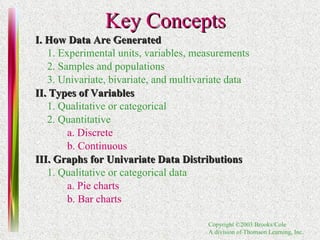
This document provides an overview of key concepts in probability and statistics including:
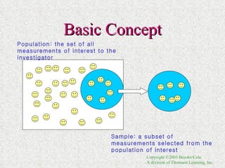
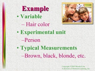
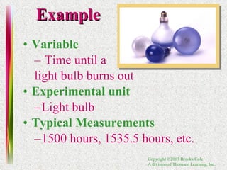
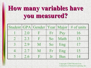
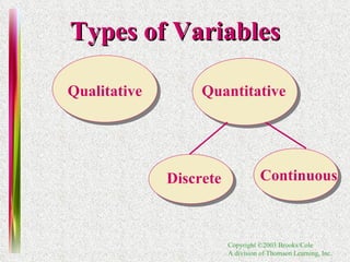
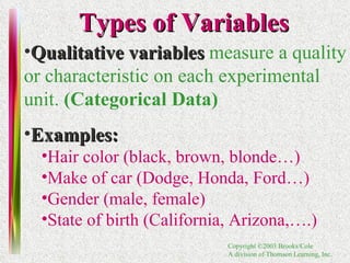
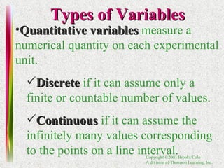
1. Definitions of experimental units, variables, samples, populations, and types of data.
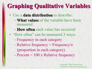
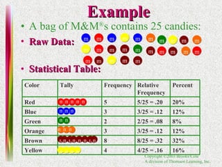
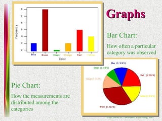
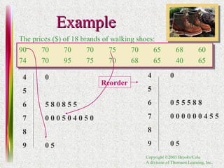
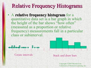
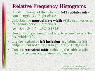
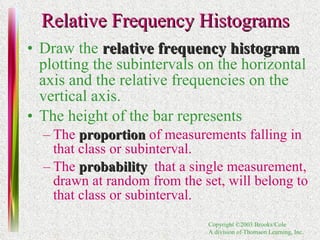
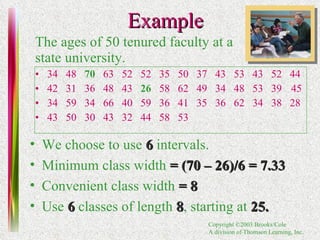
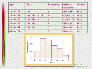
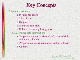
2. Methods for graphing univariate data distributions including bar charts, pie charts, histograms and more.
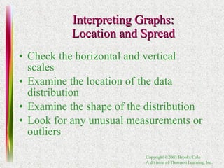
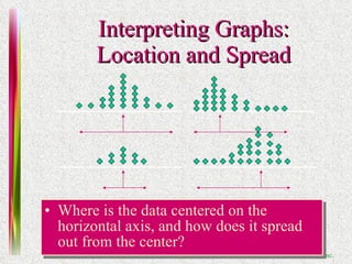
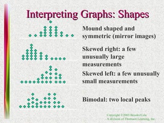
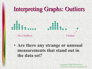
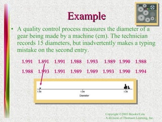
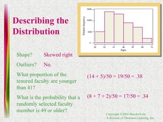
3. Techniques for interpreting graphs and describing data distributions based on their shape, proportion of measurements in intervals, and presence of outliers.