Objectives of thissession
• To know how to make frequency distributions and its
importance
• To know different terminology in frequency
distribution table
• To learn different graphs/diagrams for graphical
presentation of data.
2
Frequency Distributions
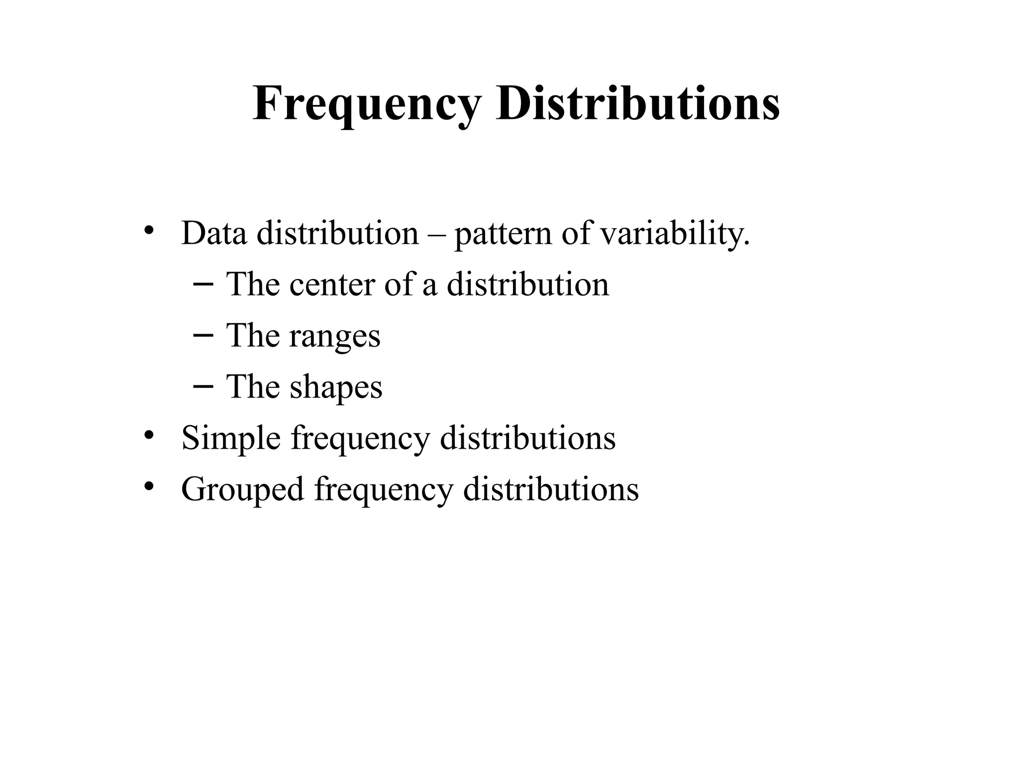
• Datadistribution – pattern of variability.
– The center of a distribution
– The ranges
– The shapes
• Simple frequency distributions
• Grouped frequency distributions
5
6.
Simple Frequency Distribution
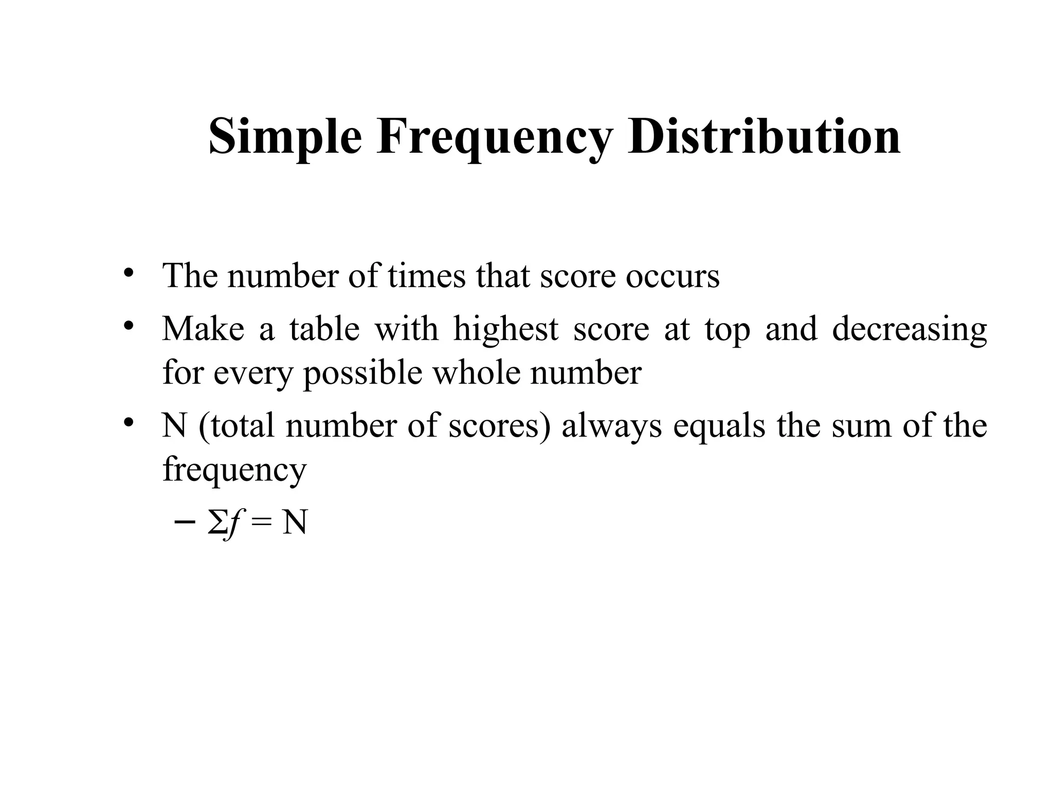
•The number of times that score occurs
• Make a table with highest score at top and decreasing
for every possible whole number
• N (total number of scores) always equals the sum of the
frequency
– f = N
6
7.
Categorical or Qualitative
Categoricalor Qualitative
Frequency Distributions
Frequency Distributions
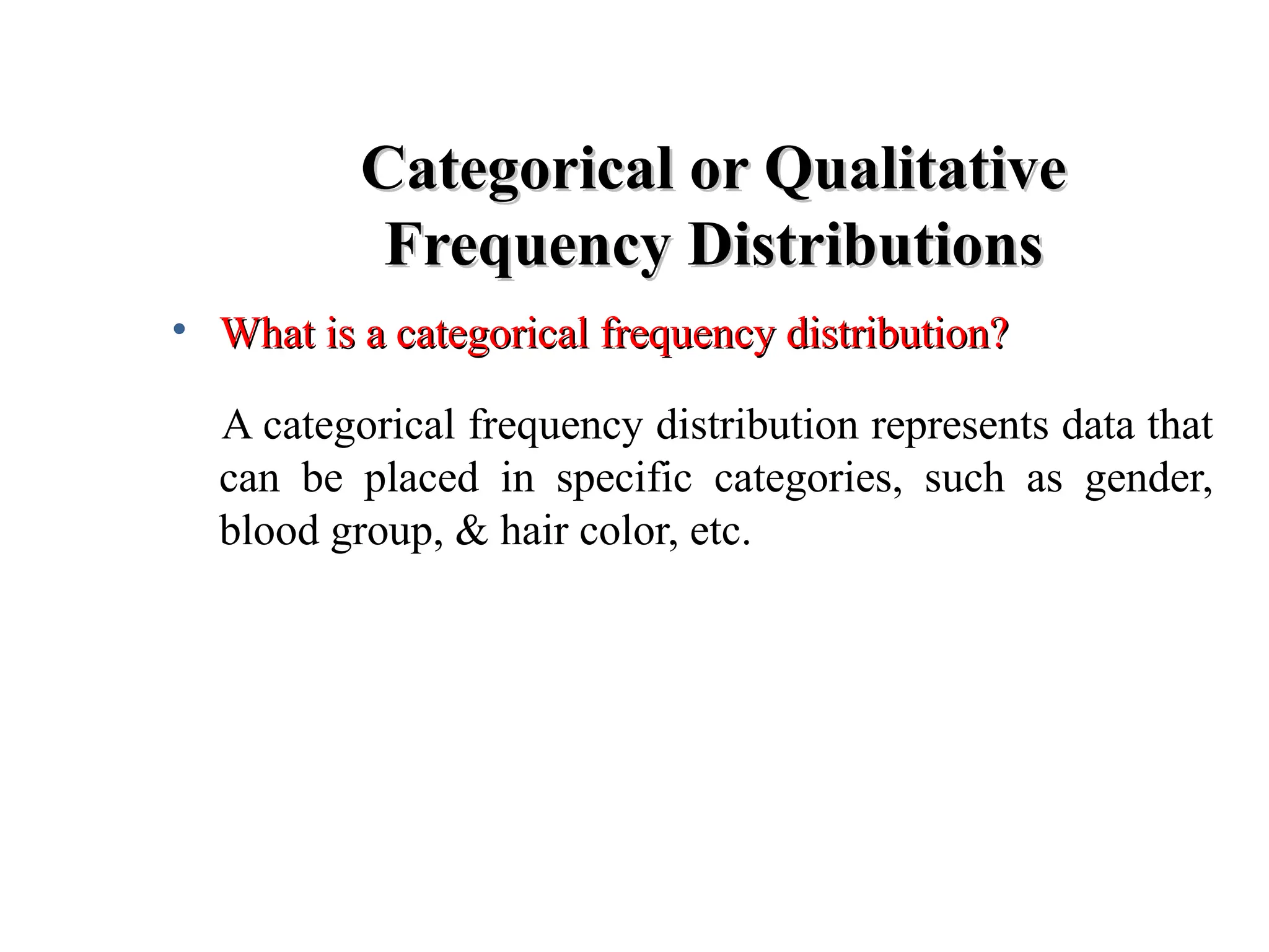
• What is a categorical frequency distribution?
What is a categorical frequency distribution?
A categorical frequency distribution represents data that
can be placed in specific categories, such as gender,
blood group, & hair color, etc.
8.
Categorical or Qualitative
Categoricalor Qualitative
Frequency Distributions -- Example
Frequency Distributions -- Example
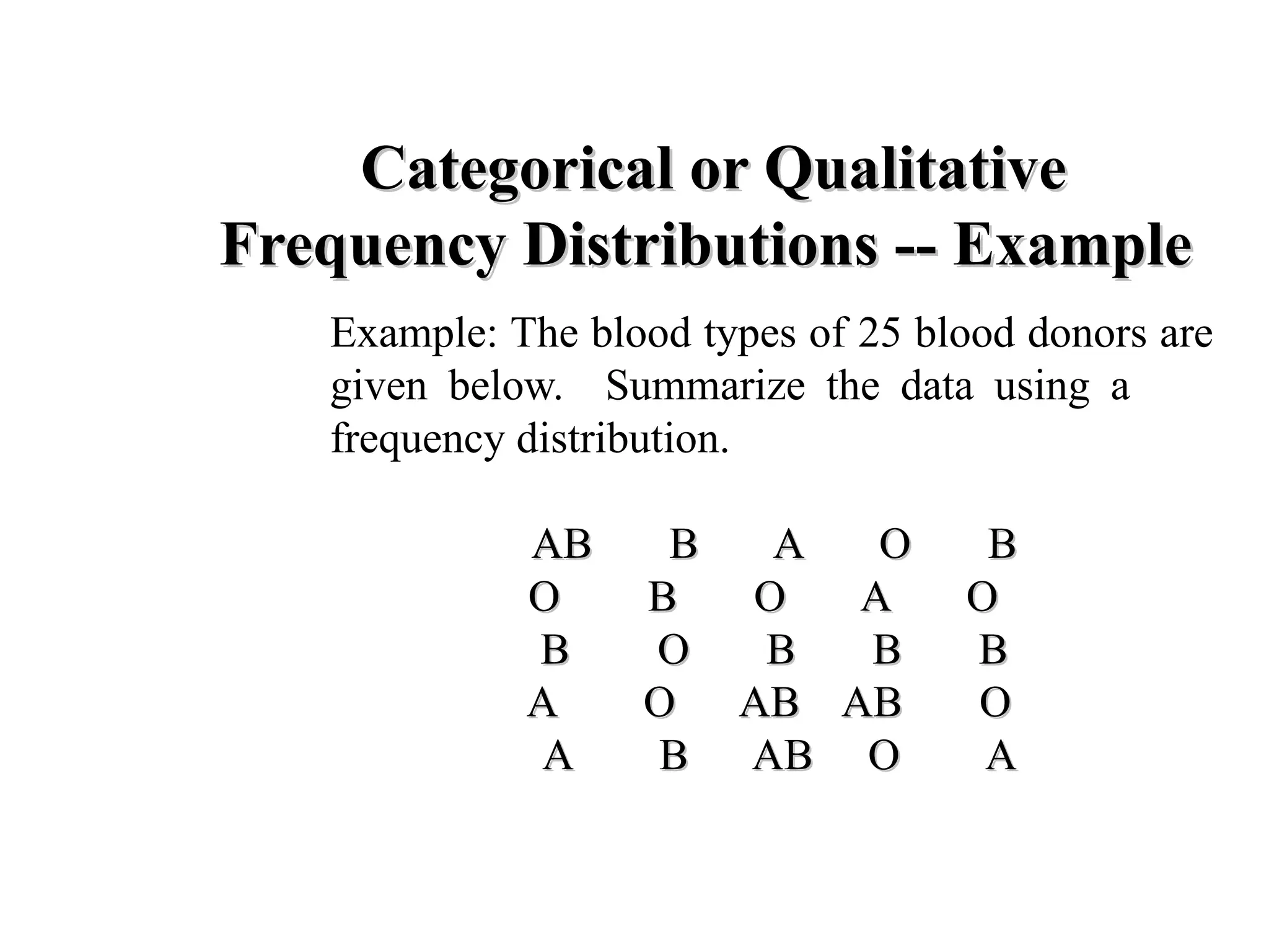
Example: The blood types of 25 blood donors are
given below. Summarize the data using a
frequency distribution.
AB B A O B
AB B A O B
O B O A O
O B O A O
B O B B B
B O B B B
A O AB AB O
A O AB AB O
A B AB O A
A B AB O A
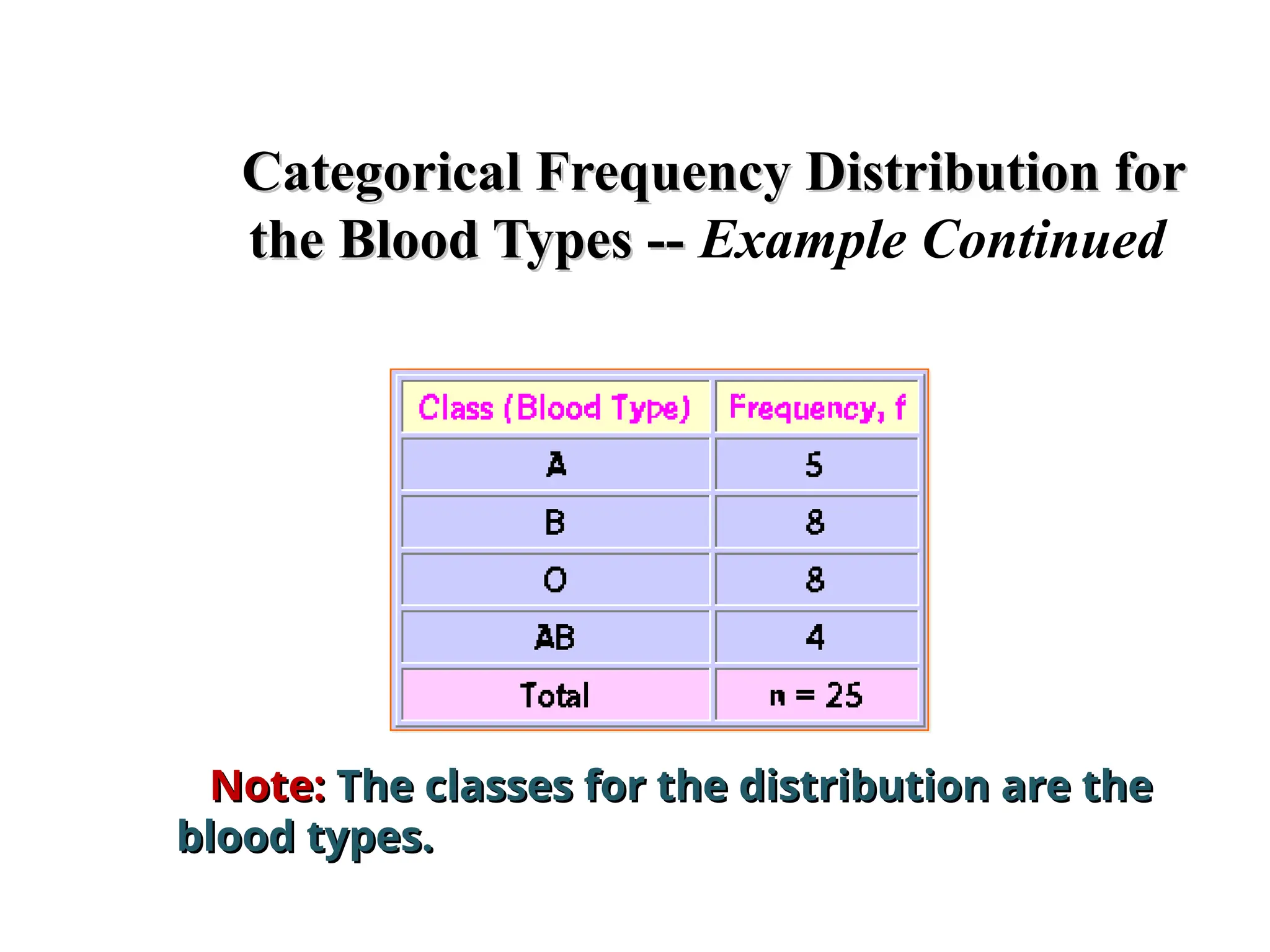
9.
Categorical Frequency Distributionfor
Categorical Frequency Distribution for
the Blood Types --
the Blood Types -- Example Continued
Note:
Note: The classes for the distribution are the
The classes for the distribution are the
blood types.
blood types.
10.
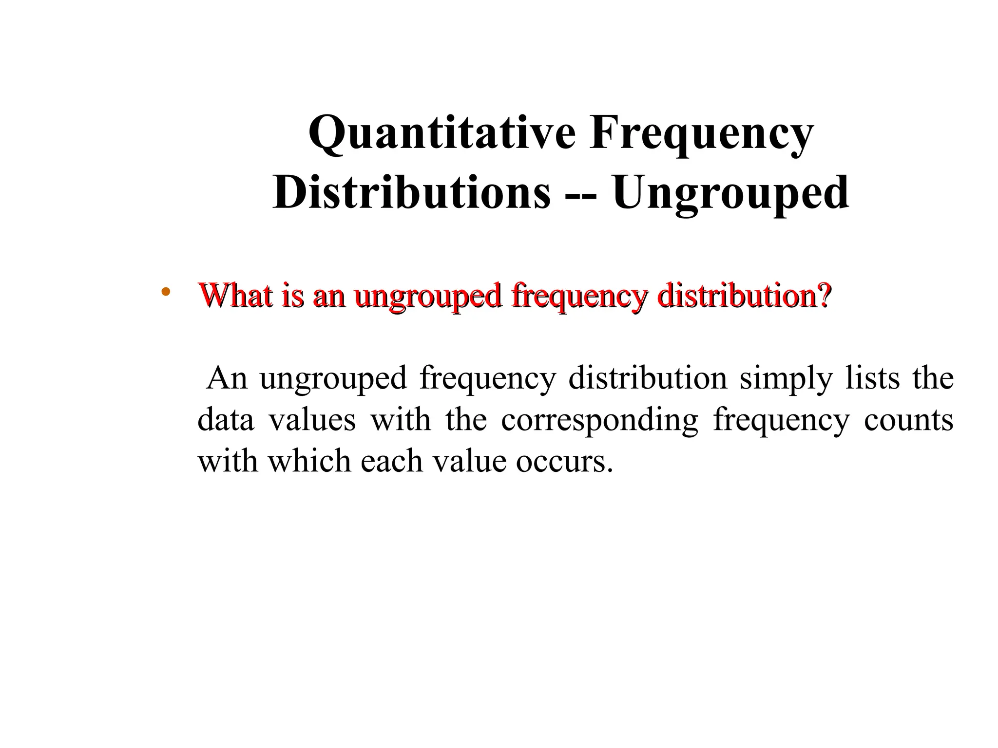
Quantitative Frequency
Distributions --Ungrouped
• What is an ungrouped frequency distribution?
What is an ungrouped frequency distribution?
An ungrouped frequency distribution simply lists the
data values with the corresponding frequency counts
with which each value occurs.
11.
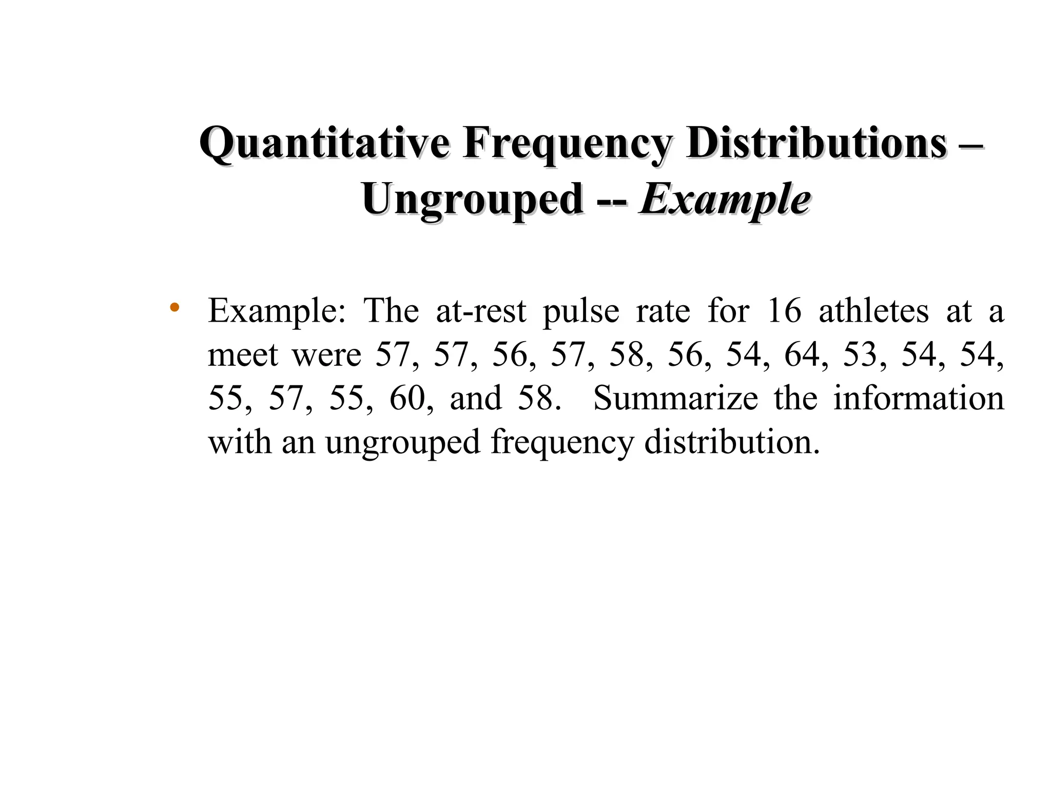
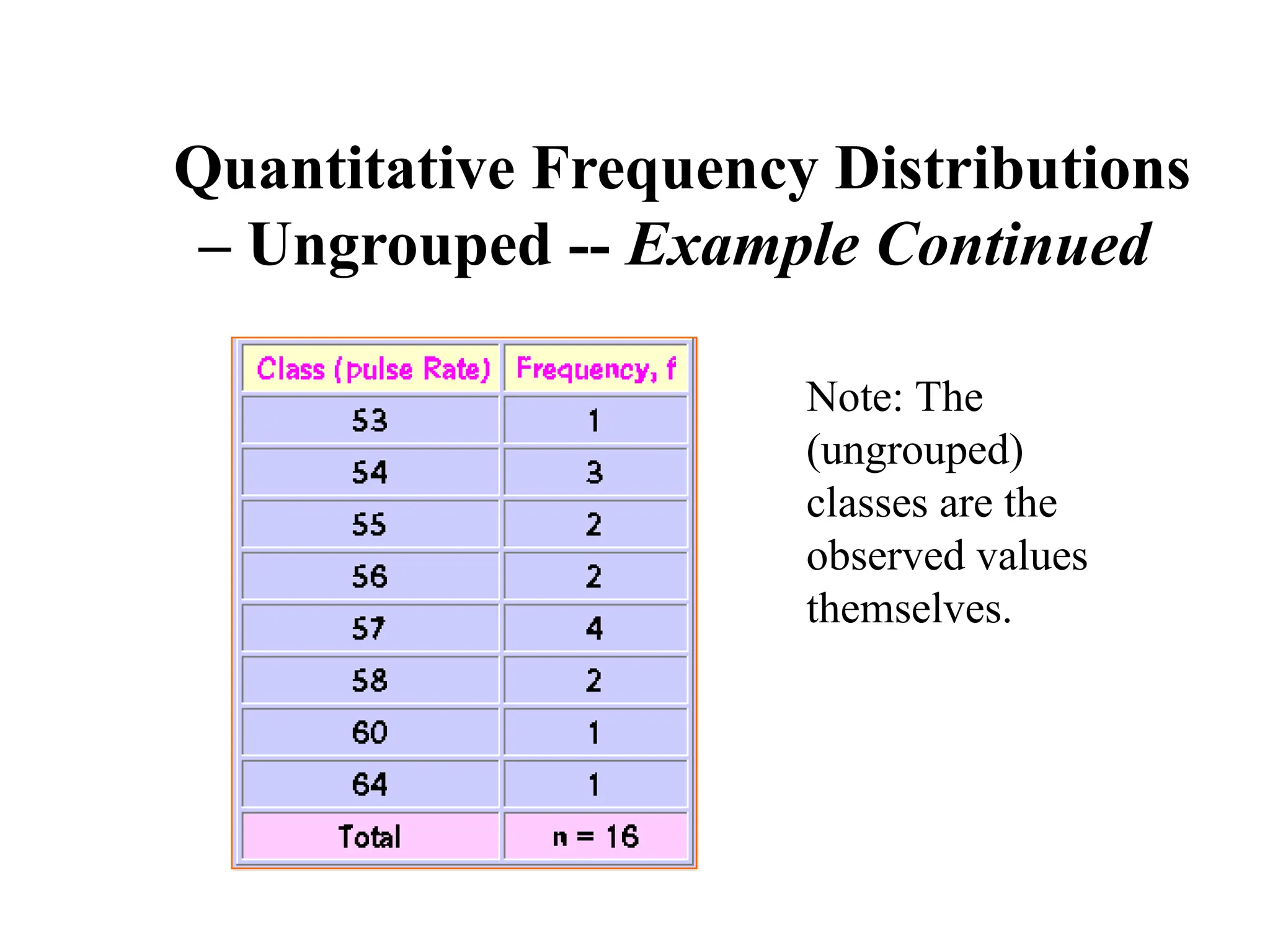
Quantitative Frequency Distributions–
Quantitative Frequency Distributions –
Ungrouped --
Ungrouped -- Example
Example
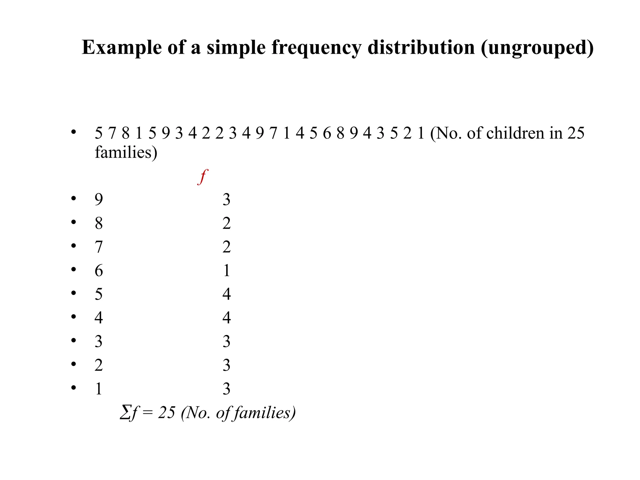
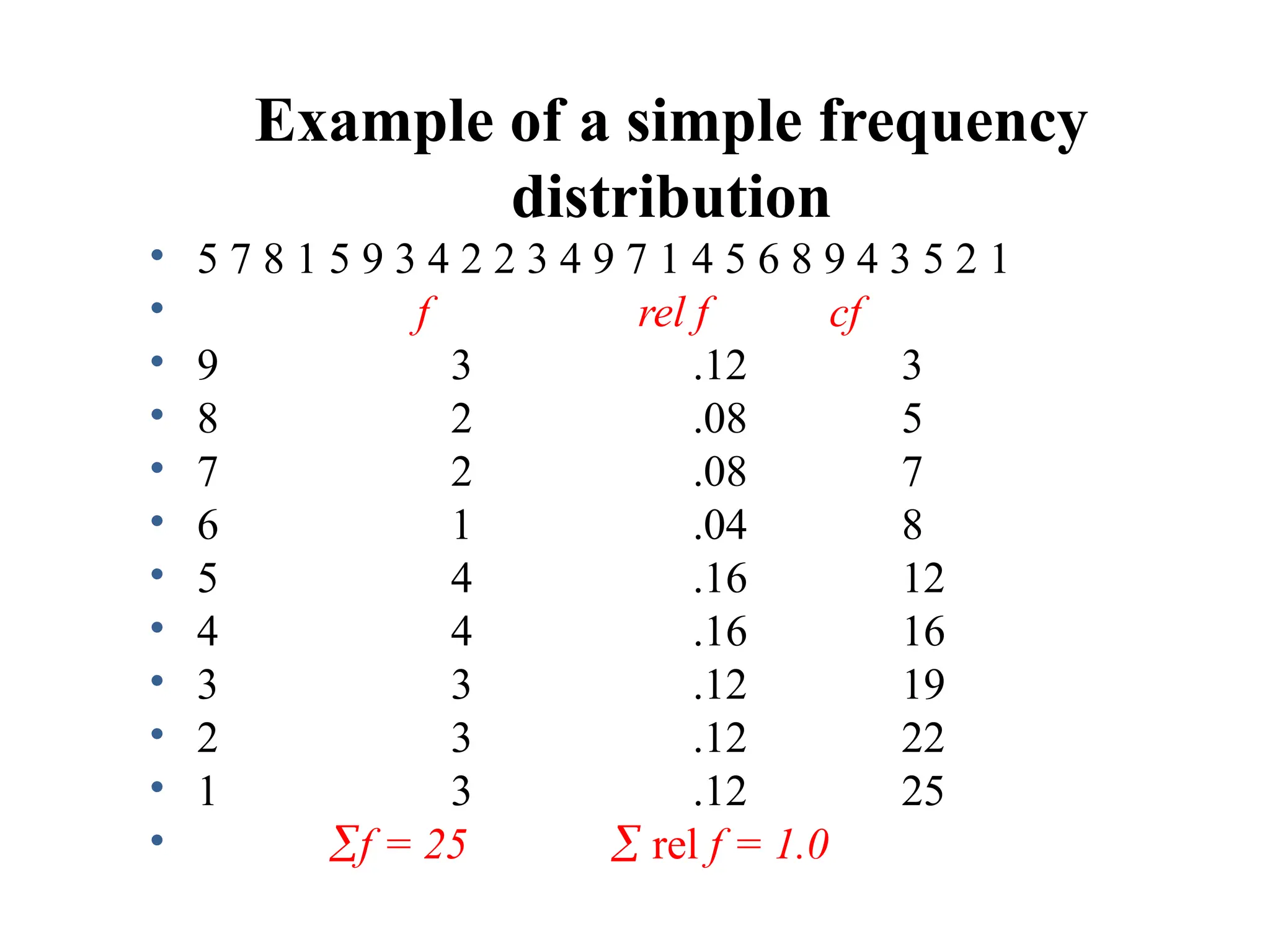
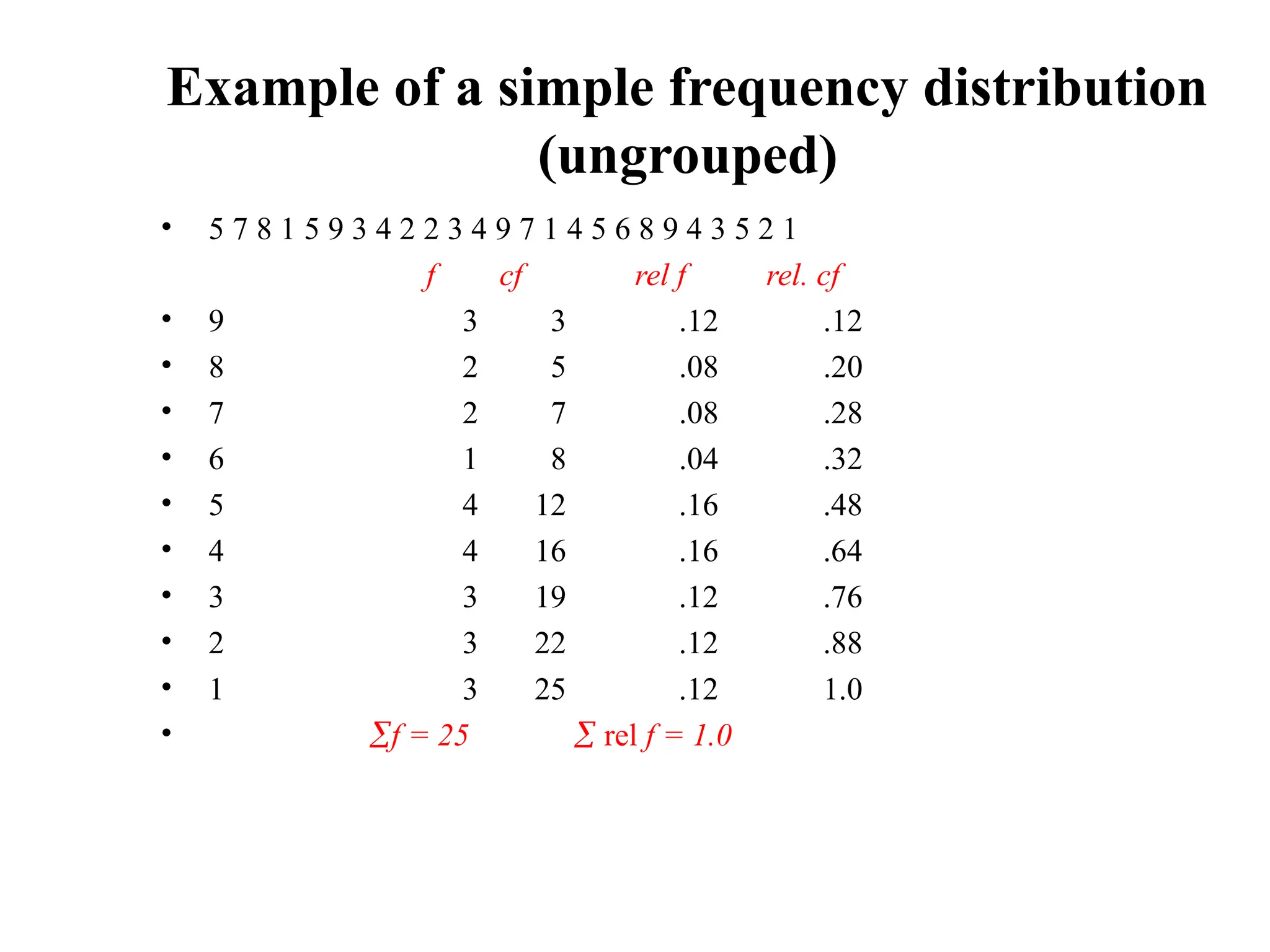
• Example: The at-rest pulse rate for 16 athletes at a
meet were 57, 57, 56, 57, 58, 56, 54, 64, 53, 54, 54,
55, 57, 55, 60, and 58. Summarize the information
with an ungrouped frequency distribution.
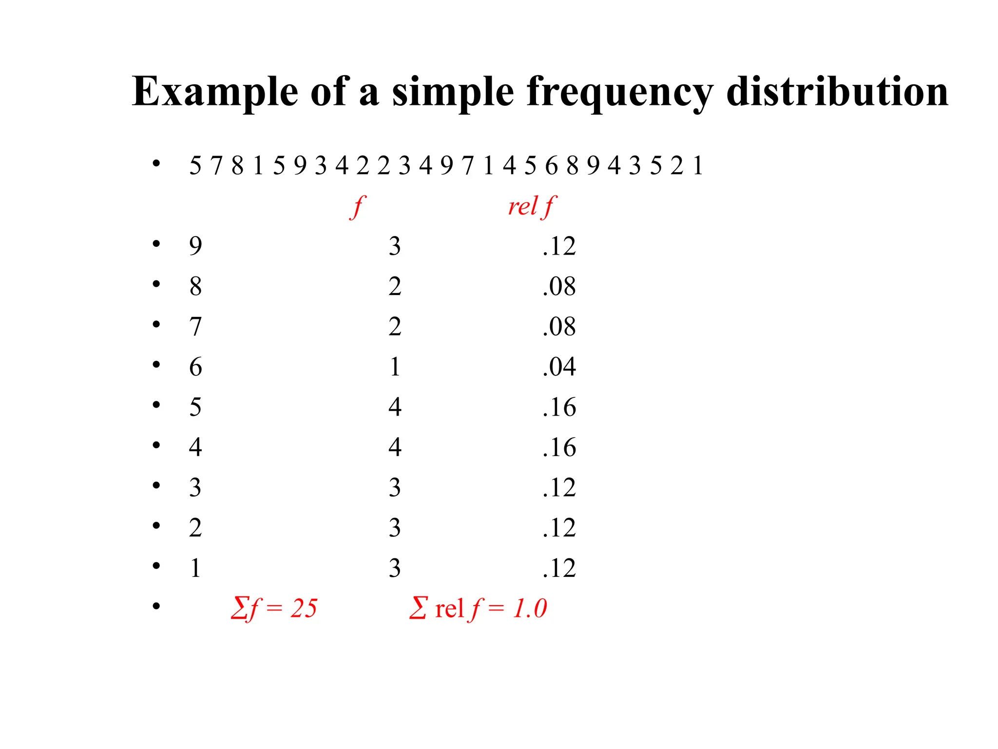
Example of asimple frequency distribution (ungrouped)
• 5 7 8 1 5 9 3 4 2 2 3 4 9 7 1 4 5 6 8 9 4 3 5 2 1 (No. of children in 25
families)
f
• 9 3
• 8 2
• 7 2
• 6 1
• 5 4
• 4 4
• 3 3
• 2 3
• 1 3
f = 25 (No. of families)
14.
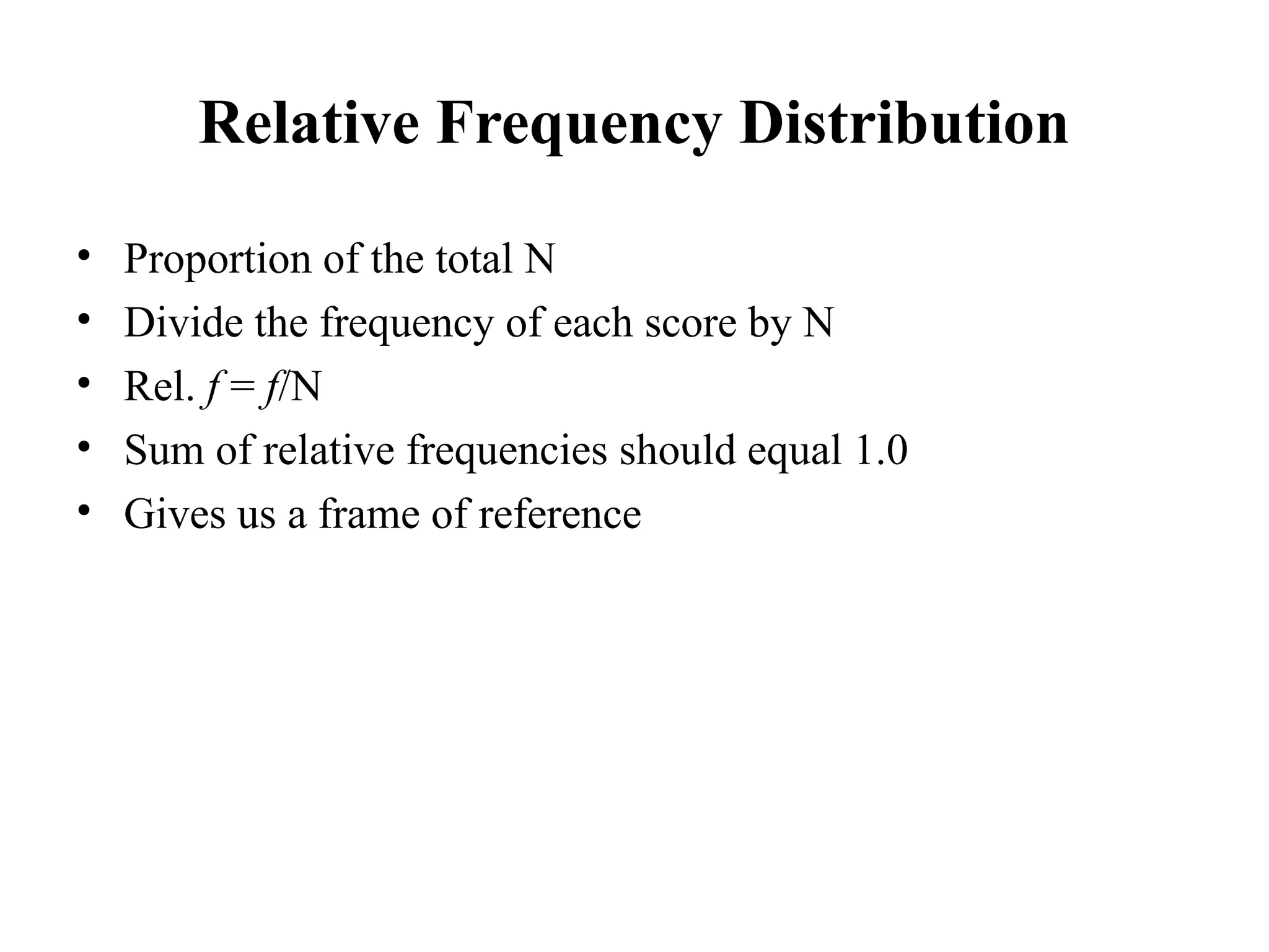
Relative Frequency Distribution
•Proportion of the total N
• Divide the frequency of each score by N
• Rel. f = f/N
• Sum of relative frequencies should equal 1.0
• Gives us a frame of reference
14
15.
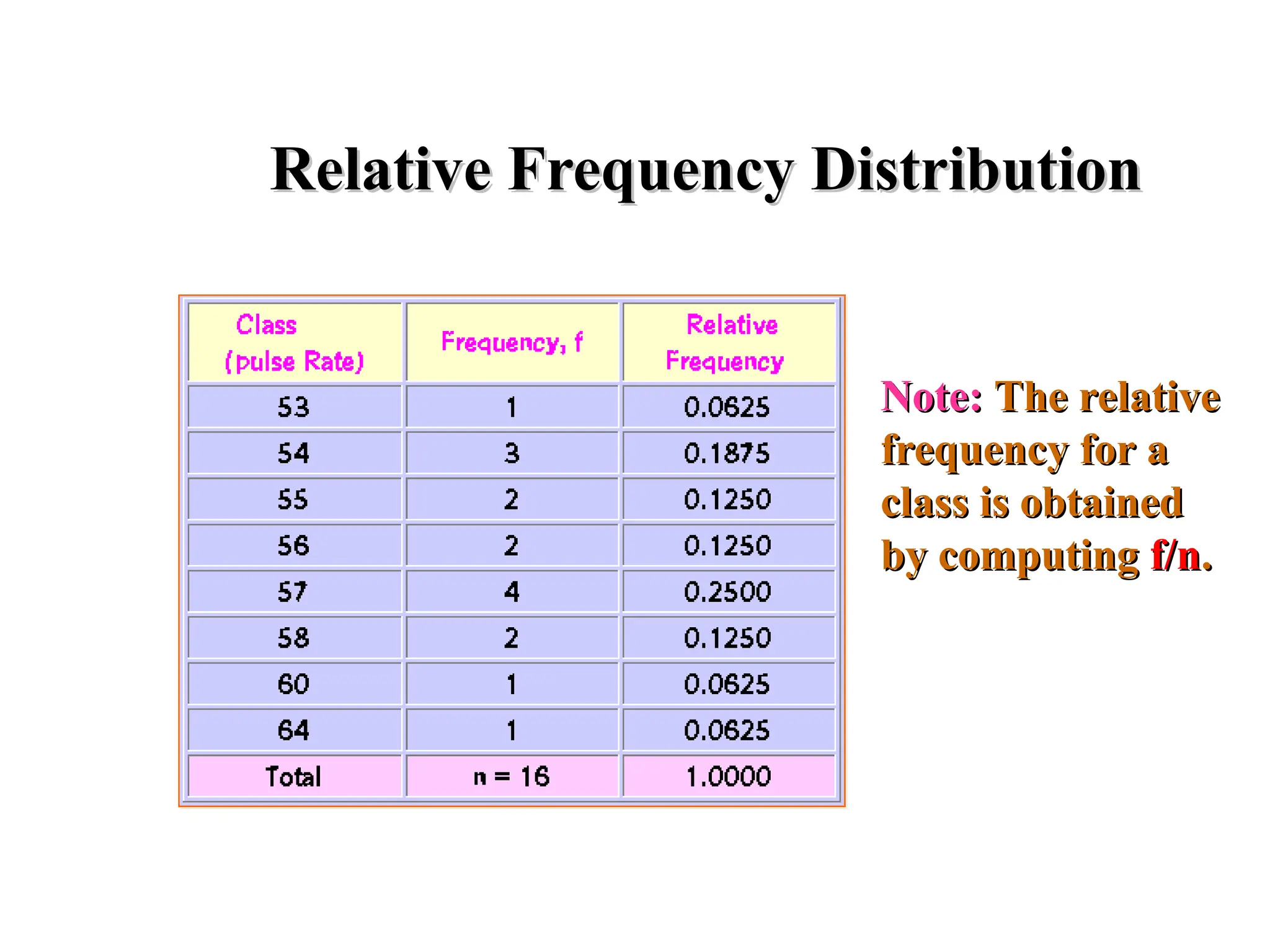
Relative Frequency Distribution
RelativeFrequency Distribution
Note:
Note: The relative
The relative
frequency for a
frequency for a
class is obtained
class is obtained
by computing
by computing f/n
f/n.
.
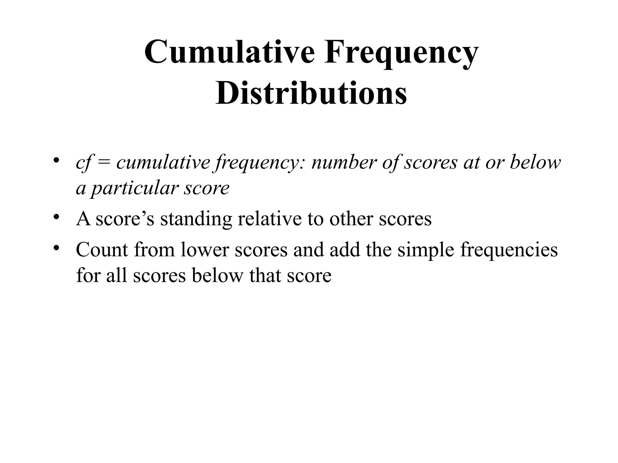
Cumulative Frequency
Distributions
• cf= cumulative frequency: number of scores at or below
a particular score
• A score’s standing relative to other scores
• Count from lower scores and add the simple frequencies
for all scores below that score
17
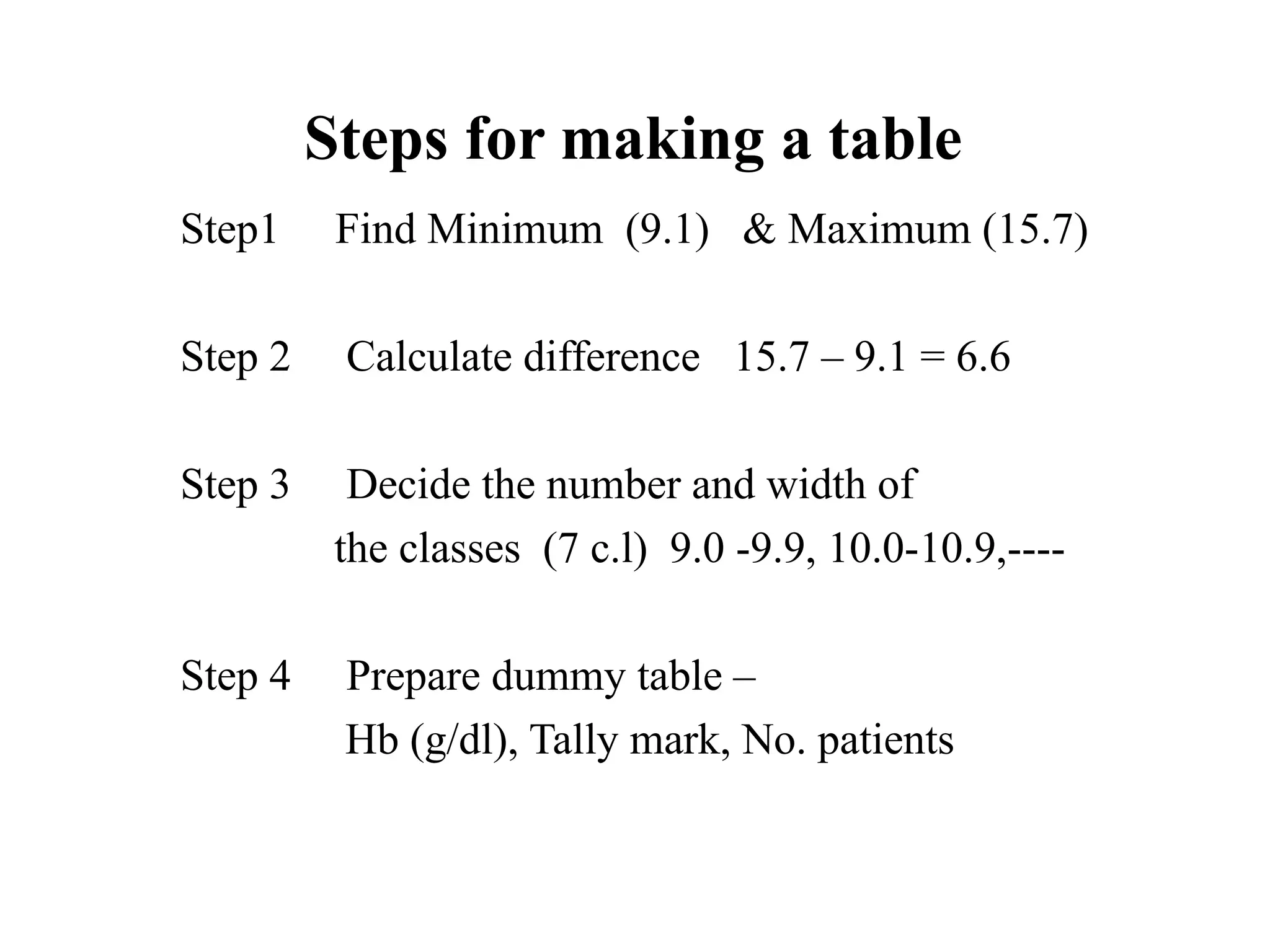
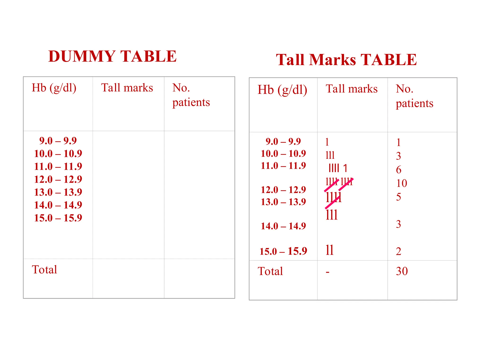
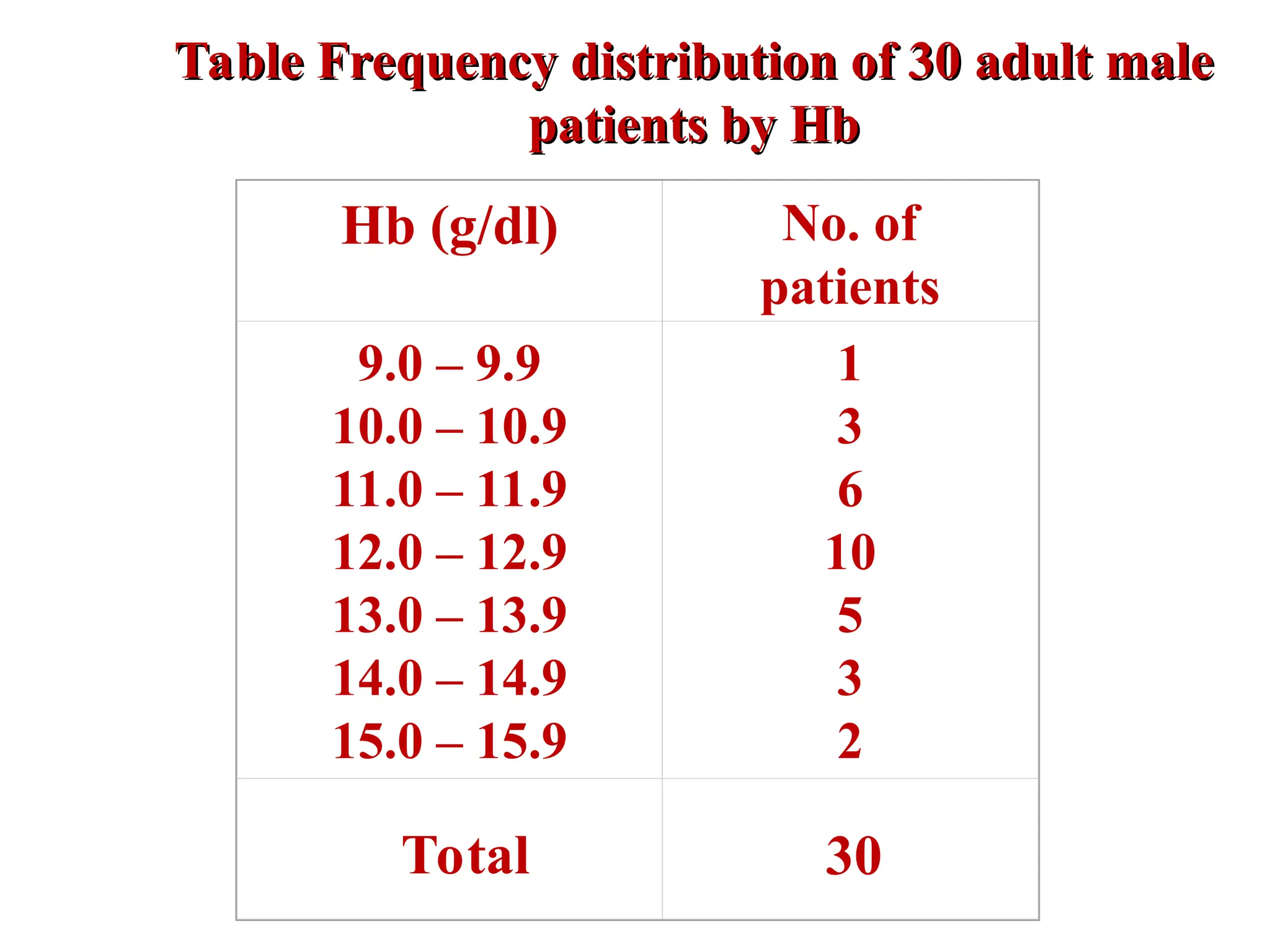
Quantitative Frequency
Distributions --Grouped
• What is a grouped frequency distribution?
What is a grouped frequency distribution? A grouped
frequency distribution is obtained by constructing
classes (or intervals) for the data, and then listing the
corresponding number of values (frequency counts) in
each interval.
24
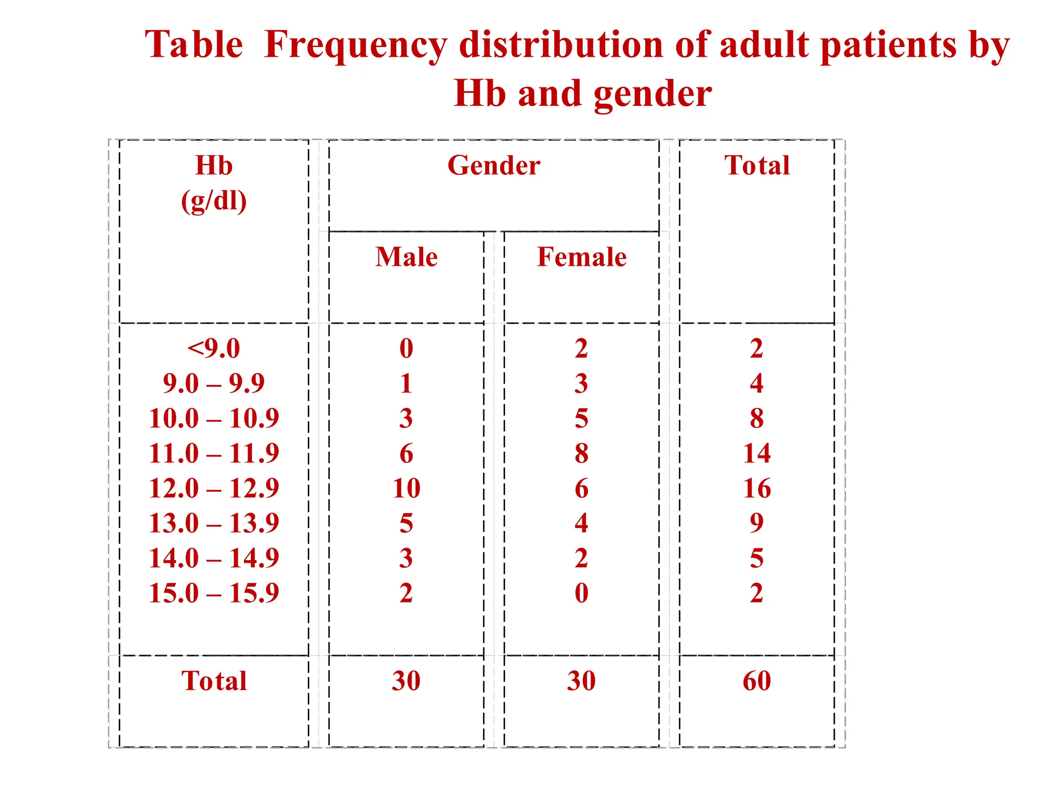
Hb (g/dl) No.of
patients
9.0 – 9.9
10.0 – 10.9
11.0 – 11.9
12.0 – 12.9
13.0 – 13.9
14.0 – 14.9
15.0 – 15.9
1
3
6
10
5
3
2
Total 30
Table Frequency distribution of 30 adult male
Table Frequency distribution of 30 adult male
patients by Hb
patients by Hb
26
Elements of aTable
Ideal table should have
Number
Title
Column headings
Foot-notes
Number - Table number for identification in a report
Title, place - Describe the body of the table,
variables,
Time period (What, how classified, where and when)
Column - Variable name, No. , Percentages (%), etc.,
Heading
Foot-note(s) - to describe some column/row
headings, special cells, source, etc.,
27.
27
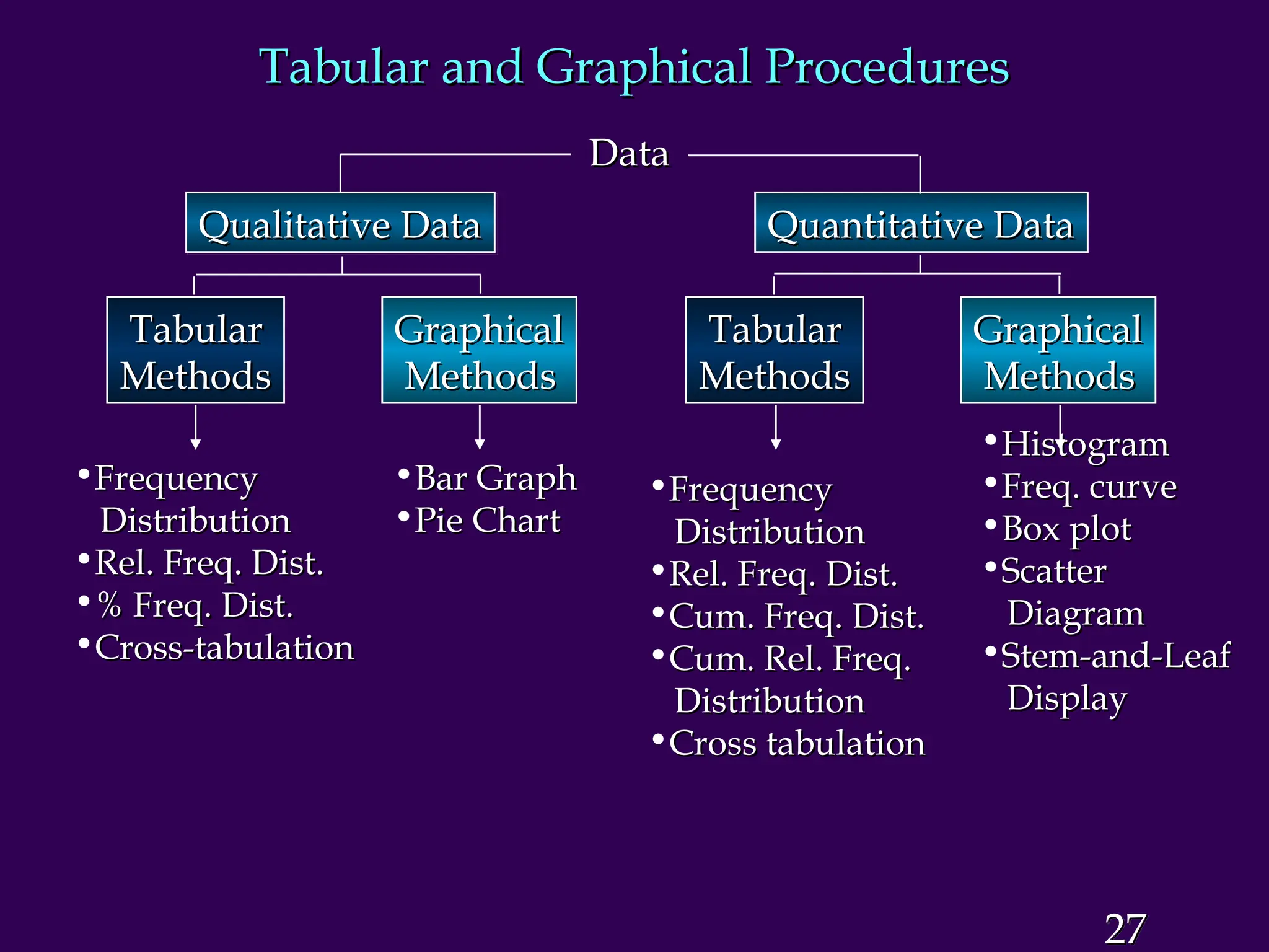
Tabular and GraphicalProcedures
Tabular and Graphical Procedures
Data
Data
Qualitative Data
Qualitative Data Quantitative Data
Quantitative Data
Tabular
Tabular
Methods
Methods
Tabular
Tabular
Methods
Methods
Graphical
Graphical
Methods
Methods
Graphical
Graphical
Methods
Methods
•Frequency
Frequency
Distribution
Distribution
•Rel. Freq. Dist.
Rel. Freq. Dist.
•% Freq. Dist.
% Freq. Dist.
•Cross-tabulation
Cross-tabulation
•Bar Graph
Bar Graph
•Pie Chart
Pie Chart
•Frequency
Frequency
Distribution
Distribution
•Rel. Freq. Dist.
Rel. Freq. Dist.
•Cum. Freq. Dist.
Cum. Freq. Dist.
•Cum. Rel. Freq.
Cum. Rel. Freq.
Distribution
Distribution
•Cross tabulation
Cross tabulation
•Histogram
Histogram
•Freq. curve
Freq. curve
•Box plot
Box plot
•Scatter
Scatter
Diagram
Diagram
•Stem-and-Leaf
Stem-and-Leaf
Display
Display
28.
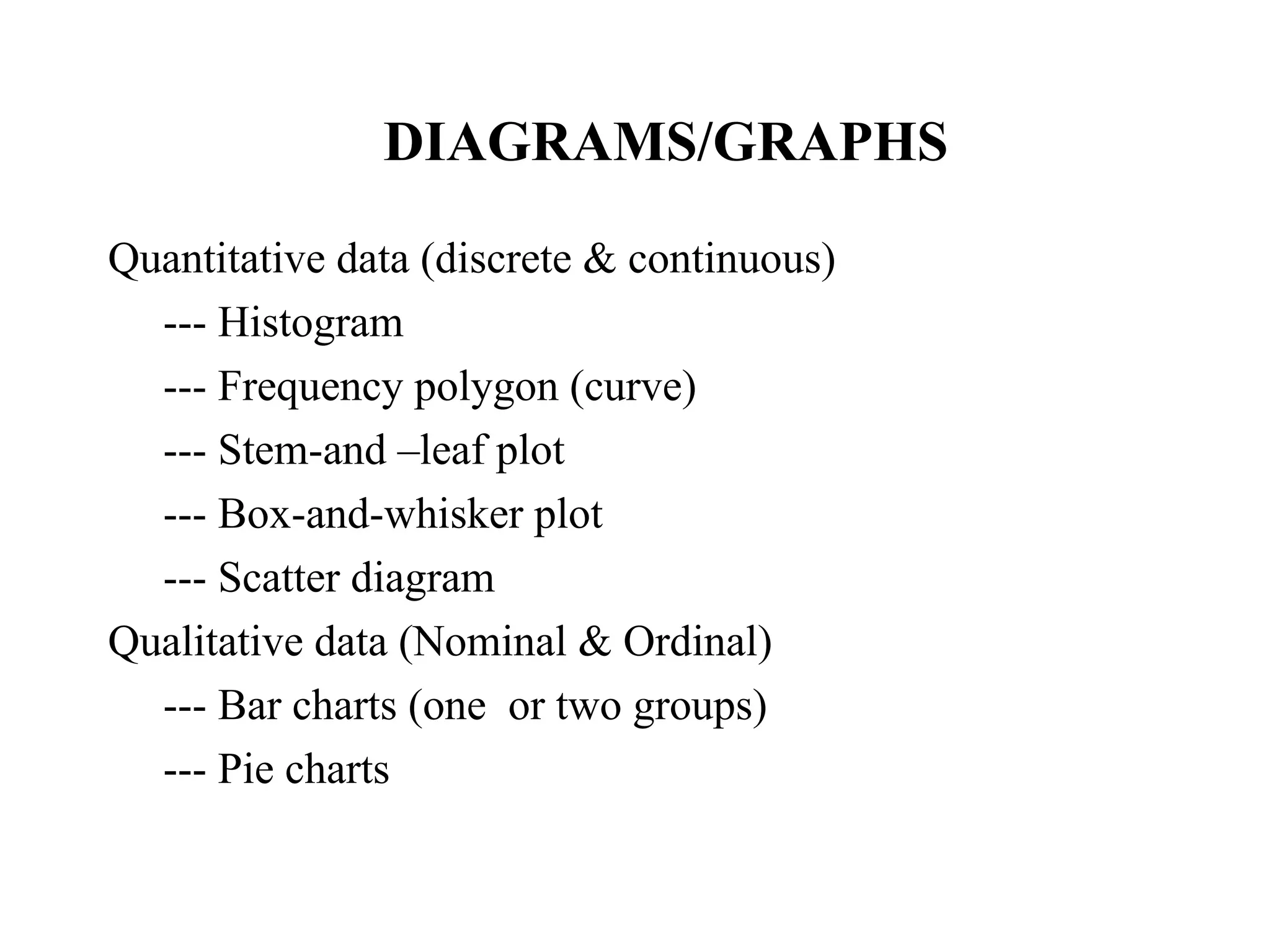
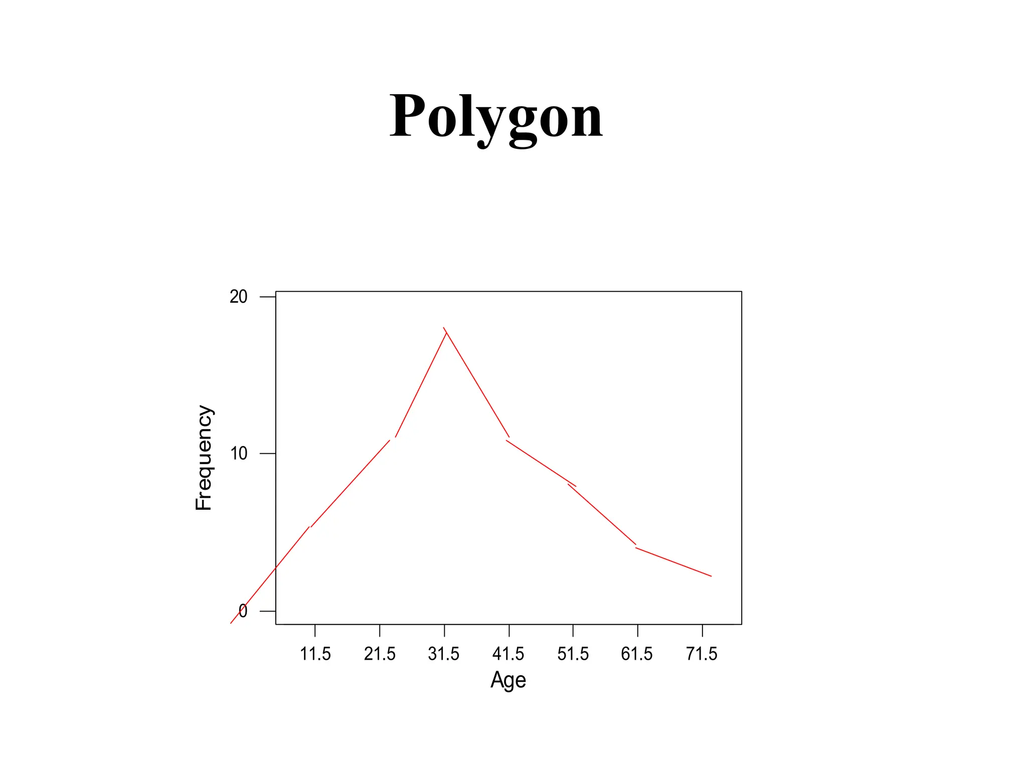
DIAGRAMS/GRAPHS
Quantitative data (discrete& continuous)
--- Histogram
--- Frequency polygon (curve)
--- Stem-and –leaf plot
--- Box-and-whisker plot
--- Scatter diagram
Qualitative data (Nominal & Ordinal)
--- Bar charts (one or two groups)
--- Pie charts
28
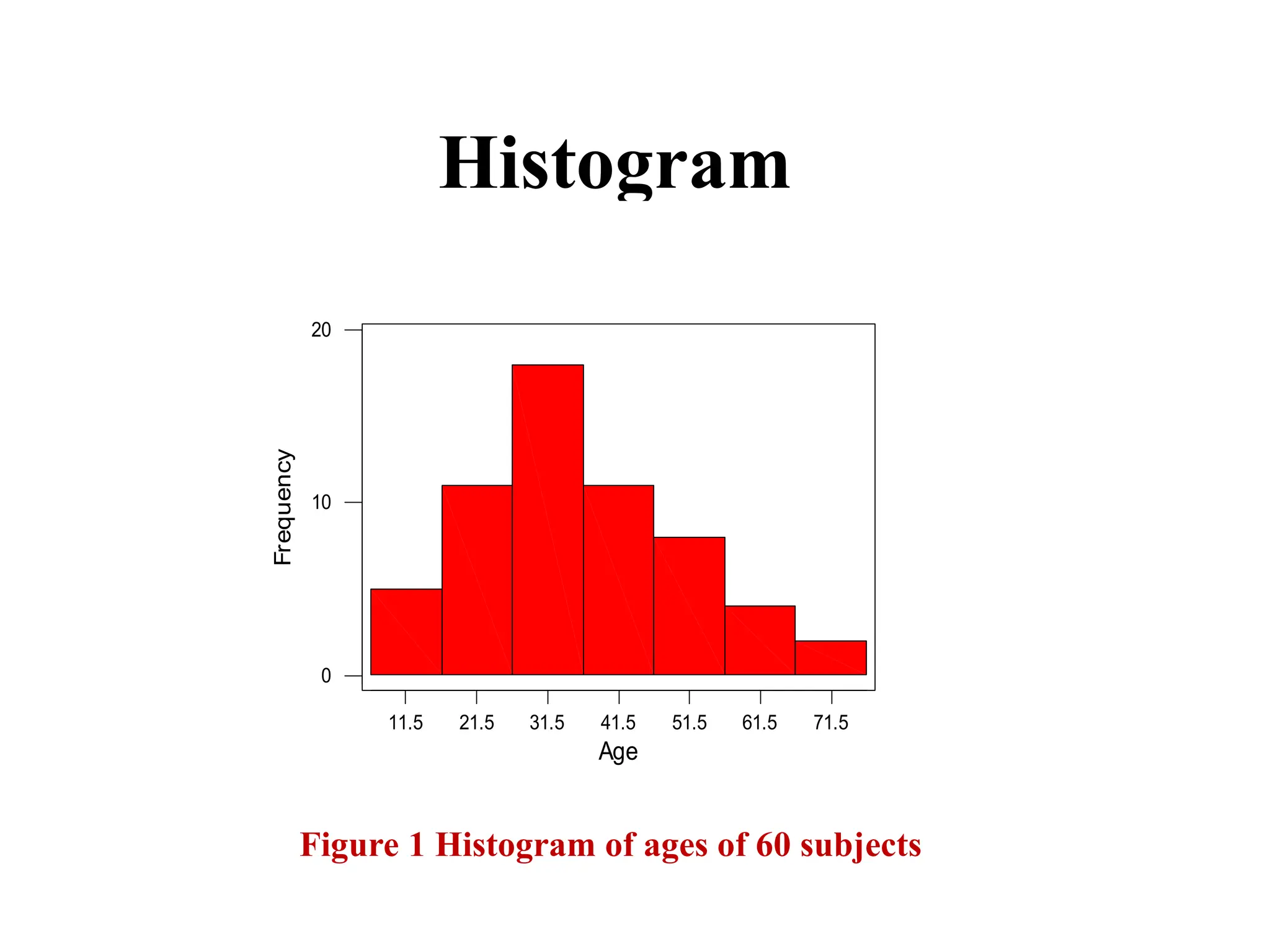
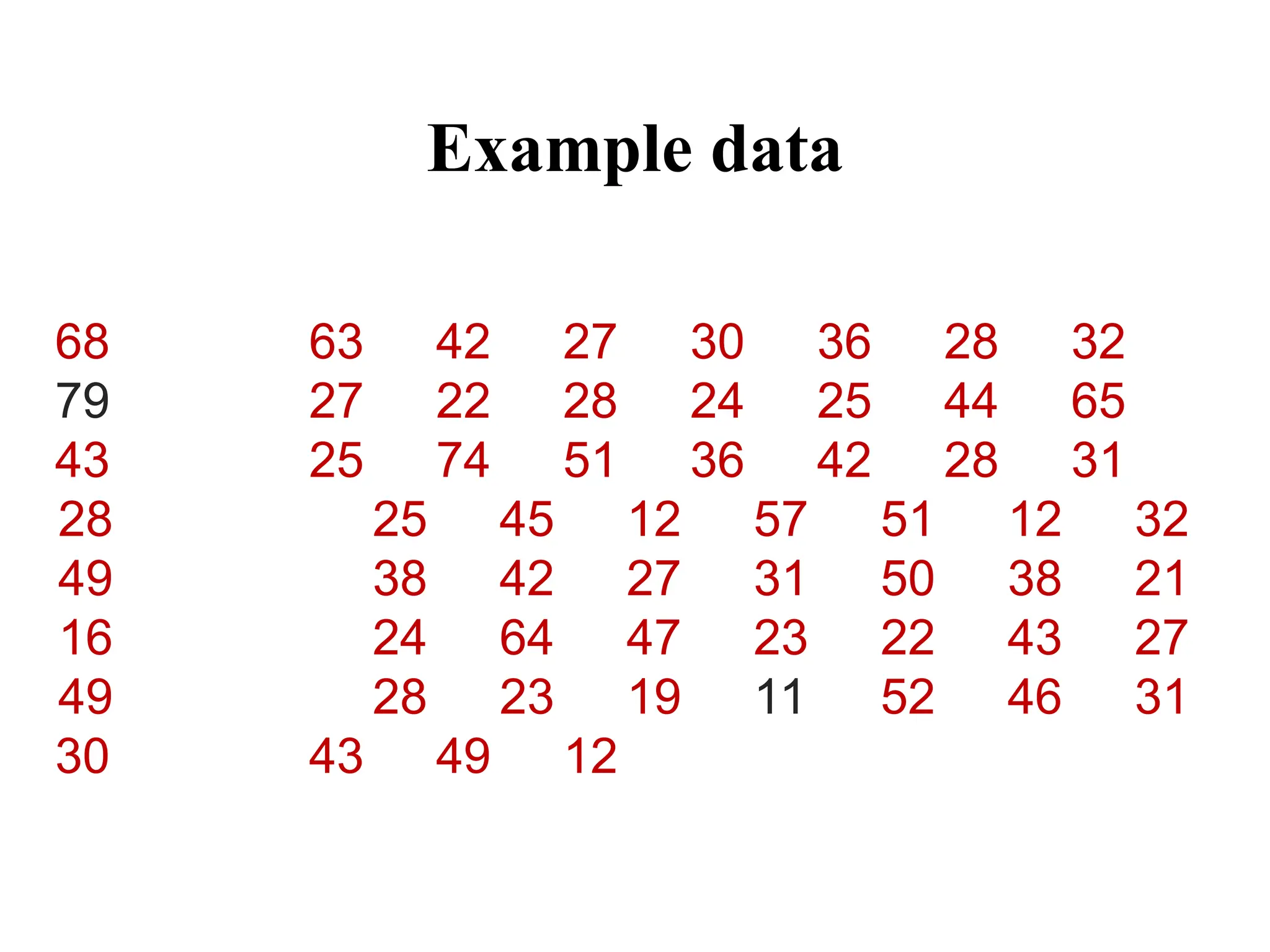
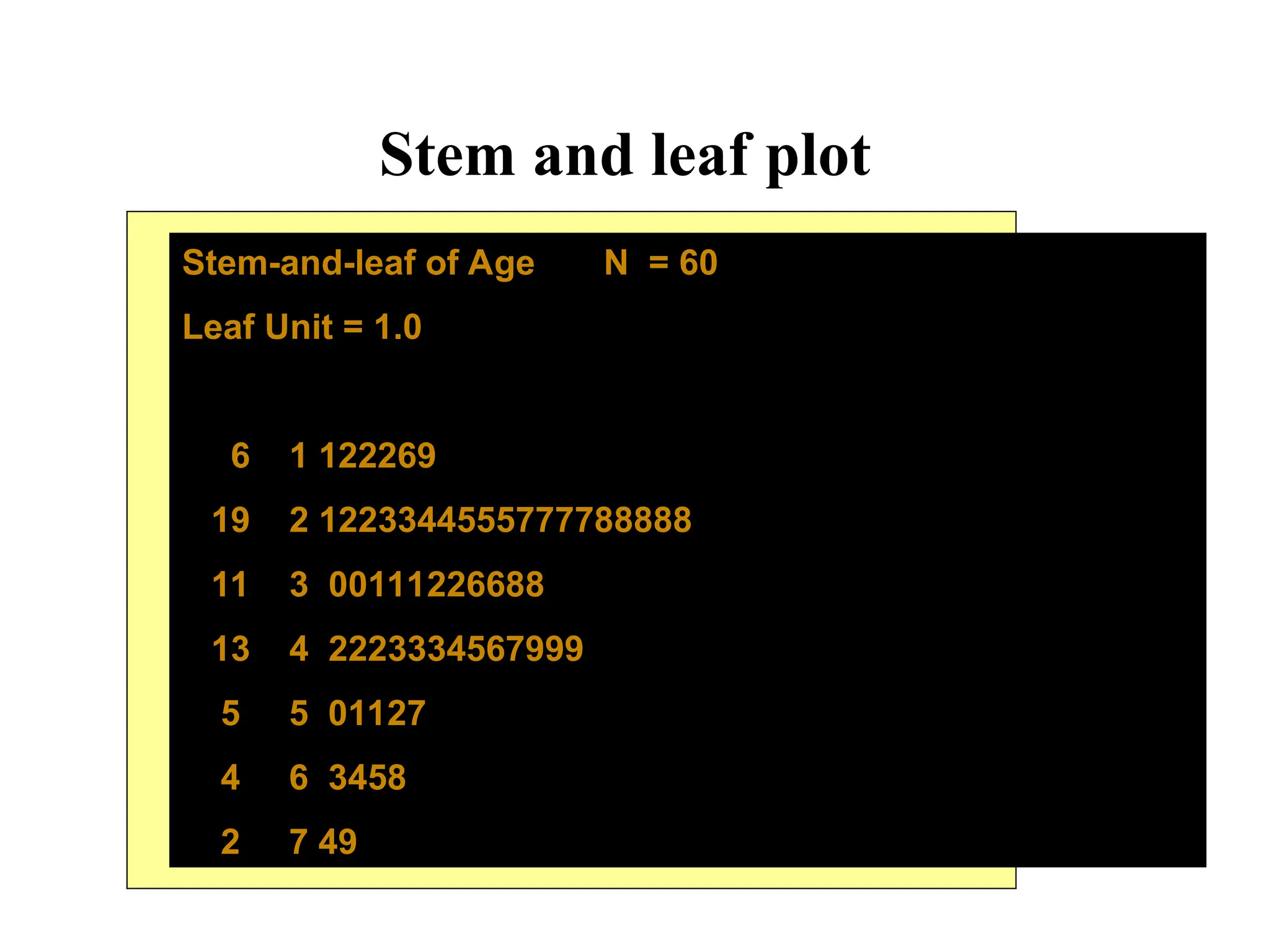
Stem and leafplot
33
Stem-and-leaf of Age N = 60
Leaf Unit = 1.0
6 1 122269
19 2 1223344555777788888
11 3 00111226688
13 4 2223334567999
5 5 01127
4 6 3458
2 7 49
34.
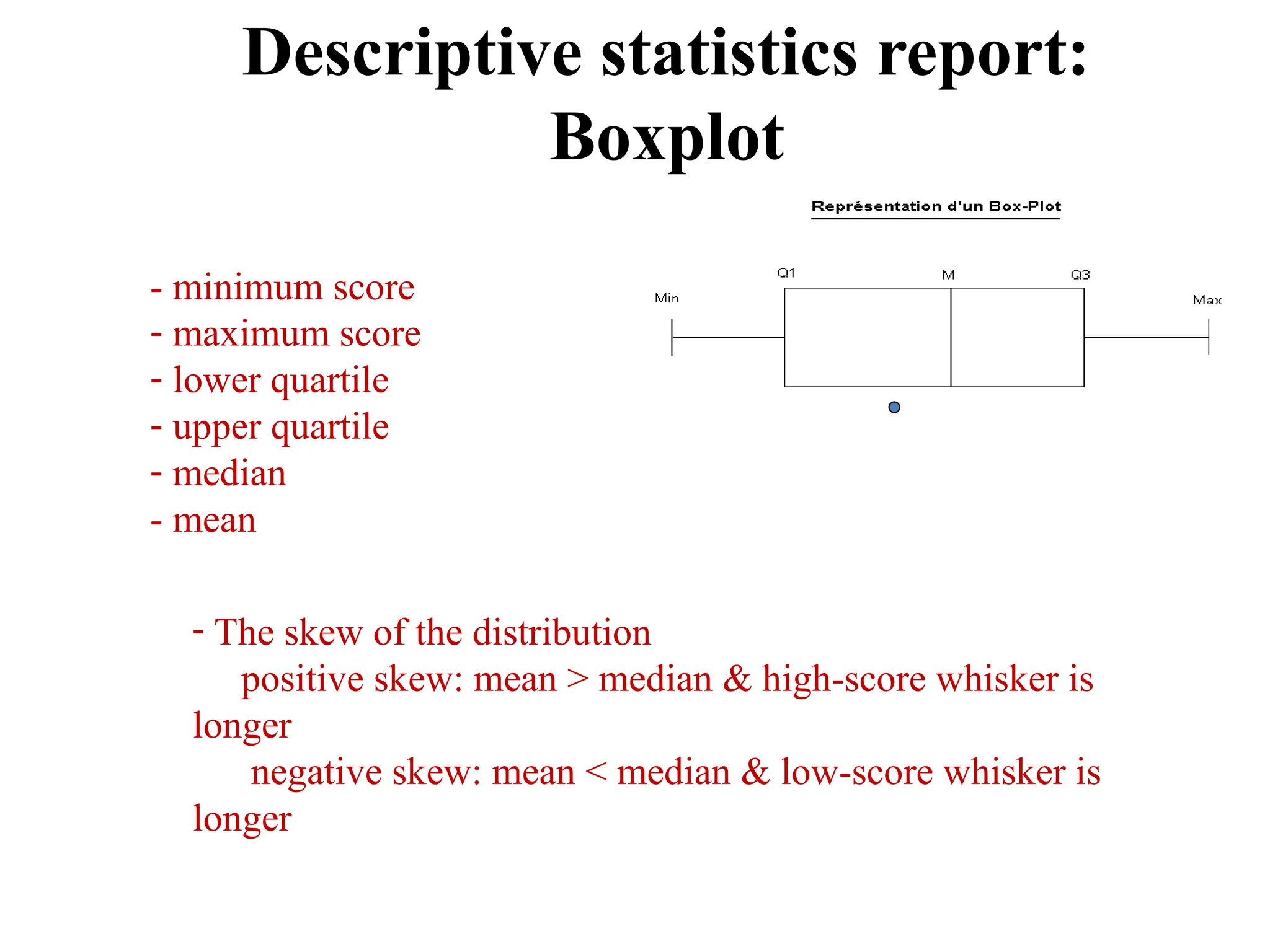
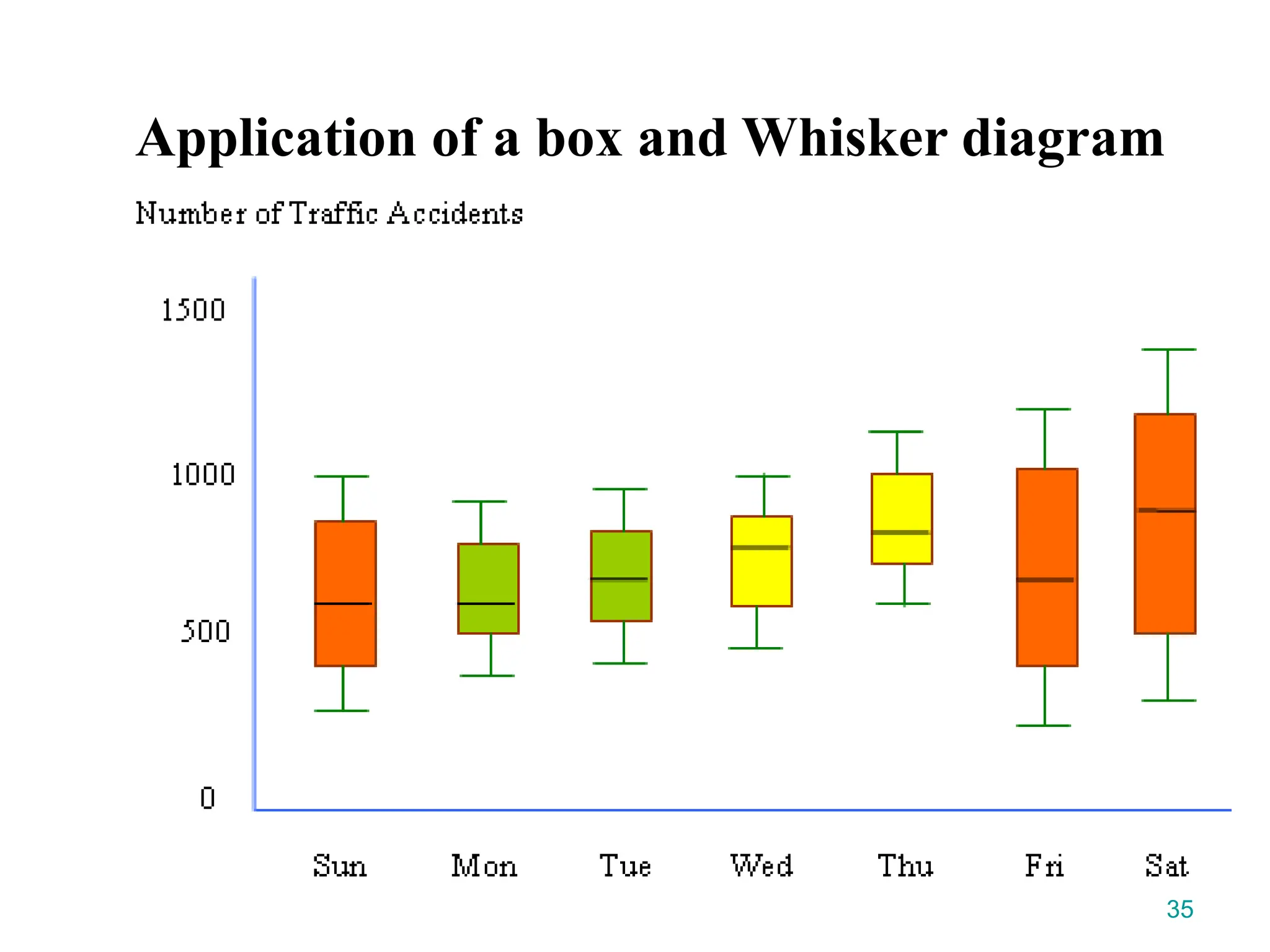
Descriptive statistics report:
Boxplot
34
-minimum score
- maximum score
- lower quartile
- upper quartile
- median
- mean
- The skew of the distribution
positive skew: mean > median & high-score whisker is
longer
negative skew: mean < median & low-score whisker is
longer
38
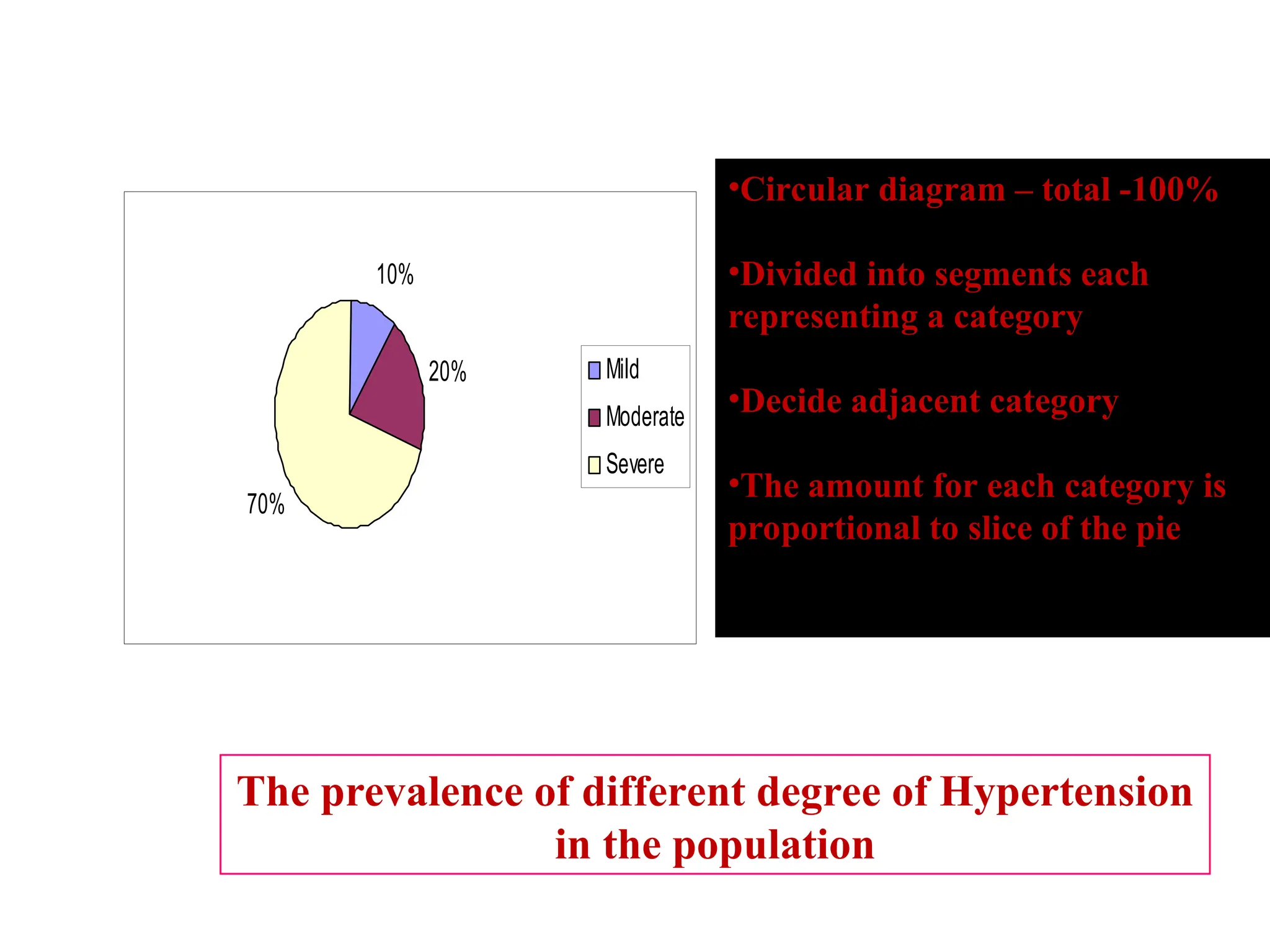
10%
20%
70%
Mild
Moderate
Severe
The prevalence ofdifferent degree of Hypertension
in the population
Pie Chart
•Circular diagram – total -100%
•Divided into segments each
representing a category
•Decide adjacent category
•The amount for each category is
proportional to slice of the pie
39.
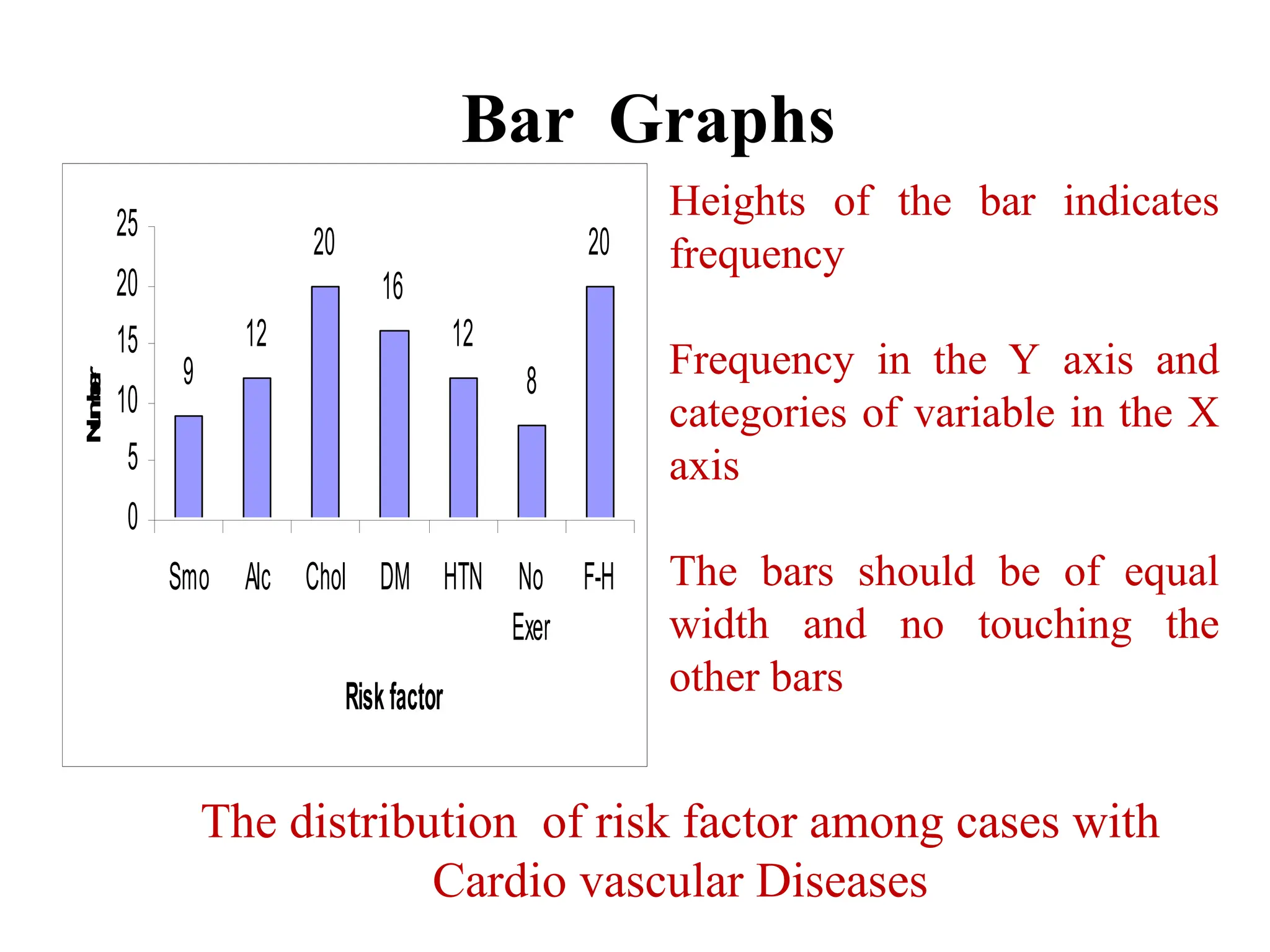
Bar Graphs
39
9
12
20
16
12
8
20
0
5
10
15
20
25
Smo AlcChol DM HTN No
Exer
F-H
Riskfactor
N
u
m
b
e
r
The distribution of risk factor among cases with
Cardio vascular Diseases
Heights of the bar indicates
frequency
Frequency in the Y axis and
categories of variable in the X
axis
The bars should be of equal
width and no touching the
other bars
40.
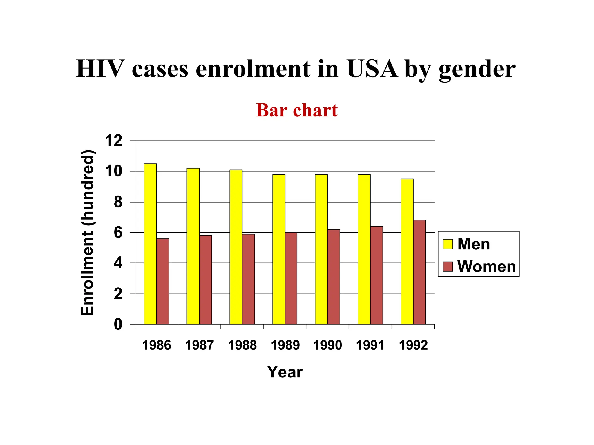
HIV cases enrolmentin USA by gender
0
2
4
6
8
10
12
1986 1987 1988 1989 1990 1991 1992
Year
Enrollment
(hundred)
Men
Women
40
Bar chart
41.
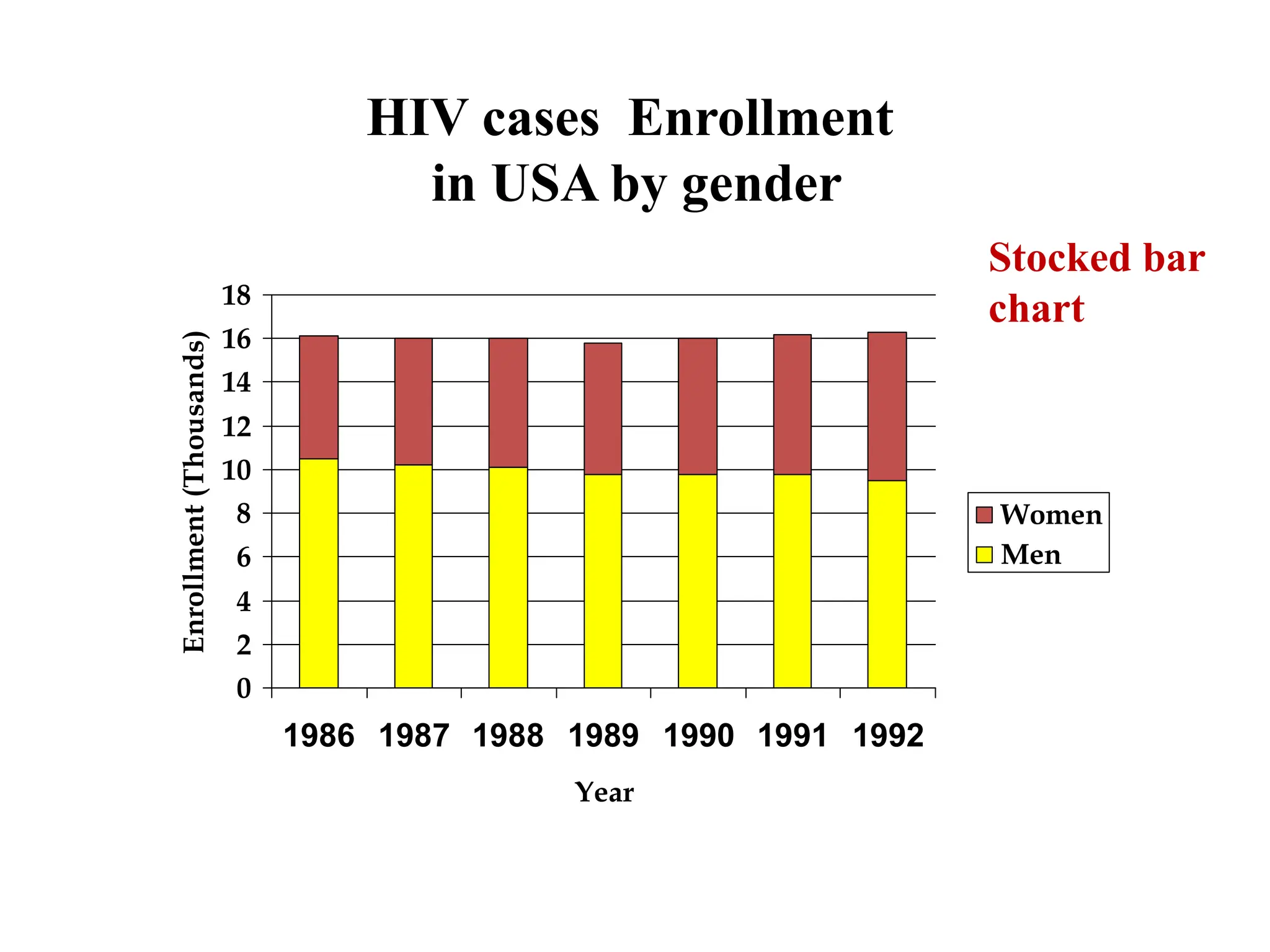
HIV cases Enrollment
inUSA by gender
0
2
4
6
8
10
12
14
16
18
1986 1987 1988 1989 1990 1991 1992
Year
Enrollment
(Thousands)
Women
Men
41
Stocked bar
chart
42.
General rules fordesigning graphs
• A graph should have a self-explanatory legend
• A graph should help reader to understand data
• Axis labeled, units of measurement indicated
• Scales important. Start with zero (otherwise // break)
• Avoid graphs with three-dimensional impression, it may
be misleading (reader visualize less easily
42