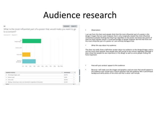
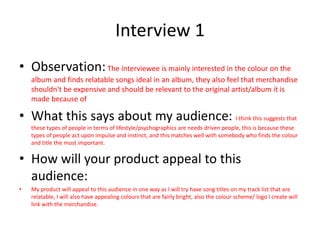
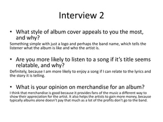
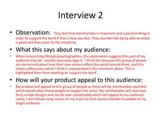
Here are the key points I've gathered from analyzing the audience research:
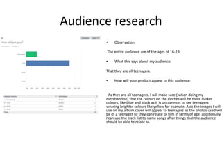
- The target audience is teenagers aged 16-19.
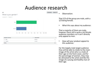
- The audience skews slightly more male, so products should appeal to both genders.
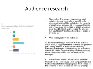
- Teenagers want albums with 13-15 tracks to satisfy their interest in music.
- Poster design/images are most influential for promotion, followed by willingness to attend.
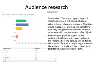
- Popular merchandise includes t-shirts and hoodies in darker colors like black/navy.
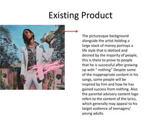
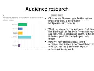
- Front covers should feature the artist in a picturesque background setting.
- Song titles should relate to things teenagers can connect with.
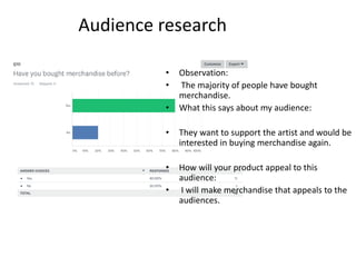
- People support artists but mainly wear what they like
This document analyzes and compares the album covers and posters for the albums "Communion" by Years & Years, "One Direction" by One Direction, and "I Created Disco" by Calvin Harris. Key points analyzed include use of color, imagery, font, and positioning of text and images to target young audiences. Both the Years & Years and Calvin Harris materials use bright colors and minimal text focused on the artist to attract teenagers and young adults. Meanwhile, One Direction features photos of the band members' faces and styles to appeal to their largely female fanbase.
An album release poster advertises a new album by featuring the album artwork and providing information like the release date and record label. It aims to promote popular songs from the album to attract a wider audience beyond just fans. The poster uses visual elements like fonts, images, and colors along with text about the album and artist to inform potential buyers and persuade them to purchase the album.
The document analyzes several album advertisements. It discusses various design elements used across the ads, including prominent placement of the band/album names, use of colors and fonts consistent with the artists' branding, inclusion of review quotes, and links to purchase and further information. Common themes identified are an emphasis on accessibility of the album and assumption of an existing fan base familiar with the artists' discography. Overall, the analysis suggests the ads effectively leverage established branding conventions to promote new albums to current and potential new listeners.
An album release poster advertises a new album by featuring the album artwork and providing information like the release date and record label. It aims to promote popular songs from the album to attract a wider audience beyond just fans. The poster summarizes key details about the album in a concise way to encourage people to learn more and potentially purchase the album.
The document analyzes conventions used in magazine advertisements for music albums. It finds that ads typically feature the album cover, information on release formats and singles, and the artist/label websites. They also often sexualize the artist to target male audiences. Reviews are included to make the album seem desirable. Keeping colors and fonts consistent with the album art maintains brand recognition. Placement near the end of articles increases visibility. These conventions will inform the design of an advertisement for a fictional album.
The document analyzes magazine advertisements for artists Jessie J, Florence + the Machine, and Rihanna. It examines the key elements of each ad, including the main image, color scheme, masthead, album name, release date, and record labels. Elements like the main image, masthead, and album name are prominently featured to attract attention and identify the artist and album being promoted. Color schemes and other visual cues aim to represent the artist's brand and style of music. Text details like release dates, song examples, and record labels provide additional promotional information. Overall, the analyses show how magazine ads employ consistent conventions but also customized elements to market specific artists and albums to readers.
This magazine advertisement analyzes an album advertisement for Ed Sheeran's "Plus" album:
- It features a close-up photo of Ed Sheeran to attract his primary female audience.
- It lists some popular singles to persuade readers who are familiar with those songs.
- At the bottom it includes a positive quote and rating from Q Magazine to demonstrate the album's quality.
The document discusses conventions in magazine design within different genres of rock music. It begins by analyzing conventions seen in the Pretty Reckless magazine within the alternative rock genre, and comparing them to conventions found in indie magazines. It then discusses how analyzing these magazines helped develop an understanding of how to analyze still images and what makes them effective. The document goes on to discuss the design process for creating fake album artwork, advertisements, and other materials for an imaginary alternative rock artist named Daisy Jessop. It references researching real examples from bands like Nirvana, Arctic Monkeys, and The Pretty Reckless to incorporate genre conventions into the designs.
The front and back covers of the album portray a simplistic design with dull colors and lack of characters, suggesting the band cares more about their music than promotion. However, the intentional styling also attracts their target audience by portraying rebellion while still "selling" the album. Elements like the tea stains on the CD inlay and spine further this image of not caring about appearance or professionalism, though the design is carefully considered to have this effect and contradict the idea that the band is truly rebelling against industry conventions.
The document discusses choosing a song to base three music-related products on. It considers several song options and gets feedback from the target audience, 15-18 year olds, on each song. Based on the feedback, the song "Cool Kids" by Echosmith is chosen because it appeals most to the target audience. It is described as more interesting than typical pop songs and features a strong female lead singer that would appeal to the female target demographic. Now that the song is selected, more detailed planning for the three consistent and interlinked products can begin.
This Digi-pack promotes Rihanna's album through imagery of the artist appearing lonely and vulnerable while also being a strong, independent woman. The front cover uses a soft pink color suggesting Rihanna's soft interior side, while the back has a sexualized image of her promoting her as an object to be looked at. Song titles and the record label logo also promote both the artist and label.
This document discusses the conventions of digipak CD packaging and provides examples. It begins by explaining that digipaks are made of cardboard and can open from left to right to display the CD in the center. Common conventions include having 4-6 panels, featuring the artist image on the front, including a song list on the back, and maintaining a consistent theme. A diagram shows a template for a 6-panel digipak. Analyzing Katy Perry's candy-themed digipak provides ideas for creating an original digipak, such as considering font, colors, layout, and applying music video theories to promote the artist.
This is my customer questionnaire. From this I have been able to establish my target audience and the particular conventions that will actually appeal to them. I will need to follow these when producing my three products.
The document discusses different types of narrative structures in music videos. It begins by defining a narrative music video as one that uses visuals and lyrics together to tell a story that enhances the song. Common storylines involve love stories meant to evoke emotion. Narrative techniques like cuts and shots are used to advance time over the short duration. Narrative structures can be linear with a beginning, middle, end or open-ended without resolution. Performance and concept-based videos take different narrative approaches as well, focusing on the artist or a single idea respectively. Various theories on narrative structures are also outlined.
This album cover features Rihanna topless with words like "faith", "#navy", "7", "diamonds", "ROC Nation", and the album title "Unapologetic" covering her body. The close-up image encourages the male gaze while also teasing the viewer. The words provide context about Rihanna's faith, her large fanbase called the "Navy", that this is her 7th album, and references to her successful single "Diamonds" and her record label ROC Nation. The provocative image and words work together to portray Rihanna as fearless, unapologetic, and confident in her sexuality and artistry.
The Digipak advert for Jay-Z's album "Blueprint 3" features the album name, artist name, and release date in bold capital letters to draw attention. Instead of an image of Jay-Z, the central image is a pile of instruments representing the musical content and technology required to create the album. Three red lines positioned in the instruments reference the album's name and number "3" while generating intrigue. The color scheme of red, white, and black is used to highlight key elements and convey emotions like passion that compliment the album concept. Reviews/ratings and an image of Jay-Z are conventions absent from the advert.
Andrew Goodwin and Simon Firth present different theories on music video typologies and conventions. Goodwin identifies four relationships between lyrics and visuals in music videos: illustrative, contradictory, amplification, and disjuncture. Firth categorizes music videos as performance, conceptual, or narrative. Performance videos show the artist performing, conceptual rely on metaphor to evoke mood, and narrative tell a story. Richard Dyer argues that pop stars are manufactured images created by the music industry to make money, and that they aim to appeal to a range of audiences.
The combination of brand identity elements across Rihanna's music albums, clothing line, and other products has helped make her brand highly recognizable and successful. Her consistent use of the letter "R" logo builds brand awareness and allows fans to easily identify her various works.
Similarly, the band in the document has established a unified brand identity using consistent font styles, colors, and imagery across their music video, advertisements, CD cover, and digital packaging. Elements like the album name in italic font and inclusion of pinks and blacks help connect the products and communicate the band's pop genre to audiences. Maintaining cohesive branding across multiple media helps promote and sell all of the band's works.
This document analyzes several music advert designs. It discusses how the Jessie J advert uses the rule of thirds to make her face the main focus. It also notes how the dominant black color scheme helps her name and album details stand out. The document then examines how a band's advert uses a childish font to appeal to younger audiences, includes songs and purchase details, and features their calm demeanor to convey their music's style. Finally, it summarizes how another band's advert uses bold, slanted text and a calm scene to match their indie genre and help the reader keep calm.
The document provides analyses of several album covers, summarizing key elements and intended meanings/messages:
- Bastille's "Bad Blood" cover prominently displays their name to establish identity, uses a distinctive font and features the lead singer running to signify a journey.
- Angels & Airwaves' "I-Empire" cover depicts all band members equally and uses a minimalist design/colors that contrast typical alternative rock styles.
- Passion Pit's "Gossamer" cover challenges gender norms through its use of pink and features silhouetted figures set against the sky to portray an indie image.
- Jack's Mannequin's "People and Things" cover emphasizes its visual over
The magazine advertisement and CD cover for an artist use similar color schemes and shots from the same photo shoot. Both prominently display the artist's name in large, bold letters in a contrasting color that stands out against the backdrop. Additional information like release dates and track listings are also included to provide fans with essential details in a conventional way. The close-up shot of the artist looking directly at the camera creates a unified commercial image and brand identity.
Research case studies - Album art work and insertsadinachante
The document analyzes conventions of album artwork by examining covers from artists Paloma Faith, Florence + the Machine, and Katy Perry. Some conventions discussed include: the artist's name being larger than the album title for branding purposes; continuity of imagery, fonts, and themes across the album packaging; inclusion of production details on the back cover; and connecting the visuals to the music's themes/genres. The analysis will inform the design of the student's own album packaging to follow conventions and effectively target their audience.
1) Advertising is a form of mass promotion used to widely promote a product or service to potential customers.
2) This document contains analyses of different advertisements for music albums and bands. It examines the target audiences, messages, and design elements of each ad.
3) The ads employ various visuals, fonts, colors, and layouts to promote new albums, tours, and band websites to audiences interested in genres like rock, alternative, techno, indie, and pop-punk music.
The document analyzes several album covers from the funk genre. It discusses elements like font style and color that are used consistently across albums to market the artists and albums to their target audiences. Specific elements like an artist's hair or costumes are also examined for the symbolic meanings and themes they represent that would appeal to younger audiences interested in funk music. Overall, the covers are designed to clearly identify the artists and albums while representing qualities of fun, energy, and rebellion through their visual design elements to effectively promote and sell the music.
This document provides an analysis of the cover and contents pages of the Hip-Hop Weekly magazine. On the cover, there are many images of famous rappers which would attract fans. However, the design is described as "hectic" and not very mature. The contents pages layout is praised for clearly showing the stories and sections in an organized manner. The double page spread about Eazy-E is analyzed positively for using iconic black-and-white images of Eazy-E and his son that would appeal to fans, along with a well-organized text layout of the interview.
Katy Perry's album cover uses bright colors like green, pink, and orange that are typical for her pop genre. The cover features flowers and sunsets to appeal to her target audience of teens and young adults. Beyoncé's simple album cover with her name in pink capital letters on a dark background appeals to a wide range of people without directing at any specific group. Sam Smith's album cover portrays his style through a simple solo shot of himself, reflecting the lonely theme of the album.
The document discusses conventions used in R&B artist marketing, including dark backgrounds with bright white font in posters to look sophisticated, focusing on the artist in all materials, and linking websites, videos and posters through similar color schemes and styles to create synergy. It also notes using trendy clothing in materials to attract young audiences and presenting the artist's style.
This poster advertisement is promoting Green Day's new album. At the top in large red font are the words "THE WAIT IS FINALLY OVER..." representing the genre of music. The band's name is written in the font used on their albums and merchandise to introduce their new style. The picture in the center is the album cover so people know what to look for. Release information like the date of May 15th is in bold white writing to highlight important details and generate excitement for the release. At the bottom it mentions the single "KNOW YOUR ENEMY" to get people interested in the album.
The advertisement uses a black and white color scheme with minimal text to promote an indie rock band's new album. It centers the band's logo above release details in matching fonts. This simple, monochromatic design reinforces the band's indie genre and appeals to an older audience rather than younger fans who prefer brighter ads.
This document analyzes magazine advertisements and album packaging for artists Jessie J, Katy Perry, and Miley Cyrus. It examines the typography, imagery, lighting, and language used in the advertisements and discusses how design elements are used to promote the albums and appeal to target audiences. Specific techniques analyzed include the use of bold fonts to draw attention, close-up celebrity images to create intimacy, and color schemes and themes that match the artists' brands. Overall, the document provides a detailed breakdown of how visual design conveys information and persuades readers in music advertising.
The document analyzes the magazine advertisement for Green Day's 2004 album "American Idiot". The ad uses a simple color scheme of black, white, and red to make the text and image stand out. It only includes the band name and album title, keeping the content mysterious. The placement of text in the top left catches the reader's eye. The same font is used throughout, creating consistency with other Green Day products. The sole image depicts a heart-shaped grenade, representing a song's lyrics and themes of patriotism and dissent. Using the same design as the album cover creates recognition between the ad and product.
The magazine advertisement for Green Day's 2004 album "American Idiot" uses a simple color scheme of black, white, and red to make the text and image stand out. It features only the band's name and album title in the band's own font in the top left corner to draw the eye and maintain an air of mystery. The sole image is of a hand holding a heart-shaped grenade, representing a song about holding one's heart "like a hand grenade." Using the same design as the album cover creates synergy between the advert and album, making the album easily recognizable to potential buyers.
This proposal is for a rap album cover. The proposed title is "FRESH" to convey new and cool music. The purpose is to entertain and intrigue audiences by including attention-grabbing fonts, graphics, and conventions of the rap genre. The genre is rap and the cover will feature a rap artist with tattoos and jewelry. Research on existing album covers and graphics informed the idea to include a cartoon graphic, which is popular in rap music. The target audience is 16-18 year old males, and the cover will appeal to them using masculine colors and an eye-catching graphic. While the songs may contain swearing, the cover will include a parental advisory and not intentionally offend any groups. Proper
This document analyzes magazine advertisements for the band Paramore. It discusses the font, colors, images, and text used in the ads and what promotional techniques and psychological messages they aim to convey. Specifically, it notes that the ads target a young audience by using youthful fonts, colors like blue that challenge rock conventions, and calls to text for song updates. Imagery of the band members further aims to inspire fans and portray a rebellious image through their clothing and poses. The goal of the ads is to attract new, younger fans and increase awareness of the band's music, shows, and brand.
This document discusses the conventions used in various magazine covers, contents pages, and spreads. It analyzes how effective they are and whether they follow typical conventions. Key conventions highlighted include using bold colors and fonts, large images of famous artists, and advertising free items. The target audiences and music genres represented are also assessed. Overall, the document provides insights into magazine design conventions and ideas for layouts.
This document provides an analysis of advertisements for music albums. It analyzes aspects like colors, typography, genre, layout, images, audience and more for several different album ads. One ad features a hand holding a blood orange against a blue background promoting a summery, upbeat indie album. Another displays a striking image of an artist with black clothing and makeup against a white background to portray a strong personality in a pop/rock album. A third shows an abstract metallic sculpture as the focal point to suggest a futuristic, reflective album influenced by techno.
Here is a summary of the key points from the research evaluation:
- Product research provided existing examples to draw inspiration from but was limited to the researcher's existing knowledge.
- Questionnaires gathered useful information but responses could be inaccurate. They were distributed via SurveyMonkey which was efficient but difficult to get enough responses.
- Interviews were more valuable than questionnaires as they provided genuine feedback in a face-to-face format. Responses to the research overall were positive and informed the product development.
The research methods each had strengths and limitations. Product research set the foundation while questionnaires and interviews directly engaged target audiences to gather qualitative feedback. Getting sufficient survey responses remained a challenge.
- The document discusses possible genres for a new music magazine, including rock, R&B, and hip hop. It analyzes the strengths and weaknesses of targeting each genre.
- The author decides to target the pop genre because it is versatile and appeals to both genders, allowing for a wider target audience aged 16-24. Pop will allow for inclusion of various popular artists.
- Examples of existing music magazines like Blender are analyzed for effective cover designs, color schemes, fonts, and how they target younger audiences through celebrity images.
- The author selects a font for the magazine masthead that incorporates a bubble gum "O" to symbolize the pop genre and target audience. The masthead name "LO
This document analyzes a Jay-Z album advertisement. It notes that the advertisement stands out by not including a picture of Jay-Z, but instead focusing on his name in large font at the top. Musical instruments in the main image suggest a variety of music styles on the album. A simplistic grey background allows other elements like text to stand out. Three red strips reference the album title and record label. Jay-Z's image in the center indicates his fame and roots in graffiti. Logos promote companies involved in the album's production and distribution. Overall, the advertisement catches viewers' eyes through contrast and emphasis on the artist and album name.
This document discusses the target audience and design choices for a proposed music magazine focused on hip hop and rap genres. The target audience is identified as males aged 15-35 who enjoy hip hop/rap music. Design elements like the front cover, contents page, and double page spread are analyzed. Consistency of fonts, colors, and layouts are prioritized. Representation of age, ethnicity, and gender groups is also considered, with design choices like featuring a young black male on the cover aimed at these factors. Comparisons are made to real music magazines to highlight similarities and some differences in conventions used.
The document discusses the target audience and marketing strategy for a proposed new music magazine called "Logic". The target audience is identified as males aged 15-35 who enjoy hip hop and rap music. To attract this audience, the magazine's cover features a young black male rapper to represent the genre. Throughout the magazine, consistency is maintained through color schemes, fonts, and direct eye contact in photos. The magazine aims to inspire readers by profiling up-and-coming artists. If successful, the magazine hopes to be distributed by the major music distributor Intermedia to gain wider exposure and credibility within the industry.
The font used in the advert is large and bold to stand out from other fonts and be memorable. A pink color was added to portray a feminist view, though the sexualized images of women contrast this. The main image takes up the most space to indicate her importance and draw attention, potentially leading viewers to research her and the album. Background details like the CD and release date information help viewers find and engage with the album. The plain background makes the colorful text and images pop out to attract and engage the audience.
This document analyzes the front cover of a music magazine. It examines various design elements like the title, images, fonts, colors, layout, language, target audience, and representations. For each element, it provides context on how that element relates to the magazine's genre (hip-hop/grime) and is intended to attract its target demographic of teenage music fans. Overall, the document conducts a thorough semiotic analysis of the magazine cover's visual communication strategies.
The document provides an analysis of an album cover for Drake's album. It discusses various elements of the main image including Drake telling his audience that "the sky is the limit" and that he is in his own league. It also notes that the image includes the CN Tower in Toronto, where Drake is from, and suggests the urban background relates to his music. Additional elements analyzed include the simplicity of the image, Drake's recognition in Toronto, and the implication that his album could have incredible views. The small image of Drake on the tower is said to imply he doesn't need to be big to make a loud song.
The document analyzes the design and typography used in an advertisement for the band The Vaccines. It notes that the use of a rhetorical question engages the audience. The bold black typography draws emphasis and demands an answer from viewers. Continuity is shown through using the same font from the advertisement to their album packaging. The simple font and layout conveys that the band wants to appear raw and unedited. Key details are clearly visible, with the rhetorical question at the center to immediately grip attention. The color scheme and referenced magazines suggest the indie rock genre. The contrast of pastel pink and bold black softens yet boldly identifies the band's style. Hidden details connect the background image to their album cover, a convention
This document analyzes the design elements of Example's album "The Evolution of Man". It discusses various visual and textual aspects of the album's digipack and poster advertisement. Key points include:
- The album cover features Example's signature logo and imagery that conveys his artistic growth and connection to fans.
- Design elements like font, placement of text/images, and color scheme are intentionally selected to represent the album's themes and appeal to target audiences.
- The digipack and poster continuation utilize similar visuals and layouts to maintain brand consistency and familiarity for fans across formats.
The document is a proposal for an "Iconic EP" music project. It outlines the target audience as being males and females aged 16-19 from a working class background in the UK. It will appeal specifically to heterosexual males through use of darker colors, exciting fonts, and genres like grime music. Research was conducted through interviews and surveys to understand audience preferences. The proposal includes a schedule and bibliography and states the project will include an album cover, merchandise, track list, magazine cover, and other promotional materials created in Photoshop. Evaluation of the audience response and technical/aesthetic qualities will occur throughout and at completion.
Tommy Lister has experience working in retail sales roles at Vans and Argos where he assisted customers, stocked inventory, and worked well under pressure and in a team. He achieved strong GCSE results including grades A-C in English, Maths, Science, Spanish, History, and ICT. Currently, Tommy is studying Creative Media Production at college and possesses skills in determination, resilience, communication, organization, and confidence.
Tommy Lister is applying to study sports journalism. He has a passion for football and writing. He excelled in English at school and studied creative media production at college, gaining skills in design, photography, and factual writing. He created a fanzine about Liverpool FC and writes articles for a Liverpool Twitter page. He hopes to gain experience in sports journalism at university to pursue a career reporting on football.
This presentation discusses Tommy Lister's plans to launch an online store called Kop Online. It identifies the target audience as male and female adults located anywhere with no specified political beliefs. It provides links to promotional videos on YouTube and a podcast on SoundCloud to introduce the new online store before opening for questions.
Tommy Lister conducted research for his evaluation project on media theories and influential figures. While the PowerPoint on this topic did not prove useful, creating a bibliography provided familiarity that helped later. Lister analyzed existing similar products and websites to inform his own work. Audience research via surveys and statistics reinforced what was already known about the large demographic but did not significantly impact the production. Planning involved considering practical problems and solutions, though some preparations proved unnecessary as the projects changed. Experimental logos and articles provided practice but did not directly influence the final products.
The document describes the process of creating various digital products to promote a fitness brand on social media. Products include a Twitter account, YouTube video, PowerPoint presentation, website, and podcast. For the website, the presenter animated match reports using layered images and drop down menus. The podcast was edited down from a full recording into a trailer using Audition. Overall, the presenter was happy with the aesthetic quality and technical skills shown in the animations and feels they demonstrated the ability to create multiple promotional digital products.
Tommy analyzed his time management throughout the project. He admits that he did not manage his time well and lost focus due to distractions like friends and phone. Specifically, he fell behind on daily development diaries which negatively impacted his work. While his time management was better early on with research PowerPoints, it became poor during production. To improve, he should have stuck more closely to a schedule and reported back daily to keep on track.
The document provides feedback on a website concept, podcast logo, and brand logo. The feedback includes suggestions to make the website more visually appealing and consistent such as by improving the color scheme, changing the tabs and articles, and adding animations. The feedback also notes that the logos are difficult to differentiate and could be improved by adding minor distinguishing details. While the red color is attention-grabbing, it may be too bright on the website. Overall, the feedback aims to help refine and professionalize the visual design elements while maintaining brand consistency.
The document summarizes the first 4 days of an individual's production diary for creating a fan page website and related assets for Liverpool FC. On day 1, they created a logo using red as the primary color to represent the club, and added elements like stars, text, and the Liverpool crest. On day 2, minor adjustments were made to the logo and a banner image was created of Anfield stadium. A podcast logo was also designed using headphones and a mic overlayed on the existing logo design. On day 3, struggles were encountered setting up the website on WordPress, with difficulties customizing templates and positioning elements as desired. On day 4, a couple articles were written for the site, with challenges finding the right angle for
Day 6: The student analyzed the website LFCTransferRoom, noting both positive and negative aspects to potentially incorporate or avoid in their own work. Positives included a live banner displaying the latest news in bold, clear text to grab attention. Negatives were the low placement of the navigation menu and poor font color/contrast making it hard to see, highlighting the importance of clear navigation. Overall the analysis of existing websites is helping the student understand effective design techniques to apply and pitfalls to avoid in their own products.
Tommy Lister discusses potential problems he may face in creating his first podcast. He considers technical issues like unfamiliarity with camera and lighting equipment, lost footage, and inexperience recording and editing audio. His proposed solutions include practice recordings, researching techniques used by other podcasts, and getting help from tutors. He recognizes that recording outside of college would reduce quality and equipment access, so plans to first create the podcast at college to learn professional techniques.
The document discusses several influential figures and theories related to graphic design, including Herbert Bayer and the Bauhaus movement, Laszlo Moholy-Nagy, Gestalt principles, and Ellen Lupton. It provides background on Bayer's work developing the Bauhaus typographic style and Moholy-Nagy's influences from modernist art movements. Gestalt principles of visual perception are explained. Ellen Lupton's work theorizing graphic design is cited, noting her view that designers engage politically and globally. Podcasting theory is discussed, highlighting how the medium has grown in popularity and respect.
The document analyzes the website designs of Liverpool Echo and LFCTransferRoom. For Liverpool Echo, it praises the use of the color red which appeals to Liverpool fans. It also likes the sans serif font and iconic liver bird logo. For LFCTransferRoom, it critiques the large empty space above the navigation menu and says the menu should be closer to the top. It praises the moving news banner but says the navigation menu colors could be improved. The analysis will inform the design of the author's own website project.
The document discusses layout plans and style sheets for a website and podcast called "Kop Online" dedicated to Liverpool FC. It considers logo designs, colour schemes, fonts, and layouts. For the main logo, it plans a circular design featuring red, gold, and 5 stars representing Liverpool's history. The podcast logo will be similar but include a microphone icon. Colour schemes will focus on red and gold to represent the club. Fonts will be bold and clear. Website layouts include a banner, menus, news articles and the league table. Article layouts discuss placement of images and text.
Tom proposes creating an online outlet called "Kop Online" focused on Liverpool FC, including a website, articles, and podcast. The website will be built using WordPress and kept running after completion. Research will cover graphic design, journalism, and podcast theory to understand conventions and make work successful. Experiments will test logos, articles, podcasts, and websites to analyze strengths/weaknesses. Production includes the logo, website, articles, and a podcast. Work will be evaluated through a diary and feedback to improve efficiency for Tom's journalism career.
Here are a few suggestions on how to improve your factual production analysis:
- Provide more context about the intended audience and purpose of your product. Who is it aimed at and why?
- Analyze specific design and content choices in more depth. For example, discuss why you chose a particular font, image, or layout and how it relates to conventions and expectations of the genre/audience.
- Compare and contrast your product to existing examples in a more structured way. You could have separate paragraphs or bullet points for similarities, differences, strengths, weaknesses, etc.
- Cite sources to back up any claims about audience preferences, conventions, or how your choices relate to the genre. For example, reference the research
The document discusses style sheets for a website and other products dedicated to Liverpool FC. It analyzes potential colour schemes, images, and fonts. For colours, red will be primary to represent the club, and yellow/gold will be secondary. Red elicits passion associated with fans. Potential greens and whites are also considered. Podcast logos and similar sites inspired the images, especially use of club colours and circular logos. Potential fonts focus on clear, bold sans serif for readability and masculinity appealing to the target audience. Headings and important text will use bold fonts.
The document discusses several influential figures and theories related to graphic design, including Herbert Bayer and the Bauhaus movement, Laszlo Moholy-Nagy, Gestalt principles, and Ellen Lupton. It provides background on Bayer's work developing the Bauhaus typographic style and Moholy-Nagy's influences from modernist art movements. Gestalt principles of visual perception like similarity, closure and figure/ground are explained. Ellen Lupton's influence on establishing graphic design as a respected field and encouraging designers to engage with social and political issues is noted.
The document discusses style sheets for a website and other products dedicated to Liverpool FC. It analyzes potential colour schemes, images, and fonts. For colours, red will be primary to represent the club, and yellow/gold will be secondary. Red elicits passion associated with fans. Potential greens and whites are also considered. Podcast logos and similar sites inspired the images, especially use of club colours and circular logos. Analyzed fonts will be bold, clear sans serifs for readability and masculinity appealing to the target audience. Headings and important text will use bold fonts to stand out.
Tommy Lister outlines several potential theoretical problems that could arise when creating his podcast, articles, and website. For the podcast, unwanted noise, a guest becoming unavailable, or profanity being used could disrupt production. For articles, missing deadlines or lacking internet access to write could be issues. For the website, WordPress inexperience or losing internet connection while designing could negatively impact the project. He provides solutions such as planning recordings during quiet times, preparing backup guests/questions, censoring mistakes, setting writing schedules, and practicing WordPress to mitigate these potential challenges.
Tommy Lister outlines several potential theoretical problems that could arise with creating his podcast and articles. For the podcast, unwanted noise, a guest becoming unavailable, or a guest using inappropriate language could be issues. He proposes solutions like planning recordings when it's quiet, having backup guests, and censoring any inappropriate language. Potential problems for articles include missing deadlines, lacking internet access to write, or experiencing fatigue while writing. Setting strict schedules, writing on a phone in offline situations, and taking regular breaks could help address these issues.
How to Manage Your Lost Opportunities in Odoo 17 CRMCeline George
Odoo 17 CRM allows us to track why we lose sales opportunities with "Lost Reasons." This helps analyze our sales process and identify areas for improvement. Here's how to configure lost reasons in Odoo 17 CRM
MATATAG CURRICULUM: ASSESSING THE READINESS OF ELEM. PUBLIC SCHOOL TEACHERS I...NelTorrente
In this research, it concludes that while the readiness of teachers in Caloocan City to implement the MATATAG Curriculum is generally positive, targeted efforts in professional development, resource distribution, support networks, and comprehensive preparation can address the existing gaps and ensure successful curriculum implementation.
it describes the bony anatomy including the femoral head , acetabulum, labrum . also discusses the capsule , ligaments . muscle that act on the hip joint and the range of motion are outlined. factors affecting hip joint stability and weight transmission through the joint are summarized.
A Strategic Approach: GenAI in EducationPeter Windle
Artificial Intelligence (AI) technologies such as Generative AI, Image Generators and Large Language Models have had a dramatic impact on teaching, learning and assessment over the past 18 months. The most immediate threat AI posed was to Academic Integrity with Higher Education Institutes (HEIs) focusing their efforts on combating the use of GenAI in assessment. Guidelines were developed for staff and students, policies put in place too. Innovative educators have forged paths in the use of Generative AI for teaching, learning and assessments leading to pockets of transformation springing up across HEIs, often with little or no top-down guidance, support or direction.
This Gasta posits a strategic approach to integrating AI into HEIs to prepare staff, students and the curriculum for an evolving world and workplace. We will highlight the advantages of working with these technologies beyond the realm of teaching, learning and assessment by considering prompt engineering skills, industry impact, curriculum changes, and the need for staff upskilling. In contrast, not engaging strategically with Generative AI poses risks, including falling behind peers, missed opportunities and failing to ensure our graduates remain employable. The rapid evolution of AI technologies necessitates a proactive and strategic approach if we are to remain relevant.
Thinking of getting a dog? Be aware that breeds like Pit Bulls, Rottweilers, and German Shepherds can be loyal and dangerous. Proper training and socialization are crucial to preventing aggressive behaviors. Ensure safety by understanding their needs and always supervising interactions. Stay safe, and enjoy your furry friends!
This presentation includes basic of PCOS their pathology and treatment and also Ayurveda correlation of PCOS and Ayurvedic line of treatment mentioned in classics.
How to Add Chatter in the odoo 17 ERP ModuleCeline George
In Odoo, the chatter is like a chat tool that helps you work together on records. You can leave notes and track things, making it easier to talk with your team and partners. Inside chatter, all communication history, activity, and changes will be displayed.
Strategies for Effective Upskilling is a presentation by Chinwendu Peace in a Your Skill Boost Masterclass organisation by the Excellence Foundation for South Sudan on 08th and 09th June 2024 from 1 PM to 3 PM on each day.
Macroeconomics- Movie Location
This will be used as part of your Personal Professional Portfolio once graded.
Objective:
Prepare a presentation or a paper using research, basic comparative analysis, data organization and application of economic information. You will make an informed assessment of an economic climate outside of the United States to accomplish an entertainment industry objective.
2. Existing Product – Drake album
coverFirstly, the font used gives connotations of
somebody who is in danger or has gone insane and
has resorted to scribbling on a wall like someone in
an asylum. This also infers how famous Drake is as
he can do a plain album cover without putting his
name in as he feels he doesn’t need the exposure.
The distorted style font could represent lyrics within
the songs and gives connotations of a sense of
confusion as well as potentially warning for danger.
The sense of confusion is reinforced by the small
drawing at the bottom as it it hard to tell what it is
and creates questions, al the confusion/ mystery of
this album cover leads to people having questions,
which they may feel will be answered by listening to
the album. The typical audience for this album wont
necessarily have a large majority male fan base,
unlike other rappers may do and Drake in fact has
quite a large female fan base compared to other
rappers, this could be due to his lyrics being more
meaningful to a lot of people in general, compared
to other rappers who may have lyrics that males
would identify with more and also lyrics that can be
seen as sexist, so Drake stands out to a female
audience too.
3. Existing Product
Also, Drake’s ethnicity is mixed race, and the colour schemes of
the album of black and white could represent that and show
Drake being proud of his origins. A ‘parental advisory
content label is also on the album, this shows that the lyrics are
not going to be family friendly and not something children
should be listening to as well as something that would typically
not interest older generations, therefore the type of profane
language used would more than likely interest the younger
audience such as teenagers. ‘The audience age is largely varied
form teenagers to people who are around the age of 30. This
album may appeal to this audience as it’s style of portraying
someone in danger/distress could relate to younger people who
may feel stressed while growing up. This product has helped me
as it has showed that the use of font is really important and the
font alone can say a lot about the album in general/ the lyrics
that are in the songs. This will help my final project as my album
will be about a fictional rapper who came up from nothing and
the style of a distorted type font will fit that well.
4. Existing Product
When looking at the album cover, the part that
stands out to me the most is the text, due to the
font,colours and style of letters used. Firstly the
font used has a hand drawn style to it which
imitates a child’s handwriting, this could link to
the album content and could be a reference to
the immature attitudes presented in the lyrics.
Additionally, the colours used juxtapose the rest
of the black and white theme that covers the
rest of the album. Many of Joey Bada$$’s lyrics
and songs stand for equality and are standing up
against racism, therefore this mixture of a black
and white theme could be there to symbolise
black and white people being together, this is
reinforced as well by the variation of colour on
the album title.
5. Existing Product
The target audience for this is mainly males
aged around 15-30, this album cover can
appeal to men as there is a lot of the colour
black, this colour gives connotations of power
and strength which typically are associated
with masculinity so it appeals to the larger
male audience as power and strength are two
things the majority of males may aspire to
gain. I have chosen to look at this product as I
am fan of this artist and I like what he stands
for and the message he tries to convey to his
audience. I also like the design in general of
this album as it is quite unique in the sense of
the types of themes it uses together. From this
I have researched more about why people
chose to use certain colours and why certain
colours are used. This will certainly help my
product as I can take advantage of this
knowledge and apply it to my work depending
on my target audience, for example if I have a
largely male target audience I will use colours
such as black.
6. Existing Product
The picturesque background
alongside the artist holding a
large stack of money portrays a
life style that is idolised and
desired by the majority of people,
this is there to prove to people
that he is successful after growing
up with “ nothing” Despite some
of the inappropriate content in his
songs, some people will be
inspired by him and how he has
gained success from nothing. Also
the parental advisory content logo
refers to the content of the lyrics,
which generally may appeal to his
target audience of teenagers/
young adults.
7. Existing Product
Something else that stands out is the text
used, both for it's font and colour. The vibrant
colour on the title " the world is yours " match
the encouraging theme suggested by the title,
this is because bright colours, such as this pink
tend to give the viewer an energetic and
generally positive feeling, which complements
the encouraging message given by the title.
This product's audience is typically for male
teenagers to young adults, it appeals to them
by using someone who would fit in with the
target audience ( Rich The Kid – the artist. )
They use his image and portray him being
successful, which shows the target audience
that there is someone like them who has
became successful.
8. Existing Product
I chose to look at this as this is also a product I
am interested in, as well as this I like the
design and colours used as I think It is eye
catching and has multiple elements to it that
draw attention to it rather than just one thing.
additionally it is currently popular and trending
so it is useful to see what techniques it uses as
I could try emulate some of these for my
product, also it's target audience in terms of
age is similar to mine. I have learned from this
that brighter colours are effective in creating a
positive feeling for the viewer. This has helped
me for my project as it is something I will want
to add into mine as that is a feeling I also want
people who look at the album cover to get.
9. Existing Product
Immediately when looking at this track list graphic,
what stands out is the largely black theme. This theme
complements well with the title " revival" as both the
title and the colour scheme have the same
connotations of negativity to an extent, as to be
revived, initially something bad must have happened.
However, the small amount of red, which stands out
even more due to the use of black also fits with it as it
is a more positive colour which matches well with the
thought of something being " revived”. Other than the
large amount of black, the other colour frequently
used on this graphic is white, after researching in more
depth about " colour psychology" I have learned that
white is associated with being " pure and clean and
good" this also corresponds with the title as it could
infer of someone changing themselves and bettering
themselves, and in the context of this album that is
quite relevant as it is trying to suggest a career revival.
10. Existing Product
The style of this design is very simplistic and
does not include a lot of colour or images, (
other than the small R logo that represents the
title. ) This simplistic style suggests how
maybe the artist doesn’t want to create a large
colourful graphic, as he feels the content acts
for itself without the colour advertisement.
The target audience for Eminem is quite broad
compared to some other rappers, however a
large percentage of his audience is male and
are around the ages of 16-35. The bold and
dark theme of this graphic appeals to the
typical male audience, for example the colour
back has connotations of power, strength and
authority, which stereotypically are things men
strive for
11. Existing Product
I have chosen to look at this product as it
currently is one of the biggest albums to be
released in the last year so I wanted to
research it and analyse features of it to try
understand parts of it which may have
influenced it’s popularity, consequently,
following some research and analysis I have
learned that one factor that may have
contributed is it’s colour schemes and what
connotations they have and how they appeal
to a large part of his target audience. This has
helped me for my FMP as it has reinforced the
importance of colours in advertising as well as
showing me, unlike the other products, that it
isn’t necessary to have lots of colour as well as
images.
12. Existing Product
The first thing that stands out to me is the large
image of the artist advertised in a cartoon style. This
stands out because it is not necessarily a
conventional way of advertising something on a
poster, as well as this it is centered so it is
intentionally the thing the person looking at the
poster sees first. This unconventional cartoon style
of the poster may have been done to represent the
concert and to suggest it isn't like any other concert
and to intrigue the people interested in the event.
The other main feature of this poster is the text
beneath. The text of “ Jay Z” is in a very large sized
font, and the style of the font is just like block
capitals in a simple colour (white.) The reason
behind these styles of font is to highlight the
importance of Jay Z being the headline act and so it
shows how he is more popular than other acts. Also
the colour schemes used throughout the poster
represent his African American heritage, this also
explains why the other artists at the concert are of
the same ethnicity.
13. Existing Product
The typical audience to this is likely to be targeted towards
males as well as people who are around the ages of 16-30.
The dark colour scheme appeals to a largely male target
audience as the colours such as black can be associated
with power and authority, which culturally can be seen as
something men strive for so these colours may naturally
appeal to men without them realising. I chose to look at
this product because I plan to do a poster myself for a rap
concert/tour and this one appealed to me the most visually
due to its uniqueness in terms of the cartoon style
compared to the other ones. I have learned from this that
the colour schemes and their reasoning for being there go
much further beyond just simply looking nice but also
people chose certain colours and themes because of a
deeper meaning/ also a colour that relates to the product
in some way. This will help me as originally I would
probably have chose colours and fonts that look quite well
without necessarily thinking about what connotations they
give off, however now in my project I will think about the
type of things I want the audience to get connotations of,
and then work backwards and chose a colour/ font that
denotes what I want the audience to think.
14. Research Analysis
• •I will include the majority of the aspects of my research in my production work, to start with
I will include the research I did on colours, for these I will specifically chose each colour for
reasons that go beyond just standing out, I will try use colours that represent the artists
background but also ones that fit the theme of the genre. Another important aspect of my
research I will include is the research I conducted on the fonts, this is very similar to the
colours. I will need to consider multiple fonts for each product, for example I want to use a
similar distorted font that can be seen on most of the existing products as it represents the
rap genre well. I also want to use a bold font for the main piece of text on my poster. From
my research of the Eminem ‘Revival’ existing product, I want to emulate how he keeps a
consistent theme across his track list and album cover, I will include this in my own work by
creating a logo for the title of the album cover, and I will also use this on all my other
products. The aspect of how they appeal to their target audience's’ is something I will
include in my own product. I will do this by considering all the things above but in relation to
the audience, for example like on the Eminem one, the bold, dark theme is used as it appeals
to men, so if I had a large male fan base I would replicate that so for my work I will use
colours that are popular amongst the age and gender of the majority of my target audience.
16. Audience research
• Observation:
The entire audience are of the ages of 16-19.
• What this says about my audience:
That they are all teenagers.
• How will your product appeal to this audience:
As they are all teenagers, I will make sure ( when doing my
merchandise) that the colours on the clothes will be more darker
colours, like blue and black as it is uncommon to see teenagers
wearing brighter colours like yellow for example. Also the images I will
use on my album cover will appeal to teenagers as the photos used will
be of a teenager so they can relate to him in terms of age, additionally
I can use the track list to name songs after things that the audience
should be able to relate to.
17. Audience research
• Observation:
That 2/3 of the group are male, with a
1/3 being female.
• What this says about my audience:
That a majority of them are male,
however there still is quite a lot female
audience members so it can’t directly
only appeal to men.
• How will your product appeal to
this audience:
For the largely male target audience
they will be able to relate to the main
image of the artist who is a male of
their age on the front cover, and for
the percentage of women, they may
be attracted to the artist and like the
image of a young and healthy man of
their age.
18. Audience research
• Observation: The answers have quite a bit of
variation although generally at least 10 is the
minimum that should be included as the majority
of people want between 11-13, however there is
also a reasonable percentage of people who want
more than 15, I think as an average the amount
that would satisfy the largest number of people is
probably 15.
• What this says about my audience:
As it is mainly the larger numbers that the audience
would want, it suggests that the audience has generally
got a strong interest in music which is not very
surprising as teenagers stereotypically get associated
with music so this suggest that my audience generally
follow the cultural norms that are expected of
teenagers.
• How will your product appeal to this audience:
On my track list I will include 13-15 songs as that is the
best way to satisfy the most people so it will appeal to
the audience as it has the desired amount of songs.
19. Audience research
• Observation:
I can see from this that most people think that the most influential part of a poster is the
design/ images that are used, however that is only marginally viewed the most influential
compared to people thinking that they’ll go regardless to the poster and those two points of
view are fairly equally shared. A small percentage of people however did find that fonts are
the most influential part of a poster so I cant entirely disregard that.
• What this says about my audience:
This does not really show a definitive answer about my audience as the design/images used is
not too much more popular than people who will just go to the concert regardless although it
does show that people do see importance in the design as well as some people finding the
fonts important.
• How will your product appeal to this audience:
• Because I will make sure the images and graphics used are ones that would appeal to
the audience and I know from a future question that the audience likes a picturesque
background witha photo of the artist and that is what I will include.
20. Audience research
• Observation: The most popular types of
merchandise are a t shirt and a hoodie.
• What this says about my audience: That they
would most prefer clothing and something
that they can get more use out of for their
moneys worth than just an everyday object.
• How will your product appeal to this
audience: I will choose to make clothing as
the merchandise, the colours will be darker,
like navy or black, or a simple brighter colour
like white as typically teenagers don’t wear
brighter colours like yellow or pink.
21. Audience research
• Observation: The most popular themes are
brighter colours/ a picturesque
background with the artist.
• What this says about my audience: That they
like the thought of the idyllic front cover such
as a picturesque background and the artist as
it shows a good lifestyle and a good role
model
• How will your product appeal to this
audience: I will make my front cover have the
artist and use the greenscreen to put a
picturesque background.
22. Audience research
• Observation:
• The large majority of people see the song
title as important.
• What this says about my audience:
They like to have a connection with the song and if
they can relate to it they'd be more likely to enjoy i
• How will your product appeal to this
audience: When doing the track list I will
make up song names that can be related
things that appeal to teenagers.
23. Audience research
• Observation:
• People like to support the artist but mainly people
will just wear what they like because of its design.
• What this says about my audience:
• That people want to wear whatever looks nice more
than any old thing that is only there to help the artist
so it is important to design something that looks good
rather than is just focused on the artist.
• How will your product appeal to this audience:
• I will carefully think about the fonts and colour
schemes used and I will use ones that appeal to the
audience such as darker colours and not bright
colours.
24. Audience research
• Observation:
• It is fairly even but more people would prefer the
standard edition.
• What this says about my audience:
• They generally would rather just have a standard
edition but some people do also enjoy having a
special edition, this could be because some people
just are interested in the music alone however
others want more from the artist that isn't just
music.
• How will your product appeal to this audience:
• I will make a standard edition only more than
likely but the other products will include extra
things about the artist so he can still be supported.
25. Audience research
• Observation:
• The majority of people have bought
merchandise.
• What this says about my audience:
• They want to support the artist and would be
interested in buying merchandise again.
• How will your product appeal to this
audience:
• I will make merchandise that appeals to the
audiences.
27. Interview 1
• What style of album cover appeals to you the most, and why?
Colourful ones with a catchy title because they will stand out the most in a
shop.
• Are you more likely to listen to a song if it’s title seems relatable, and why?
Yes because if you can relate to the song, the song becomes more enjoyable
and has a meaning to you.
• What is your opinion on merchandise for an album?
The merchandise should be at an affordable price and have a colour scheme
that links in with the album cover.
28. Interview 1
• Observation:The interviewee is mainly interested in the colour on the
album and finds relatable songs ideal in an album, they also feel that merchandise
shouldn't be expensive and should be relevant to the original artist/album it is
made because of
• What this says about my audience: I think this suggests that
these types of people in terms of lifestyle/psychographics are needs driven people, this is because these
types of people act upon impulse and instinct, and this matches well with somebody who finds the colour
and title the most important.
• How will your product appeal to this
audience:
• My product will appeal to this audience in one way as I will try have song titles on my track list that are
relatable, I will also have appealing colours that are fairly bright, also the colour scheme/ logo I create will
link with the merchandise.
29. Interview 2
• What style of album cover appeals to you the most,
and why?
Something simple with just a logo and perhaps the band name, which tells the
listener what the album is like and who the artist is.
• Are you more likely to listen to a song if it’s title seems
relatable, and why?
Definitely, because I am more likely to enjoy a song if I can relate to the lyrics and
the story it is telling.
• What is your opinion on merchandise for an album?
I think that merchandise is good because it provides fans of the music a different way to
show their appreciation for the artist. It also helps the artists to gain more money, because
typically albums alone doesn’t pay that much as a lot of the profits don’t go to the band.
30. Interview 2
• Observation: They feel that merchandise is important and a positive thing in
order to support the band if that is how you feel. They also feel like being able to relate
is good and they seem to like simplicity.
• What this says about my audience:
• When researching lifestyle/psychographics, this observation suggests this part of my
audience may be ' socially conscious type A ' I think this because this group of people
are concerned about how their own actions effect the world around them, and this
shows selflessness which I think is represented in the comment above. This is
highlighted from them wanting to 'support the band'.
• How will your product appeal to this audience:
• My product will appeal to this group of people as there will be merchandise available
which would allow these people to support the artist. My merchandise will also have
fairly simple designs and not be over complicated which will appeal to my audience.
Lastly, I will include song names on my track list that sound relatable to people of my
target audience.
32. Bibliography
1. Lister, T (2018) Target Audience Research Survey (conducted on
13/04/18)
2. Gibson, T. (2018) Target Audience Interviews (conducted on 13/04/18)
3. Thirlway, W (2018) Target Audience Interviews (conducted on 13/04/18)
4. Drake (2015) If You’re Reading This It’s Too Late
5. Joey Bada$$ (2015) B4.DA.$$.
6. Rich The Kid (2018) The world is yours
7. Eminem (2017) Revival
8. Jay Z ( 1999) Continental Airlines Arena, East Rutherford NJ
Editor's Notes
Choose a recent product similar to your own and annotate it
Type of image- studio/location, angle, effects, post-production
Use of lighting/composition/mise en scene/costume/props/location/colours/fonts etc.
Audience appeal- how does it make its audience want to buy/watch/play it?
Why have you chosen to look at this? What have you learned that can help you in your project?
List all products researched in previous sections. Include anything additional you have watched/read in preparation for production. Alphabetise your list.