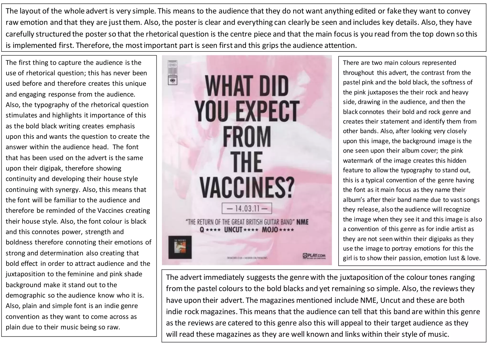
The document analyzes the design and typography used in an advertisement for the band The Vaccines. It notes that the use of a rhetorical question engages the audience. The bold black typography draws emphasis and demands an answer from viewers. Continuity is shown through using the same font from the advertisement to their album packaging. The simple font and layout conveys that the band wants to appear raw and unedited. Key details are clearly visible, with the rhetorical question at the center to immediately grip attention. The color scheme and referenced magazines suggest the indie rock genre. The contrast of pastel pink and bold black softens yet boldly identifies the band's style. Hidden details connect the background image to their album cover, a convention