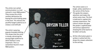
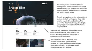
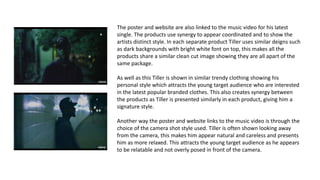
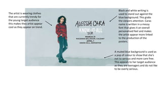
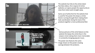
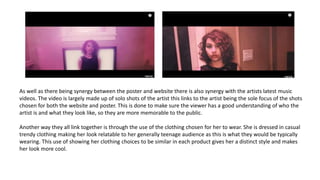
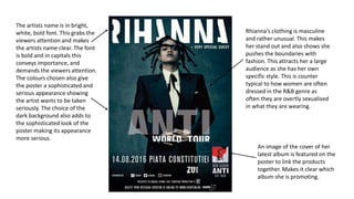
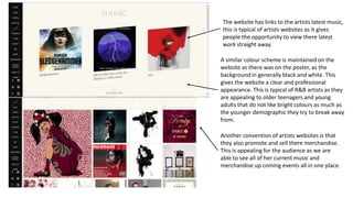
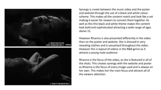
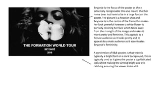
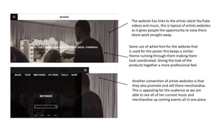
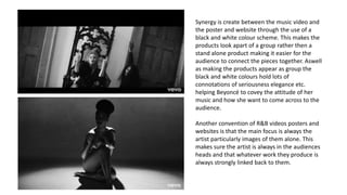
The artists non-verbal
communication is a trait
noticed in most R&B posters.
They convey the artists
careless demeanour by
having the artist looking away
in the shot. This attracts the
youthful target audience as it
coveys a cool attitude
The artists name is in
bright, white, bold font in
the centre of the frame.
This grabs the viewers
attention and makes the
artists name clear. The font
is bold and in capitals this
conveys importance. The
colours chosen also give
the poster a sophisticated
and serious appearance
showing the artist wants to
be taken seriously.
The artist is wearing
popular branded clothing.
This shows that the artist
is trendy, attracting the
young target audience to
which fashion is very
important. This is a
convention found in most
R&B posters.
All the information given is
written in white font this
draws the viewers attention
to the writing.
The writing on the website matches the
writing on the poster as it’s the same bright
white font on a dark background. This creates
synergy between the two products and gives
the artist a distinct image.
The website has links to the artists latest
YouTube videos, this is typical of artists
websites as it gives people the opportunity to
view there latest work straight away. This is
conventional of artists websites.
There is synergy between the artists clothing
choices. Similarly to the poster the artist is
wearing popular branded clothing. This
shows that the artist is trendy, attracting the
young target audience to which fashion is
very important.
The poster and the website both share a similar
colour scheme of white, black and grey this
creates synergy between the products as it
makes them look coordinated.
The poster and website are also linked to the music video for his latest
single. The products use synergy to appear coordinated and to show the
artists distinct style. In each separate product Tiller uses similar deigns such
as dark backgrounds with bright white font on top, this makes all the
products share a similar clean cut image showing they are all apart of the
same package.
As well as this Tiller is shown in similar trendy clothing showing his
personal style which attracts the young target audience who are interested
in the latest popular branded clothes. This also creates synergy between
the products as Tiller is presented similarly in each product, giving him a
signature style.
Another way the poster and website links to the music video is through the
choice of the camera shot style used. Tiller is often shown looking away
from the camera, this makes him appear natural and careless and presents
him as more relaxed. This attracts the young target audience as he appears
to be relatable and not overly posed in front of the camera.
The artist is wearing clothes
that are currently trendy for
the young target audience
this makes they artist appear
cool as they appear on trend.
Black and white writing is
used to stand out against the
blue background. This grabs
the viewers attention. Caras
name is written in a messy
font that gives it an overall
personalised feel and makes
the artist appear more linked
to the production of the
posters.
A muted blue background is used as
a pop of colour to show that she's
not to serious and more care free.
This appeals to her target audience
as they are teenagers and do not like
to be overly serious.
The website has links to the artists latest
YouTube videos, this is typical of artists
websites as it gives people the opportunity to
view there latest work straight away.
The poster also features the same
image shown on the poster creating
synergy between the products.
Same use of white font for the website that
is used for the poster this keeps a similar
theme running through them making them
look coordinated. Giving the look of the
products together a more professional feel.
Various pictures of the artist feature on the
website this keeps the artists face in the
viewers mind making them more memorable
in constantly changing popular music.
As well as there being synergy between the poster and website there is also synergy with the artists latest music
videos. The video is largely made up of solo shots of the artist this links to the artist being the sole focus of the shots
chosen for both the website and poster. This is done to make sure the viewer has a good understanding of who the
artist is and what they look like, so they are more memorable to the public.
Another way they all link together is through the use of the clothing chosen for her to wear. She is dressed in casual
trendy clothing making her look relatable to her generally teenage audience as this is what they would be typically
wearing. This use of showing her clothing choices to be similar in each product gives her a distinct style and makes
her look more cool.
The artists name is in bright,
white, bold font. This grabs the
viewers attention and makes
the artists name clear. The font
is bold and in capitals this
conveys importance, and
demands the viewers attention.
The colours chosen also give
the poster a sophisticated and
serious appearance showing
the artist wants to be taken
seriously. The choice of the
dark background also adds to
the sophisticated look of the
poster making its appearance
more serious.
Rhianna's clothing is masculine
and rather unusual. This makes
her stand out and also shows she
pushes the boundaries with
fashion. This attracts her a large
audience as she has her own
specific style. This is counter
typical to how women are often
dressed in the R&B genre as
often they are overtly sexualised
in what they are wearing.
An image of the cover of her
latest album is featured on the
poster to link the products
together. Makes it clear which
album she is promoting.
The website has links to the artists latest music,
this is typical of artists websites as it gives
people the opportunity to view there latest
work straight away.
A similar colour scheme is maintained on the
website as there was on the poster, as the
background in generally black and white. This
gives the website a clear and professional
appearance. This is typical of R&B artists as they
are appealing to older teenagers and young
adults that do not like bright colours as much as
the younger demographic they try to break away
from.
Another convention of artists websites is that
they also promote and sell there merchandise.
This is appealing for the audience as we are
able to see all of her current music and
merchandise up coming events all in one place.
Synergy is create between the music video and the poster
and website through the use of a black and white colour
scheme. This makes all the content match and look like a set
making it easier for viewers to connect them together. As
well as this this black and white theme makes the content
look bold and sophisticated attracting a wide range of ages
above 15.
However Rhianna is also presented differently in the video
then on the poster and website. She is dressed in very
revealing clothes and is sexualised throughout the video.
However this is typical of videos in the R&B genre as it
attracts a young male audience.
Rhianna Is the focus of the video, as she is featured in all of
the shots. This creates synergy with the website and poster
as Rhianna is the focus of every image used and is always on
her own. This makes her the main focus and attracts all of
the viewers attention.
A convention of R&B posters is that there is
typically a bright font on a dark background, this is
typically used as it gives the poster a sophisticated
look whilst making the writing bright and eye
catching ensuring the viewer looks at it.
Beyoncé is the focus of the poster as she is
extremely recognisable this also means that her
name does not have to be in a large font on the
poster. The picture is a head on shot and
Beyoncé is in the centre of the frame this makes
her look powerful however a white flower is
partially covering her face which takes away
from the strength of the image and makes it
more pretty and feminine. This appeals to a
female audience as it looks pretty and it
appeals to a male audience as it accentuates
Beyoncé's femininity.
Another convention of artists websites is that
they also promote and sell there merchandise.
This is appealing for the audience as we are
able to see all of her current music and
merchandise up coming events all in one place.
The website has links to the artists latest YouTube
videos and music, this is typical of artists websites
as it gives people the opportunity to view there
latest work straight away.
Same use of white font for the website that
is used for the poster this keeps a similar
theme running through them making them
look coordinated. Giving the look of the
products together a more professional feel.
Synergy is create between the music video and
the poster and website through the use of a
black and white colour scheme. This makes the
products look apart of a group rather then a
stand alone product making it easier for the
audience to connect the pieces together. Aswell
as making the products appear as group the
black and white colours hold lots of
connotations of seriousness elegance etc.
helping Beyoncé to covey the attitude of her
music and how she want to come across to the
audience.
Another convention of R&B videos posters and
websites is that the main focus is always the
artist particularly images of them alone. This
makes sure the artist is always in the audiences
heads and that whatever work they produce is
always strongly linked back to them.

Ancilary tasks

  • 2.
    The artists non-verbal communicationis a trait noticed in most R&B posters. They convey the artists careless demeanour by having the artist looking away in the shot. This attracts the youthful target audience as it coveys a cool attitude The artists name is in bright, white, bold font in the centre of the frame. This grabs the viewers attention and makes the artists name clear. The font is bold and in capitals this conveys importance. The colours chosen also give the poster a sophisticated and serious appearance showing the artist wants to be taken seriously. The artist is wearing popular branded clothing. This shows that the artist is trendy, attracting the young target audience to which fashion is very important. This is a convention found in most R&B posters. All the information given is written in white font this draws the viewers attention to the writing.
  • 3.
    The writing onthe website matches the writing on the poster as it’s the same bright white font on a dark background. This creates synergy between the two products and gives the artist a distinct image. The website has links to the artists latest YouTube videos, this is typical of artists websites as it gives people the opportunity to view there latest work straight away. This is conventional of artists websites. There is synergy between the artists clothing choices. Similarly to the poster the artist is wearing popular branded clothing. This shows that the artist is trendy, attracting the young target audience to which fashion is very important. The poster and the website both share a similar colour scheme of white, black and grey this creates synergy between the products as it makes them look coordinated.
  • 4.
    The poster andwebsite are also linked to the music video for his latest single. The products use synergy to appear coordinated and to show the artists distinct style. In each separate product Tiller uses similar deigns such as dark backgrounds with bright white font on top, this makes all the products share a similar clean cut image showing they are all apart of the same package. As well as this Tiller is shown in similar trendy clothing showing his personal style which attracts the young target audience who are interested in the latest popular branded clothes. This also creates synergy between the products as Tiller is presented similarly in each product, giving him a signature style. Another way the poster and website links to the music video is through the choice of the camera shot style used. Tiller is often shown looking away from the camera, this makes him appear natural and careless and presents him as more relaxed. This attracts the young target audience as he appears to be relatable and not overly posed in front of the camera.
  • 6.
    The artist iswearing clothes that are currently trendy for the young target audience this makes they artist appear cool as they appear on trend. Black and white writing is used to stand out against the blue background. This grabs the viewers attention. Caras name is written in a messy font that gives it an overall personalised feel and makes the artist appear more linked to the production of the posters. A muted blue background is used as a pop of colour to show that she's not to serious and more care free. This appeals to her target audience as they are teenagers and do not like to be overly serious.
  • 7.
    The website haslinks to the artists latest YouTube videos, this is typical of artists websites as it gives people the opportunity to view there latest work straight away. The poster also features the same image shown on the poster creating synergy between the products. Same use of white font for the website that is used for the poster this keeps a similar theme running through them making them look coordinated. Giving the look of the products together a more professional feel. Various pictures of the artist feature on the website this keeps the artists face in the viewers mind making them more memorable in constantly changing popular music.
  • 8.
    As well asthere being synergy between the poster and website there is also synergy with the artists latest music videos. The video is largely made up of solo shots of the artist this links to the artist being the sole focus of the shots chosen for both the website and poster. This is done to make sure the viewer has a good understanding of who the artist is and what they look like, so they are more memorable to the public. Another way they all link together is through the use of the clothing chosen for her to wear. She is dressed in casual trendy clothing making her look relatable to her generally teenage audience as this is what they would be typically wearing. This use of showing her clothing choices to be similar in each product gives her a distinct style and makes her look more cool.
  • 10.
    The artists nameis in bright, white, bold font. This grabs the viewers attention and makes the artists name clear. The font is bold and in capitals this conveys importance, and demands the viewers attention. The colours chosen also give the poster a sophisticated and serious appearance showing the artist wants to be taken seriously. The choice of the dark background also adds to the sophisticated look of the poster making its appearance more serious. Rhianna's clothing is masculine and rather unusual. This makes her stand out and also shows she pushes the boundaries with fashion. This attracts her a large audience as she has her own specific style. This is counter typical to how women are often dressed in the R&B genre as often they are overtly sexualised in what they are wearing. An image of the cover of her latest album is featured on the poster to link the products together. Makes it clear which album she is promoting.
  • 11.
    The website haslinks to the artists latest music, this is typical of artists websites as it gives people the opportunity to view there latest work straight away. A similar colour scheme is maintained on the website as there was on the poster, as the background in generally black and white. This gives the website a clear and professional appearance. This is typical of R&B artists as they are appealing to older teenagers and young adults that do not like bright colours as much as the younger demographic they try to break away from. Another convention of artists websites is that they also promote and sell there merchandise. This is appealing for the audience as we are able to see all of her current music and merchandise up coming events all in one place.
  • 12.
    Synergy is createbetween the music video and the poster and website through the use of a black and white colour scheme. This makes all the content match and look like a set making it easier for viewers to connect them together. As well as this this black and white theme makes the content look bold and sophisticated attracting a wide range of ages above 15. However Rhianna is also presented differently in the video then on the poster and website. She is dressed in very revealing clothes and is sexualised throughout the video. However this is typical of videos in the R&B genre as it attracts a young male audience. Rhianna Is the focus of the video, as she is featured in all of the shots. This creates synergy with the website and poster as Rhianna is the focus of every image used and is always on her own. This makes her the main focus and attracts all of the viewers attention.
  • 14.
    A convention ofR&B posters is that there is typically a bright font on a dark background, this is typically used as it gives the poster a sophisticated look whilst making the writing bright and eye catching ensuring the viewer looks at it. Beyoncé is the focus of the poster as she is extremely recognisable this also means that her name does not have to be in a large font on the poster. The picture is a head on shot and Beyoncé is in the centre of the frame this makes her look powerful however a white flower is partially covering her face which takes away from the strength of the image and makes it more pretty and feminine. This appeals to a female audience as it looks pretty and it appeals to a male audience as it accentuates Beyoncé's femininity.
  • 15.
    Another convention ofartists websites is that they also promote and sell there merchandise. This is appealing for the audience as we are able to see all of her current music and merchandise up coming events all in one place. The website has links to the artists latest YouTube videos and music, this is typical of artists websites as it gives people the opportunity to view there latest work straight away. Same use of white font for the website that is used for the poster this keeps a similar theme running through them making them look coordinated. Giving the look of the products together a more professional feel.
  • 16.
    Synergy is createbetween the music video and the poster and website through the use of a black and white colour scheme. This makes the products look apart of a group rather then a stand alone product making it easier for the audience to connect the pieces together. Aswell as making the products appear as group the black and white colours hold lots of connotations of seriousness elegance etc. helping Beyoncé to covey the attitude of her music and how she want to come across to the audience. Another convention of R&B videos posters and websites is that the main focus is always the artist particularly images of them alone. This makes sure the artist is always in the audiences heads and that whatever work they produce is always strongly linked back to them.