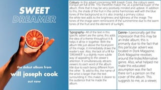
This document provides an analysis of advertisements for music albums. It analyzes aspects like colors, typography, genre, layout, images, audience and more for several different album ads. One ad features a hand holding a blood orange against a blue background promoting a summery, upbeat indie album. Another displays a striking image of an artist with black clothing and makeup against a white background to portray a strong personality in a pop/rock album. A third shows an abstract metallic sculpture as the focal point to suggest a futuristic, reflective album influenced by techno.
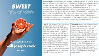
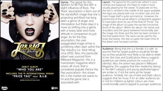
2. Colours- In this advert concerning Will Joseph Cook, the colours seem
tranquil yet full of life. This therefore makes me, as a potential buyer of the
album, think that it may be very positively minded and upbeat. In addition
to this, the shade of the fruit in the centre harmonises well with the blue
tones of the background as it is also (mainly) a primary colour.
the white text adds to the brightness and lightness of the image. The
tones of the image seem reminiscent of the summertime due to the warm
tones of the fruit and the element of sunlight.
Typography- All of the text in this
specific advert are the same; this adds
the idea of a theme throughout it &
helps it all tie in together. With the
album title just above the focal point
of the image, it immediately draws the
reader’s eye. Also, the lack of a fill for
‘DREAMER’ is a slightly more subtle
way of appealing to the viewer’s
attention. It simultaneously attracts
viewers to each word of the album
title due to each being different from
the other. To add to this, the name of
the artist is larger than the text
surrounding it- this makes it clearer to
the audience that he made the
album.
Genre- I personally get the
impression that this may be
an Indie album; this is
primarily due to the fact that
this particular advert was
located in Dork Magazine.
Dork Magazine revolves
around the Indie/Alternative
genre. Also, what helped me
make this educated
assumption was the fact
there isn’t a person on the
cover of the album. This
suggests to me, as a viewer,
3. Layout- The layout for this is primarily
centred, then further divided
(horizontally) into thirds. This allows
even distribution of the subjects and
helps the overall advert to appear
balanced. As well as this, the way in
which the text and image are placed,
the viewer’s eye are automatically
drawn towards the fruit in the centre.
This is most likely due to the
contrasting colour of it. However, the
arm holding the orange is emerging
from the left side- this adds a-
symetricality to the image and makes
more visually pleasing as it is not so
typically centred and ‘perfect’.
Audience- As for the audience of this
album, we can assume them to be
young due to the bright, vibrant
colours used and this has long since
been an indicator of youth, with
darker colours being used to appeal
to older ages. We can also assume
that it is appealing to an audience in
the summertime due to the presence
of sunlight (this fits with the advert’s
release in May 2017). However, no
specific genre is being targeted here
due to the use of gender neutral
colours being used. However, a male
hand is featured which may target
males more.
Main Image- The main image is simple. It merely consists of a hand, which
we can assume to be male due to the features, holding up a halved blood
orange towards the camera against a blue background. As I mentioned
before, the colours combine to give it a feeling similar to that of
summertime. The bright colours elicit a light, joyful feeling- thus giving the
impression that the album will do the same. The inclusion of sunlight also
adds to the summer feeling. Furthermore, the simple image becomes
relevant to the album due to the way that ‘sweet’ is often a way used to
describe fruit. Also, the subtle gradient of the background adds a sense of
dimension to the image, this makes it seem slightly more realistic.
4. Main Image- The main image here is striking, to say the least. Each part of it was
intended to make a statement. The artist glares straight into the camera and thus
captures the viewer in a somewhat intimidating stare. This, combined with the
colour contrasts, bring the impression that she has a very strong personality. The
fact that her mouth is open contributes to it; she appears to be almost in the
of speech. Although the image is very striking here, it is the clever use of colour
really brings it to the next level.
Colour- When creating this, the main thing that appears to have been though
about was the colour combinations. The use of such a deep black against the
artist’s pale skin and the white background really bring it to attention. Jessie J is
wearing all black (black eye-makeup, black nail polis, black lipstick, and black
clothing). This helps to establish a theme throughout the album cover and the
magazine advert. The use of gold as an accent colour draws attention to specific
features of the magazine (such as the text, the artist’s name and lips).
Typography- As for the typography and the text, only three fonts have been used in
total. One for the nameplate of the artist’s name, one for the ‘handwritten’ name of the
album and a final one for the rest of the text on the advert. The way in which the
nameplate is so unique in comparison to the rest of the text draws the reader’s eye due
to the size and boldness of it. The title of the album could be considered almost meek
in comparison to the name behind it but this adds a personal touch to the title in the
sense that shows an aspect of who she is- this calm, personal side to the artist contrasts
massively with the standoffish image she presents in the main image. The body
text (below the album) is all the same font but has been differentiated from each phrase
by use of different sizing, colours and lines. This adds an element of separation to it and
makes it easier for the reader to identify which lines are paired together/should be read
together.
5. Genre- The genre for this
appears to be Pop but with a
slight influence of Rock. The
‘Rock’ assumption is born out of
the standoffish image that she is
projecting and Rock has long
been a genre of anger and
intimidation but these days it is
more so shifting into a genre
with a heavy beat and more
attitude in comparison to just
anger. As for the Pop
assumption, the over
exaggerated image of her is
something often seen within the
Pop industry (i.e. Nicki Minaj
circa 2010). Also, this particular
advert was sourced from
Billboard Magazine- this is a
mainstream magazine which
covers all music that is
considered popular (hence the
Pop association)- this shows
this is the market she wants to
hit and the genre she is
associated with.
Layout- The layout for this particular advert is very
centred and balanced, this helps to make it more
visually pleasing for the viewer. To elaborate on this,
the text is centred in the middle of the space available,
the logos are placed with one on either side, and the
main image itself is quite symmetrical. However, the
positioning of the actual advert’s components appears
to have been done by use of the Rule Of Thirds. The
image of the album occupies the top two horizontal
thirds of the album. Within the album, her hands and
shoulders (and the space between) horizontally split
the image into three and the text has been centred in
the final lowest third. The same can be said for the
body text below- the text occupies the lower third of
the advert and has been centred.
Audience- Being that she is a female, it is safe to
assume that her target audience would be female
too as they would be most likely to be able to relate
to her (the Uses and Gratifications theory suggests
audiences use media products for a source of
identity). Also, the advert was placed in Billboard
Magazine; this suggests that their readership (being
in the ABC1 category and young adults/teenagers)
are similar to, if not the same as) her target
audience. Similarly, her use of dark and bold colours
suggests that her music if for an older audience (as
in not for children) as lighter colours are more
conventionally used to appeal to younger audiences.
6. Colours- The
colours here are
relatively muted
and appear to
be just varying
tones of the
same colour;
this helps to link
them all
together as they
all share the
same colour.
The advert isn’t
bright, to say
the least, and it
suggests that
the music itself
within the
accrual album
may be more
relaxed and less
‘in your face’ as
a lot of music
tends to be
these days.
Genre- Personally, the main giveaway about the genre is
that there isn’t anyone on the cover. This leads me assume
that the artist (Deewee) is relatively unknown. As well as this,
this particular advert was featured in DIY Magazine; this
leads me to presume that they consider themselves as a
part of that genre. DIY Magazine focuses on the
indie/alternative genres of music. They feature almost
everything within these and, in a way, this links with the
name ‘DIY’ as an acronym for ‘Do It Yourself’- as in break
the boundaries of music yourself. This tells us that this
particular album (Soulwax) would be in the indie/alternative
genre. Also, the name of the album (‘Soulwax’) suggests that
it may be soulful music (and the abstract metal artwork
suggests it may have a techno influence).
Audience- Based on the cover and the fact that it was located
in DIY, we can make the assumption that they are appealing
to a young adult audience due to the subdued colours and
metallic sculpture. The use of a shiny metallic abstract
sculpture as the focal point suggests that it will be influenced
by techno which is stereotypically aimed at a relatively young
audience. Also, DIY’s audience consists largely of young adults
of the ABC1 category and Deewee’s placement here suggests
that they are trying to reach a similar audience. Also, the lack
of colour could suggest it isn’t gender oriented but the slight
blue tones may make it appeal more to males.
7. Typography- The typography in
this is minimalistic; no fancy
fonts or the like are used and
this keeps the advert in tune
with the simple, futuristic
approach. [See Main Image for
more on this]. Also, the colours
used for this (dark grey and
white) are both hues found
within the main image and do
well to tie it all together. There
are only four lines/phrases of
text on the entire page
(excluding the website details at
the bottom) and this works to
direct the reader’s attention
towards the vital information.
Said information is supplied on
a ’need to know basis’. Only the
artist name, the fact that there is
a new album and it is out now,
and the album title. This helps
the viewer to process the
information quicker as they
don’t have to work to filter out
the unnecessary data.
Layout- The layout is centred with a slight
emphasis on the left and refreshingly simple;
nothing is included that doesn't’t need to be
there. This makes the advertisement look like
cluttered and makes it easier for the
viewer/audience to process the information
and also makes them feel less overwhelmed
with it. Also, sometimes the ‘less-is-more’ idea
comes into play and the lack of focal points
makes it seem more professional and well-
established.
Main Image- The main focus of the advert
(as a whole) is the full bleed image. It
appears to be an abstract layered sculpture
of a human (judging by the features). This
abstract representation, combined with it’s
metallic look and the ad’s overall limitedly
cool colour scheme leads us to assume that
the album may be relatively futuristic. It is
also extremely reflective and so leads us to
assume that the album may cause the
listener to explore themselves, to reflect their
on the souls- the title ‘Soulwax’ reinforces
this.