Unit 3 Emotional Intelligence and Spiritual Intelligence.pdf
Album release
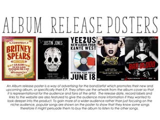
1. An Album release poster is a way of advertising for the band/artist which promotes their new and
upcoming album, or specifically their E.P. They often use the artwork from the album cover so that
it is representational for the audience and fans of the artist. The release date, record labels and
links to the website are also featured to give the audience more information if they wanted to
look deeper into the product. To gain more of a wider audience rather than just focusing on the
niche audience, popular songs are shown on the poster to show that they know some songs
therefore it might persuade them to buy the album to listen to the other songs.
2. The colours on this poster follow quite a dull and
monochromatic theme. The main colour of the font is
white, allowing it to stand out on the grey and black
background. The title of the album ‘my everything’ is in a
handwritten font, in the colour pink to connote that it a
female that has written it. The use of calling it ‘my
everything’ makes it more personal, as it feels like it is
coming directly from her. The main image, is of the artist,
Ariana Grande. She is in the centre of the poster, sitting on
a chair doing a pose with her eyes shut. This brings a simple
feel adding to the simple tone of colours, making the
audience wonder what she is doing, or even thinking
about. The clothing that she is wearing is minimal – shorts
and a crop top that look like underwear. This gains a male
audience as well as her typical female fans as they find this
attractive. Her high heels connote femininity. The text at
the bottom of the poster includes two different fonts – one
is a standard font, used in a small size as well as a bold font
that is quite big. The big font is used for more ‘important’
words such as the unique selling point – collaborations with
other well known artists and well known songs from that
album. This will grab the audience’s attention as these are
songs and other artists that they know and like, therefore it
will persuade them to buy the album if they know what is
included that they like, hoping they will enjoy the rest of
the album.
3. This album poster includes bright colours as
well as a harsh contrast with the black
background. This is because the artist, Ed,
wants the main focal point of the poster to
be the image of his album cover which
would be recognisable to the audience.
The main colour on the poster is orange.
This has been the chosen colour for the
album as it is the colour that people
connote Ed Sheeran with instantly, due to
his ginger hair. The album cover doesn’t
have his name on it, therefore on the
poster it is in a big size font across the top
so that people that aren't familiar with the
album cover already, know what artist it is.
His iconic symbol that is recognisable
towards his identity is the paw print which
is used next to his name. The promotional
text on the poster is a link to his website,
where you can buy his album as well as
other merchandise, which persuades the
audience to go on and buy more than just
the album.
4. ‘Bad Blood’ is a huge single by Taylor Swift, featuring on the ‘1989’
album. The promotional posters were purely for the single, rather
than the album. The main theme for the single and music video is
an action film, therefore all of the posters are designed to look like
a film poster. For example, to introduce Taylor Swift as the artist it
says ‘Produced by Taylor Swift’ and to tell the audience when it will
be released it says ‘World Premiere’ followed by the date. The
colour scheme of the poster is black images with red and white
text which follows the codes and conventions of action film
posters. The title is spread across the poster, at a slight angle, in the
colour red. This connotes danger which goes well with the title
‘Bad Blood’. In this poster, the main image is of Taylor Swift. She is
wearing a costume that is all black to match the theme as well as
having minimal material. Her breasts are in the centre of the whole
poster and they are on show, which slightly objectifies her to be
seen as something different to a male audience compared to a
female audience. She is also wearing gloves which implies that she
could possibly ride a motor bike or need them for some action.
For more promotion, posters were
made for each character in the
music video, showing the
character. All posters were
designed the same – title position,
colour scheme, blood splatters
and slogan. Also on every poster
the female character is in the
centre, looking powerful by the
specific leather costumes, props or
pose and stance.
5. This Arctic Monkey’s album realise poster is mainly
black and white, apart from the image. This is
mainly because it matches their genre
connotations with it being indie, bright colours
and patterns are usually for the pop genre. The
font of the title isn’t their normal recognisable
font, however the use of thick text is what they
normally use as their logo. The title is the thing on
the poster that stands out the most, which is
important as it tells the audience who the poster is
promoting. The band themselves is going to be
more popular than their upcoming album,
therefore it people see their name first they could
become more interested in what the poster is
promoting. The image is quite unusual,
challenging the fact that most artists use
themselves on the cover. This implies that they are
already have a big audience therefore don’t
need to show themselves off. The photo is clearly
from their music video of one of the songs
featured on the album. This is shown by the label
on the image. In smaller font underneath the
image it states what singles are featured on the
album, one of them being the song that the
images are from which shows us it is popular
already. At the bottom of the poster stars are
shown with names of magazines beneath them to
prove to the audience that other mediums are
recommending this album.
6. Lady Gaga uses two different images
on her poster – on natural image
showing her true self and one image
showing her pop star persona. This
could imply that the album features
two different styles on it. The poster is in
black and white, with large white font
across the images. The bottom third of
the image is to put the information
about her album on. There is two small
images of her album covers which are
the same images of the ones used on
the poster but they are the same CD
and tracks. The use of showing the
album itself on the poster is so that the
audience become familiar with what
they will look like, rather than being
confused when they see two different
versions of the album cover. A quote is
used from the magazine ‘Rolling Stone’
who say that Lady Gaga is ‘the
defining pop star of 2009’. This is a
unique selling point as the audience of
that magazine may decide to go and
buy this album, gaining Lady Gaga a
wider audience.
7. Lady Gaga uses two different images
on her poster – on natural image
showing her true self and one image
showing her pop star persona. This
could imply that the album features
two different styles on it. The poster is in
black and white, with large white font
across the images. The bottom third of
the image is to put the information
about her album on. There is two small
images of her album covers which are
the same images of the ones used on
the poster but they are the same CD
and tracks. The use of showing the
album itself on the poster is so that the
audience become familiar with what
they will look like, rather than being
confused when they see two different
versions of the album cover. A quote is
used from the magazine ‘Rolling Stone’
who say that Lady Gaga is ‘the
defining pop star of 2009’. This is a
unique selling point as the audience of
that magazine may decide to go and
buy this album, gaining Lady Gaga a
wider audience.