Call Girls in Dwarka Mor Delhi Contact Us 9654467111
Ben howard analysis
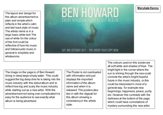
1. The layout and designfor
this album advertisement is
plain and simple which
reflects in the artist’s calm
and laid back style of music.
The artists name is in a
large basic white text The
use of white for the colour
of the font could be
reflective of how his music
and folk/acoustic music in
general is simplistic and
wholesome.
The colours used on this posterare
all softwhite and shades of blue. The
bright light in the corner where the
sun is shining through the sea could
connote the artist’s bright hopeful
future in the music industry, or this
could be interpreted in more of a
general way, for example new
beginnings, happiness,peace, purity
etc. However this contrasts with the
darkness at the bottom of the page
which could have connotations of
mystery surrounding this new artist.
The image on the page is of Ben Howard
diving in deep large empty water. This could
suggestthe big deep dive he is taking into the
music industry with this debut album and to
reflecthow big and scary the music industry
while starting out as a new artist. With the
advertisementnot being over complicated it is
easy for the audience to see exactly what
album is being advertised.
The Poster is not overloaded
with information and just
displays the important
information of the album
name and when it is
released. The posters also
ties in with the digipak for
this album showing a
consistencyin the artists
style.
Marykate Kenny