
Recommended
More Related Content
What's hot
What's hot (20)
Similar to Magazine Contents Page Analysis
Similar to Magazine Contents Page Analysis (20)
More from nathansimmons11
Recently uploaded
Recently uploaded (20)
Magazine Contents Page Analysis
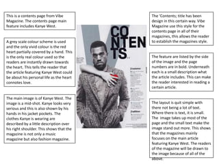
- 1. This is a contents page from Vibe The ‘Contents; title has been Magazine. The contents page main design in this certain way. Vibe feature includes Kanye West. Magazine use this style for the contents page in all of their magazines, this allows the reader A grey scale colour scheme is used to establish the magazines style. and the only vivid colour is the red heart partially covered by a hand. This is the only real colour used so the The feature are listed by the side readers are instantly drawn towards of the image and the page the heart. This tells the reader that numbers are in bold. Underneath the article featuring Kanye West could each is a small description what be about his personal life as the heart the article includes. This can make connotes love. the reader interested in reading a certain article. The main image is of Kanye West. The image is a mid-shot. Kanye looks very The layout is quit simple with serious and this is also shown by his there not being a lot of text. hands in his jacket pockets. The Where there is text, it is small. clothes Kanye is wearing are The image takes up most of the described by a little description over page and the small text make the his right shoulder. This shows that the image stand out more. This shows magazine is not only a music that the magazines mainly magazine but also fashion magazine. focuses on the main article featuring Kanye West. The readers of the magazine will be drawn to the image because of all of the above.
- 2. The image on features a band. The title ‘Q’ Contents features The band as it being the the same masthead from the magazine main article would front cover, the Q logo. The title have had a different image of Contents is clearly shown and them on the cover. This image the reader will identify this shows all band members in a quickly. Also on the masthead long shot, with the lead singer are the date, issue number and being probably the one at the website addresses. front in the white t-shirt. The image takes up the main page which makes the reader focus on The cover lines which are under the image. the title ‘features’ are titled in black text. The titles are followed by a small description The colour scheme is a mix of of what is included in the article black, white and red. The front which gives the reader a brief cover will most likely have a idea what the article will be similar colour scheme. The major about. Underneath is a small titles are shown with black boxes textbox which is a special feature and white text and then the in the magazine, ‘Oasis Special’, subtitles are shown with white the border of the text box and text over red. The image matches This contents page is quite busy . title use gold text which contrast the colour scheme quite well as The image takes up the majority with the colour scheme and of the page which gain the focus the band is wearing mainly black makes it stand out. of the reader. or white clothing
- 3. Instead of using the more common There are a lot of images in this ‘Contents’ this contents page uses contents page, to show which is ‘Inside This Week’. This is from NME the main article a larger image is magazine, the title is in bold black used and is also placed in the text in capital letters, this makes the middle of the page . The main title stand out. Underneath the title image shows a close up shot of the is the date. subjects face. Most of the cover lines are all The colour scheme is a mix of underneath the image its relates to. white, black and red. The images The cover line titles include quotes match the colour scheme as the from the person who’s image is subjects are wearing dark and above, underneath the titles white clothing. The colour scheme are followed by a small is quite simple with it mainly only description of what is included, this using black and white but the give the reader a brief idea what images and their backgrounds that section is about. The page contrast well with the colour numbers of the articles are located scheme. in the bottom right corner of the images, they are large and in a white textbox in front of the image. At the bottom of the page we see an advert for subscription of the magazine, it tries to persuade the The page is again quite busy with reader to buy it by saying, ‘for only not a lot of space but uses a simple £9.99’ and ‘ the perfect Christmas colour schemes. The layout is gift’. This section is red which unorganized and not in any stands out so the reader focuses numerical order etc. The images are on it. placed in a way to highlight their importance.