1. I will base my front cover on Rolling Stone magazine and Q magazine
as these issues of the magazines are based on a pop artist, Adele. The
images are very similar as they are both windswept and she is looking
serious/relaxed facial expression. I will use this style of image for my
magazine, it is also a close up and both images are looking directly at
the audience. I will use an image that is more like the Rolling Stone one
as this I feel captures the audience’ s eye better.
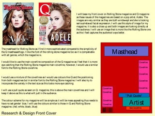
The masthead for Rolling Stone as I find it more sophisticated compared to the simplicity of
the Q mastheaad/logo. I like the font of the rolling stone magazine too as it is compatiable
with all genres, which the magazine is.
Masthead
I would like to use the main coverline composition of the Q magazine as I feel that it is more Coverline
eye catching than the Rolling Stone magazine main coverline, however, I would use a similar
font to the Rolling Stone coverline. Coverline
Coverline
I would use a mixture of the coverlines as I would use colours like Q and the positioning
from both magazines but in similar font to the Rolling Stone magazine. I will also try to Coverline
incorporate the variety in the text size as this looks more eye catching.
Coverline Coverline
I will use a pull quote as seen on Q magazine, this is above the main coverlines and I will
Coverline
keep it above as this is what will pull in the audience.
“ Pull Quote”
Artist
The colour scheme for my magazine will be simple as it will be mass appealing thus needs to Coverline
have no set gender bias. I will use the colours similar to those in Q and Rolling Stone Coverline
magazine. (red, white, black, blue) Sub coverline
Research & Design Front Cover
2. I will base my contents page on these 3
‘ popular’ magazines, although they are a
mix of genres, they contain pop and thus
‘ popular’ music. The heading goes along
the top of the page on all 3 pages and have
a similar layout as they all have the
‘ contents’ in columns instead of rows. All 3
contents pages use images and subheadings,
the bigger the image the more important it
is.
The masthead for Q is simple and is almost a banner due to it having a bold black border in
which contents is wrote in white along it. There is also the Q symbol next to the content, I will
use something similar as this format is also seen in NME magazine. I will have a simple
Heading
heading like Q, NME and also Rolling Stone magazines as they are eye catching and represent
no particular genre or gender.
Image
The columns in which the text is in makes the page look neat and simple font, the subheadings
are in a bold in either a red or black box out with white writing to let the subheading stand out
from the background and other texts. I will use a similar technique when it comes to making
my own contents page for my music magazine.
Image
The images will be a mid shot high angle as I feel this would be the most eye catching and
would suit the contents page best. This is because the contents page above have the contents Desc
either side of the images so I thought that mine should have the images in the middle and the ri pti o
contents around it. All the above have the heading at the top of the page thus to keep to the pop
n
genre I will do the same.
Research & Design Contents Page
3. I will use an image to fill up the whole of the left page as this is what is going to be
The heading I will put at the top of the right page under
the most eye catching in the double page spread, this will be of my artist, this will be
the border, this will be in a simple font as seen in the
a mid shot high angle as this seems to be a common image. I decided to also put it on
double page spreads above from Q, NME and Rolling
the left side as this is the first page the audience will see so it must be engaging.
Stone.
The quote will be under the heading this is because this is
where a quote is normally found in a music magazine as it
is the second most engaging convention.
Heading
A
I will use a giant drop capital that is situated behind the
text so that the text is able to be seen . I will use the first
letter of the artist as seen in the Q magazine with Jay-Z.
“ Quote”
The columns will be spit depending on the subject. The
text for this will be in a simple times new roman font so
that it is easy to read for all audiences. I will use this Image
format as it is commonly used in most magazines. The
interview style will be a question and answer.
The page numbers will be in the left and right bottom
corner of the page as this is also where the numbers are
found.
Research & Design Double Page Spread