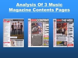
Analysis Of 3 Music
Magazine Contents Pages
NME MAGAZINE
CONTENTS PAGE ANALYSIS                                       The banner is spread across the
                                                                                                      top of the page to show what the
The NME Masthead is the same
as on the front of the magazine so                                                                    page is about. The font is very
the cover and the contents can                                                                        similar to the font on the cover and
linked together. Also NME                                                                             also similar to the masthead to
Masthead is like a logo and this is                                                                   show a link between the cover and
placed on the contents so it can                                                                      the rest of the magazine. The
be advertised to the public.                                                                          banner is also in block capitals to
                                                                                                      stand out and show what this page
                                                                                                      is about.
Bands are listed in red because they
                                                                                                  The date is shown so the reader can
are trying to show importance and
                                                                                                  see if they have the latest edition of
the one of the main focuses in the
                                                                                                  the magazine and also the date
magazine. It also is in red because it
                                                                                                  helps collectors of the magazine for
stand out on the white background.
                                                                                                  ordering purposes. The date is small
The page numbers are in black to
                                                                                                  because it is not the main feature
have a differentiation from the colour
                                                                                                  but is placed underneath the banner
of the bands. The Black and Red is
                                                                                                  so it will get noticed quickly.
also the main colour scheme for the
magazine and when we see these
                                                                                                    The subheading are blocked out
colours we can automatically
                                                                                                    to break the magazine up into
associate this with the NME
                                                                                                    sections. The white font stands
Magazine.
                                                                                                    out on the black background.
                                                                                               The brief heading allows the reader to
                                                                                               know what's in the magazine and the
The Main image is linked                                                                       red page numbers stand out on the
with the article below which                                                                   white background to inform them what
talks about a touring special                                                                  page the articles are on. The brief
the woman is standing in                                                                       summary gives the reader a taste of
front of a tour bus.                                                                           what each article is about.

                                                                                  The previous and future editions allow the
Image is edited so it looks like a                                                reader to purchase editions which they may
photograph. This is appropriate                                                   have missed and also the ability to subscribe to
because the image tries to                 The Editors introduction to contents
                                                                                  future editions. The details are give to help them
create a fun and wild                      of magazine gives the readers a
                                                                                  purchase editions and they also advertise the
atmosphere and makes touring               chance to hear from the editor
                                                                                  NME website through this. The use of the yellow
look cool. The image is at a               behind the magazine and also see
                                                                                  on the wording allows a change in the colour
angle to give photograph effect.           what is new with NME.
                                                                                  scheme which is black, red and white this helps
                                                                                  it stand out from the rest of the page.
ANALYSIS OF LAYOUT/DESIGN
FEATURES OF CONTENTS PAGE
                        MASTHEAD AND BANNER (CONTENTS) –
                        BOLD AT TOP WITH DATE/ISSUE NUMBER


                                             SUBHEADINGS

             BAND                            NEWS
             INDEX      MAIN IMAGE EDITED
             LIST OF    LIKE A PHOTOGRAPH
                        SET AT AN ANGLE.     RADAR
             BANDS IN
             RED AND
             PAGE
             NUMBERS                         REVIEWS
             IN BLACK

                        EDITORS
                        INTRODUCTION         LIVE
                        TOURING SPECIAL

                                             FEATURE


                                             SUBSCRIPTION
                                             FOR PREVOIUS
                                             AND FUTURE
                                             EDITIONS.
Q MAGAZINE
CONTENTS PAGE ANALYSIS

The Q Masthead is the same as on                                                    The date and issue number of the
the front of the magazine so the cover                                              magazine have been written at the
and the contents can linked together.                                               top and it links with the subscriptions
Also Q Masthead is like a logo and                                                  at the bottom so people can find out
this is placed on the contents so it                                                the issue and date if they wanted to
can be advertised to the public                                                     purchase any previous or future
                                                                                    editions.

The banner is coloured white to link to
the colour scheme of the magazine
and it also stands out on the black
background. The banner is placed                                                    The main image dominates the
very close to the magazines masthead                                                contents page with a group shot of a
almost trying to make it look like one                                              band to show they are the main
word.                                                                               attraction to this weeks issue. The
                                                                                    white box at the bottom of the picture
The features are showing the                                                        tells us that the band is called the
reader what is in this weeks                                                        Courteeners and it also tell the reader
issue and what page they are                                                        there is more information about them
on. The content is in black and                                                     of page 38.
the page numbers are in red so
the numbers can stand out and
that there is differentiation
                                                                                     The review area gives the
between the numbers and
                                                                                     readers a chance to read reviews
content.
                                                                                     on the latest music and new
                                                                                     albums. The review content is
The Oasis special is also a                                                          separated from the rest of the
separated section from the rest of                                                   content from the magazine to
the content. Also Oasis having a                                                     show it is a separate area of the
separate special section this                                                        magazine.
shows they are a very important              The every month part of the contents
band in this music genre. Also the           is showing that these are here every
colour scheme has changed for                when you buy the magazine such as
the special Oasis section and the            the crossword and subscriptions.
page number are in gold instead of
the normal red
MASTEHEAD AND BANNER (CONTENTS)
                                    DATE

             MAIN IMAGE

FEATURES     COURTEENERS BAND
             GROUP SHOT
WITH
CONTENT IN
BLACK AND
NUMBERS IN
RED


OASIS
SPECIAL
CLOURED IN
GOLD

             REVIEW
             LATEST MUSIC REVIEWS


EVERY
MONTH
NME MAGAZINE
CONTENTS PAGE ANALYSIS
                                                                                                              The banner is spread across the
The NME Masthead is the same                                                                                  top of the page to show what the
as on the front of the magazine so                                                                            page is about. The font is very
the cover and the contents can                                                                                similar to the font on the cover and
linked together. Also NME                                                                                     also similar to the masthead to
Masthead is like a logo and this is                                                                           show a link between the cover and
placed on the contents so it can                                                                              the rest of the magazine. The
be advertised to the public.                                                                                  banner is also in block capitals to
                                                                                                              stand out and show what this page
                                                                                                              is about. The banner has been
Bands are listed in red because they                                                                          placed next to the masthead so it
are trying to show importance and                                                                             looks like it is one sentence.
the one of the main focuses in the
magazine. It also is in red because it                                                                    The date is shown so the reader can
stand out on the white background.                                                                        see if they have the latest edition of
The page numbers are in black to                                                                          the magazine and also the date
have a differentiation from the colour                                                                    helps collectors of the magazine for
of the bands. The Black and Red is                                                                        ordering purposes. The date is small
also the main colour scheme for the                                                                       because it is not the main feature
magazine and when we see these                                                                            but is placed underneath the banner
colours we can automatically                                                                              so it will get noticed quickly.
associate this with the NME
Magazine.
                                                                                                          The subheading are blocked out
                                                                                                          to break the magazine up into
                                                                                                          sections. The white font stands
The previous and future editions allow the                                                                out on the black background. The
reader to purchase editions which they may                                                                sections show different parts of
have missed and also the ability to subscribe to                                                          the magazine and what pages
future editions. The details are give to help them                                                        they are on and what they are
purchase editions and they also advertise the                                                             about.
NME website through this. The use of the yellow
on the wording allows a change in the colour
scheme which is black, red and white this helps      The article links to the
it stand out from the rest of the page. Also the                                      The Main image is of a
                                                     above picture and the
use of yellow shows that it is important                                              band on a stage either
                                                     readers can understand the
information.                                                                          performing or preparing for
                                                     picture more after the article
                                                                                      a gig
                                                     is read.
BAND        NME MASTHEAD AND BANNER
INDEX
                                               DATE
                                      SUBHEADINGS
                                      OF DIFFERENT
BANDS                                 SECTIONS OF
LISTED IN                             THE ISSUES
RED                                   CONTENT
            MAIN IMAGE
PAGE                                  NEWS
NUMBERS                               RADAR
IN BLACK

                                      REVIEW


                                      LIVE
            ARTICLE LINKS TO MAIN
            IMAGE ABOVE


                                      FEATURES


            SUBCRIPTIONS

Contents Analysis

  • 1.
    Analysis Of 3Music Magazine Contents Pages
  • 2.
  • 3.
    CONTENTS PAGE ANALYSIS The banner is spread across the top of the page to show what the The NME Masthead is the same as on the front of the magazine so page is about. The font is very the cover and the contents can similar to the font on the cover and linked together. Also NME also similar to the masthead to Masthead is like a logo and this is show a link between the cover and placed on the contents so it can the rest of the magazine. The be advertised to the public. banner is also in block capitals to stand out and show what this page is about. Bands are listed in red because they The date is shown so the reader can are trying to show importance and see if they have the latest edition of the one of the main focuses in the the magazine and also the date magazine. It also is in red because it helps collectors of the magazine for stand out on the white background. ordering purposes. The date is small The page numbers are in black to because it is not the main feature have a differentiation from the colour but is placed underneath the banner of the bands. The Black and Red is so it will get noticed quickly. also the main colour scheme for the magazine and when we see these The subheading are blocked out colours we can automatically to break the magazine up into associate this with the NME sections. The white font stands Magazine. out on the black background. The brief heading allows the reader to know what's in the magazine and the The Main image is linked red page numbers stand out on the with the article below which white background to inform them what talks about a touring special page the articles are on. The brief the woman is standing in summary gives the reader a taste of front of a tour bus. what each article is about. The previous and future editions allow the Image is edited so it looks like a reader to purchase editions which they may photograph. This is appropriate have missed and also the ability to subscribe to because the image tries to The Editors introduction to contents future editions. The details are give to help them create a fun and wild of magazine gives the readers a purchase editions and they also advertise the atmosphere and makes touring chance to hear from the editor NME website through this. The use of the yellow look cool. The image is at a behind the magazine and also see on the wording allows a change in the colour angle to give photograph effect. what is new with NME. scheme which is black, red and white this helps it stand out from the rest of the page.
  • 4.
    ANALYSIS OF LAYOUT/DESIGN FEATURESOF CONTENTS PAGE MASTHEAD AND BANNER (CONTENTS) – BOLD AT TOP WITH DATE/ISSUE NUMBER SUBHEADINGS BAND NEWS INDEX MAIN IMAGE EDITED LIST OF LIKE A PHOTOGRAPH SET AT AN ANGLE. RADAR BANDS IN RED AND PAGE NUMBERS REVIEWS IN BLACK EDITORS INTRODUCTION LIVE TOURING SPECIAL FEATURE SUBSCRIPTION FOR PREVOIUS AND FUTURE EDITIONS.
  • 5.
  • 6.
    CONTENTS PAGE ANALYSIS TheQ Masthead is the same as on The date and issue number of the the front of the magazine so the cover magazine have been written at the and the contents can linked together. top and it links with the subscriptions Also Q Masthead is like a logo and at the bottom so people can find out this is placed on the contents so it the issue and date if they wanted to can be advertised to the public purchase any previous or future editions. The banner is coloured white to link to the colour scheme of the magazine and it also stands out on the black background. The banner is placed The main image dominates the very close to the magazines masthead contents page with a group shot of a almost trying to make it look like one band to show they are the main word. attraction to this weeks issue. The white box at the bottom of the picture The features are showing the tells us that the band is called the reader what is in this weeks Courteeners and it also tell the reader issue and what page they are there is more information about them on. The content is in black and of page 38. the page numbers are in red so the numbers can stand out and that there is differentiation The review area gives the between the numbers and readers a chance to read reviews content. on the latest music and new albums. The review content is The Oasis special is also a separated from the rest of the separated section from the rest of content from the magazine to the content. Also Oasis having a show it is a separate area of the separate special section this magazine. shows they are a very important The every month part of the contents band in this music genre. Also the is showing that these are here every colour scheme has changed for when you buy the magazine such as the special Oasis section and the the crossword and subscriptions. page number are in gold instead of the normal red
  • 7.
    MASTEHEAD AND BANNER(CONTENTS) DATE MAIN IMAGE FEATURES COURTEENERS BAND GROUP SHOT WITH CONTENT IN BLACK AND NUMBERS IN RED OASIS SPECIAL CLOURED IN GOLD REVIEW LATEST MUSIC REVIEWS EVERY MONTH
  • 8.
  • 9.
    CONTENTS PAGE ANALYSIS The banner is spread across the The NME Masthead is the same top of the page to show what the as on the front of the magazine so page is about. The font is very the cover and the contents can similar to the font on the cover and linked together. Also NME also similar to the masthead to Masthead is like a logo and this is show a link between the cover and placed on the contents so it can the rest of the magazine. The be advertised to the public. banner is also in block capitals to stand out and show what this page is about. The banner has been Bands are listed in red because they placed next to the masthead so it are trying to show importance and looks like it is one sentence. the one of the main focuses in the magazine. It also is in red because it The date is shown so the reader can stand out on the white background. see if they have the latest edition of The page numbers are in black to the magazine and also the date have a differentiation from the colour helps collectors of the magazine for of the bands. The Black and Red is ordering purposes. The date is small also the main colour scheme for the because it is not the main feature magazine and when we see these but is placed underneath the banner colours we can automatically so it will get noticed quickly. associate this with the NME Magazine. The subheading are blocked out to break the magazine up into sections. The white font stands The previous and future editions allow the out on the black background. The reader to purchase editions which they may sections show different parts of have missed and also the ability to subscribe to the magazine and what pages future editions. The details are give to help them they are on and what they are purchase editions and they also advertise the about. NME website through this. The use of the yellow on the wording allows a change in the colour scheme which is black, red and white this helps The article links to the it stand out from the rest of the page. Also the The Main image is of a above picture and the use of yellow shows that it is important band on a stage either readers can understand the information. performing or preparing for picture more after the article a gig is read.
  • 10.
    BAND NME MASTHEAD AND BANNER INDEX DATE SUBHEADINGS OF DIFFERENT BANDS SECTIONS OF LISTED IN THE ISSUES RED CONTENT MAIN IMAGE PAGE NEWS NUMBERS RADAR IN BLACK REVIEW LIVE ARTICLE LINKS TO MAIN IMAGE ABOVE FEATURES SUBCRIPTIONS