
Recommended
More Related Content
Viewers also liked
Similar to Magazine template
Similar to Magazine template (20)
Magazine template
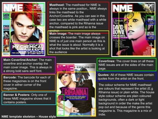
- 1. Masthead: The masthead for NME is always in the same position,. NME always links the masthead to the Anchor/Coverline. As you can see in this case two are white masthead with a white anchor, compared to the Rihanna issue the masthead is pink and so is the anchor. Main image: The main image always crosses the boarder. The main image on NME is of just one main person as this is what the issue is about. Normally it is a shot that looks like the artist is looking at the audience Main Coverline/Anchor: The main Coverlines: The cover lines on all these coverline and anchor overlap the NME issues are at the sides of the main main cover image. This is always in page. a strong bold sans serif font. Quotes: All of these NME issues contain Barcode: The barcode for each of quotes from the artist on the front. these magazines is on the front cover in either corner of the The colour scheme for NME masthead magazine. are colours that represent the artist (E.g Rihanna issue) or plain white. The house Banner & Posters: Only one of style colour scheme are plain coloured these NME magazine shows that it backgrounds, often a dark or light contains posters. background in order the make the artist pop out and because of the genre this magazine is. This magazine is a mix of indie. NME template skeleton – House style
- 2. Masthead: Kerrang! Masthead is situated behind the cover image, it is also either black with a white background or white with a black background. It has a cracked look like shattered glass. Main image: The masthead on all three of these Kerrang! magazines are behind the image, people instantly recognise the magazine and therefore do not need to see the full kerrang! Logo as they can still read it behind plus they know that this is the house style for the kerrang! magazine. The image is also always a midshot that is looking directly at the audience. Main Coverline/Anchor: The main anchor on all these front covers are overlapping the cover image. They are promoting the main article inside The colour scheme for Kerrang! is and in two of the cases these are the dark, this is because the genre is more artists on the front cover. rock than any other genre and dark colours are generically related to rock. Banner & Posters: All of these Kerrang!’s masthead is always cracked issues of Kerrang! contain free that is either black or white, never any posters along with banners. other colour, this relates back to the generic conventions of a rock genre. Barcode: The barcode for each of these issues is situated on the front in the same corner of kerrang! KERRANG! template skeleton – House style
- 3. Masthead: Q masthead is just of white Q with a red background, this very rarely ever changed. The position of the Q is always in the left corner, same size every time. This is so it is instantly recognisable to the audience. Main Coverline/Anchor: The main coverline for Q is normally always in a black or white colour that is placed over the top of the image halfway down the page. Icons: All of these Q magazines use little icons to highlight certain features within the magazine. Main image: Q magazine nearly Barcode: The barcode is always always use a full body shot/long shot. bottom left of the magazine out of the On all of these issues of Q magazine way in the corner the artists are looking directly down Q’s colour scheme is nearly always the the lens and making eye contact with same with only a few colour variations. the audience. Q is an all-round music magazine but Coverlines: All Q magazines have mainly contains pop, hip-hop and rap. coverlines, these are always to the From these magazines you can see that either or both sides of the image. The they keep to the same style each time, image is placed in front of the this is one of the things that makes Q coverline and therefore may cover recognisable to the audience. Q could part of the image. stay a neutral colour as it does contain more than one genre and therefore needs to try not to follow any key Q template skeleton – House style convections for other genres.
- 4. Main Coverline/Anchor: Kerrang! And NME both use anchors to entice the reader plus this is also a main coverline. Q on the other hand does not use this technique in this issue. Banner & Posters: Kerrang! Is the only one out these three that offer free posters as the other two do not. Icons & Quotes: Kerrang! and Q both use little icons to show what the content is and are sometimes are promoting little competitions , NME’s issue does not offer this. All of the magazines contain quotes on the cover page from the artist/s on the front. Main image: Kerrangs! cover image is of Masthead: KERRANG! Is wrote like Hayley Williams punching towards the shattered glass, KERRANG! Is also the audience with the name Paramore wrote sound that is made when plugging in a on her hand. In contrast to this, NME has guitar and this relates to the genre of a close up of Florence Welch and in magazine as this is more of a rock genre contrast with NME, Q has a long shot with compared to Q which I more pop. Q 3 different artists on the cover. What all of magazine has just a simple Q which is these music magazines have in common always in a red square as the masthead, is that al of the artists are looking at the however this is also the logo for Q audience to engage them. magazine. The Q is instantly recognisable by the audience. NME however are the Coverlines: Q and NME both have only music magazine to variate the coverlines on these issue, however, colours of the NME logo/masthead. Kerrang! does not. Both NME and Q have MNE’s masthead is the same colour as their coverlines at the sides of the cover the coverlines. image although it may still over lap. Comparing template skeletons – House style