SlideShare a Scribd company logo
1 of 11
Grime Music Magazine
Grime is a style of music that emerged from Bow, East London, England in
the early 2000s, primarily as a development of UK garage, British hip hop
and dancehall. Pioneers of the style include Dizzee Rascal, Wiley, and Roll
Deep.

Youths 16+ students – early 20’s
Monthly
Issue size – 100 pages
Typical contents - Up and coming artists
Interviews
Gigs around the uk
£ 3:00
Flavour Magazine Case Study Notes;
• Urban music based in the u.k looking at genre’s such as hip hop, mc’ing and rapping.
•The publishing company is called “greenpark publishing” The Staff
The Staff
•Flavour Magazine Publisher: Leonard Foster
•Flavour Magazine Editorial Director: Annika Allen
•Flavour Magazine Advertising Executive: Siobhan Copland
•Art Editor: Ikem Ononiwu
•Fashion Editor: Denise Brown
•Events Team: Laura Rinaldi
•Events Team: Denise Kodia
•Sub Editor: Francesca Twinn
• bi-monthly urban entertainment and arts magazine in the United Kingdom. The
publication targets men and women 18–34. It presents interviews and discussions on
people in music, art, TV, film, beauty and fashion.

Price: Free
Frequency of Publication: Monthly
Sophisticated colour
            scheme                 Uncluttered       Main Image                Needs A
The web
                                   front page        Medium Close Up           Barcode
address
featured        Cover lines
                                                                    Includes a header and a
                                                                    slogan above it.
 Quite Plain, wouldn’t
 get me the best grade,                                                Issue Information
 good to know it needs
 more skills shown to                                              Cover Line; Identifying
 become more                                                       the Cover Star and
 successful.                                                       Giving a small detail of
                                                                   the further interview
 Girly Colours, need to                                            inside.
 be more for both
 genders so a colour that
 is not specifically linked                                           Listing other featured
 to either gender.                                                    artist so you can see
                                                                      what to expect In this
 I think their should be                                              issue of the magazine.
 more Images on the front
 cover to attract more                   A lot of jewellery worn to give that hip
 readers if they are not                 hop Urban feel to the magazine e.g
 interested in main image.               chains worn
Page Numbers in chronological
  Relevant images,             order and defined into different       This specific one from
  but not enough               sections e.g “Exposure”                “Flavour” is so Plain, I
  on there and a                                                      don’t want my
  irrelevant image                                                    Contents page to look
  should not be the                                                   Anything like this.
  biggest one.
                                                                           The colour
Not detailed when                                                          scheme is not
discussing the titles of                                                   very clear, the
different articles, which                                                  white is too
means it is hard to                                                        basic and the
differentiate between                                                      look of the
different ones and harder to                                               contents page
navigate through the                                                       is too
magazine.                                                                  simplistic.


There is no point in
subheadings for
different types of                        I don’t like the idea of the page being folded
articles if they are in                   up looks scruffy and if there is not much detail
chronological order.                      about the magazine you shouldn't have details
                                          that are unnecessary
Again too                Needs to not just be bulk text, too overwhelming
 simplistic and           for some readers, should have quotes or snippets
                                                                                   Nice
 boring.                  to attract attention
                                                                                   relevant
                                                                                   images,
Colour                                                                             look
scheme                                                                             profession
is simple                                                                          al have
but                                                                                been
effective                                                                          photo
and                                                                                shopped
works                                                                              well.
nicely
with the                                                                           Interestin
photogra                                                                           g topics
phs used                                                                           to the
in this                                                                            article
article.                                                                           e.g. the
                                                                                   gossip/sc
                                                                                   andal
     Font is very small
                                                                                   etc.
                  It would be very expensive (especially for a free magazine) to
                  produce a full-page image and is unnecessary if the article is
                  thorough.
NME Magazine case study notes;
The New Musical Express, popularly known by the initialism NME, is a music
publication in the United Kingdom, published weekly since March 1952. It
started as a music newspaper, and gradually moved toward a magazine format
during the 1980s, changing from newsprint in 1998. It was the first British
paper to include a singles chart, in the 14 November 1952 edition. In the 1970s
it became the best-selling British music newspaper. During the period 1972 to
1976 it was particularly associated with gonzo journalism, then became closely
associated with punk rock through the writing of Tony Parsons and Julie
Burchill.

• Type and focus of the magazine is “indie”
•Publishing company for NME;
•The frequency of the publication is Weekly
•Price; £2.99
•Editors name; Mike Williams
•First issue 7th of march 1952
•IPC media
NME trademark text is clear and big, easy to identify.
Great use of
colour scheme
                                                                      Picture fits in with
                                                                      colour scheme e.g
A puff is in the                                                      red in his shirt = red
top right hand                                                        text
corner of the
magazine                                                               Blue against red is
                                                                       used cleverly to
Issue                                                                  contrast against
information                                                            each other so the
(price date etc.)                                                      cover lines telling
                                                                       you what is in this
                                                                       weekly magazine
 The image
                                                                       are clear and
 overlaps the
                                                                       stand out against
 title so as not
                                                                       the rest.
 to obscure
 the medium
 shot of Alex                                                          The convention of
 Turner.                                                               a bar code is
                                                                       used.

     Vynal relevant to magazine.     Question used on the front to entice the target audience.
Clear colour     Enticing the
 scheme           reader
 looks very       mentioning “free
 effective        posters”
 sticking to      insentives.
 the pink
 white and
 black
 background.


I want to
emulate the         Barcodes used as
idea and look       a usual magazine
of the Polaroid     convention
images it
would be very
simple to do
on Photoshop      Cover lines used
and looks very    at the start
effective.
Interesting and        Issue information on top of an   Relevant Images
engaging layout.       image


  Columns like the
                                                        Page numbers big
  “PLUS” column to
                                                        and bold and
  entice the reader
                                                        shown with an
  and add little
                                                        image so it’s
  extra’s so nothing
                                                        obvious what the
  is missing on the
                                                        topic is for that
  contents page.
                                                        particular article


Date on the top
and the title is
unique as well not
just putting
“contents” and
giving that page a
specific name.
I really love the idea of the newspaper cutting out as a title is looks
really effective and gives it an alternative “punk” look which goes with        The image
the look of Lilly Allen in this photo as she is wearing tartan. I am going      goes with
to try and emulate this title idea in my double page spread.                    the colour
                                                                                scheme
                                                                                again red
Relevant image                                                                  from the
of artist which                                                                 shirt is
is the focus of                                                                 reflected
the whole                                                                       into the odd
article the                                                                     rare section
photo is a                                                                      of text in
medium long                                                                     this double
shot and it                                                                     page
takes up a full                                                                 spread.
page which
looks good but
will be costly in
printing                Not too much actual article or text              Colour scheme
expenses.               for a double page spread could be                is effective;
                        disappointing to readers that like a             using black,
                        lot of information.                              white and red
                                                                         throughout.
If text is
                                              overwhelming
                                              they have a
                                              dip in and out
                                              of side bar so
                                              readers can
                                              get bite size
                                              information
                                              quickly and it
                                              is separated
                                              from the text I
                                              would like to
                                              use this idea in
                                              my double
                                              page spread.


Really nice different images
selection.                     Action shots

More Related Content

What's hot

G321 foundation portfolio in media – Evaluation
G321 foundation portfolio in media – EvaluationG321 foundation portfolio in media – Evaluation
G321 foundation portfolio in media – Evaluationlouisestorer
 
Media as evaluation
Media as evaluationMedia as evaluation
Media as evaluationyahong24
 
Double page spread analysis
Double page spread analysisDouble page spread analysis
Double page spread analysislydiaplatts
 
Evaluation Questions 1-4.
Evaluation Questions 1-4.Evaluation Questions 1-4.
Evaluation Questions 1-4.sarahsp94
 
Magazine cover analysis_rihanna
Magazine cover analysis_rihannaMagazine cover analysis_rihanna
Magazine cover analysis_rihannaRyanDenner
 
Analysing contents pages prep for blog ppt
Analysing  contents pages prep for blog pptAnalysing  contents pages prep for blog ppt
Analysing contents pages prep for blog pptPotterM2
 
Task 1- Evaluation
Task 1- Evaluation Task 1- Evaluation
Task 1- Evaluation asmediaf12
 
Contents Page Analysis
Contents Page AnalysisContents Page Analysis
Contents Page Analysislydiaplatts
 
My music magazine evaluation
My music magazine evaluationMy music magazine evaluation
My music magazine evaluationMKTK12
 
Textual analysis
Textual analysisTextual analysis
Textual analysisjoelbmedia
 
Contents page analysis
Contents page analysisContents page analysis
Contents page analysisSuzyQuinn13
 
Question 1-7
Question 1-7Question 1-7
Question 1-7shaqsuave
 
Analysis of nme
Analysis of nmeAnalysis of nme
Analysis of nmeasmediaf12
 
Analysis of nme
Analysis of nmeAnalysis of nme
Analysis of nmeasmediaf12
 
Analysis of nme
Analysis of nmeAnalysis of nme
Analysis of nmeasmediaf12
 

What's hot (18)

G321 foundation portfolio in media – Evaluation
G321 foundation portfolio in media – EvaluationG321 foundation portfolio in media – Evaluation
G321 foundation portfolio in media – Evaluation
 
Media as evaluation
Media as evaluationMedia as evaluation
Media as evaluation
 
Double page spread analysis
Double page spread analysisDouble page spread analysis
Double page spread analysis
 
Task 2
Task 2Task 2
Task 2
 
Evaluation Questions 1-4.
Evaluation Questions 1-4.Evaluation Questions 1-4.
Evaluation Questions 1-4.
 
Magazine cover analysis_rihanna
Magazine cover analysis_rihannaMagazine cover analysis_rihanna
Magazine cover analysis_rihanna
 
Analysing contents pages prep for blog ppt
Analysing  contents pages prep for blog pptAnalysing  contents pages prep for blog ppt
Analysing contents pages prep for blog ppt
 
Task 1- Evaluation
Task 1- Evaluation Task 1- Evaluation
Task 1- Evaluation
 
Contents Page Analysis
Contents Page AnalysisContents Page Analysis
Contents Page Analysis
 
My music magazine evaluation
My music magazine evaluationMy music magazine evaluation
My music magazine evaluation
 
Textual analysis
Textual analysisTextual analysis
Textual analysis
 
Contents page analysis
Contents page analysisContents page analysis
Contents page analysis
 
Question 1-7
Question 1-7Question 1-7
Question 1-7
 
Analysis of nme
Analysis of nmeAnalysis of nme
Analysis of nme
 
Analysis of nme
Analysis of nmeAnalysis of nme
Analysis of nme
 
Analysis of nme
Analysis of nmeAnalysis of nme
Analysis of nme
 
Media Evaluation
Media EvaluationMedia Evaluation
Media Evaluation
 
Media evaluation
Media evaluationMedia evaluation
Media evaluation
 

Viewers also liked

Mise en-scene for hip-hop and rap music magazines
Mise en-scene for hip-hop and rap music magazinesMise en-scene for hip-hop and rap music magazines
Mise en-scene for hip-hop and rap music magazinesChrisDonnellan
 
Similarities and differences between 3 music genre magazines
Similarities and differences between 3 music genre magazinesSimilarities and differences between 3 music genre magazines
Similarities and differences between 3 music genre magazinesNVarun
 
Codes and conventions of a hip hop music magazine
Codes and conventions of a hip hop music magazineCodes and conventions of a hip hop music magazine
Codes and conventions of a hip hop music magazinebillybetterknow
 
Andrew Goodwin’s Theory
Andrew Goodwin’s TheoryAndrew Goodwin’s Theory
Andrew Goodwin’s Theoryguestc6d43a4a
 
Goodwin’s Theory
Goodwin’s TheoryGoodwin’s Theory
Goodwin’s Theoryoldertibz
 
Conventions Of A Hip Hop Music Video.
Conventions Of A Hip Hop Music Video.Conventions Of A Hip Hop Music Video.
Conventions Of A Hip Hop Music Video.Sarah Byard
 
Andrew goodwin’s music video theory
Andrew goodwin’s music video theoryAndrew goodwin’s music video theory
Andrew goodwin’s music video theory07weeksjor
 

Viewers also liked (10)

Mise en-scene for hip-hop and rap music magazines
Mise en-scene for hip-hop and rap music magazinesMise en-scene for hip-hop and rap music magazines
Mise en-scene for hip-hop and rap music magazines
 
Codes and conventions
Codes and conventionsCodes and conventions
Codes and conventions
 
Similarities and differences between 3 music genre magazines
Similarities and differences between 3 music genre magazinesSimilarities and differences between 3 music genre magazines
Similarities and differences between 3 music genre magazines
 
Genre representation
Genre representationGenre representation
Genre representation
 
Codes and conventions of a hip hop music magazine
Codes and conventions of a hip hop music magazineCodes and conventions of a hip hop music magazine
Codes and conventions of a hip hop music magazine
 
Hip-Hop Music and Culture
Hip-Hop Music and CultureHip-Hop Music and Culture
Hip-Hop Music and Culture
 
Andrew Goodwin’s Theory
Andrew Goodwin’s TheoryAndrew Goodwin’s Theory
Andrew Goodwin’s Theory
 
Goodwin’s Theory
Goodwin’s TheoryGoodwin’s Theory
Goodwin’s Theory
 
Conventions Of A Hip Hop Music Video.
Conventions Of A Hip Hop Music Video.Conventions Of A Hip Hop Music Video.
Conventions Of A Hip Hop Music Video.
 
Andrew goodwin’s music video theory
Andrew goodwin’s music video theoryAndrew goodwin’s music video theory
Andrew goodwin’s music video theory
 

Similar to Grime music slide

Semiotic analysis of a magazine cover
Semiotic analysis of a magazine coverSemiotic analysis of a magazine cover
Semiotic analysis of a magazine coveremjcampbell
 
Analysis of college magazine
Analysis of college magazineAnalysis of college magazine
Analysis of college magazinePhillLecorgne
 
Media as evaluation
Media as evaluationMedia as evaluation
Media as evaluationyahong24
 
Media as evaluation
Media as evaluationMedia as evaluation
Media as evaluationyahong24
 
Media as evaluation
Media as evaluationMedia as evaluation
Media as evaluationyahong24
 
Media as evaluation
Media as evaluationMedia as evaluation
Media as evaluationleanne24
 
Media as evaluation
Media as evaluationMedia as evaluation
Media as evaluationleanne24
 
Media as evaluation
Media as evaluationMedia as evaluation
Media as evaluationleanne24
 

Similar to Grime music slide (20)

Grime music slide
Grime music slideGrime music slide
Grime music slide
 
Rolling stones analysis
Rolling stones analysisRolling stones analysis
Rolling stones analysis
 
Semiotic analysis of a magazine cover
Semiotic analysis of a magazine coverSemiotic analysis of a magazine cover
Semiotic analysis of a magazine cover
 
Task 8
Task 8Task 8
Task 8
 
Evaluation
EvaluationEvaluation
Evaluation
 
Evaluation
EvaluationEvaluation
Evaluation
 
Analysis of college magazine
Analysis of college magazineAnalysis of college magazine
Analysis of college magazine
 
Ancillary stages
Ancillary stages Ancillary stages
Ancillary stages
 
Media as evaluation
Media as evaluationMedia as evaluation
Media as evaluation
 
Media as evaluation
Media as evaluationMedia as evaluation
Media as evaluation
 
Media as evaluation
Media as evaluationMedia as evaluation
Media as evaluation
 
Question 7
Question 7 Question 7
Question 7
 
Media as evaluation
Media as evaluationMedia as evaluation
Media as evaluation
 
Media as evaluation
Media as evaluationMedia as evaluation
Media as evaluation
 
Media as evaluation
Media as evaluationMedia as evaluation
Media as evaluation
 
Contents
ContentsContents
Contents
 
Magazine Analysis
Magazine AnalysisMagazine Analysis
Magazine Analysis
 
Magazine Analysis
Magazine AnalysisMagazine Analysis
Magazine Analysis
 
Powerpoint 2
Powerpoint 2Powerpoint 2
Powerpoint 2
 
Contents
ContentsContents
Contents
 

Grime music slide

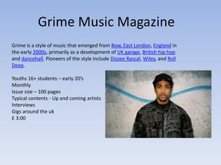
  • 1. Grime Music Magazine Grime is a style of music that emerged from Bow, East London, England in the early 2000s, primarily as a development of UK garage, British hip hop and dancehall. Pioneers of the style include Dizzee Rascal, Wiley, and Roll Deep. Youths 16+ students – early 20’s Monthly Issue size – 100 pages Typical contents - Up and coming artists Interviews Gigs around the uk £ 3:00
  • 2. Flavour Magazine Case Study Notes; • Urban music based in the u.k looking at genre’s such as hip hop, mc’ing and rapping. •The publishing company is called “greenpark publishing” The Staff The Staff •Flavour Magazine Publisher: Leonard Foster •Flavour Magazine Editorial Director: Annika Allen •Flavour Magazine Advertising Executive: Siobhan Copland •Art Editor: Ikem Ononiwu •Fashion Editor: Denise Brown •Events Team: Laura Rinaldi •Events Team: Denise Kodia •Sub Editor: Francesca Twinn • bi-monthly urban entertainment and arts magazine in the United Kingdom. The publication targets men and women 18–34. It presents interviews and discussions on people in music, art, TV, film, beauty and fashion. Price: Free Frequency of Publication: Monthly
  • 3. Sophisticated colour scheme Uncluttered Main Image Needs A The web front page Medium Close Up Barcode address featured Cover lines Includes a header and a slogan above it. Quite Plain, wouldn’t get me the best grade, Issue Information good to know it needs more skills shown to Cover Line; Identifying become more the Cover Star and successful. Giving a small detail of the further interview Girly Colours, need to inside. be more for both genders so a colour that is not specifically linked Listing other featured to either gender. artist so you can see what to expect In this I think their should be issue of the magazine. more Images on the front cover to attract more A lot of jewellery worn to give that hip readers if they are not hop Urban feel to the magazine e.g interested in main image. chains worn
  • 4. Page Numbers in chronological Relevant images, order and defined into different This specific one from but not enough sections e.g “Exposure” “Flavour” is so Plain, I on there and a don’t want my irrelevant image Contents page to look should not be the Anything like this. biggest one. The colour Not detailed when scheme is not discussing the titles of very clear, the different articles, which white is too means it is hard to basic and the differentiate between look of the different ones and harder to contents page navigate through the is too magazine. simplistic. There is no point in subheadings for different types of I don’t like the idea of the page being folded articles if they are in up looks scruffy and if there is not much detail chronological order. about the magazine you shouldn't have details that are unnecessary
  • 5. Again too Needs to not just be bulk text, too overwhelming simplistic and for some readers, should have quotes or snippets Nice boring. to attract attention relevant images, Colour look scheme profession is simple al have but been effective photo and shopped works well. nicely with the Interestin photogra g topics phs used to the in this article article. e.g. the gossip/sc andal Font is very small etc. It would be very expensive (especially for a free magazine) to produce a full-page image and is unnecessary if the article is thorough.
  • 6. NME Magazine case study notes; The New Musical Express, popularly known by the initialism NME, is a music publication in the United Kingdom, published weekly since March 1952. It started as a music newspaper, and gradually moved toward a magazine format during the 1980s, changing from newsprint in 1998. It was the first British paper to include a singles chart, in the 14 November 1952 edition. In the 1970s it became the best-selling British music newspaper. During the period 1972 to 1976 it was particularly associated with gonzo journalism, then became closely associated with punk rock through the writing of Tony Parsons and Julie Burchill. • Type and focus of the magazine is “indie” •Publishing company for NME; •The frequency of the publication is Weekly •Price; £2.99 •Editors name; Mike Williams •First issue 7th of march 1952 •IPC media
  • 7. NME trademark text is clear and big, easy to identify. Great use of colour scheme Picture fits in with colour scheme e.g A puff is in the red in his shirt = red top right hand text corner of the magazine Blue against red is used cleverly to Issue contrast against information each other so the (price date etc.) cover lines telling you what is in this weekly magazine The image are clear and overlaps the stand out against title so as not the rest. to obscure the medium shot of Alex The convention of Turner. a bar code is used. Vynal relevant to magazine. Question used on the front to entice the target audience.
  • 8. Clear colour Enticing the scheme reader looks very mentioning “free effective posters” sticking to insentives. the pink white and black background. I want to emulate the Barcodes used as idea and look a usual magazine of the Polaroid convention images it would be very simple to do on Photoshop Cover lines used and looks very at the start effective.
  • 9. Interesting and Issue information on top of an Relevant Images engaging layout. image Columns like the Page numbers big “PLUS” column to and bold and entice the reader shown with an and add little image so it’s extra’s so nothing obvious what the is missing on the topic is for that contents page. particular article Date on the top and the title is unique as well not just putting “contents” and giving that page a specific name.
  • 10. I really love the idea of the newspaper cutting out as a title is looks really effective and gives it an alternative “punk” look which goes with The image the look of Lilly Allen in this photo as she is wearing tartan. I am going goes with to try and emulate this title idea in my double page spread. the colour scheme again red Relevant image from the of artist which shirt is is the focus of reflected the whole into the odd article the rare section photo is a of text in medium long this double shot and it page takes up a full spread. page which looks good but will be costly in printing Not too much actual article or text Colour scheme expenses. for a double page spread could be is effective; disappointing to readers that like a using black, lot of information. white and red throughout.
  • 11. If text is overwhelming they have a dip in and out of side bar so readers can get bite size information quickly and it is separated from the text I would like to use this idea in my double page spread. Really nice different images selection. Action shots