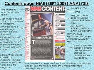
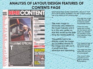
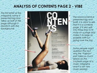
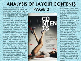
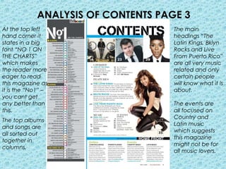
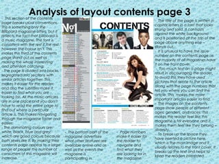
This document analyzes the layout and design features of contents pages from three different magazines: NME, Vibe, and Billboard.
The analysis examines visual elements like mastheads, images, headings, fonts, and page sections. It notes how these elements are used to attract readers' attention, convey information efficiently, and relate to the magazines' purposes and target audiences. Key aspects like color schemes, placement of images and text, and level of detail vs simplicity are evaluated.
The document provides a close visual analysis of how contents pages from different magazines employ design to effectively summarize and entice readers about the issues' content.


![Music magazine front cover analysis[1]](https://cdn.slidesharecdn.com/ss_thumbnails/musicmagazinefrontcoveranalysis1-120423125101-phpapp02-thumbnail.jpg?width=640&height=640&fit=bounds)